
Today, we’re sharing the biggest change to the Budibase brand in our recent history. We have a vibrant new look, with the aim of making Budibase as beautiful as the workflows that it enables.
It’s a makeover a long time in the making, and a lot of love went into it. We hope it shows.
Why a rebrand?
Budibase is on a mission to help you and your team turn data into action. By making it easy and faster to build workflow apps, we give you more time to do the work that matters: rehoming refugees, curing patients, running election campaigns, or whatever it is your company does. That’s what gets us up in the morning.
About a year ago, we looked at our brand and realized that we just weren’t conveying who we are or what we stand for. We’ve also grown rapidly over the last year, so it became more important to define our brand to create a sense of consistency across our teams. Our goal was to make everything that you interact with – from our product to this blog – more representative of who we are. But who are we?
Determining who we are and where we stand
Members from across the company participated in a number of workshops to determine "Who we are".
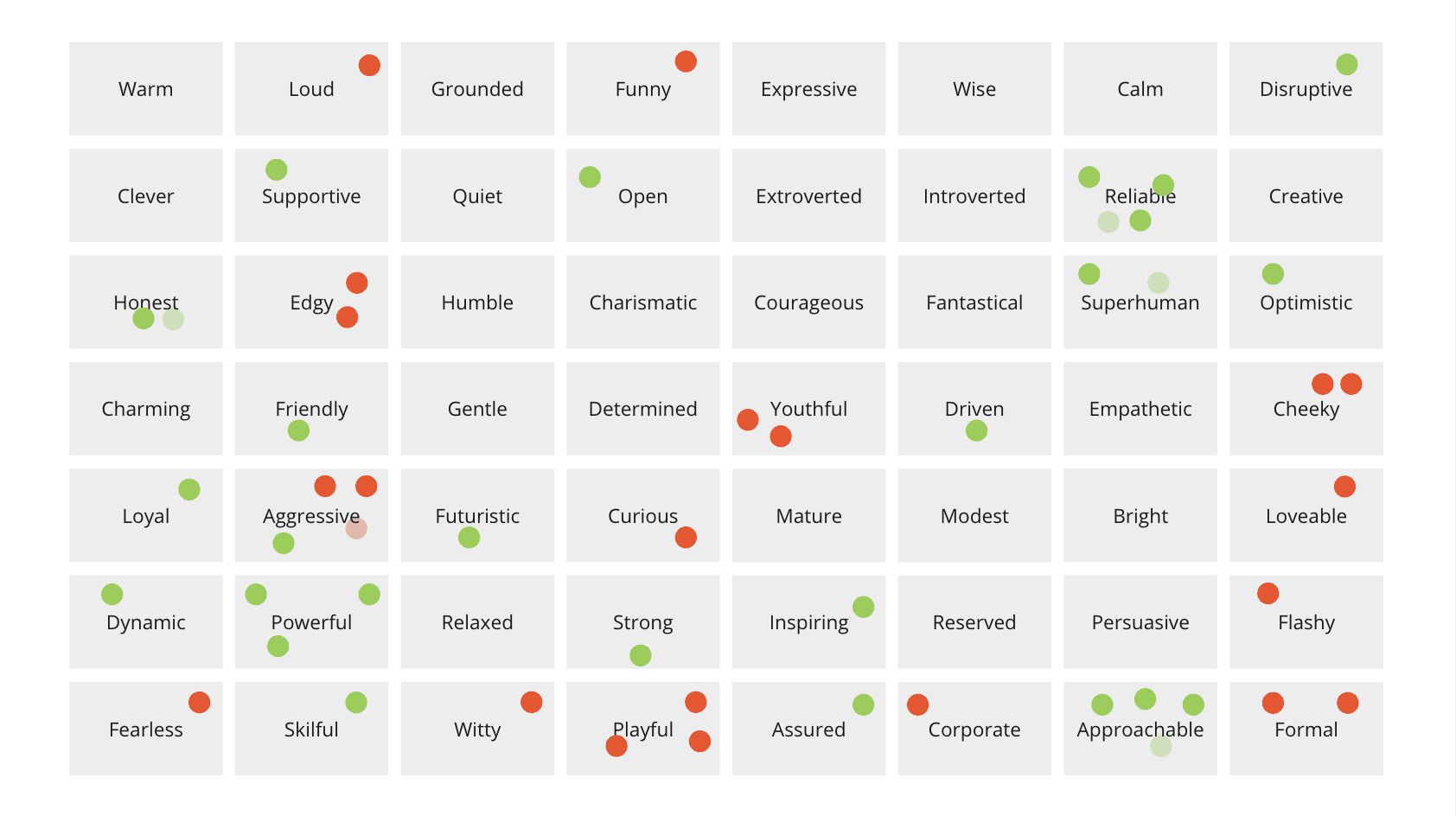
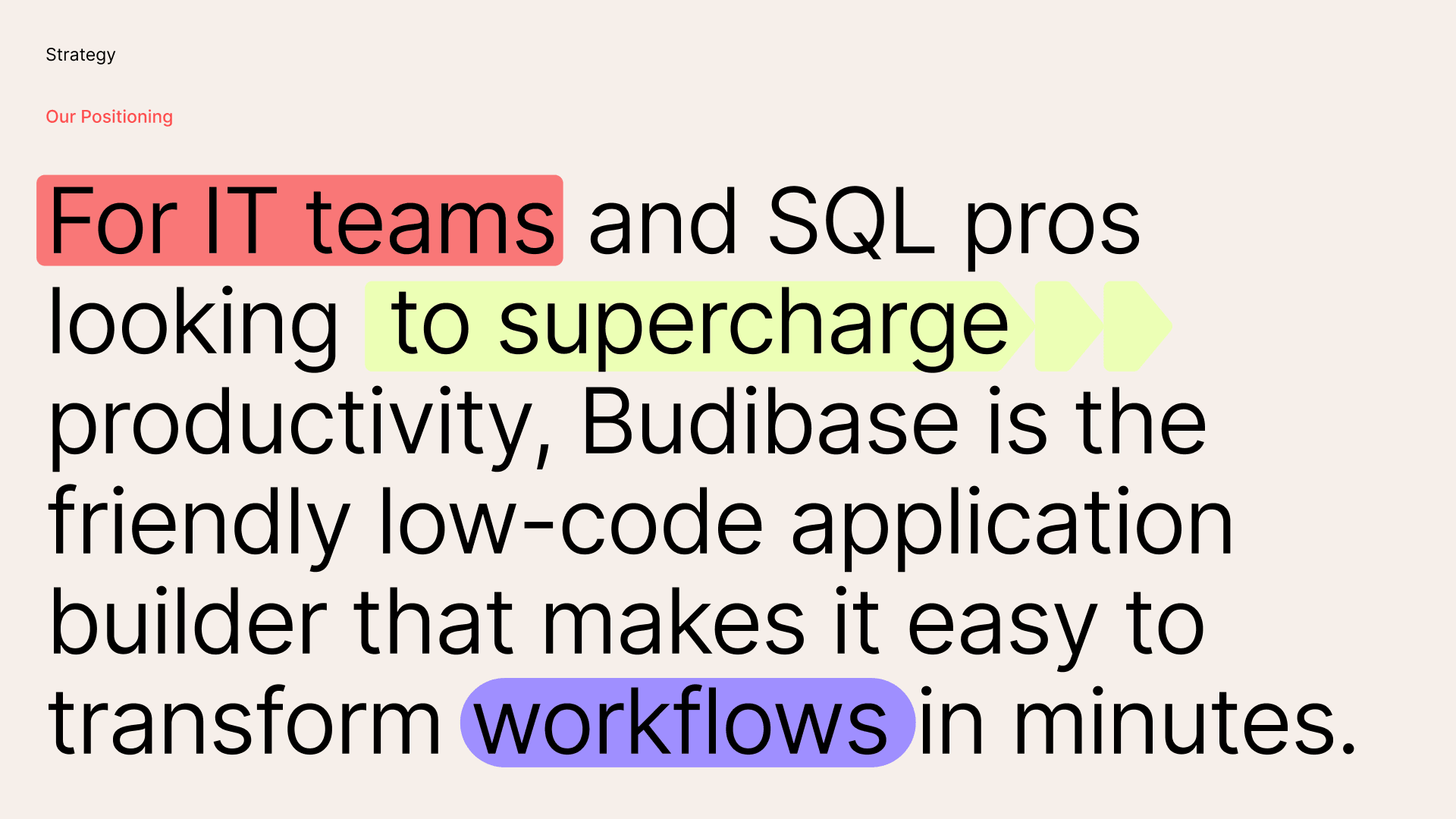
The result of this work, was the following positioning statement:
To get to this point, we gathered members of the company from across product, marketing, design, and engineering to align on the qualities we want to convey. This togetherness helped us deliver a brand we can all stand by.
Evolving the BB
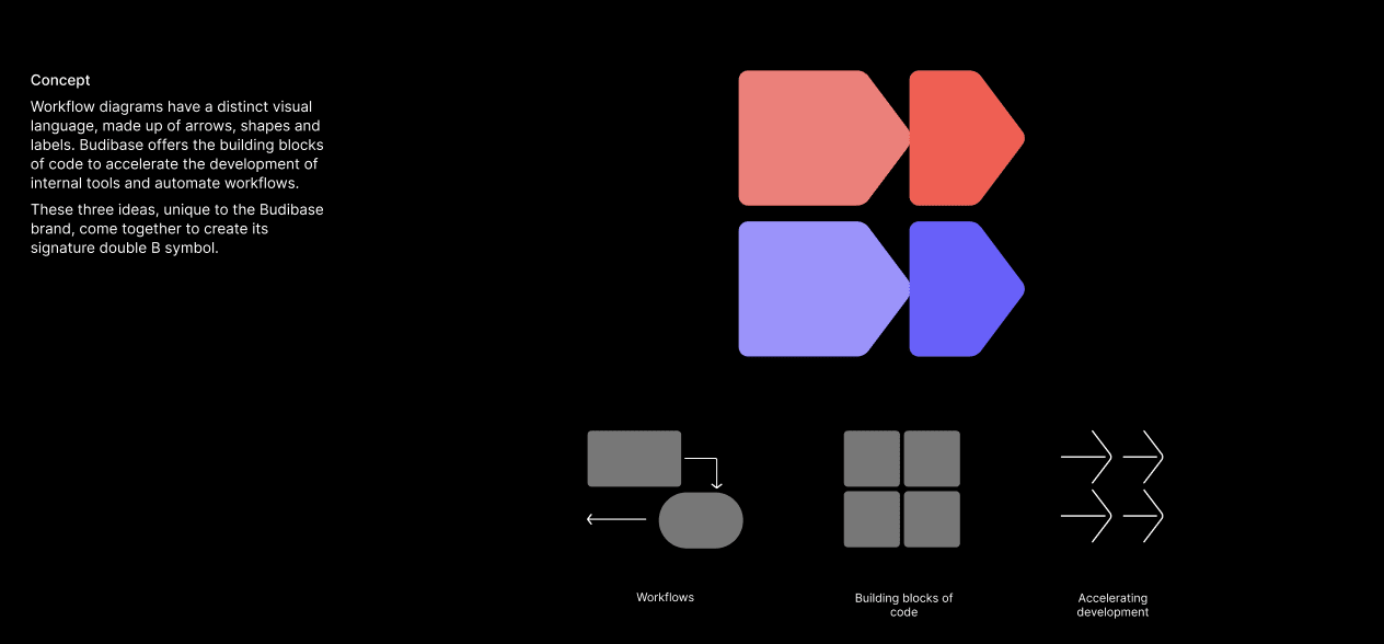
In setting out to create a new logo, we knew we wanted to capture the spirit of Budibase in a simple, iconic form—a symbol that would represent workflows for many years to come. We partnered with Moving Brands to find that symbol, and couldn’t be happier with the results.
Our initials 'BB' are still there, but they are arranged in a creative and relevant new way:
Adding flair to the wordmark
We also worked hard on creating a wordmark that looks professional, but has enough character to exist by itself:
With our vibrant palette (we'll touch on that later) we can add additional energy to the wordmark:
The new logo designed to make work flow
Combining both the wordmark and symbol, we had our new logo:
![]()
The logo has different variants that helps with scaling the brand:
![]()
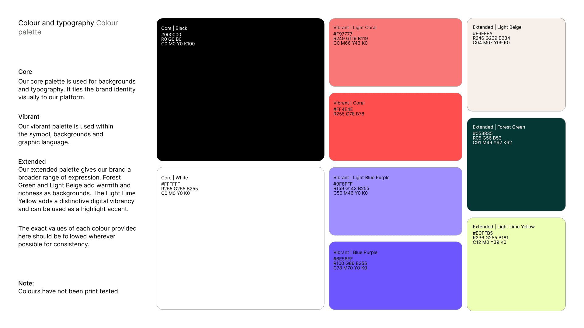
Energy and purpose in a sea of Blue
Once we had a new logo, we worked to extend that out into a brand system—a collection of colors, shapes, fonts, and patterns that make everything Budibase feel like Budibase. We wanted Budibase to look and feel like a brand our employees and users would be proud of. We want to stand out from our competitors who tend to default to Blue hues. It was important to use that our brand stood tall, full of energy and purpose - like the workflows we power.
We’re always open to feedback. Hop over to our Discord channel and let us know what you think of the new branding.
If you'd like to download the new Budibase logo, you can do so within the Budibase branding app.