Vendor request forms are a key part of managing inventories, supply chains, and procurement processes - specifically when it comes to registering new suppliers.
However, this can also create a huge amount of administrative work for logistics and finance teams alike. In particular, handling vendor requests manually or with pen and paper can lead to excessive data entry, validation, and other admin tasks.
Today, we’re checking out how you can use Budibase to digitalize your vendor request forms with minimal custom coding skills.
By the end of this tutorial, you’ll have a fully customizable multi-step form - that you can even host on your website.
But first, let’s think about a little bit of background.
What is a vendor request form?
A vendor request form app is a simple self-service UI that allows potential partners to register their interest in working with your business. Essentially, it’s a structured way of gathering key information and saving it to a database.
The idea is to replace the need for pen and paper forms - or at least documents and PDFs.
Implementing digital forms can be a huge process improvement in and of itself - or it can be the first step towards other kinds of transformation efforts - including automation, data centralization, and more.
Ultimately, the goal of a request form is to achieve two things:
- Providing external users with a more efficient, streamlined experience for making requests.
- Ensuring that all request information is stored in a consistent format in a single location.
With that in mind…
What are we building?
We’re building a multi-step, embeddable form that allows users to add entries to a table in Budibase’s internal database - although, as we’ll see, we could apply the same technique to do the same thing with a huge range of external data sources.
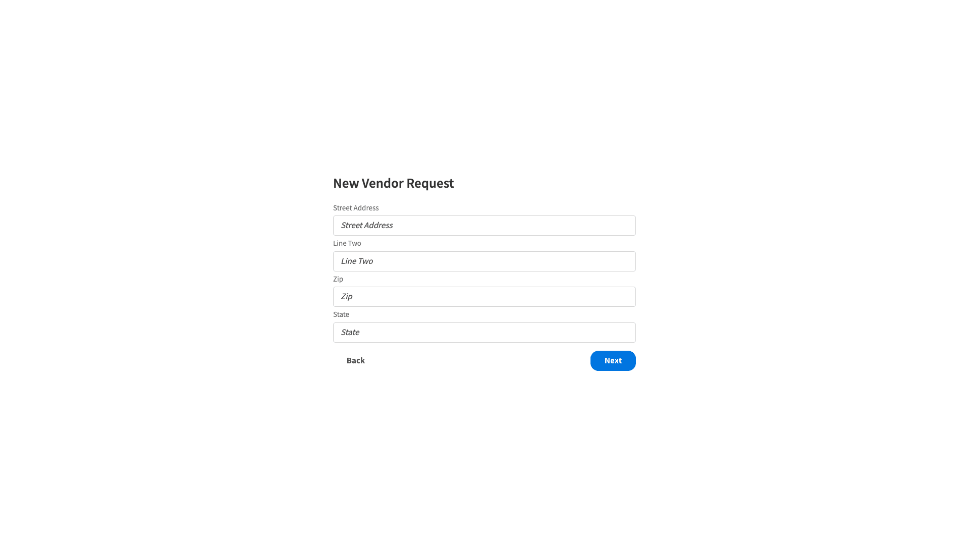
Here’s how this will look when we’re done:
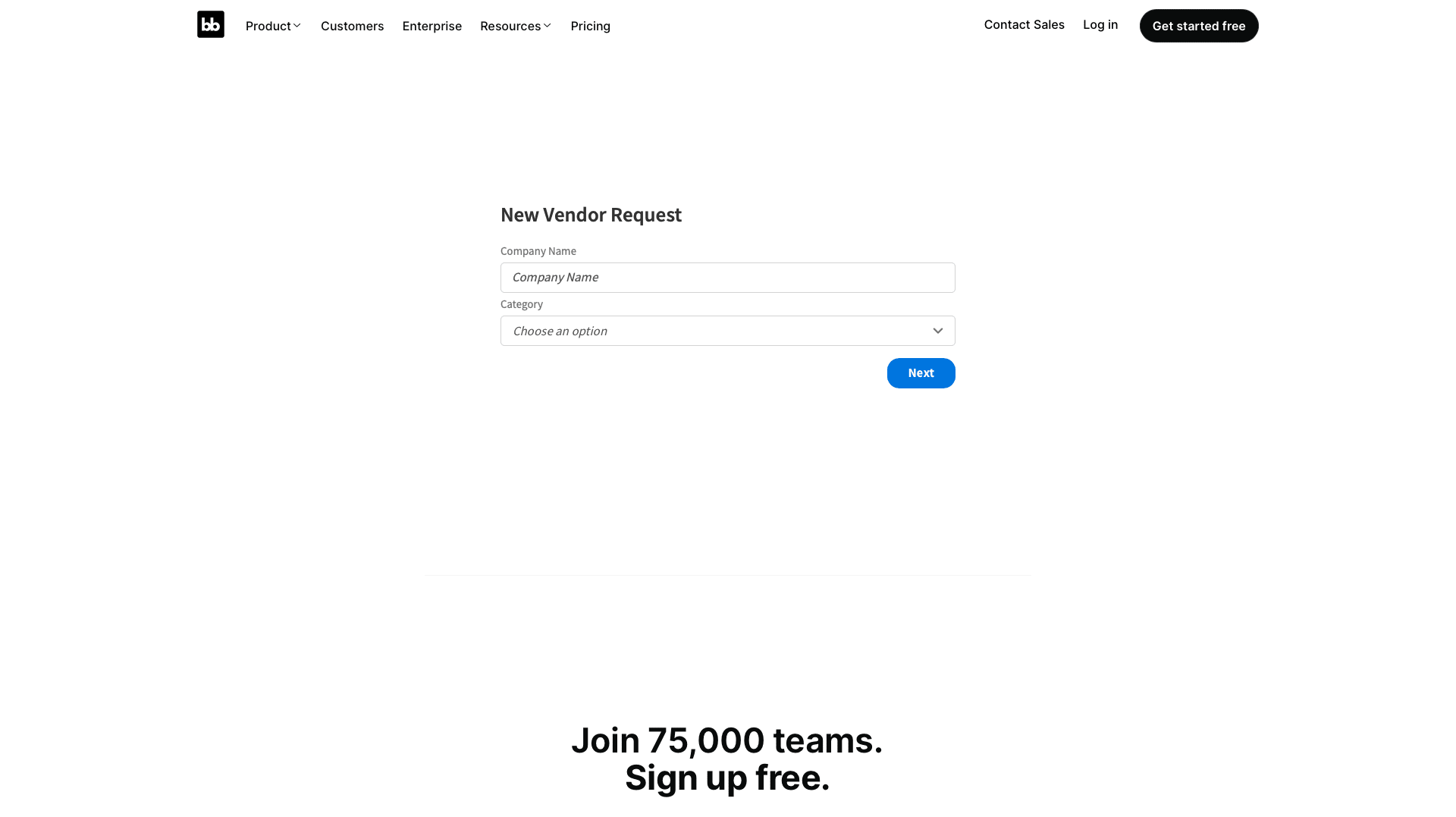
And here’s what it would look like if we embedded it on the Budibase website:
How to build a vendor request form in 6 steps
So, let’s dive right in. If you haven’t already - sign up for a free Budibase account.
Join 300,000 teams running operations on Budibase
Get started for free1. Create a new app and configure your data
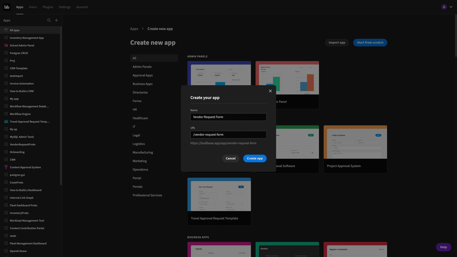
The first thing we need to do is create a new Budibase application. We have the option of importing an existing app or starting with a template - but we’re going to hit start from scratch. We’ll then be prompted to give our app a name - which will be used as its URL path:
We’re then able to choose a data source:
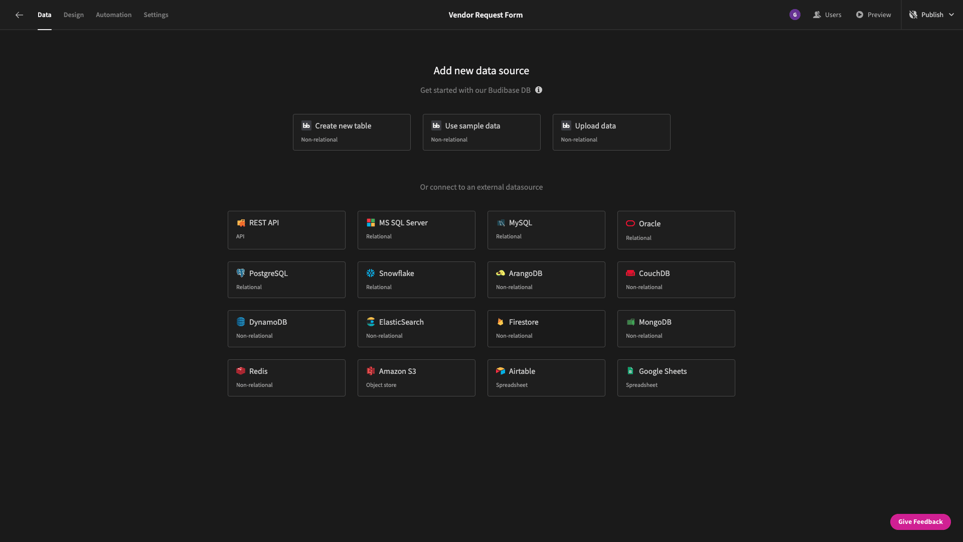
Budibase offers dedicated database connectors for MySQL, SQL Server, Postgres, REST, Google Sheets, Airtable, CouchDB, MongoDB, DynamoDB, and many more.
But, we’re going to use Budibase’s internal database. This means that we can quickly create our form’s data model on the fly - or add it using existing data from a CSV file.
When we hit create new table - we’re asked to give it a name. We’ll call ours VendorRequest:
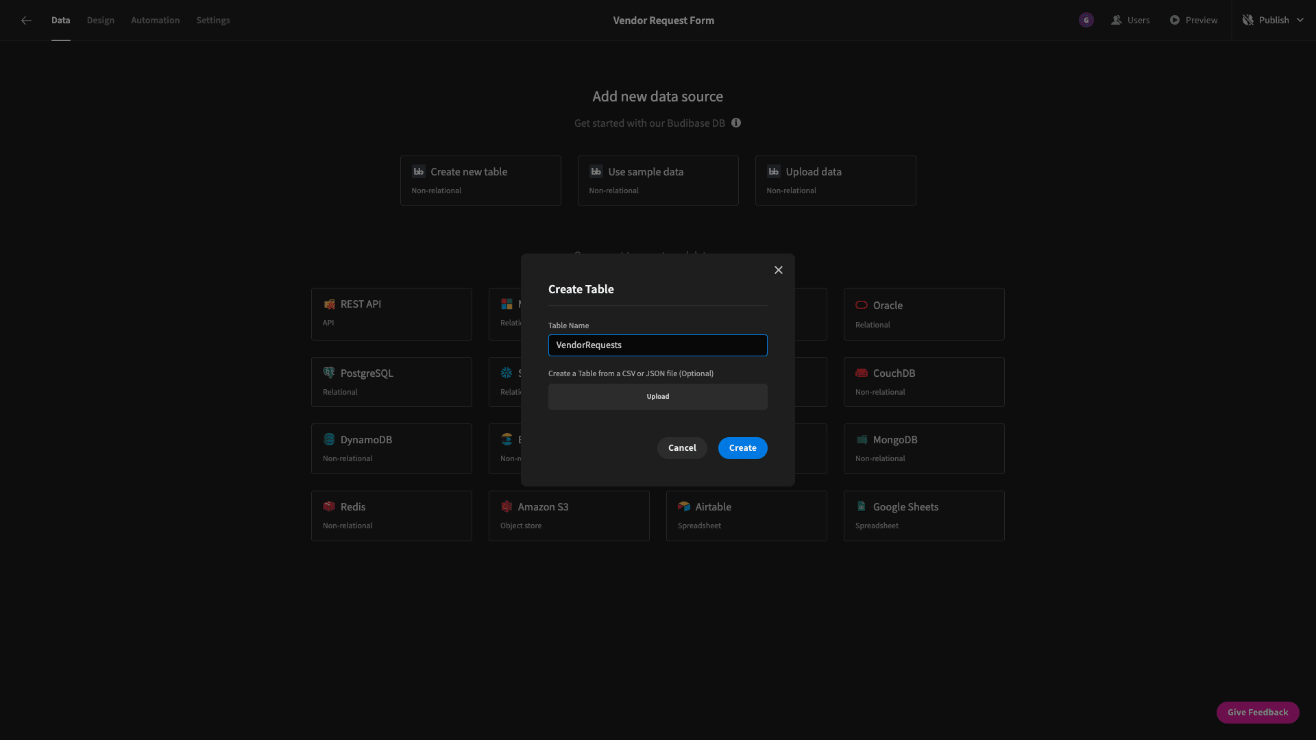
When we upload a CSV, we can choose a data type for each of the included attributes - as well as selecting a display column.
We’ll use company_name for this.
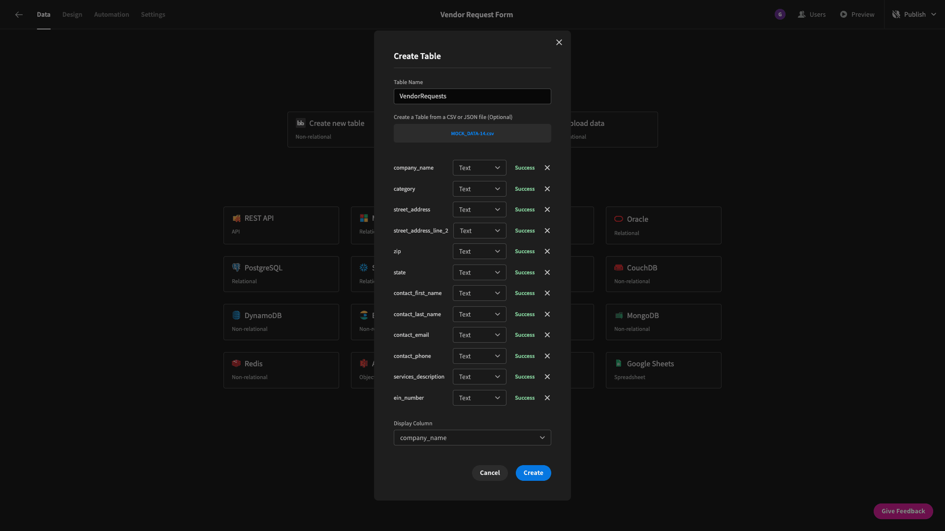
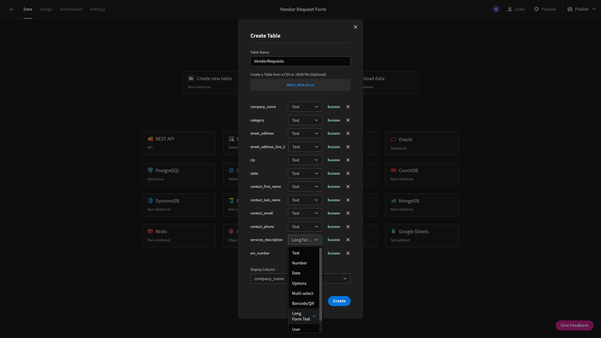
There’s an attribute in our CSV called services_description which we’re also going to change to the long form text type - so that we can give our form users a little bit more space to add information later:
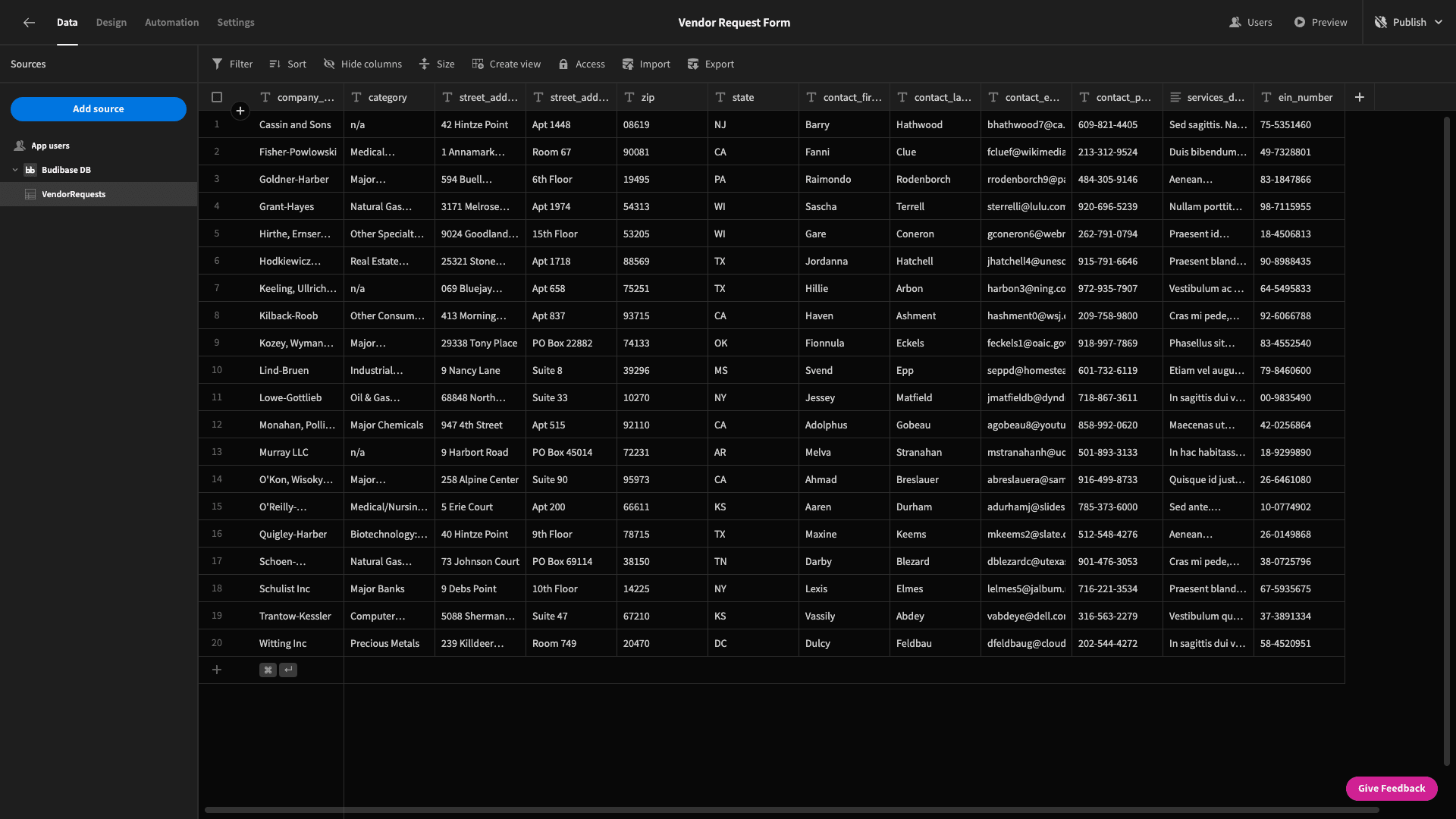
Hit create and Budibase will import our CSV data into our new table. Already, we can perform full CRUD functionality in Budibase’s back-end - as well as altering our schema by adding, editing, or deleting columns.
The data itself is pretty simple.
Our schema is based on the requester’s company information, address, the primary contact, and some basic billing details.
While we’re here- we’re going to make one change to our data model, by adding an extra attribute manually. This will be a boolean column called purchase_order_billing. We can do this with the plus icon in the table’s header:
And that’s our data model completed.
2. Add a new app screen
Now, we can start to build our form. To start, head to the design tab.
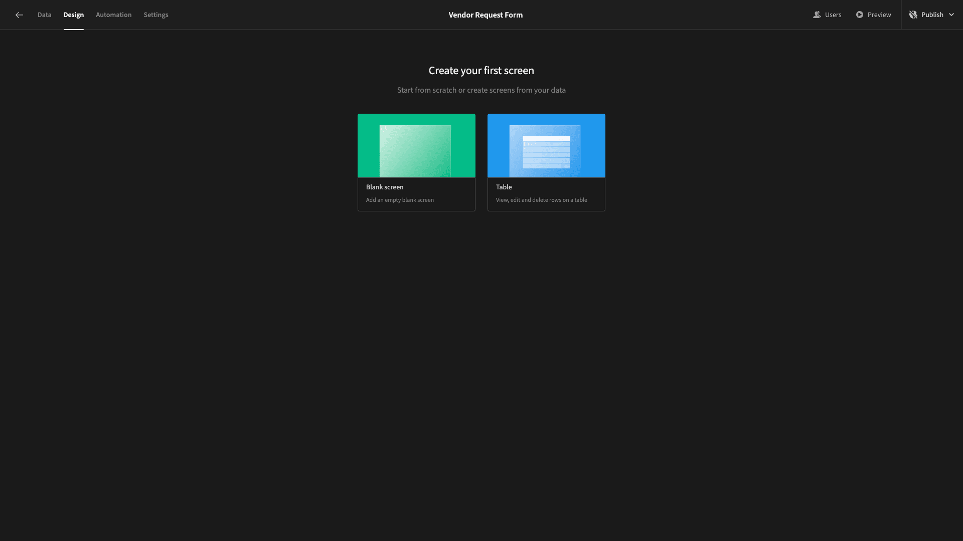
We have two options - starting from a blank screen or using a table layout, which will autogenerate a CRUD UI, based on whichever data source we select.
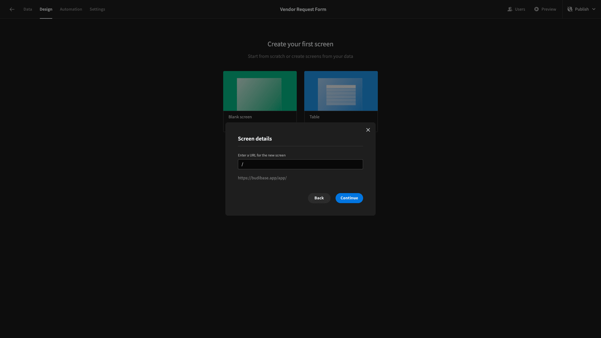
We’re going to use a blank screen. Again, we’re asked to choose a name and URL path. Our vendor request form app is only going to have one screen, so we’ll simply use “/”.
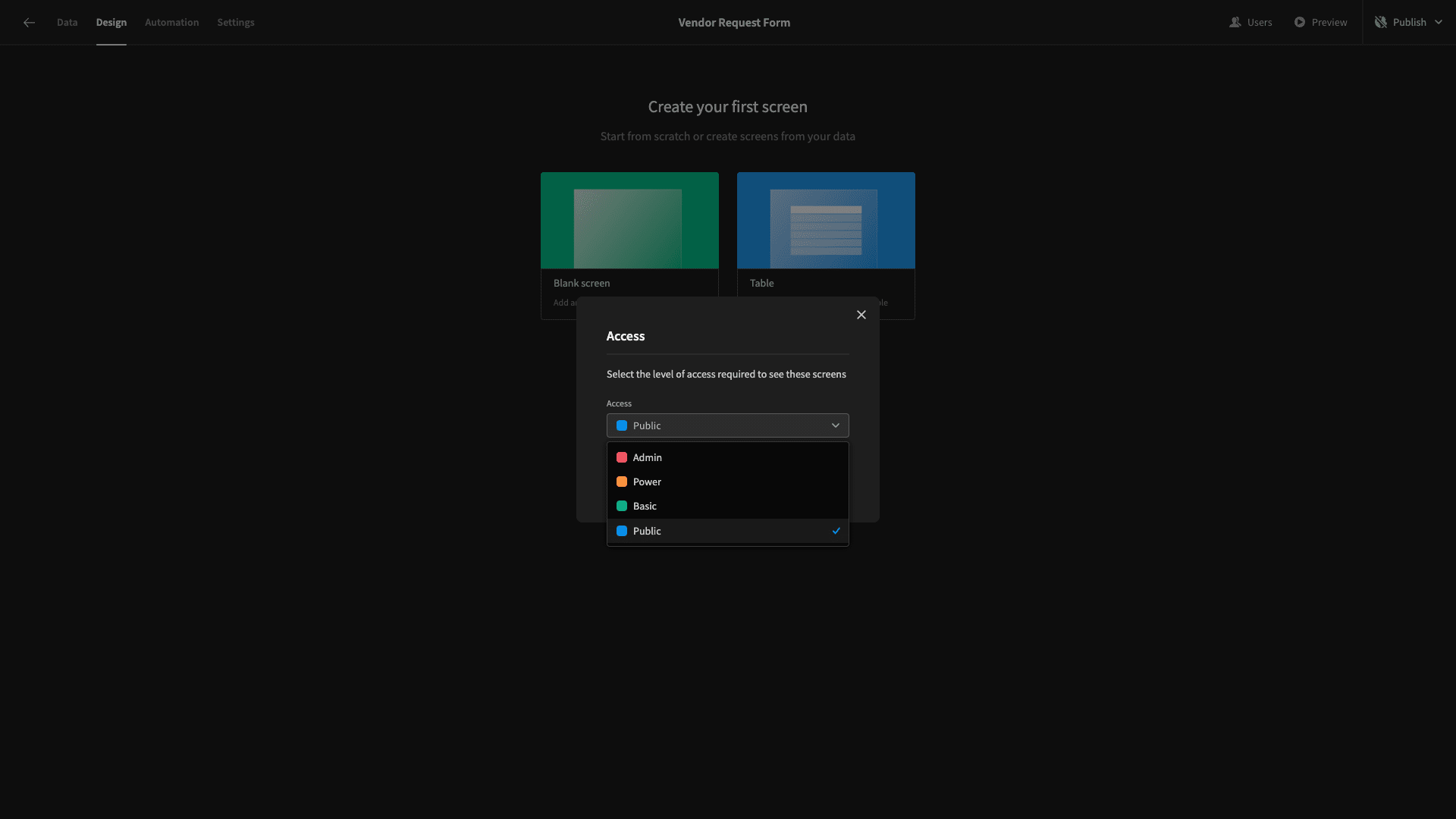
Then, we need to choose an access level for our screen. Budibase’s built-in RBAC is based around four hierarchical roles - public, basic, power, and admin.
Since we want to embed our form on our website, we’ll need it to be accessible to users who don’t necessarily have a Budibase account.
So, we need to choose public:
3. Create a new form
Now we have a blank screen:
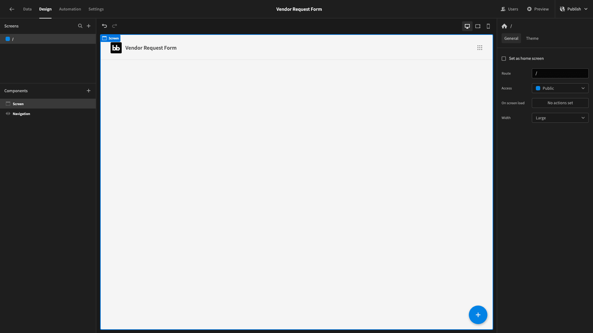
On this, we’ll add a form block.
This is a prebuilt set of components that allows us to generate a form and point it to a particular data source - for reading, creating, or updating entries:
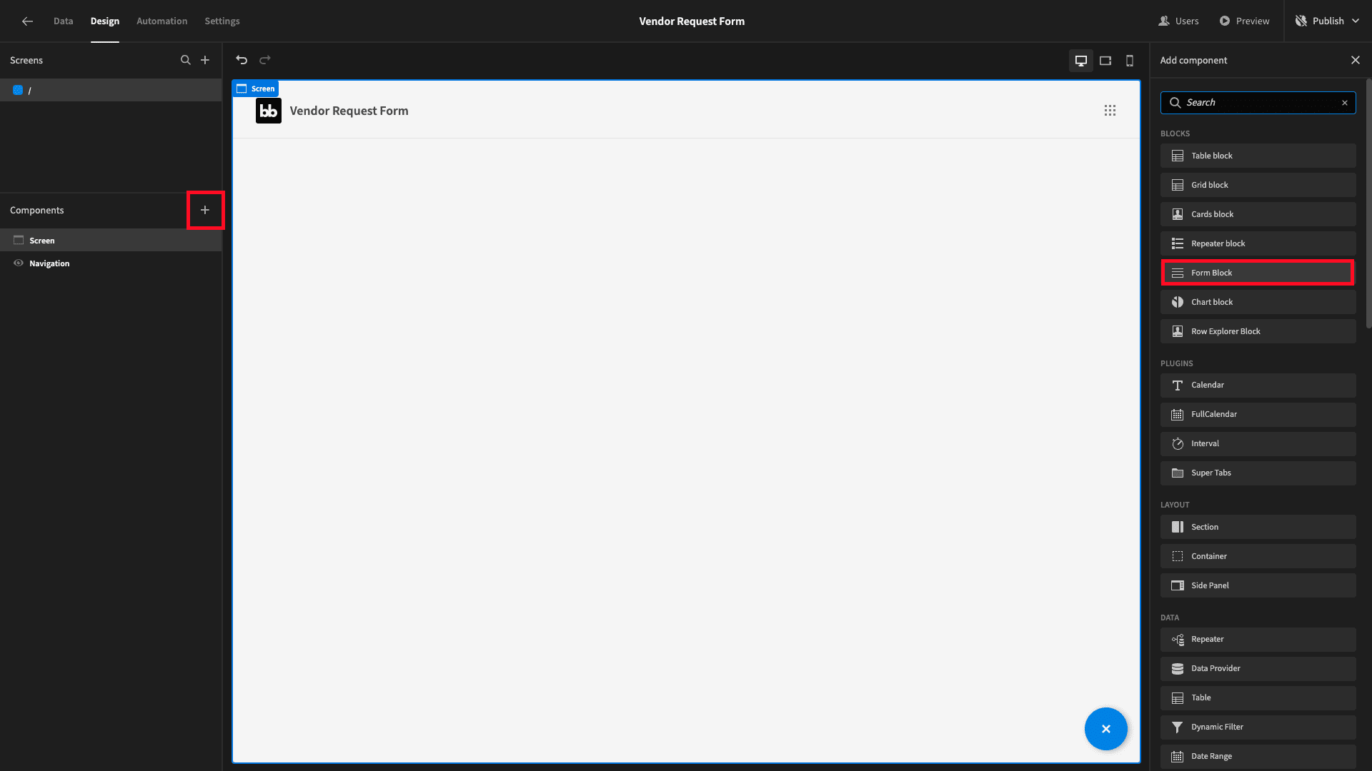
By default, this is already a create form. Since we only have one data source connected to our app, it’s also already pointed at our VendorRequests table.
Here’s what this looks like:
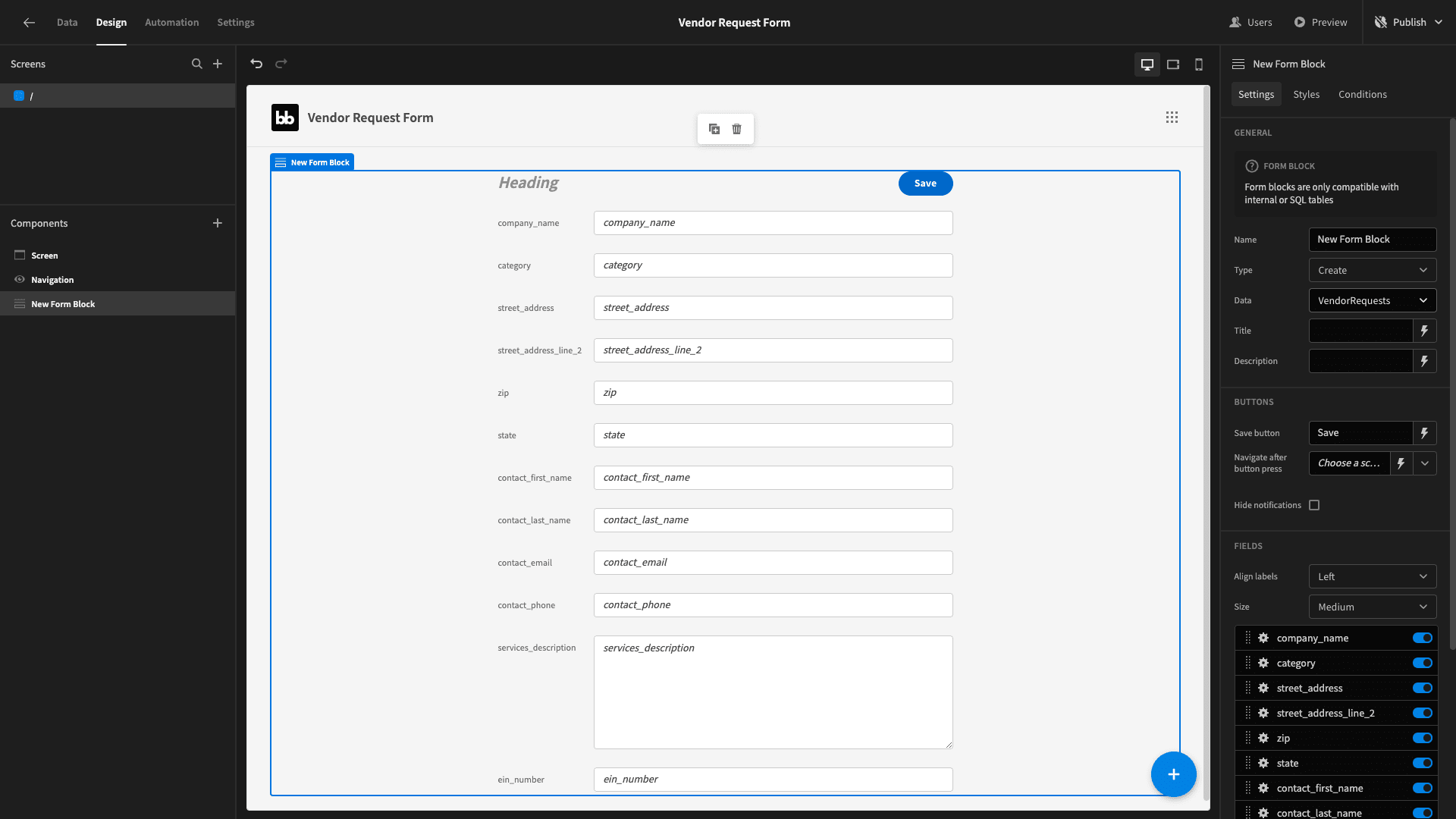
Strictly speaking, we could stop now. That is, this is already a fully functional vendor request form.
However, it’s not exactly pretty. Never worry, Budibase makes it a breeze to create professional UIs - without needing to write any custom code.
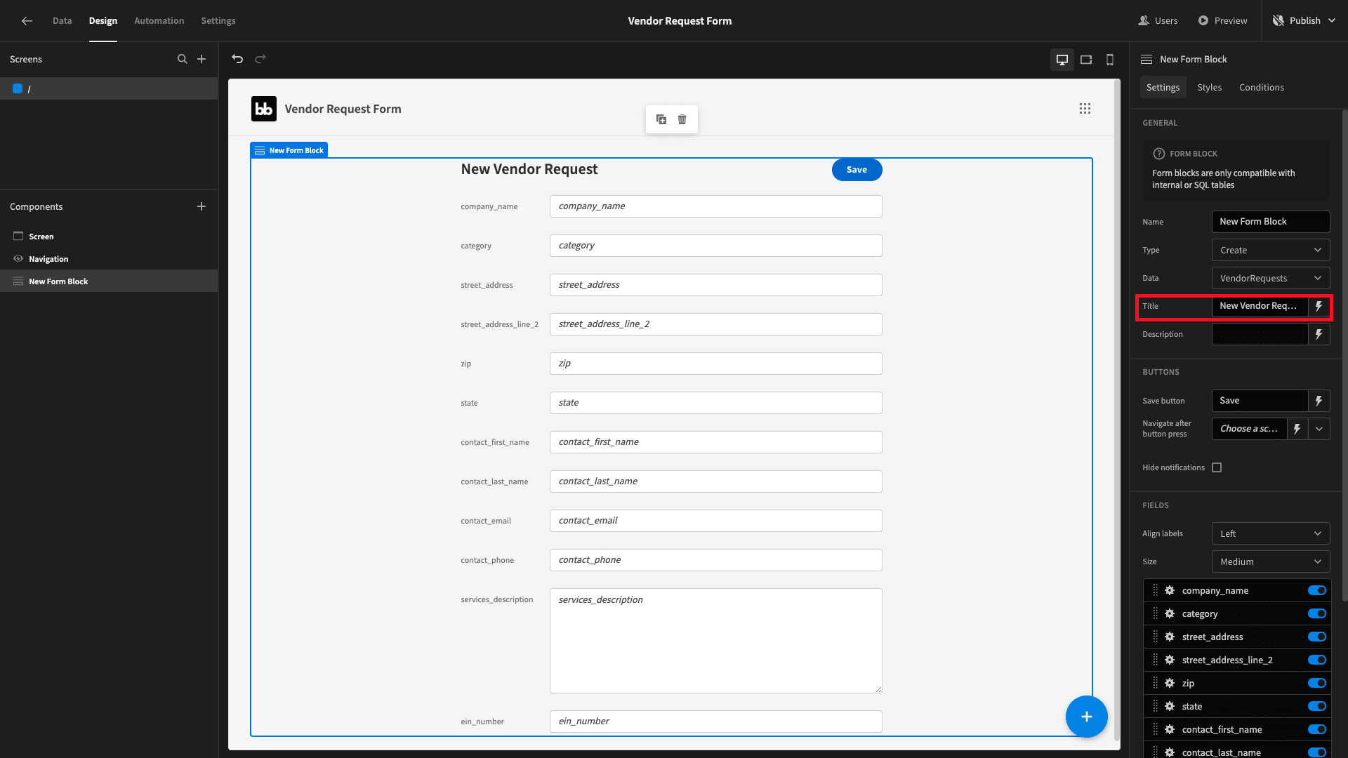
The first thing we’ll do is give our new form a heading:
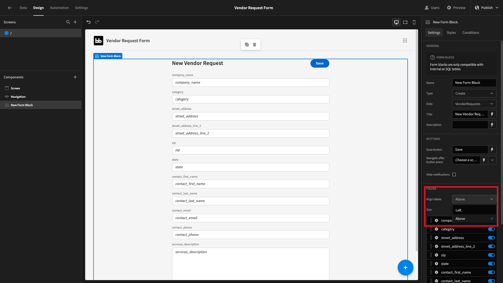
We’ll also align our field labels above their respective input boxes, rather than to the left:
And we’ll set the field size to large:
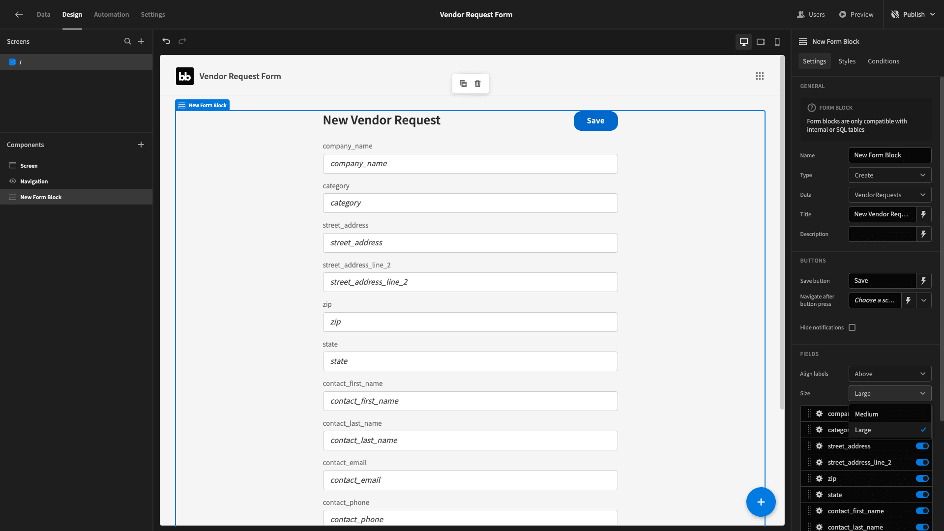
We’re happy with the order that our fields are in - but they’re being displayed to users with their attribute names as they’re stored in our database. This isn’t very appealing for a public-facing app.
We’ll use the cog beside each of our fields to capitalize their label and placeholder - as well as replacing the underscores with spaces:
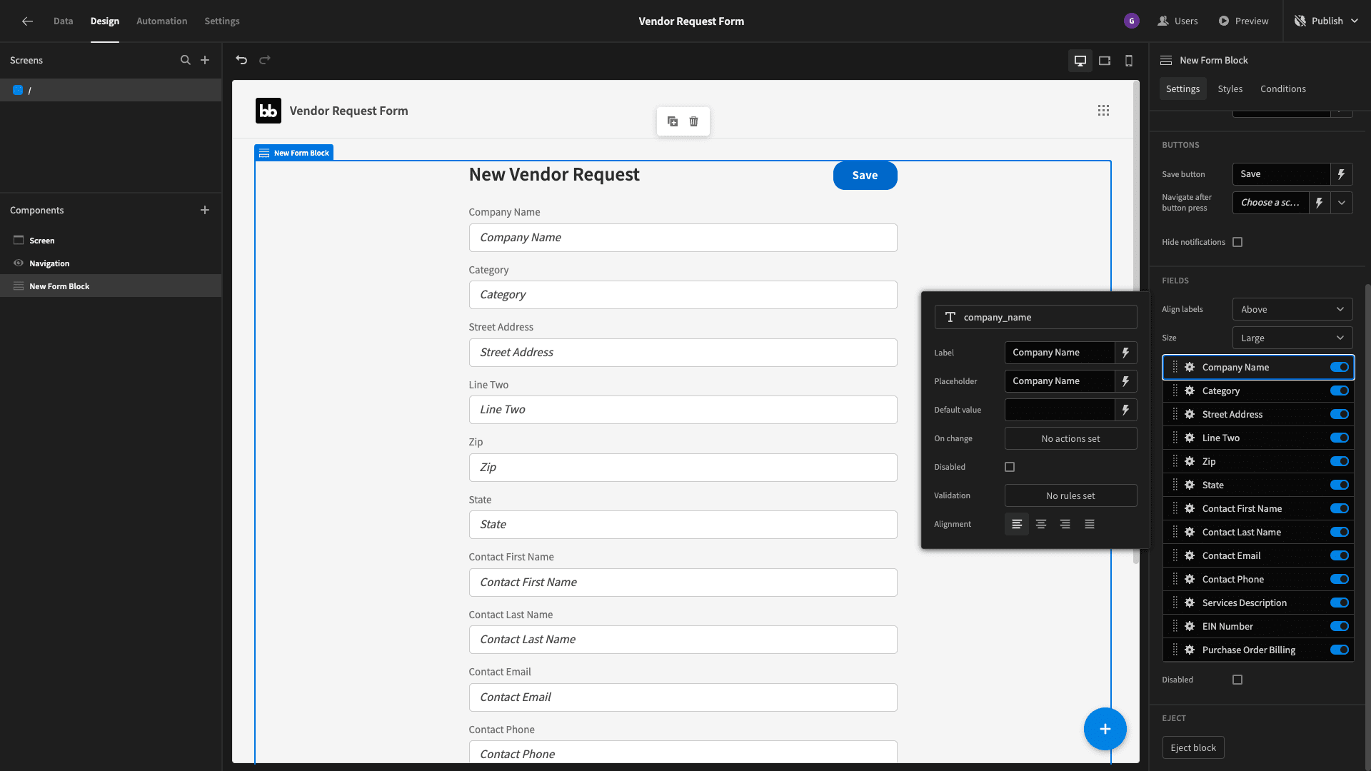
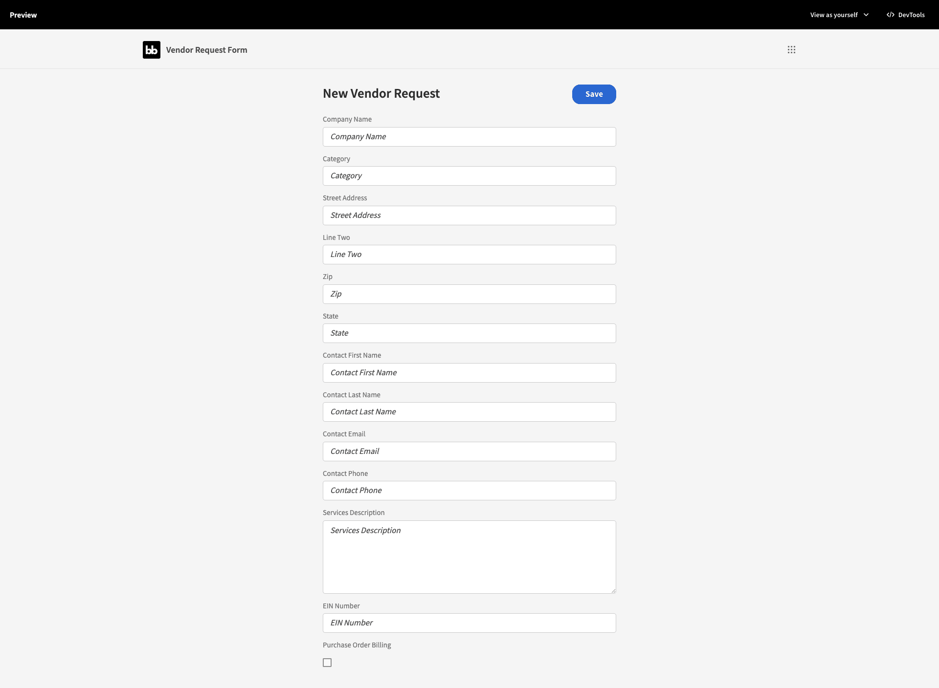
Here’s what we have so far:
4. Adding form steps
Our vendor request form is looking a lot better - but we’re asking users to provide a lot of information all at once. This can be overwhelming - and potentially harm our form completion rates or increase the risk of mistakes.
We’ll get around this problem by breaking our form up into steps. Basically, users will only be able to see related subgroups of fields at any one time.
To start doing this, we need to eject our form block:
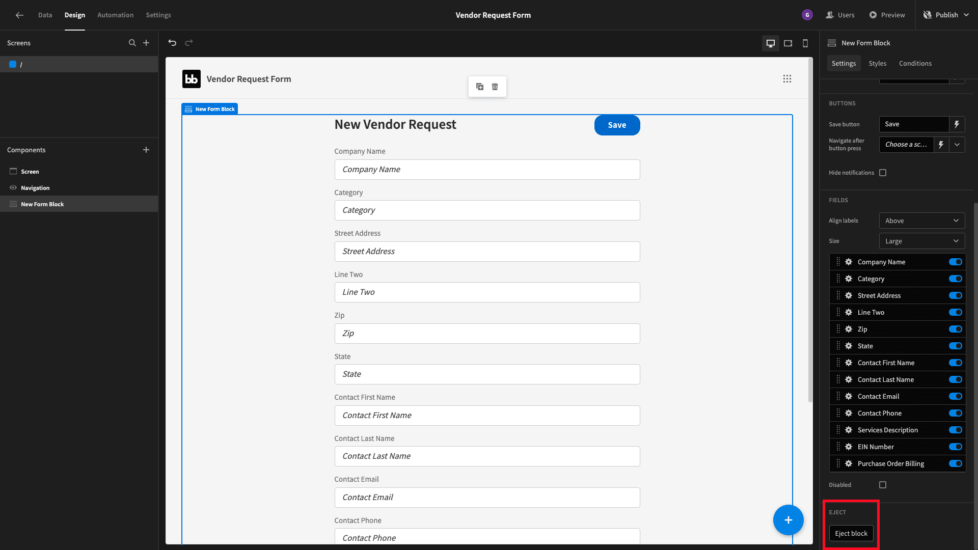
This will break our form up into its constituent components:
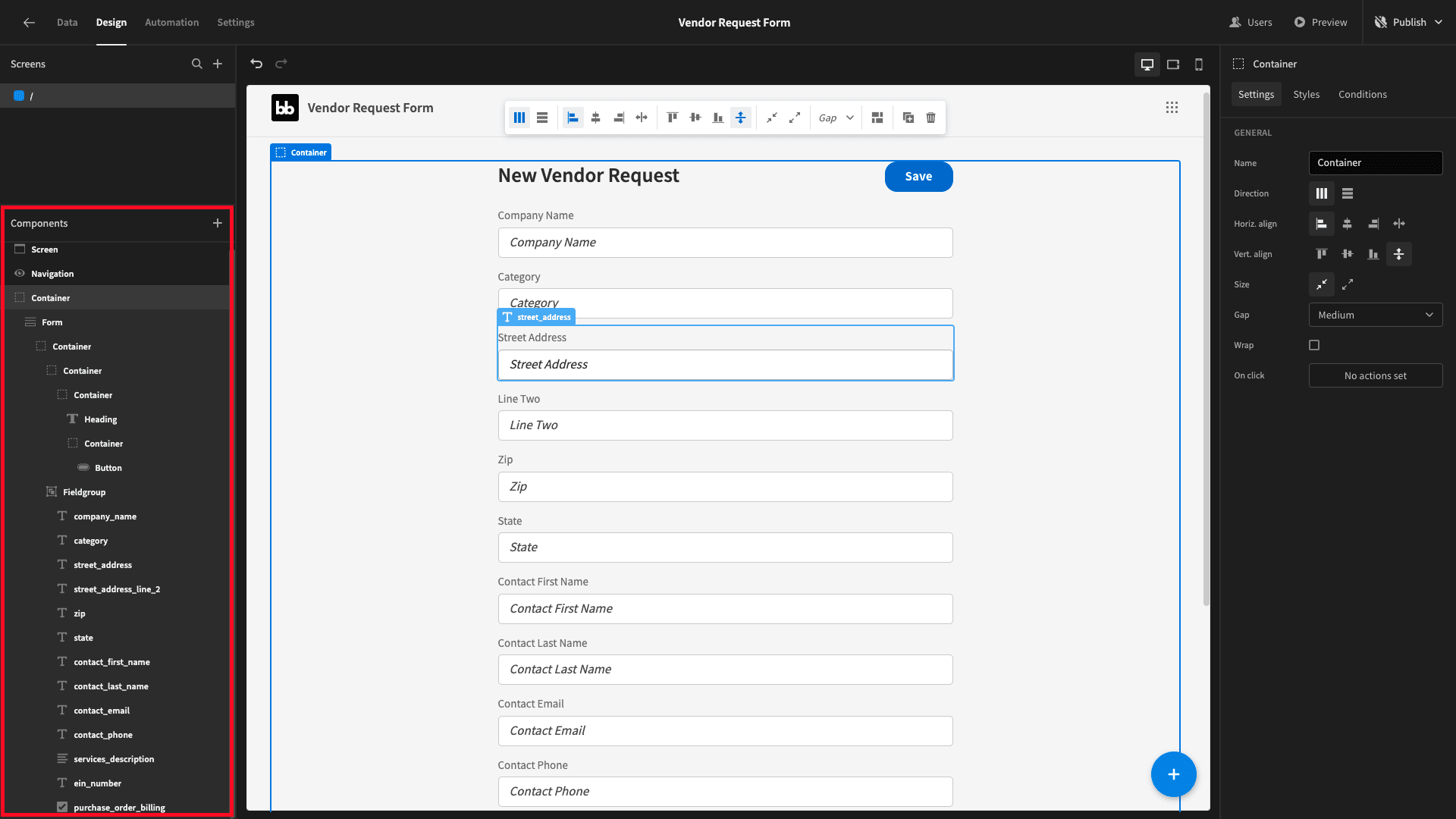
Now, add a form step component and place this at the top of our field group, like so:
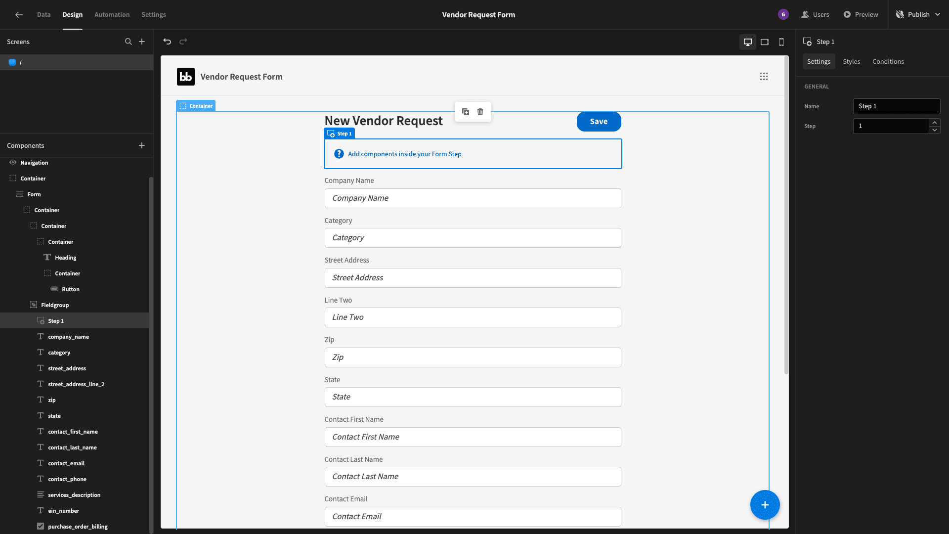
Inside this, we’ll nest our first two form fields - company_name and category:
We need some way for users to navigate between form steps, so below these two fields we’ll place a container with its direction set to horizontal - and it’s alignment set to the right:
We’ll call this Button Container:
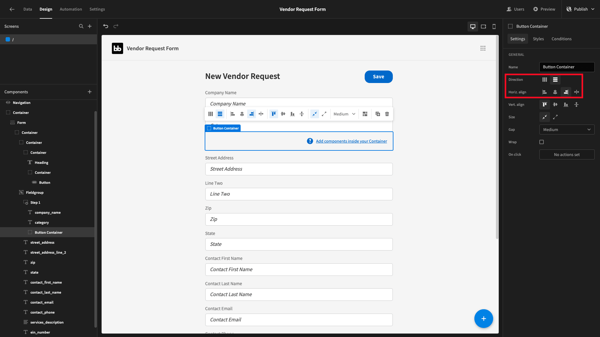
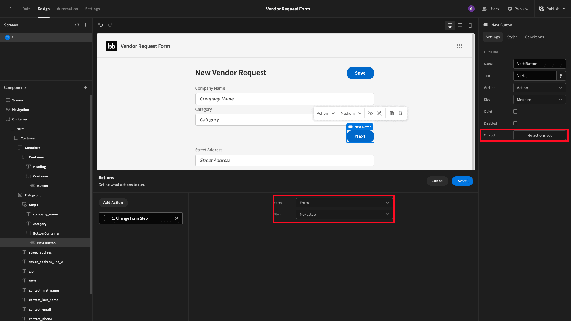
We’ll nest a button inside this and set its text to Next.
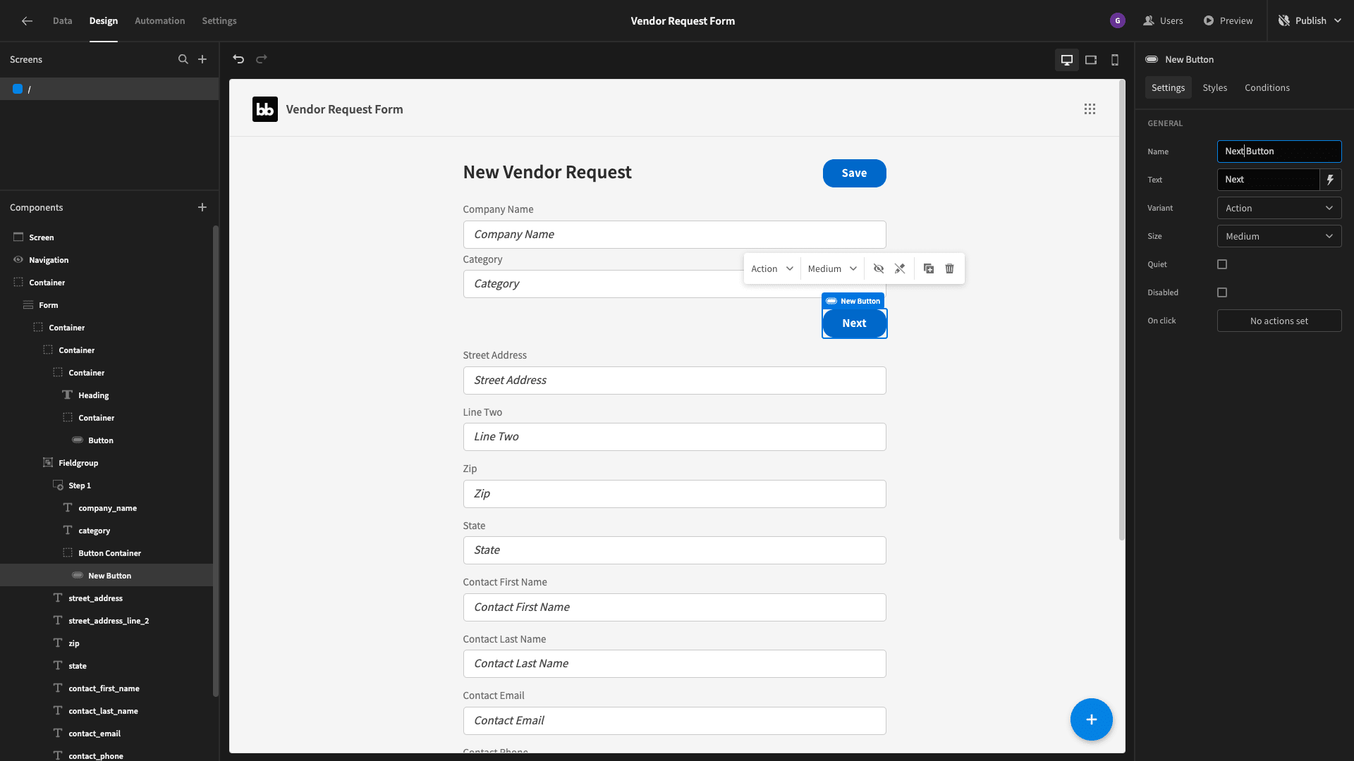
Then, we’ll add a change form step action so that when users click on our button, they navigate to the next step.
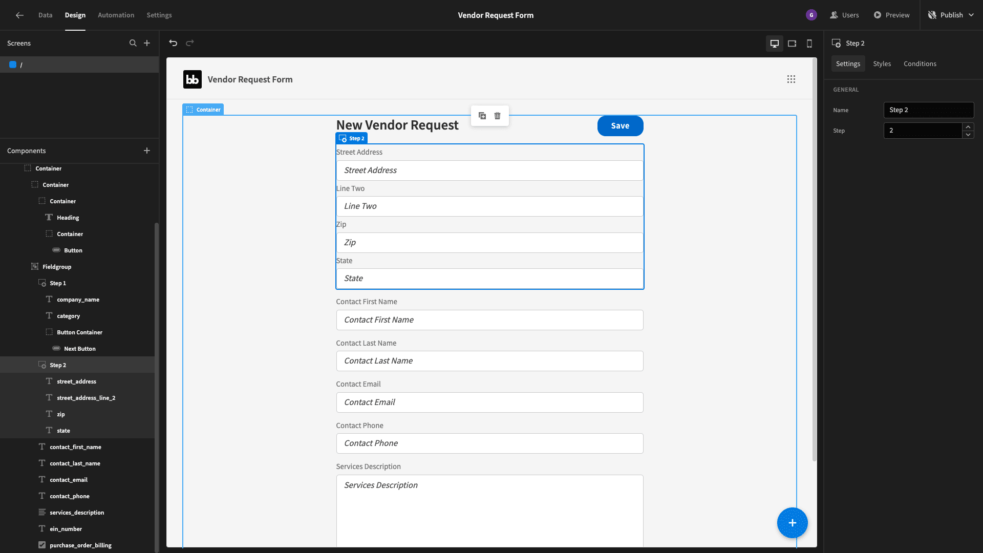
Now, we’ll add a second form step - inside of which we’ll nest street_address, street_address_line_two, state, and zip:
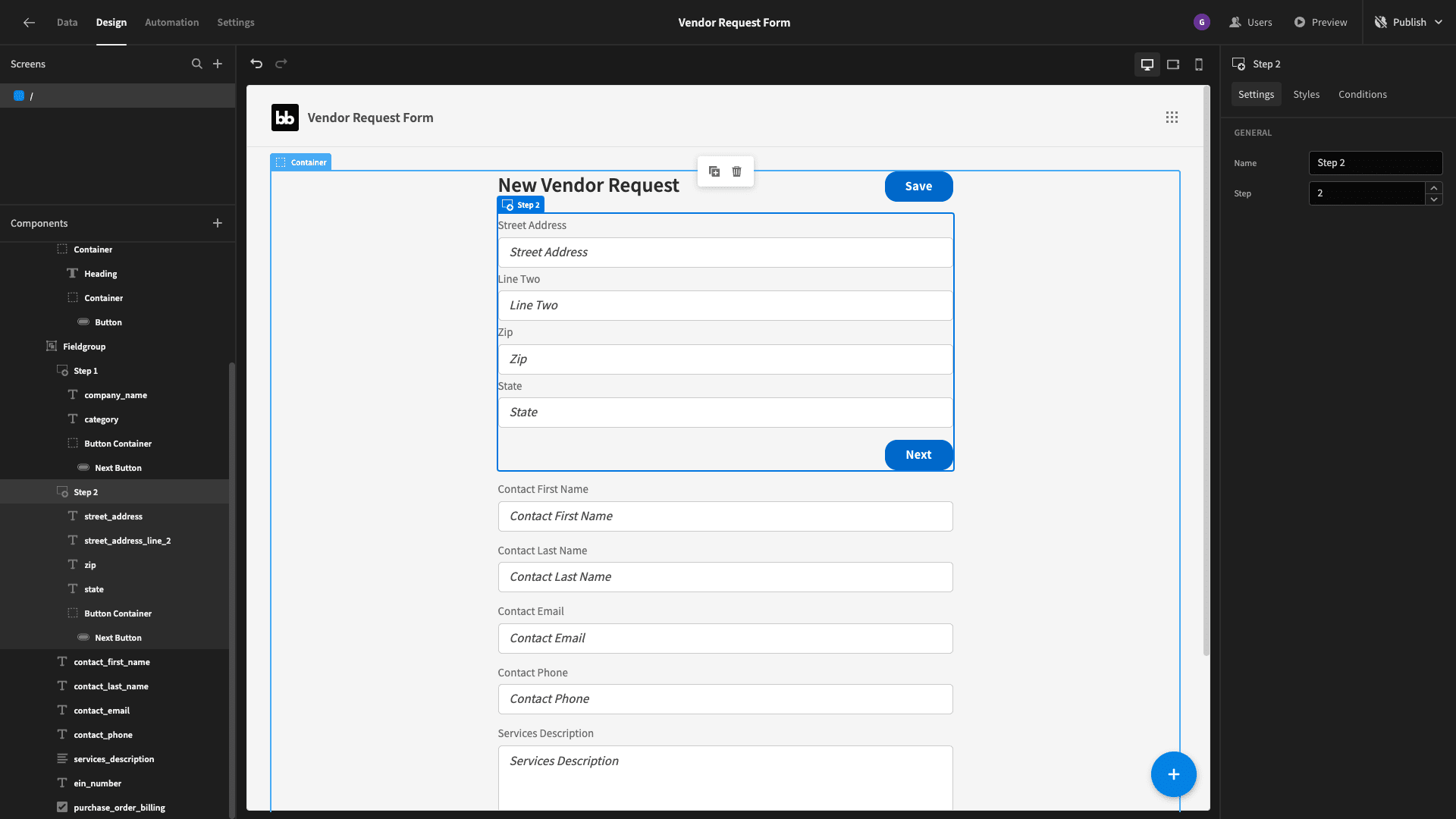
We’ll duplicate our button container from step one and drag the new version to the button of step two:
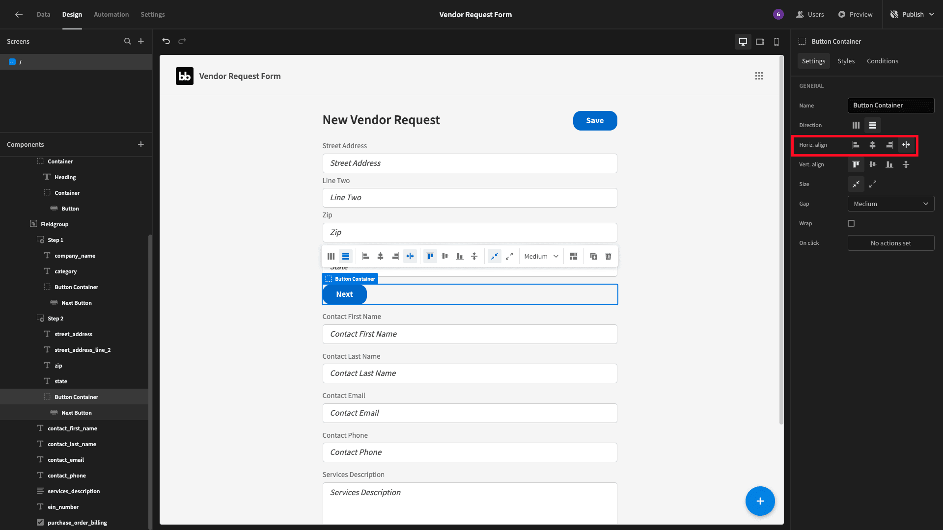
But we need to make a few tweaks to allow our users to go back to previous form steps. Start by changing the horizontal alignment of our container to stretch:
Then, add a new button inside the container before our existing one. We’ll set its text to back and check the quiet option:
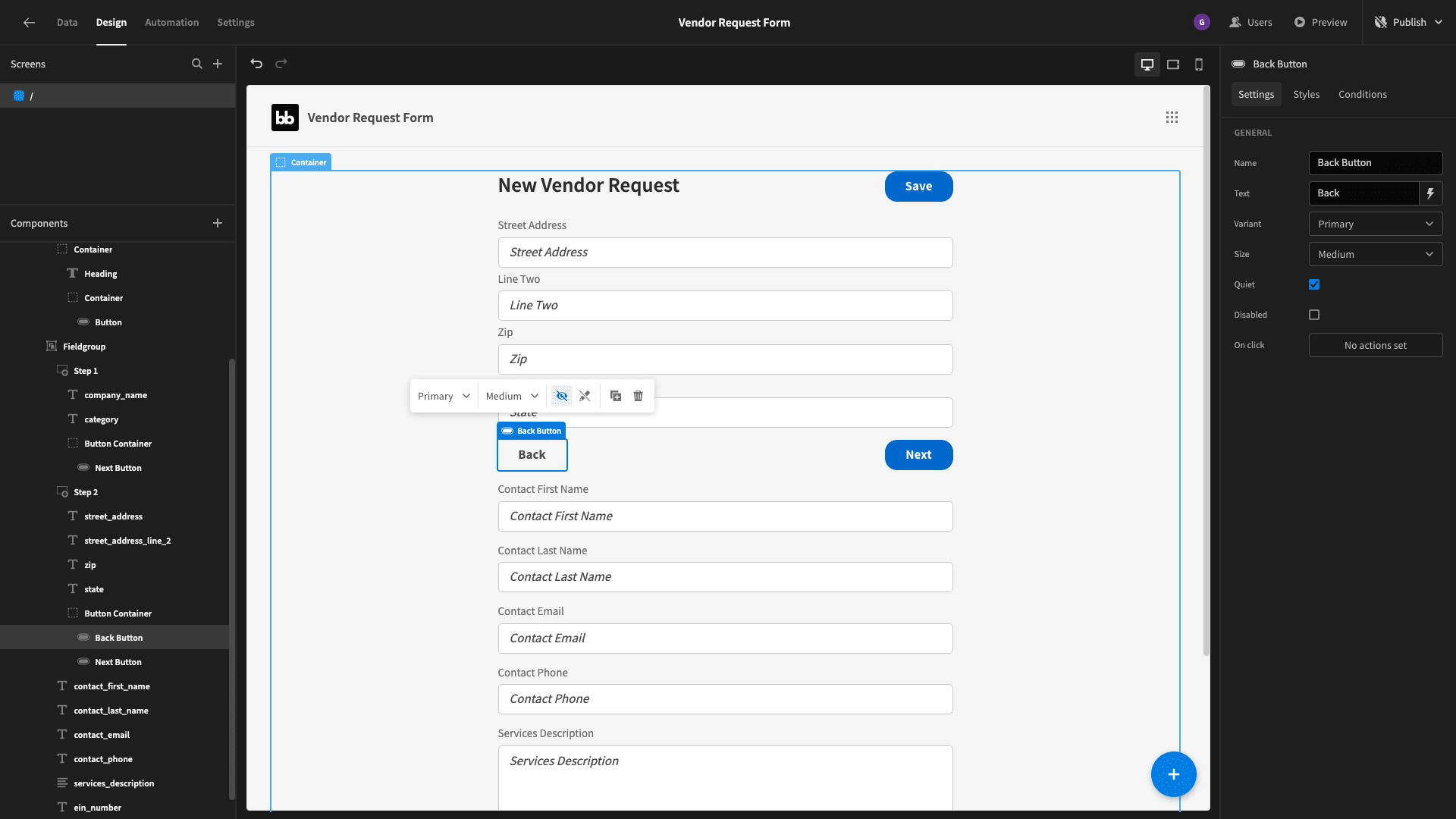
We’ll set this button’s action to navigate to the previous form step:
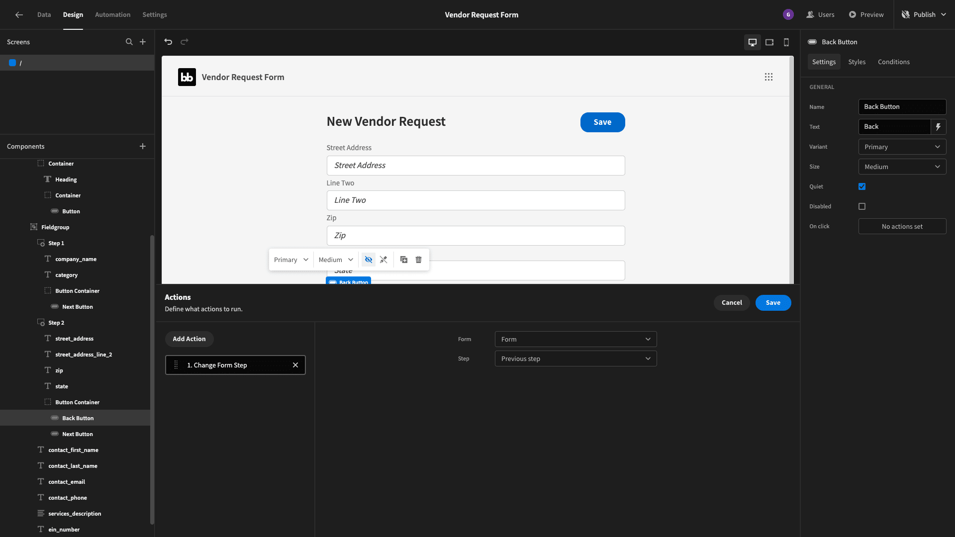
Create a third form step - inside of which we’ll place contact_first_name, contact_last_name, contact_email, and contact_phone. We’ll also duplicate our button container from step two and place this below these fields:
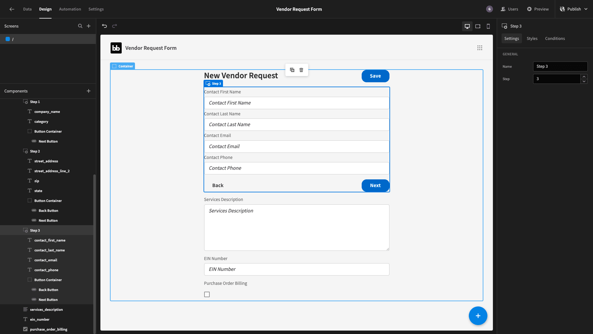
Then, repeat this process for our three remaining fields:
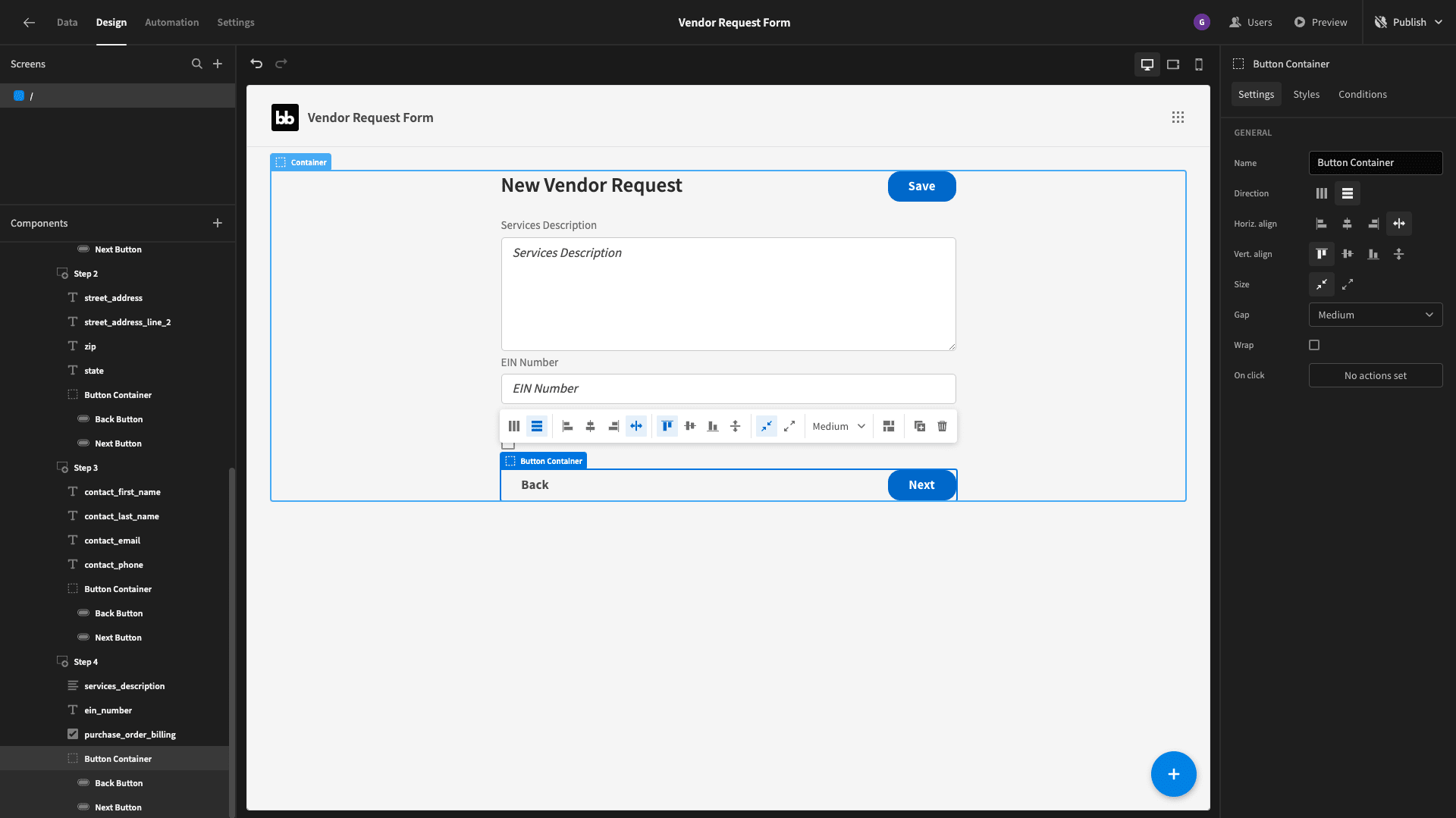
However, this time we’re going to delete the Next button - and replace it by dragging the existing Save button into its place:
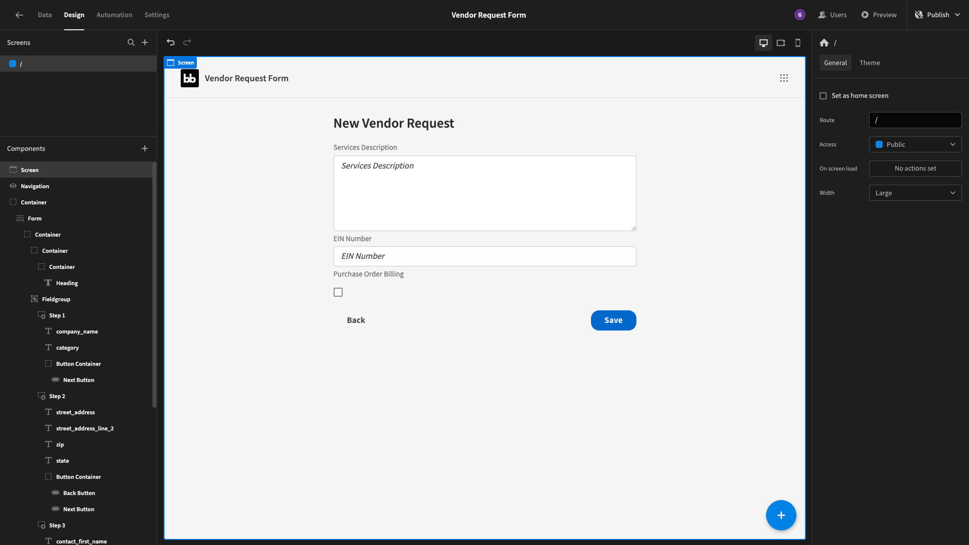
Here are the preconfigured actions for the Save button:
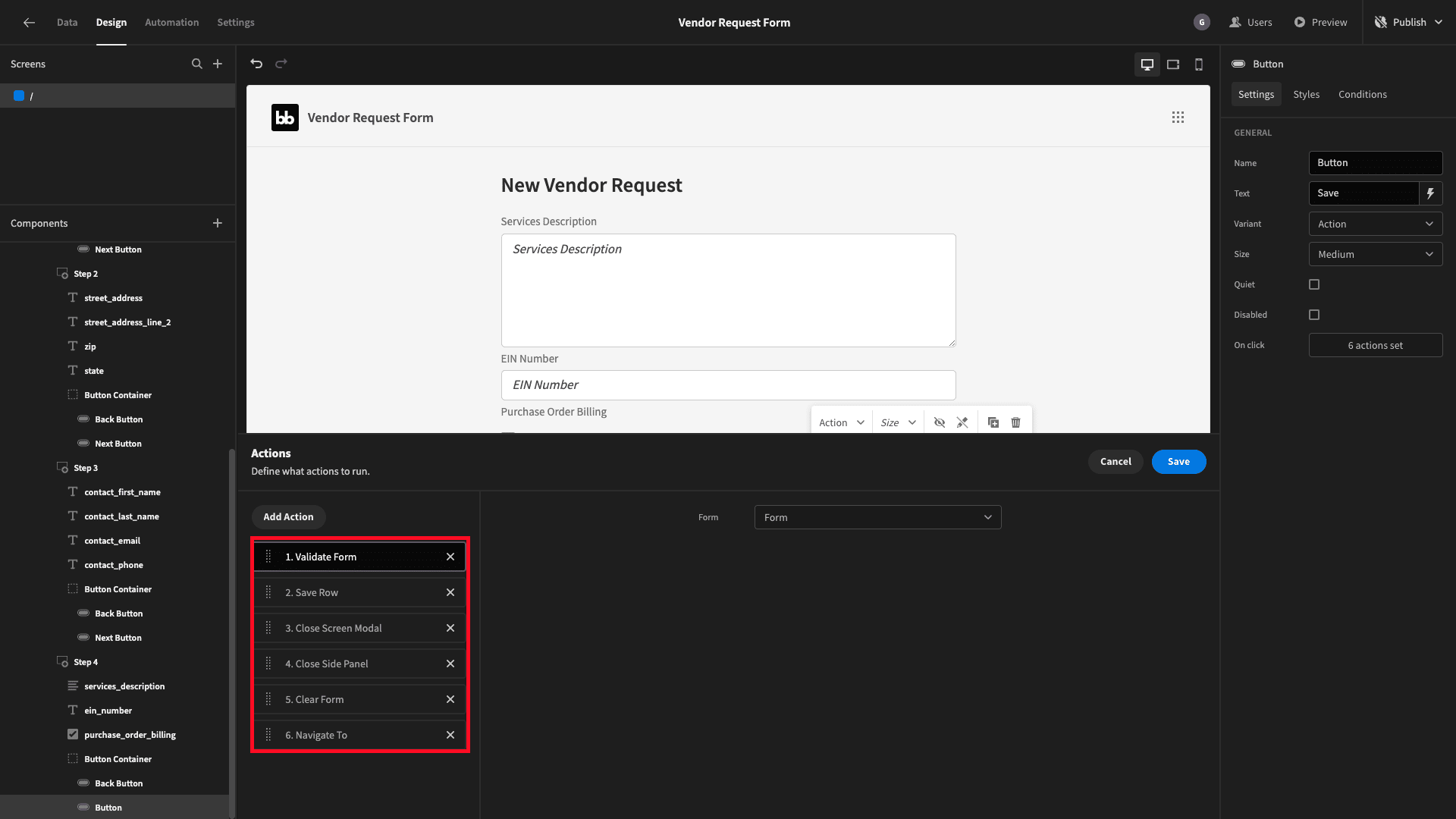
We’re going to remove everything except validate form and save row. Then, we’ll add a new action to navigate to the next form step. We’ll use this final step in a second to display a confirmation message and prevent multiple completions in a single session.
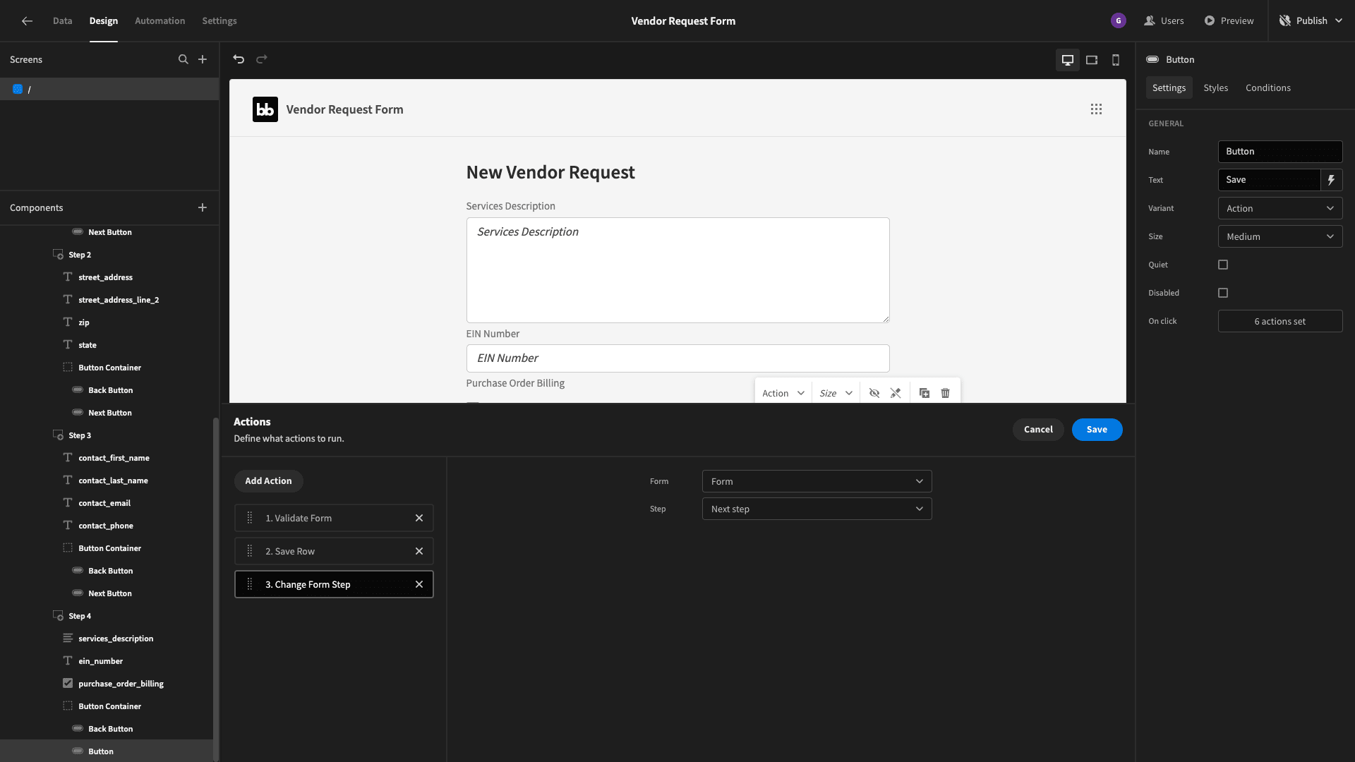
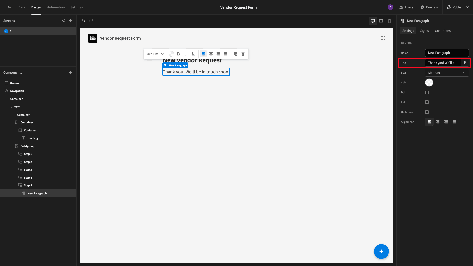
Finally, let’s add a fifth form step - and nest a paragraph component within it:
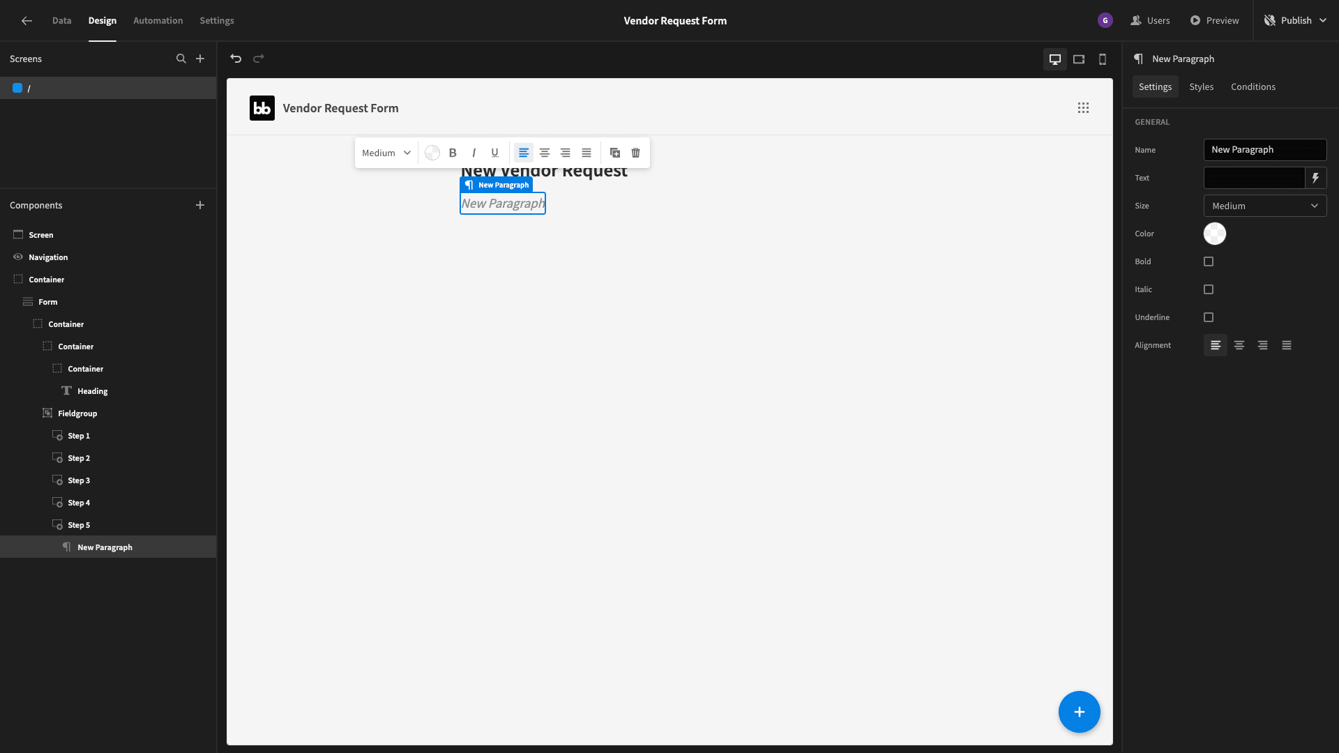
And we’ll set its text to our confirmation message:
5. Design tweaks
Now, before we can embed our vendor request form on our website, we want to make a few design changes.
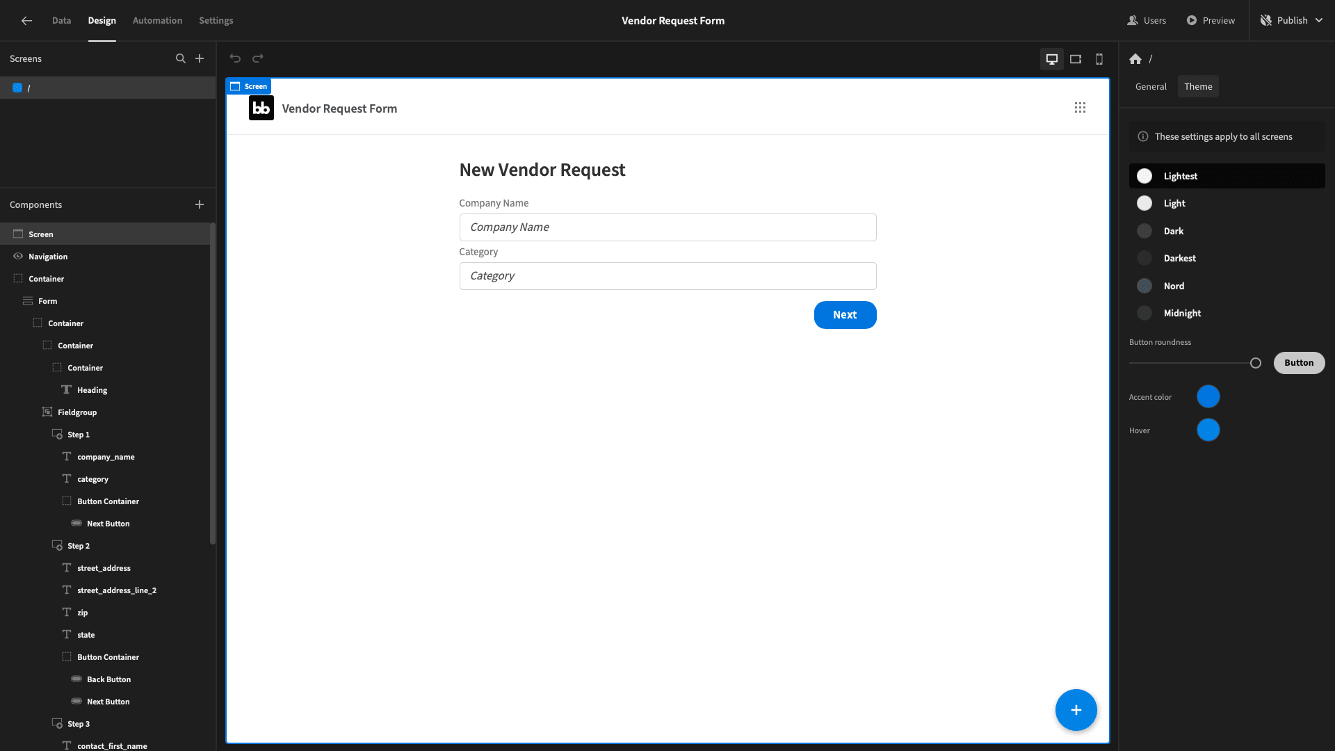
We’ll start by changing the theme to lightest, giving us a plain white background:
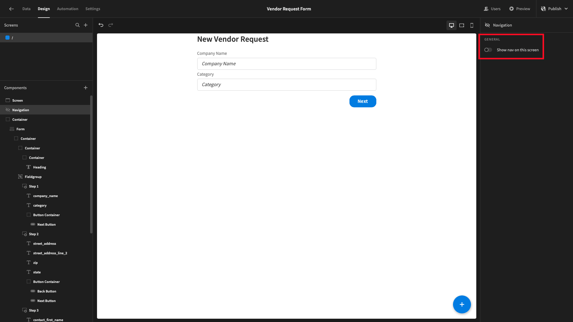
Under navigation we’ll also deselect the option to show our nav bar:
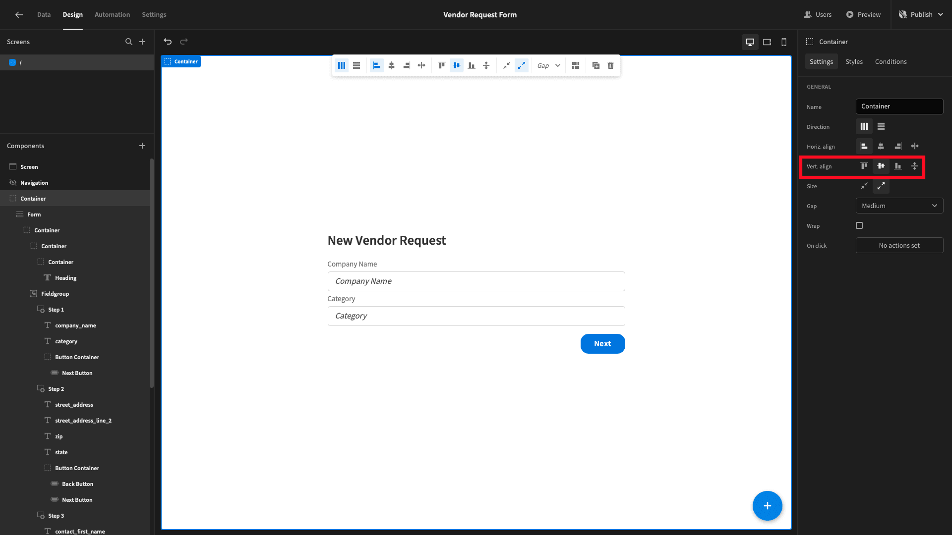
Finally, we want to vertically centre our form on the screen. All of our components are already nested inside a container - so we can simply set the vertical alignment option for this to center:
6. Publishing and embedding your vendor request form
Now, we’re ready to embed our app.
To do this, we’ll need to publish it:
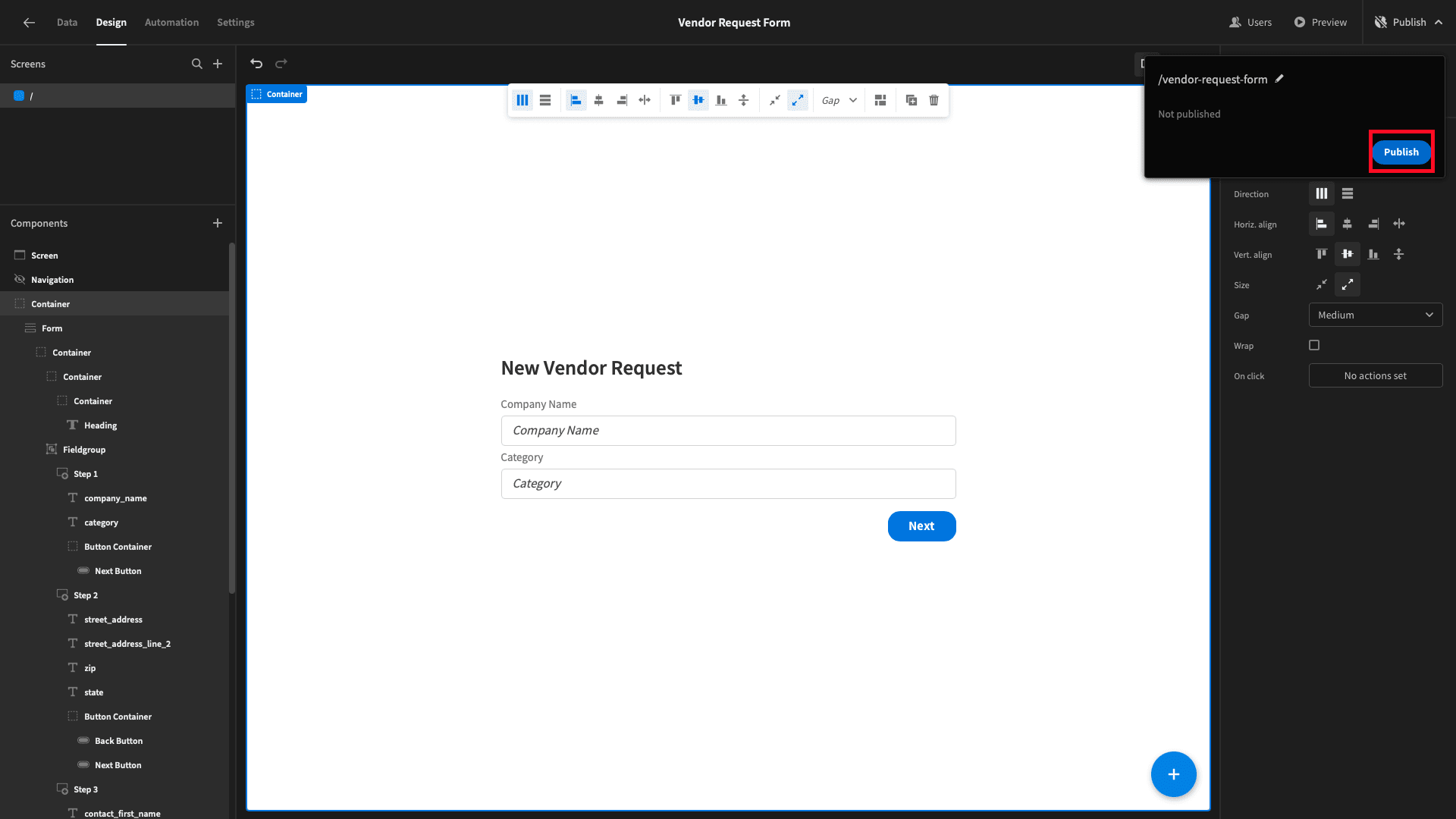
Then, click embed:
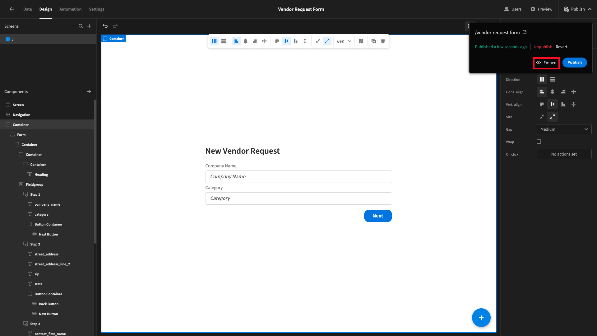
That will bring us to this page, where we can copy the HTML for an iFrame to embed our app, wherever we’d like:
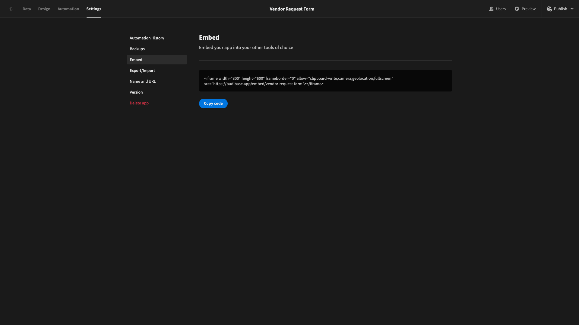
We can simply hit copy code and past this into any HTML document to embed our vendor request form on a website.
Here’s a reminder of what that looks like:

Budibase is the ideal solution for turning data into action. If you found this guide helpful, why not check out our tutorial on how to build a fleet management dashboard?