Sales dashboards are fundamental to how we track, monitor, and plan around our incoming revenues. Businesses today sit on mountains of data. But, when it comes to sales reporting - decision-makers often only need high-level metrics.
So, the challenge is cutting through the noise and providing clear, actionable insights to the right people.
Today, we’re exploring how Budibase can be used to build complex, custom solutions with all sorts of pre-existing business data.
By the end, you’ll have a full working knowledge of how to use our platform to turn data into action, based around your existing internal processes and data assets.
We’ll also provide you with all of the necessary code snippets and queries you need to perform the actions carried out in this tutorial.
But first, a little bit of background.
What is a sales dashboard?
A sales dashboard is a simple UI for reporting data related to key sales metrics. The idea is that it can be preconfigured with set metrics that update in real time as new data is populated from an external source.
That way, users can simply navigate to our application each time they need to get an update on progress, rather than having to rebuild the same report over and over again.
At a technical level, dashboards are pretty simple solutions.
Essentially, we have a preexisting data source - or multiple data sources - containing information relevant to whichever KPIs we want to track.
We can then build user interfaces on top of this in order to visualize and communicate this data - with some combination of charts, cards, and tables.
Often, dashboards will be single-screen apps.
However, in practice, we’ll often encounter some important complications here. Specifically, we’ll usually need to perform aggregations, transformations, and other processes on our raw data in order to garner the insights that we actually need to present.
Since this can take up internal development time, many businesses are seeking out solutions that empower non-developers to build professional dashboards.
Let’s check out what we’re building in our tutorial in order to get a feel for what this looks like in the real world.
What are we building?
This tutorial is a follow-on from our previous guide to building complex approvals. In that, we created an application where regional sales teams can submit monthly figures on their performance.
A central team can then review and approve these. When they’re approved, they’re added to a Postgres database table called sales_kpi - which stores the month, year, region, and all of the sales metrics relating to the report.
So, we’ve already connected our database to our Budibase app and created all of the screens and workflows we need around the report submission and approval process.
Today, we’re specifically thinking about how to build a sales dashboard based around our approved reports.
Data model
For the application as whole, the data model is a bit more complicated - but for our purposes in this guide, it’s quite simple. Our dashboard is only going to query a single table - storing all of the information around approved sales reports.
This includes the following attributes about each region’s reports:
- The month.
- The year.
- The region.
- The submitting manager.
- The approver.
- Status.
- Total marketing costs.
- Number of leads.
- Number of customers.
- Number of sales.
- Revenue.
A new entry is added to this table when a regional manager submits a report and this gets approved by the central team.
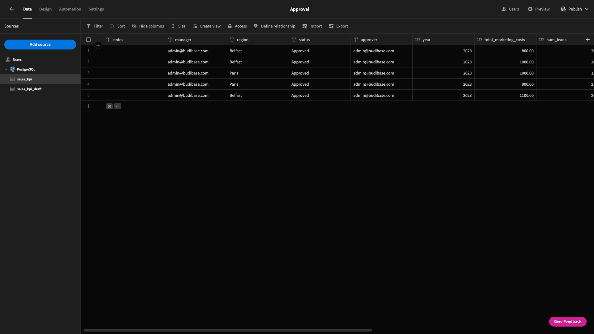
Here’s what this table looks like in Budibase:
UI
The UI is going to be the home screen for our existing app. Effectively, this has two sections:
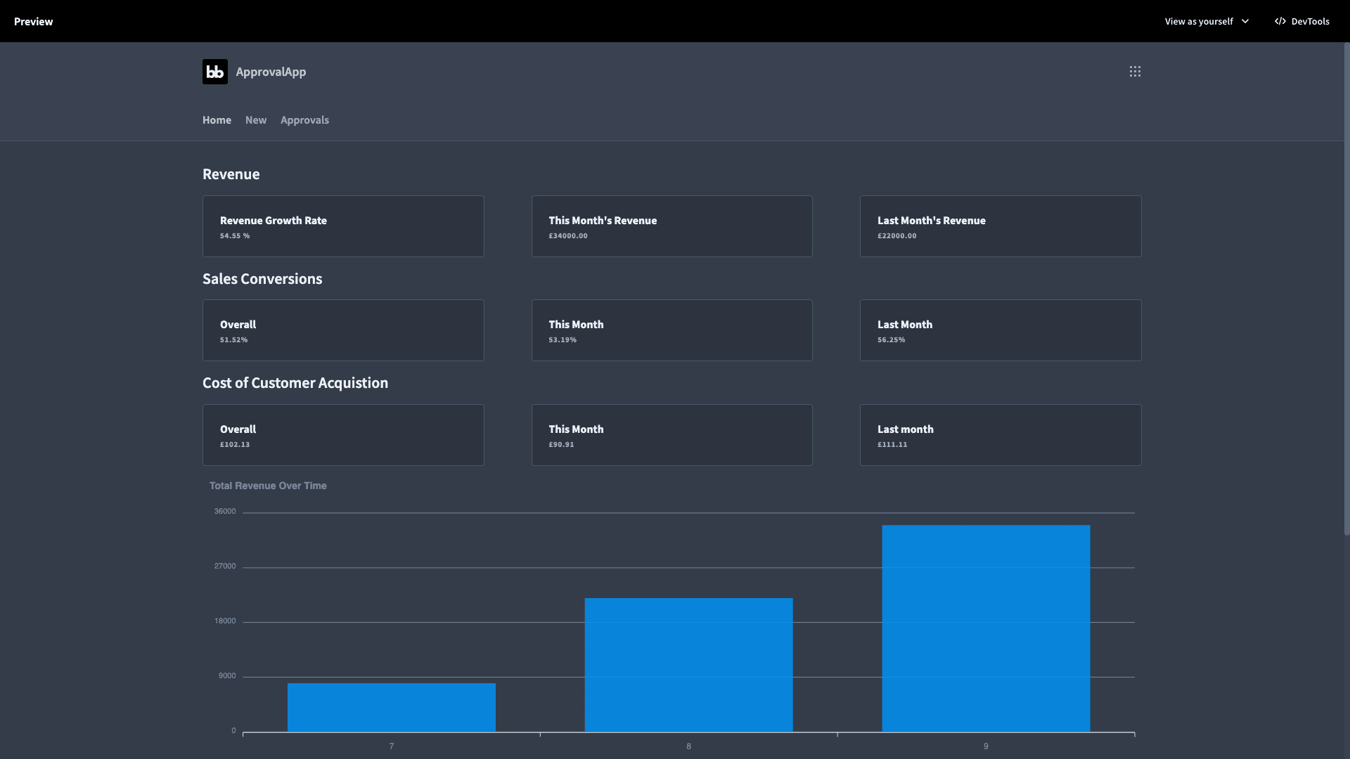
- A series of cards displaying total, current month, and previous month values for revenue, conversions, and cost of acquisition.
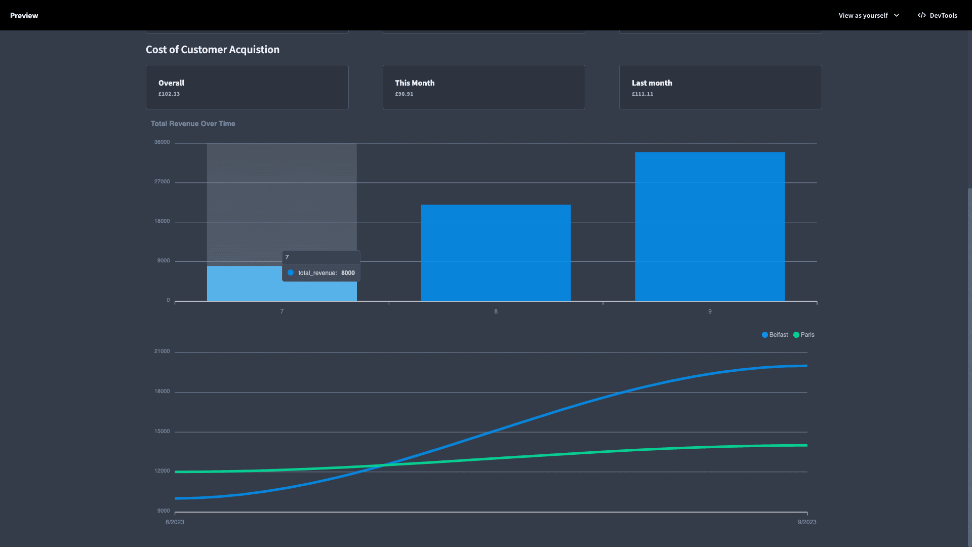
- Two charts displaying total revenue over time and revenue growth by region over time.
So, here are the cards:
And our charts:
How to build a sales dashboard in 5 steps
Okay, so now we have a pretty good idea of what we want to build. Of course, this is just an exemplary scenario. With Budibase, you also have full control over how closely you want to follow our guide.
With that in mind, let’s check out how we’ve built our sales dashboard.
1. Revenue cards
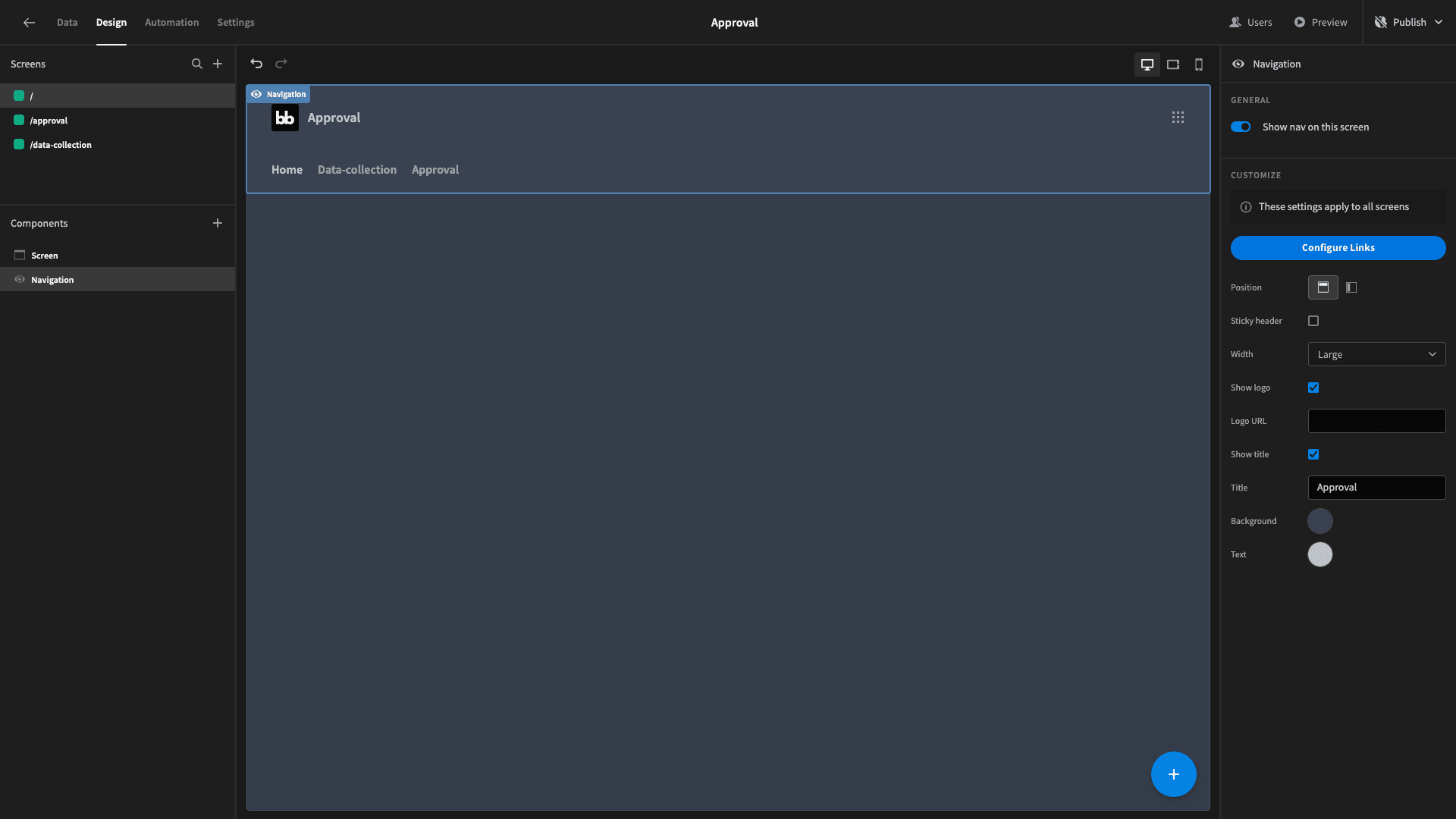
Following on from our previous channel, our first step is to create a blank screen, with “/” as its page path. This will be the app’s home screen, so we’ll also add it to our nav bar as Home.
The cards section of our dashboard UI is made up of three sets of three cards. The first row that we’re going to build will display:
- The monthly revenue growth rate.
- This month’s total revenue.
- Last month’s total revenue.
Now, you might have spotted when we outlined the data stored in our table that we don’t actually have these specific pieces of information stored - at least, not explicitly.
So, we’re going to need to extract these insights from our data table by writing a custom query to our Postgres database. Budibase allows us to write, test, save, and reuse custom queries across our application - just like we’d use any other connected data source.
So, to start, head over to the data section of the Budibase builder, and hit create new query under your existing Postgres data source:
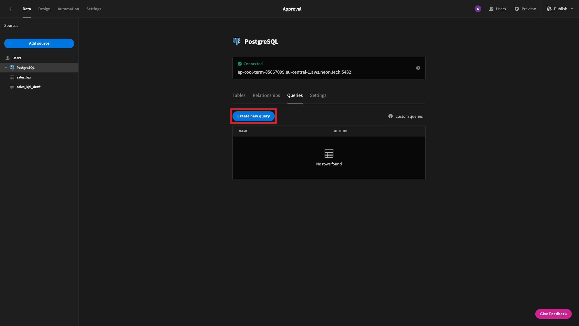
This will present us with a screen where we can configure and write our query - along with any transformations we want to apply to the returned data.
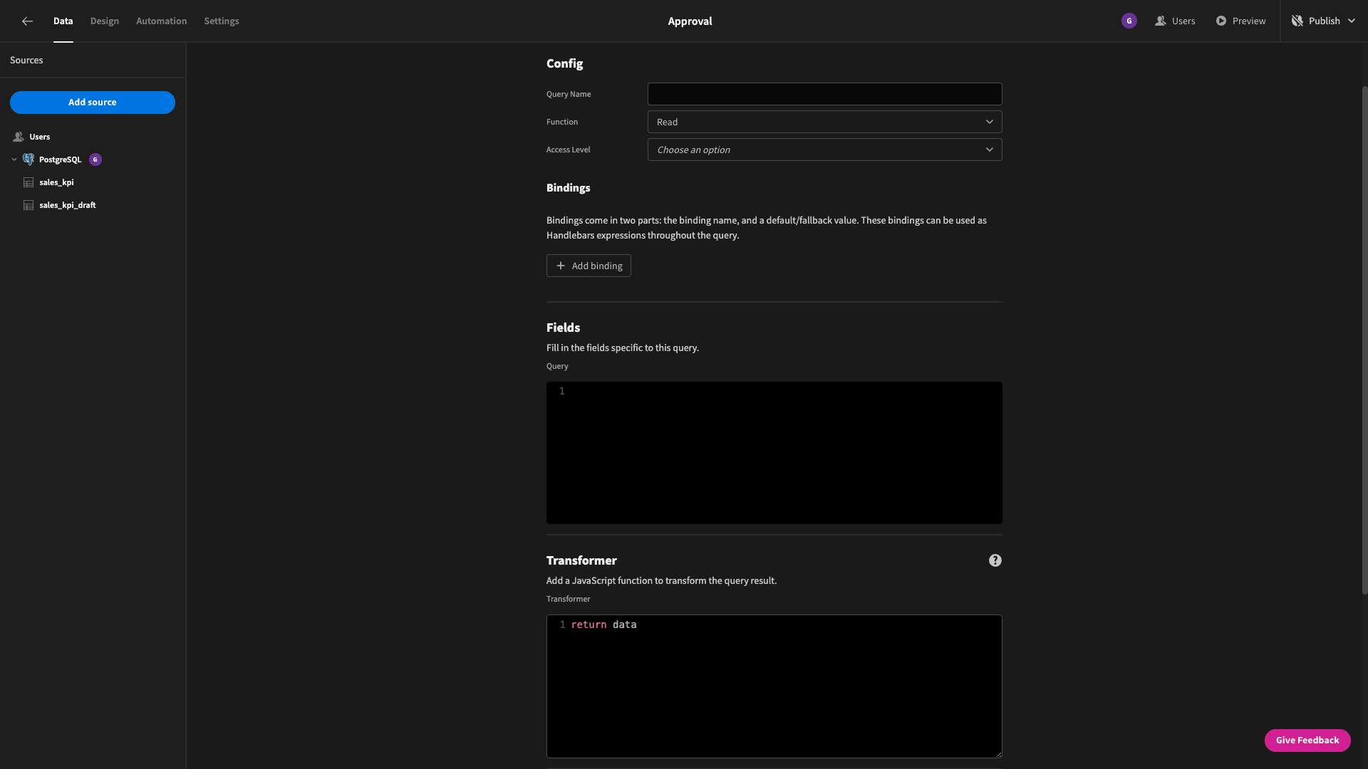
This is going to be quite a complex query, so we’re going to take it step by step. We’ll think about how to return each of the three values that we need in turn.
So first, the monthly revenue growth rate. Basically, we want to select this month’s total revenue figure minus last month’s. We’ll then divide the answer by last month’s revenue, and multiply this by 100.
We’ll call this revenue_growth_rate. So, the first part of our SQL statement is:
SELECT
(this_month_revenue - last_month_revenue) / last_month_revenue * 100
AS revenue_growth_rate
But, this_month_revenue and last_month_revenue don’t actually exist in our database. We need to create those by summing the revenues that match a defined month and year.
To make this work dynamically, we’ll need to create four bindings. These are variables that can be passed to our query from the UI or an automation each time it’s executed. Each binding has a name and a default value which can be set when we create the query.
We’ll hit add bindings to create four bindings called this_month, this_year, last_month, and last_month_year. Note, that we also need to know what year it was last month, in case we want to use our dashboard in January.
We’ll give each of these default values which relate to the current and previous month as they are now - in September 2023.
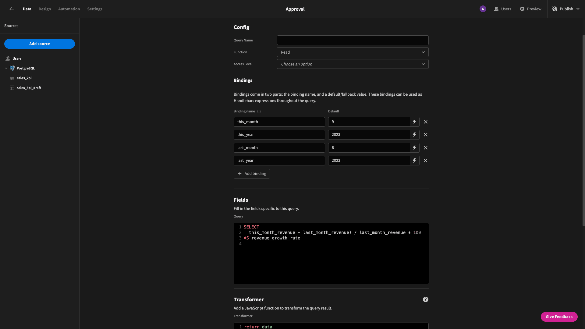
So, now we can use handlebars syntax to leverage these bindings in our query. We want to add clauses to sum the revenues where the year and month match our bindings for the current month - and then do the same for the previous month - using WHERE conditions.
We’ll call the outputs this_month_revenue and last_month_revenue using AS statements.
When we add these lines on, our query will be:
SELECT
(this_month_revenue - last_month_revenue) / last_month_revenue * 100
AS revenue_growth_rate
FROM
(SELECT SUM(revenue) AS this_month_revenue FROM sales_kpi WHERE month = {{ this_month}} AND year = {{ this_year}}) AS this_month_revenue,
(SELECT SUM(revenue) AS last_month_revenue FROM sales_kpi WHERE month = {{ last_month }} AND year = {{ last_month_year }}) AS last_month_revenue
This returns our monthly growth rate, but we haven’t specified any rounding, so we get quite a few decimal places - depending on the real figures being processed:
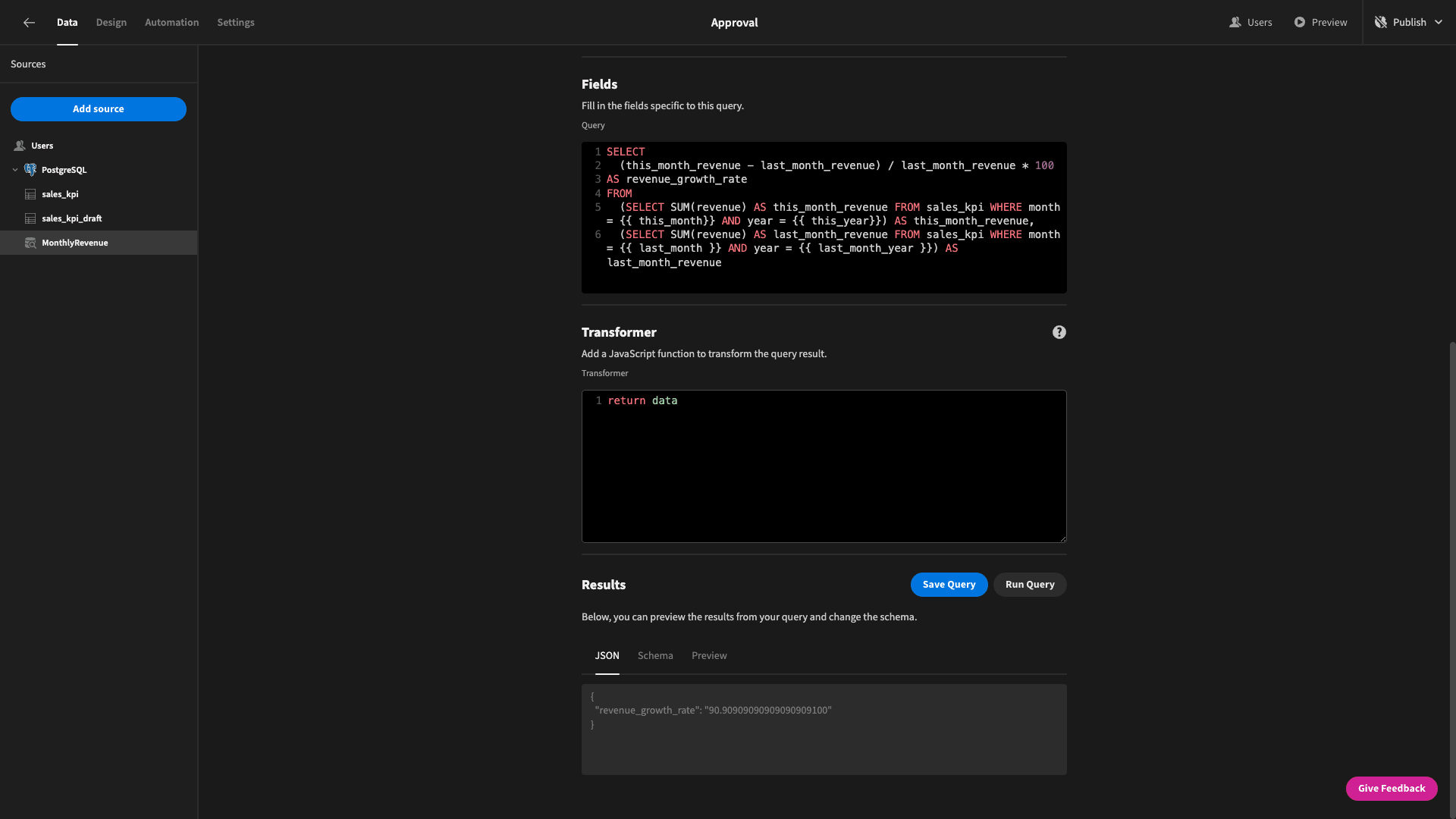
So, we’ll use the ROUND function to reduced our data down to two decimal places:
SELECT
ROUND((this_month_revenue - last_month_revenue) / last_month_revenue * 100, 2)
AS revenue_growth_rate
FROM
(SELECT SUM(revenue) AS this_month_revenue FROM sales_kpi WHERE month = {{ this_month}} AND year = {{ this_year}}) AS this_month_revenue,
(SELECT SUM(revenue) AS last_month_revenue FROM sales_kpi WHERE month = {{ last_month }} AND year = {{ last_month_year }}) AS last_month_revenue
We’re going to use rounding every time we divide or multiply in our custom queries from now on - but we’re not going to draw attention to it every time.
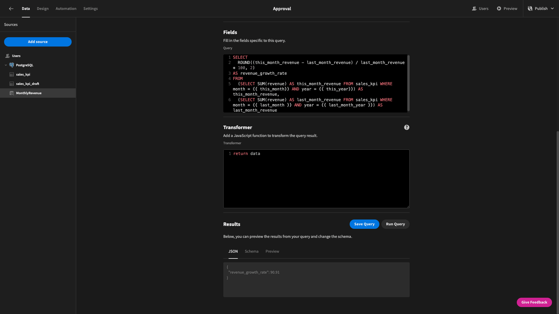
We’ll save this query as MonthlyRevenue.
While we’re here, we also want to return this_month_revenue and last_month_revenue in the response from this same query.
We can simply add these to our existing select statement, making our final query:
SELECT
ROUND((this_month_revenue - last_month_revenue) / last_month_revenue * 100, 2) AS revenue_growth_rate,
this_month_revenue,
last_month_revenue
FROM
(SELECT SUM(revenue) AS this_month_revenue FROM sales_kpi WHERE month = {{ this_month}} AND year = {{ this_year}}) AS this_month_revenue,
(SELECT SUM(revenue) AS last_month_revenue FROM sales_kpi WHERE month = {{ last_month }} AND year = {{ last_month_year }}) AS last_month_revenue
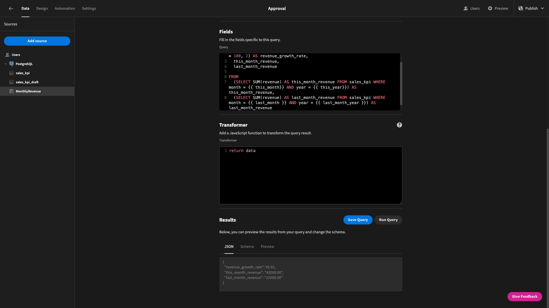
And the last thing we’ll do is specify that each of these values are numbers under the schema tab:
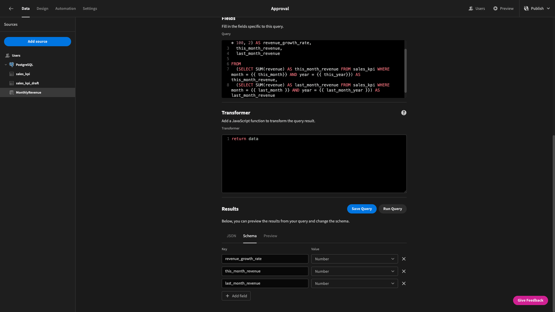
That’s the hard part over for this set of cards.
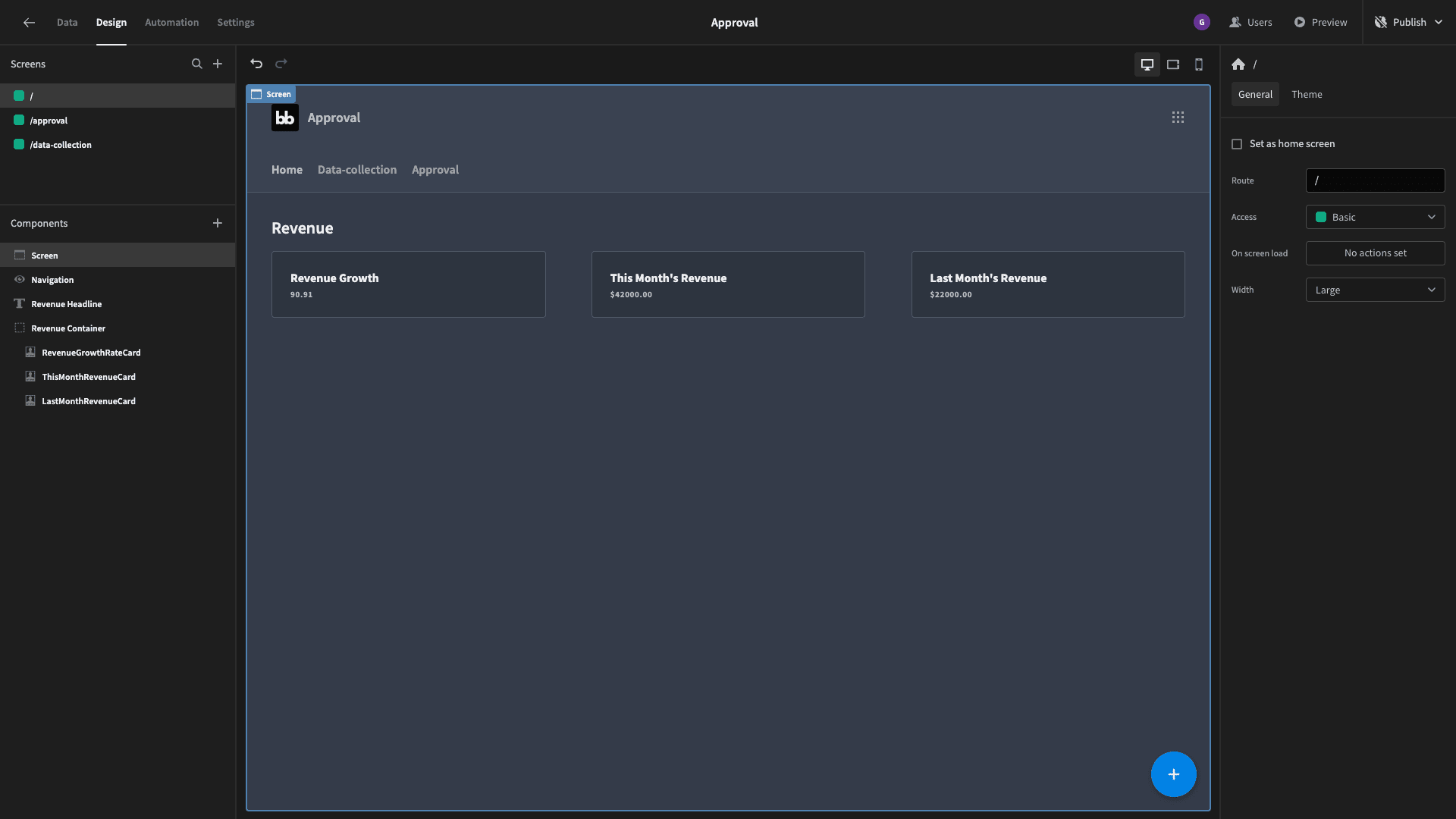
Next, let’s put our query to use. Head over to the design tab in Budibase. On our blank screen, we’re going to start by adding a headline component with its text set to Revenue, followed by a horizontal container component.
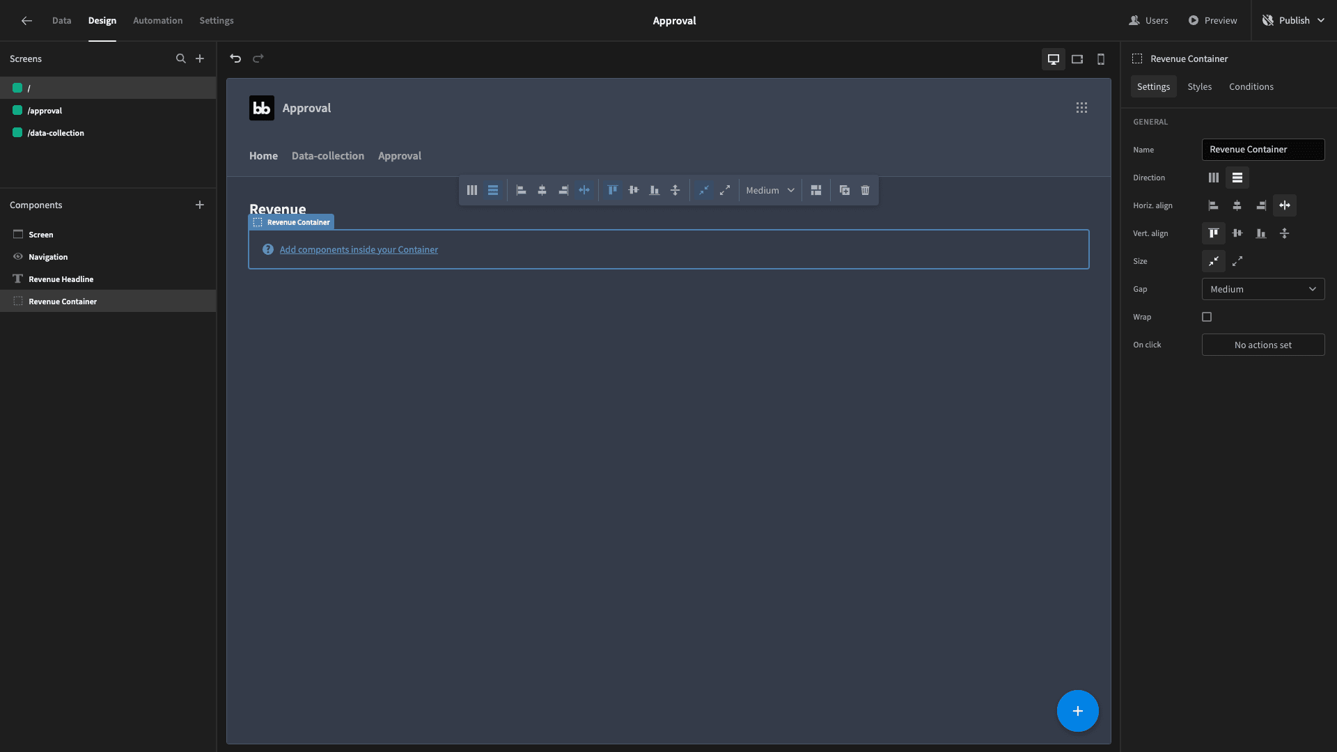
Eventually, we’ll have three cards inside this component, but we’re going to start by adding just one - which we’ll configure and then duplicate.
So, add a card block and set its data source to our monthlyRevenue query:
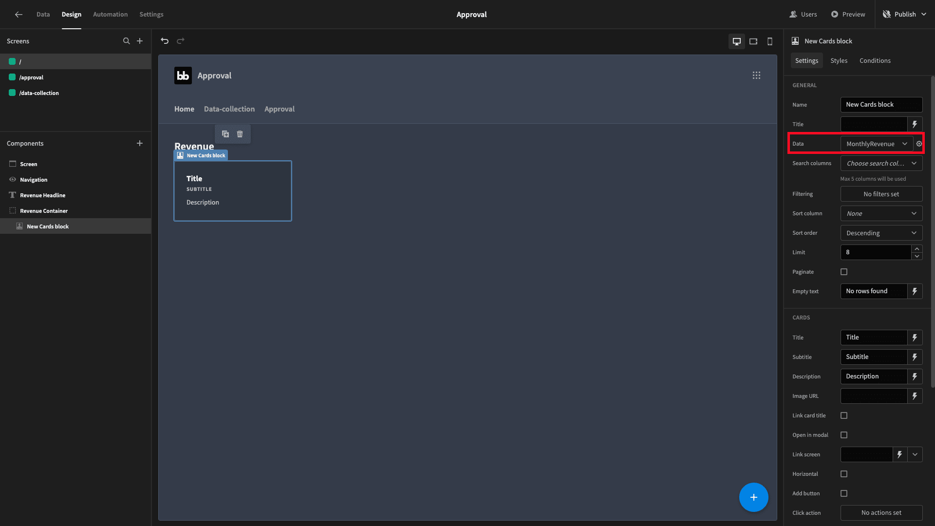
We’ll give it a title of Revenue Growth and remove its description entirely. Then, beside the subtitle field, we’ll hit the lightning bolt to open our bindings menu and select the revenue_growth_rate attribute:
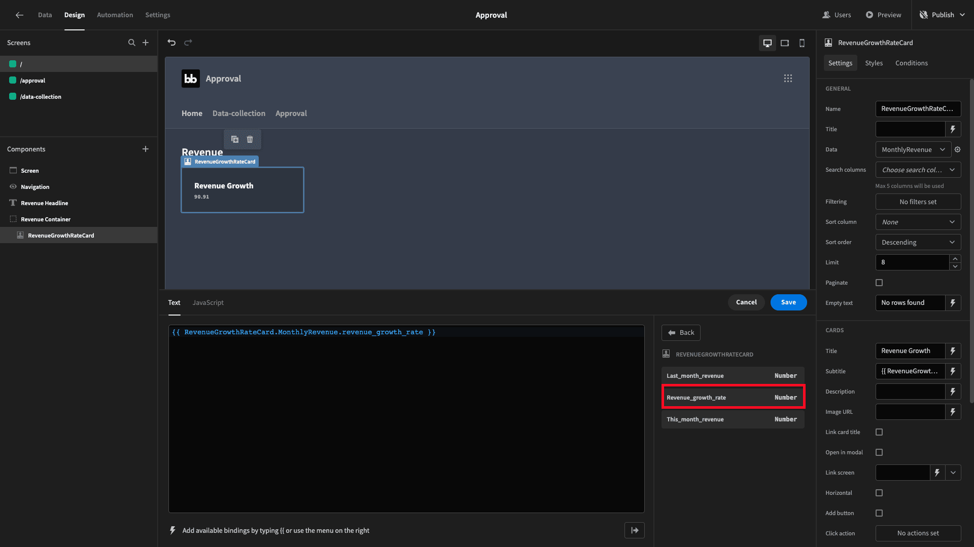
This looks right, but its not actually going to function correctly just yet. See, we’re still relying on the query bindings’ default values. We need to tell our card block to override these with the actual values for this month and last month to get the real-time calculation.
Hit the cog icon beside the data field to access a bindings menu for our query:
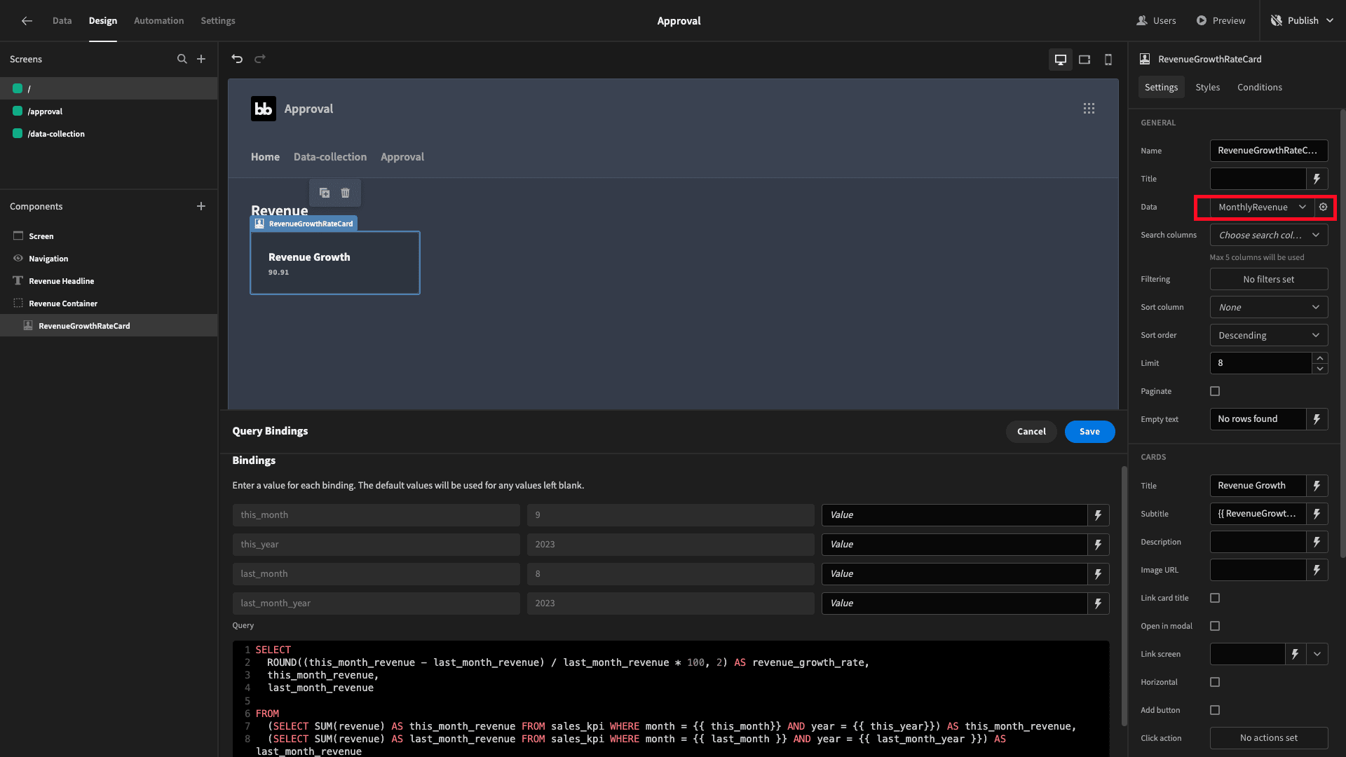
We’re going to use a mixture of handlebar expressions and custom JavaScript as bindings to populate the actual months and years we need.
For this_month we can use handlebars to get the current month in a numerical format with the expression:
{{ date now "M" }}
And do the same thing for the year using:
{{ date now "YYYY" }}
That’s easy enough. But, if we just did this using handlebars for last month’s values, we’d encounter issues around the start and end of the year, so we’re going to use custom JavaScript.
So, for last_month, our binding will be:
let today = new Date()

today.setMonth(today.getMonth() - 1)

let previousMonth = today.getMonth() + 1

return previousMonth
For last_month_year, we can use:
let today = new Date()

today.setMonth(today.getMonth() - 1)

if(today.getMonth() === 11) {

 today.setFullYear(today.getFullYear() - 1)

}

let previousMonthYear = today.getFullYear()

return previousMonthYear
This if statement is checking if last month was December. If so, we’re subtracting one from the year.
Now, our card will function as we need it to. The last thing we’ll do is set its width to 30% so it takes up just under a third of the width of the screen:
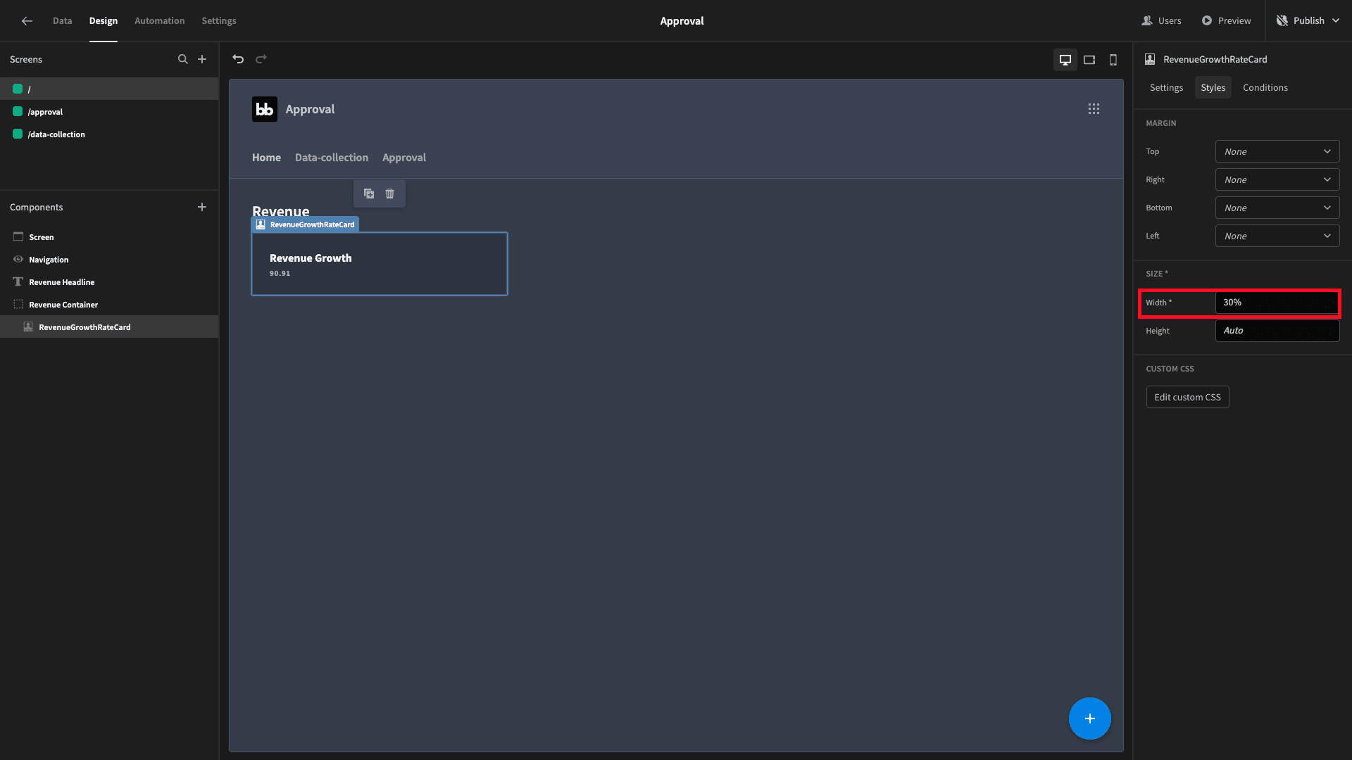
To save us configuring everything over again for our next two cards, we’ll just duplicate this existing one twice. We can then swap out the titles and subtitle bindings to reflect our other two metrics, giving us:
Join 300,000 teams running operations on Budibase
Get started for free2. Conversions cards
Next, we’ll repeat a similar process to build our next set of cards. That is, we’ll need to write a query to get the values we want and then leverage this in our UI.
So, head back to the data section. Create another new query called SalesConversion and add the exact same four bindable values.
Again, we want to return three values:
- Our overall conversion rate.
- This month’s conversion rate.
- Last month’s conversion rate.
We’re operationalizing the conversion rate as the number of sales divided by the number of leads for a given period - multiplied by 100.
Again, we’ll run through this step-by-step, but this query is actually quite a bit more complex, so pay close attention.
We’ll start by getting our overall conversion rate - since this is the easy part.
To get just this, the Postgres query would be:
SELECT

 ROUND(SUM(num_sales)*1.0/SUM(num_leads) * 100 ,2) as sales_conversion_overall

FROM

 sales_kpi
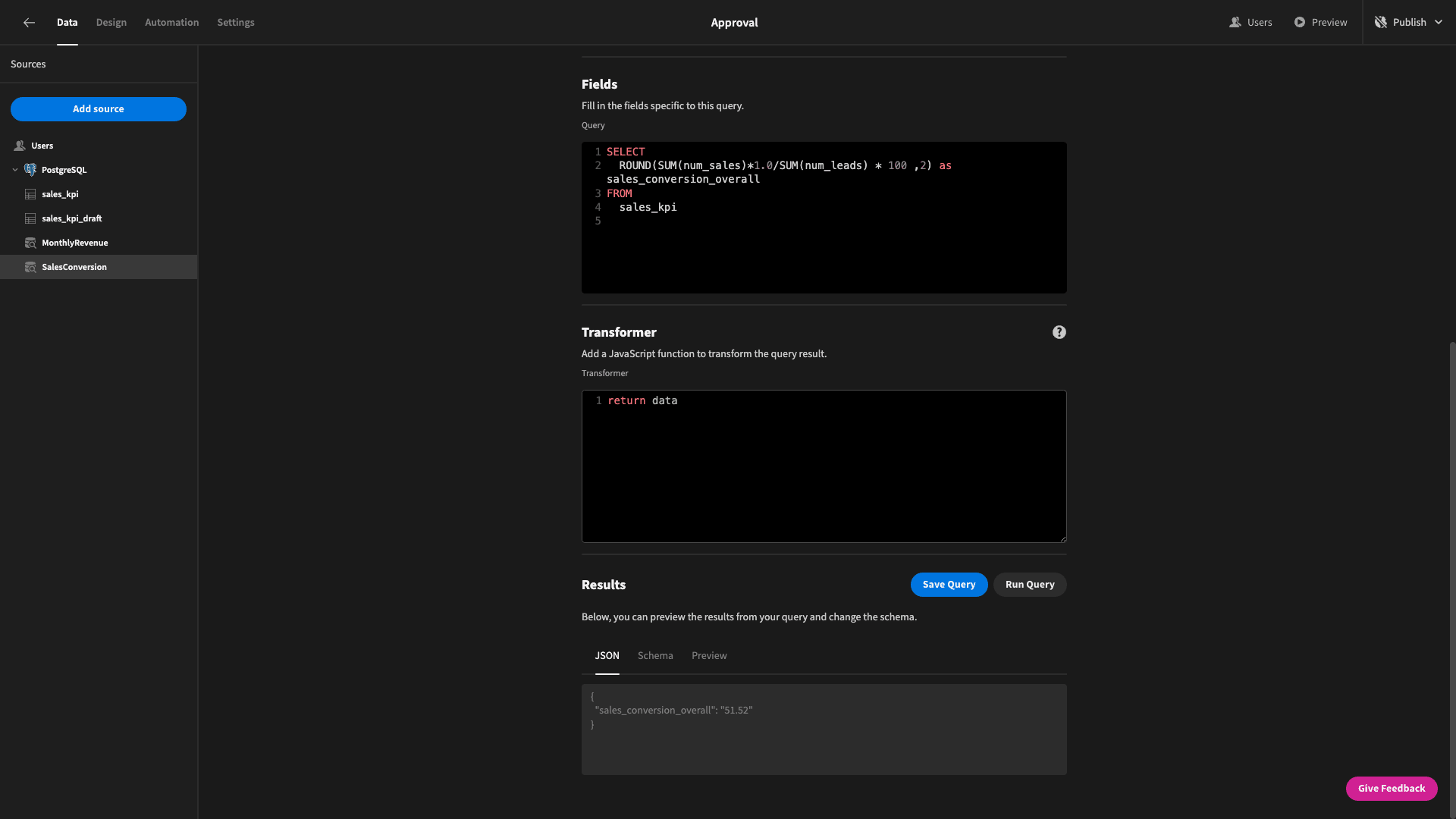
Note, we are multiplying the number of sales by 1.0 to ensure that our SQL engine knows that we’re working in decimals rather than integers.
Next, we need our dynamic data for this month and last month’s conversion rates. We’ve already created the exact same bindings as we had in our previous query.
The way we’ll calculate sales_conversion_last_month is to use CASE statements to iterate over each row that has a month and year value that match the relevant bindings, and then sum together all of the leads and customers that match this condition.
We’ll then perform the same calculation on these as before to reach our monthly conversion rate.
So, for last month, we’re selecting the following data from our sales_KPI table:
ROUND(
SUM(CASE WHEN month = {{ last_month}} AND year = {{ last_month_year}} THEN num_sales ELSE 0 END) * 1.0 /
SUM(CASE WHEN month = {{ last_month}} AND year = {{ last_month_year}} THEN num_leads ELSE 0 END) * 100
, 2) AS sales_conversion_last_month
And for sales_conversion_this_month, it’s:
ROUND(
SUM(CASE WHEN month = {{ this_month}} AND year = {{ this_year}} THEN num_sales ELSE 0 END) * 1.0 /
SUM(CASE WHEN month = {{ this_month }} AND year = {{ this_year}} THEN num_leads ELSE 0 END) * 100
, 2) AS sales_conversion_this_month
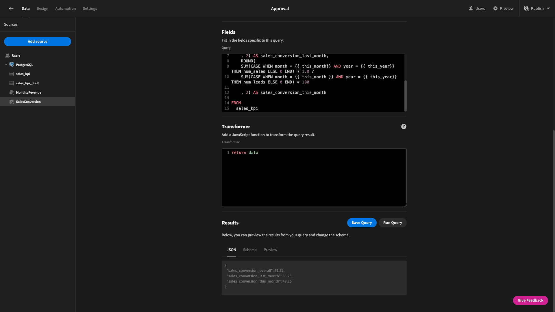
That means that our full query is:
SELECT
ROUND(SUM(num_sales)*1.0/SUM(num_leads) * 100 ,2) as sales_conversion_overall,
ROUND(
SUM(CASE WHEN month = {{ last_month}} AND year = {{ last_month_year}} THEN num_sales ELSE 0 END) * 1.0 /
SUM(CASE WHEN month = {{ last_month}} AND year = {{ last_month_year}} THEN num_leads ELSE 0 END) * 100
, 2) AS sales_conversion_last_month,
ROUND(
SUM(CASE WHEN month = {{ this_month}} AND year = {{ this_year}} THEN num_sales ELSE 0 END) * 1.0 /
SUM(CASE WHEN month = {{ this_month }} AND year = {{ this_year}} THEN num_leads ELSE 0 END) * 100
, 2) AS sales_conversion_this_month
FROM
sales_kpi
Again, we’ll specify that each of these are numbers, and we’re ready to go.
Back to the design tab.
We could build another set of cards from scratch if we needed to, but we can save ourselves a bit of time by simply duplicating what we have so far.
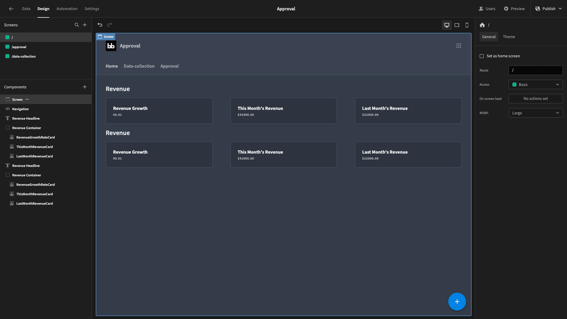
Now, we need to do a few things here to update our new cards. Specifically, we want to:
- Update the new headline to say Sales Conversion.
- Change the data for each of our new cards to our SalesConversions query.
- Reset our bindings to override the default values for our query - because these get deleted when we change the data.
- Update the titles and subtitles of our cards for overall, this month’s, last month’s conversion rates.
- Give our components new names so things don’t get confusing.
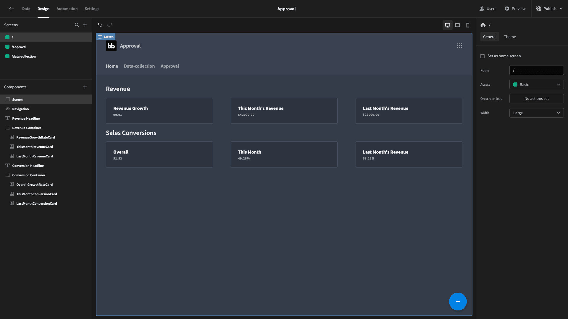
Once we do this, we’ll have:
3. Acquisition costs cards
Our last set of cards is going to display data relating to the cost of acquiring customers - again, broken down by overall, this month, and last month.
Head back to the data tab and create one more query - again with the same bindings. We’ll call this one CostOfCustomerAcquisition.
This time, we’re operationalizing our cost of acquisition as the SUM of the total marketing costs divided by the SUM of the number of new customers for each of the respective periods.
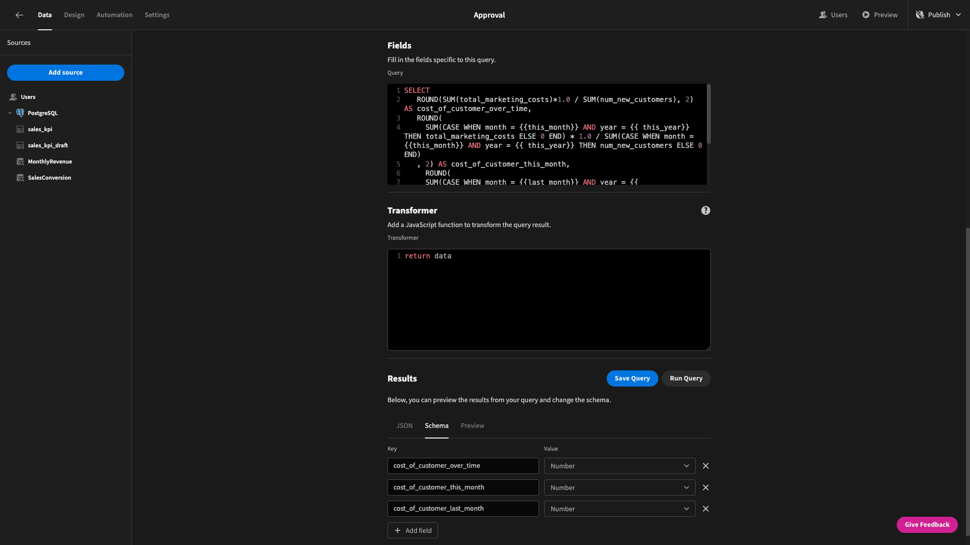
The actual query this time is pretty similar to the last one, so we’ll just give you the whole thing:
SELECT
ROUND(SUM(total_marketing_costs)*1.0 / SUM(num_new_customers), 2) AS cost_of_customer_over_time,
ROUND(
SUM(CASE WHEN month = {{this_month}} AND year = {{ this_year}} THEN total_marketing_costs ELSE 0 END) * 1.0 / SUM(CASE WHEN month = {{this_month}} AND year = {{ this_year}} THEN num_new_customers ELSE 0 END)
, 2) AS cost_of_customer_this_month,
ROUND(
SUM(CASE WHEN month = {{last_month}} AND year = {{ last_month_year}} THEN total_marketing_costs ELSE 0 END) * 1.0 / SUM(CASE WHEN month = {{last_month}} AND year = {{ last_month_year}} THEN num_new_customers ELSE 0 END)
, 2) AS cost_of_customer_last_month
FROM
sales_kpi
Save that and head back to our UI section.
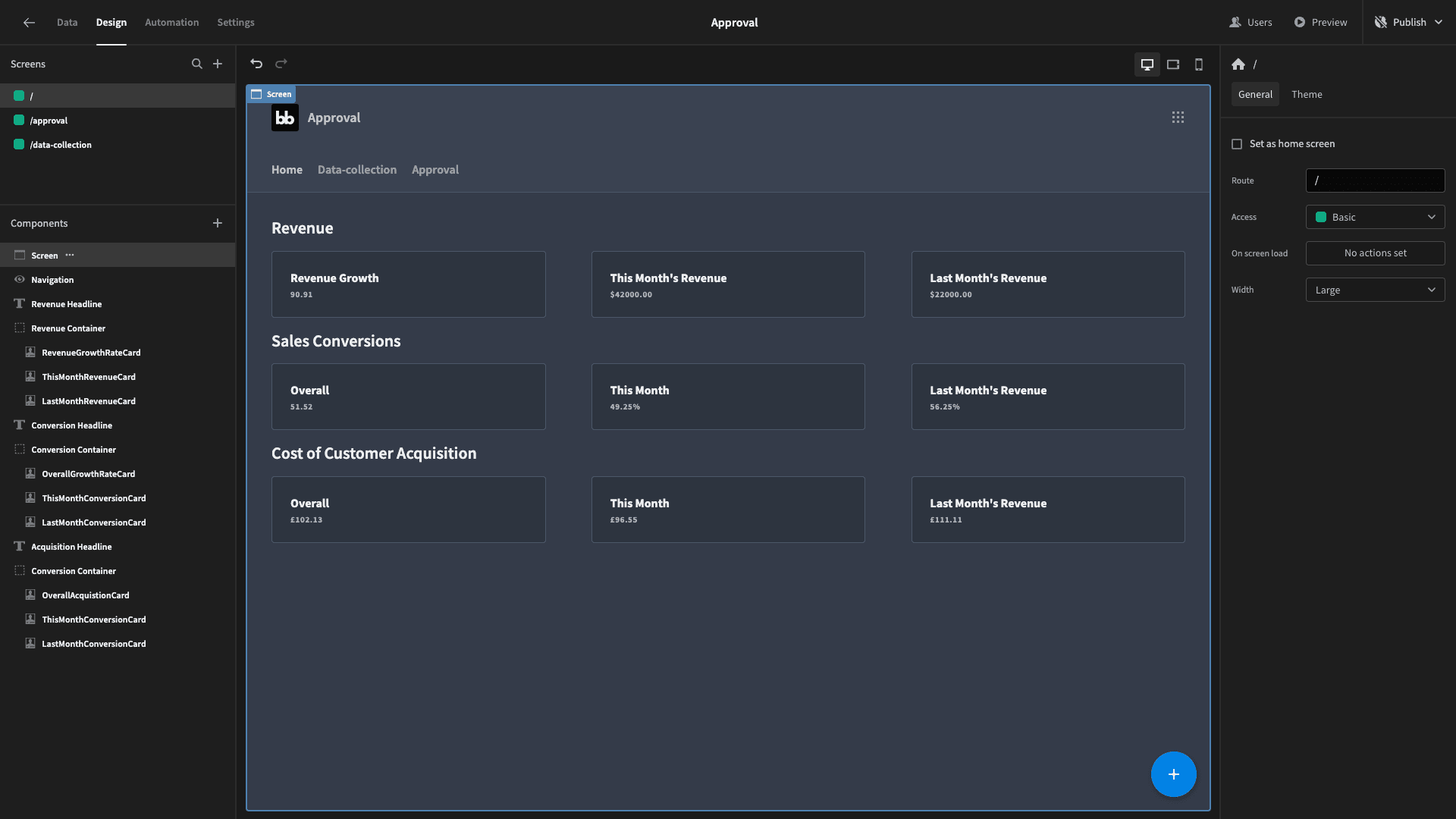
We’ll repeat the same process of duplicating and modifying one of our existing rows of cards to display our acquisition cost data.
This gives us:
4. Monthly revenue chart
Okay, now all of our cards are built. Time to start creating some charts. The first one we want is our monthly revenue. We’ll display this as a bar graph.
This one is pretty simple. All we need to do is get the total amount of money that we made in each month.
Head to the data section and create a query called TotalRevenueOverTime. We’re going to start by SELECTing the month, year, and the sum of revenues from our sales_kpi table. We’ll group these by month and year.
We’ll also ORDER by year ascending followed by month ascending.
So, our query is:
SELECT
ROUND(SUM(total_marketing_costs)*1.0 / SUM(num_new_customers), 2) AS cost_of_customer_over_time,
ROUND(
SUM(CASE WHEN month = {{this_month}} AND year = {{ this_year}} THEN total_marketing_costs ELSE 0 END) * 1.0 / SUM(CASE WHEN month = {{this_month}} AND year = {{ this_year}} THEN num_new_customers ELSE 0 END)
, 2) AS cost_of_customer_this_month,
ROUND(
SUM(CASE WHEN month = {{last_month}} AND year = {{ last_month_year}} THEN total_marketing_costs ELSE 0 END) * 1.0 / SUM(CASE WHEN month = {{last_month}} AND year = {{ last_month_year}} THEN num_new_customers ELSE 0 END)
, 2) AS cost_of_customer_last_month
FROM
sales_kpi
We’ll also tell Budibase that these are numbers again.
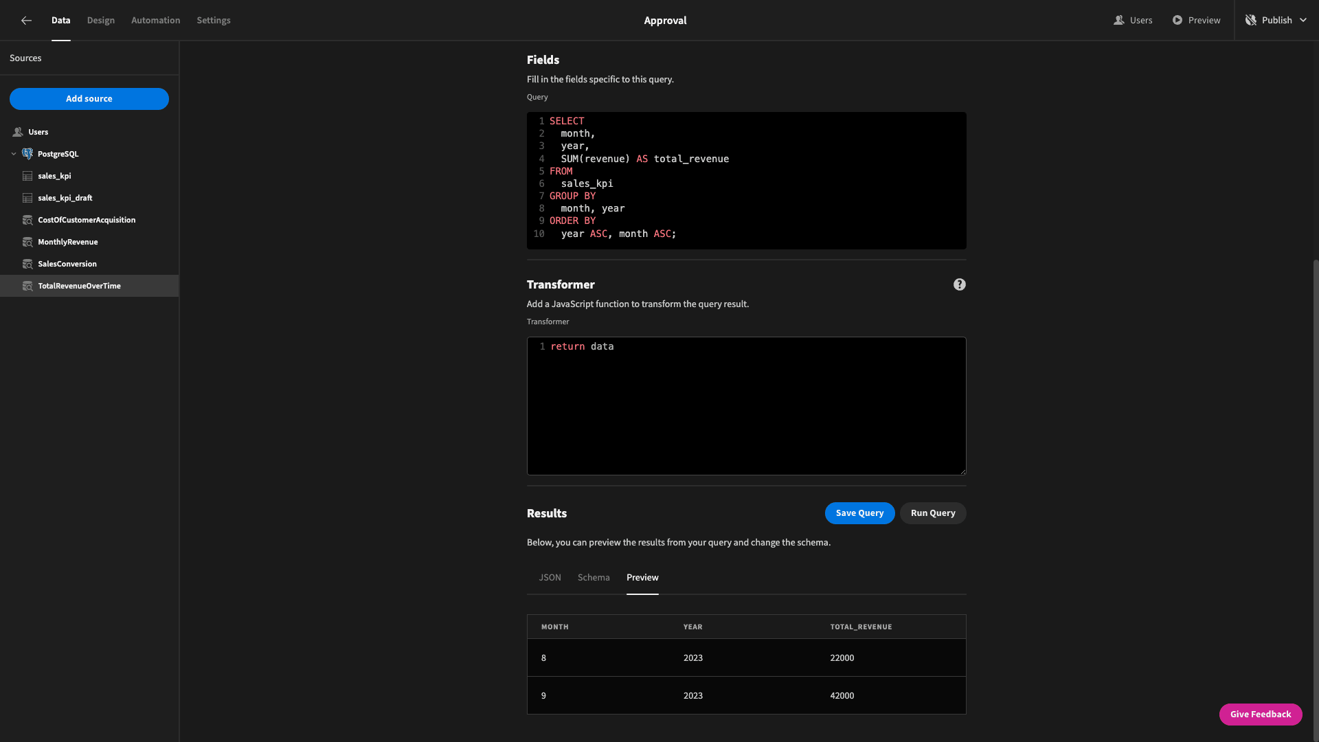
Now we have a nice neat table of monthly revenue figures.
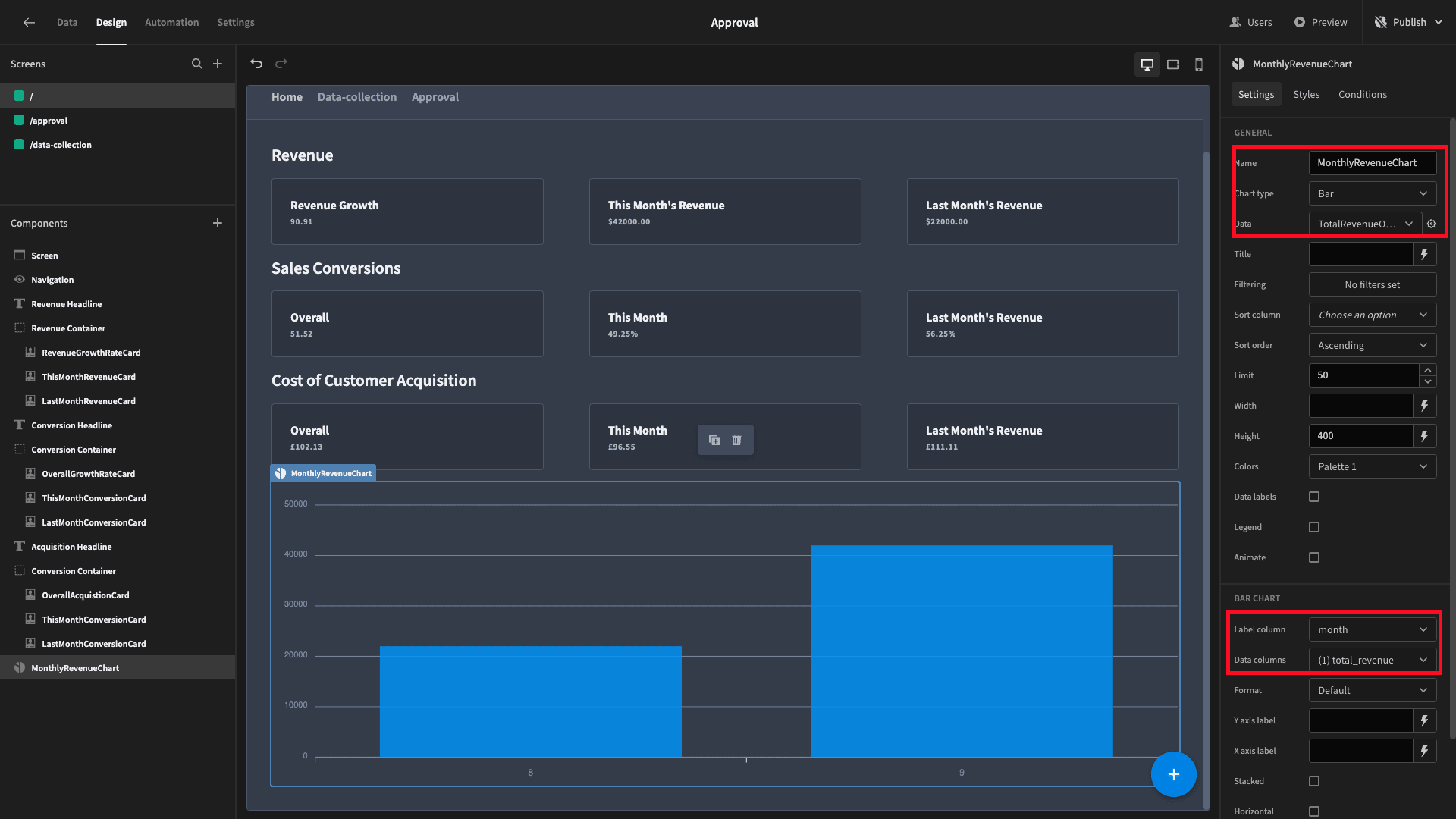
Back on our UI, we’ll add a chart block below our last set of cards. We’ll give it a name, set its type to bar, and its data to TotalRevenueOverTime. Then we’ll select month as the label column and total_revenue as the data column:
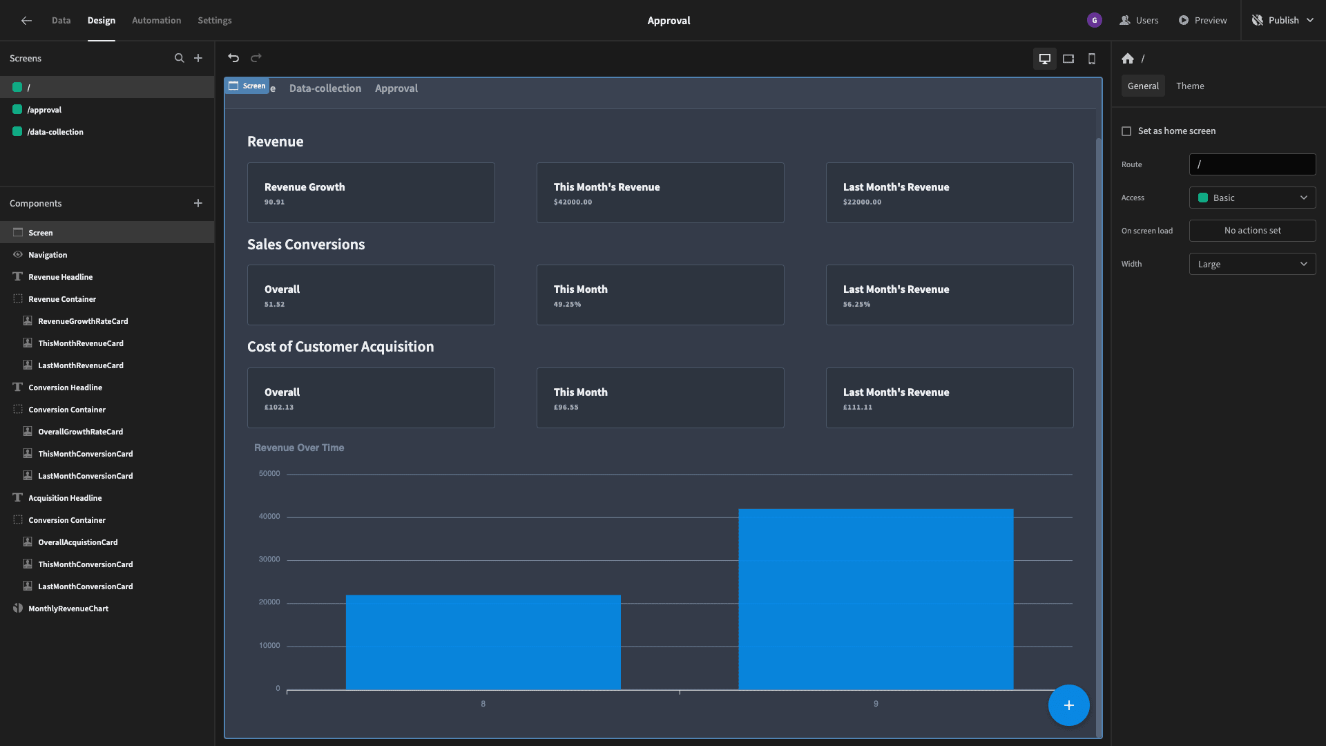
We’ll also add a title so that it’s clear what our chart means:
5. Regional monthly revenue chart
Our regional monthly revenue chart is a bit more complex. What we want this time is a line graph that will display the trend of revenues for each of the regions that have submitted sales figures.
So, we can start with a similar query, except this time we’ll also need to SELECT, GROUP BY, and ORDER using the region attribute.
This looks like this:
SELECT
month,
year,
region,
SUM(revenue) AS regional_revenue
FROM
sales_kpi
GROUP BY
month, year, region
ORDER BY
year ASC, month ASC, region ASC
We’ll call this query RevenueByRegion. But, look at the table that it returns:
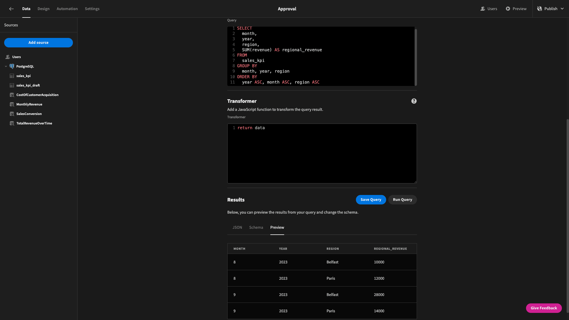
We have multiple rows for the same months, so this isn’t going to look right on a graph. Instead, we want one row per month.
In other words, our query should return a series of arrays in the format:
month: “mm/yyyy”, region: value, region: value, etc
To do this, we’re going to write a little bit of custom JavaScript in our transformer box. Specifically, we’re going to use the data.reduce() and Object.values() methods to create an accumulator and populate the relevant data into objects for each unique month.
Here’s our code, with comments explaining what each part does:
const transformedResults = data.reduce((acc, curr) => {

 // Create a unique key for each month-year combination

 const monthYearKey = `${curr.month}-${curr.year}`;

 // Check if this month-year is already in the accumulator

 if (!acc[monthYearKey]) {

  acc[monthYearKey] = {

   month: `${curr.month}/${curr.year}`,

  };

 }

 // Add the regional_revenue under the region key for the specific month/year

 acc[monthYearKey][curr.region] = curr.regional_revenue;

 return acc;

}, {});

// Convert the transformed results object into an array

const transformedResultsArray = Object.values(transformedResults);

return transformedResultsArray
Now when we run our query, the returned data looks like this:
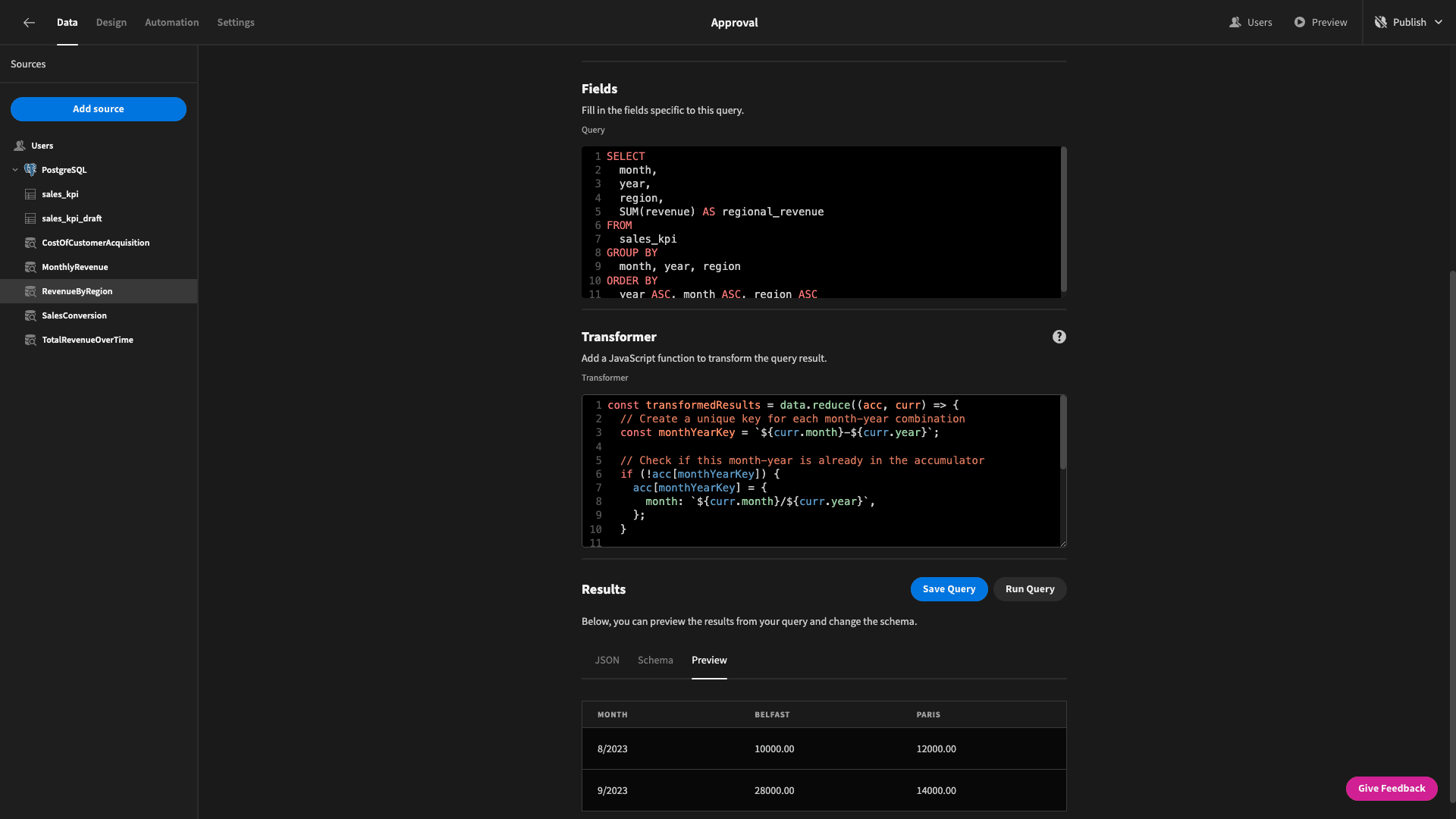
In other words, we have one attribute to show the month, and then each region has it’s own attribute that stores its respective revenue figure for that month.
Back to the data section.
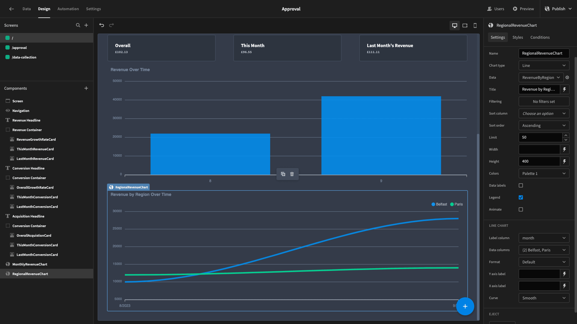
Let’s add another chart block. This time we’ll call it RegionalRevenue, set its data to our new query, and choose a line graph for its type. We’ll select month as the label column again, but this time we’ll use each of our regions as data columns.
We’ll also select the legend tick box to make it easier to read and then give it a title.
It should look like this:
And that’s our dashboard completed!
Of course, there’s near infinite scope for how you could adapt, modify, and customize our example. Budibase offers a huge range of data sources, custom queries, advanced transformations, and much much more.
To learn more about how we empower teams to turn data into action, check out our features overview.