In the fast-paced world of project management, having real-time insights into your financial situation is not just a luxury, it's a necessity. Therefore, effective project cost management software is too.
Every penny counts, and understanding where it's been spent can be the difference between a project's success and failure. But beyond just tracking project costs, what if you could effortlessly add new cost data?
How do you seamlessly integrate this financial tracking into a database you may already use? And crucially, how do you make sure that this is a user-friendly experience?
Whether they're entering details on a construction site or looking at data back at their desks - your team needs quick, easy tools to interact with relevant project data.
Today, we’re going to check out how we can use Budibase to build professional, performant project cost management software - in a fraction of the time it would take with traditional development.
First, though, let’s explore a bit more of the background.
What is project cost management software?
The name is obviously a bit of a clue here. A cost management app is any tool that enables us to interact with data and carry out defined tasks that are related to project finances.
The goal is to provide regularized experiences for tasks like monitoring budget utilization, recording new costs, analyzing cost categories, and more.
This is achieved with a combination of data aggregation, analysis, and visualization - alongside other administrative functions, like performing CRUD operations, handling approvals, or even basic data entry.
So, from a purely technical perspective, project cost management software solutions aren’t usually that complicated.
Rather, the challenging thing is accurately mapping your specific internal processes and creating tools that support our existing data assets.
Today, we’ll learn how to do exactly this.
Let’s dive in.
What are we building?
Our project cost management tool is going to be based around three key screens.
These are:
- An analytical dashboard for reporting on different kinds of costs across projects.
- A form for users to submit new costs.
- A CRUD screen users to view and manage existing costs.
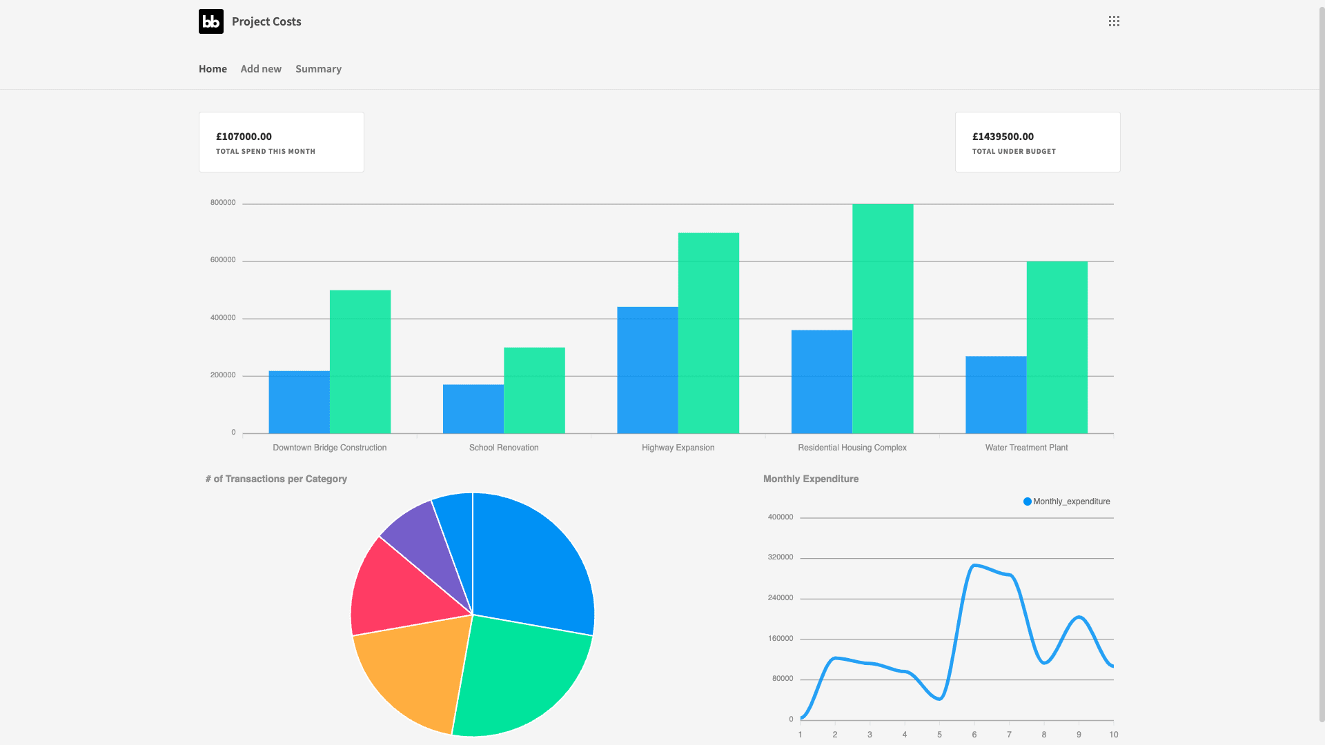
This will be built around a Postgres database with two tables - one for costs and another for projects.
We’ll be using a range of custom queries to extract the insights we need from these - as well as Budibase’s built-in CRUD functionality.
How to build project cost management software in 5 steps
Let’s get started.
If you haven’t already, sign up for a free Budiabse account so you can build along with us.
Join 300,000 teams running operations on Budibase
Get started for free1. Create a Budibase application and connect your data
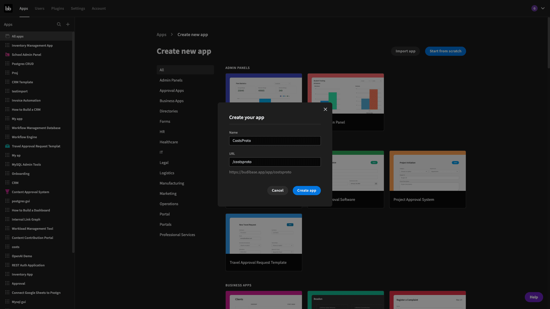
The first step is to create a new Budibase application. You have the option of importing an app or starting with one of our templates - but we’re going to hit start from scratch. We’ll then be prompted to give our new application a name:
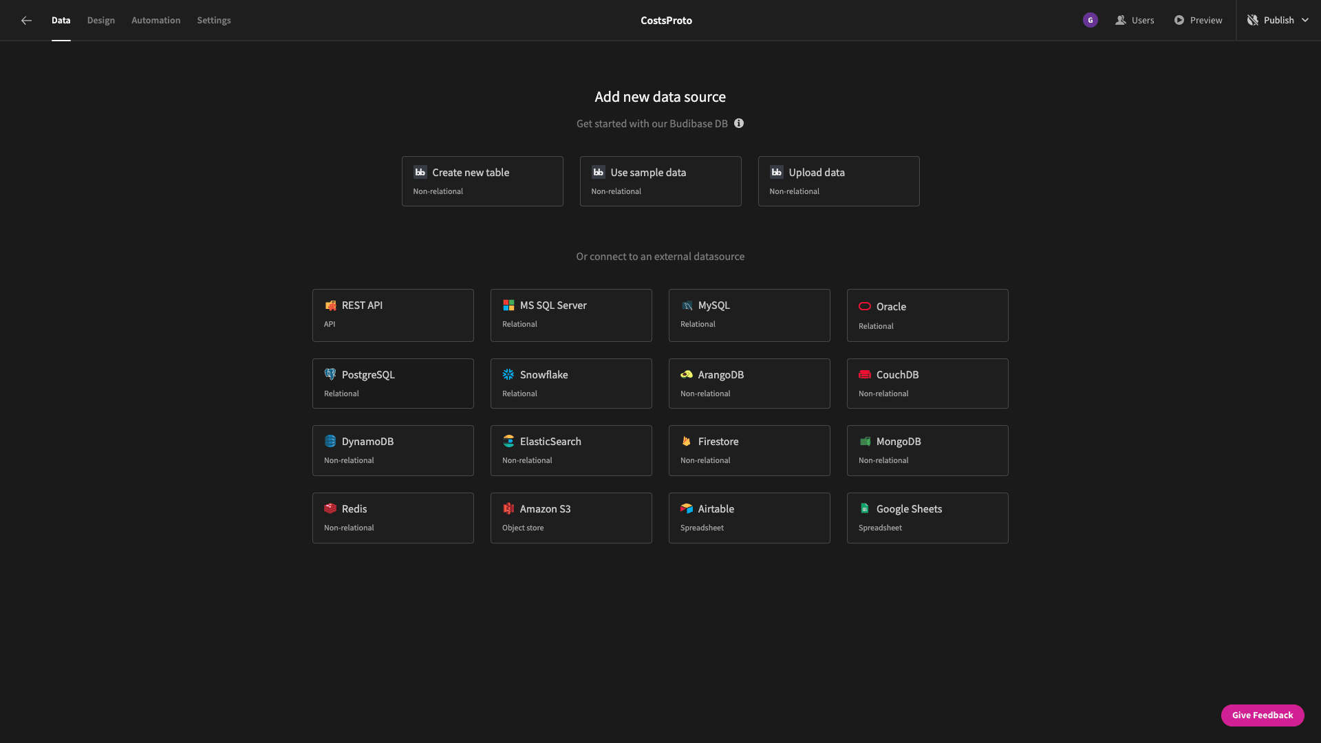
Then, we need to choose a data source. Budibase supports all kinds of relational and non-relational databases, as well as Google Sheets, REST, custom data sources, and our built-in database.
But, as we say, we’re using Postgres.
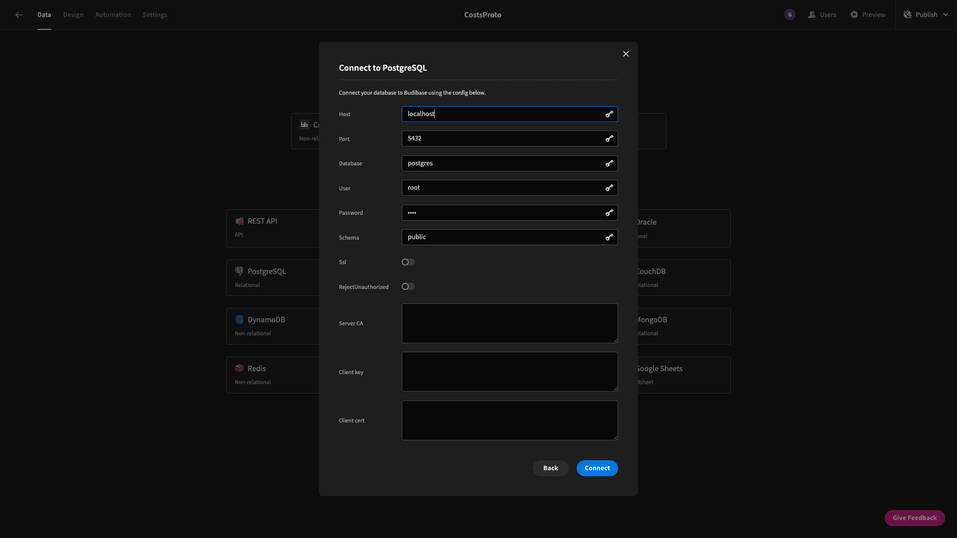
Then, we enter our database credentials:
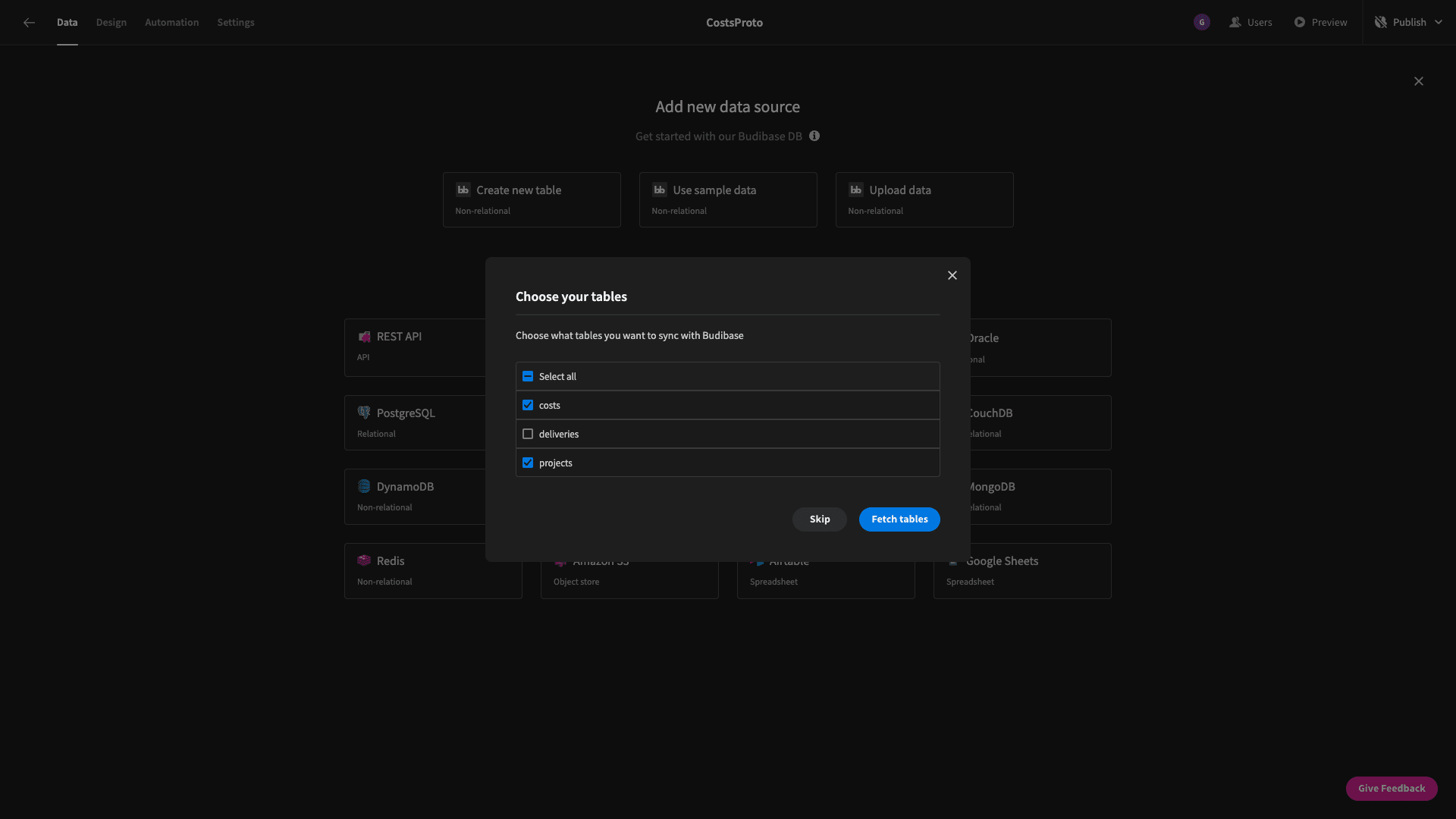
Budibase will ask us which tables we want to fetch - so that they’re queryable within our project cost management software project. We have the option of fetching all of the tables within a database - or only select ones.
As we said earlier, we need two tables - projects and costs:
2. Configuring our data layer
Already, we can manipulate our fetched tables within Budibase’s Data section. We can add, edit, or delete rows - or even alter our database’s schema.
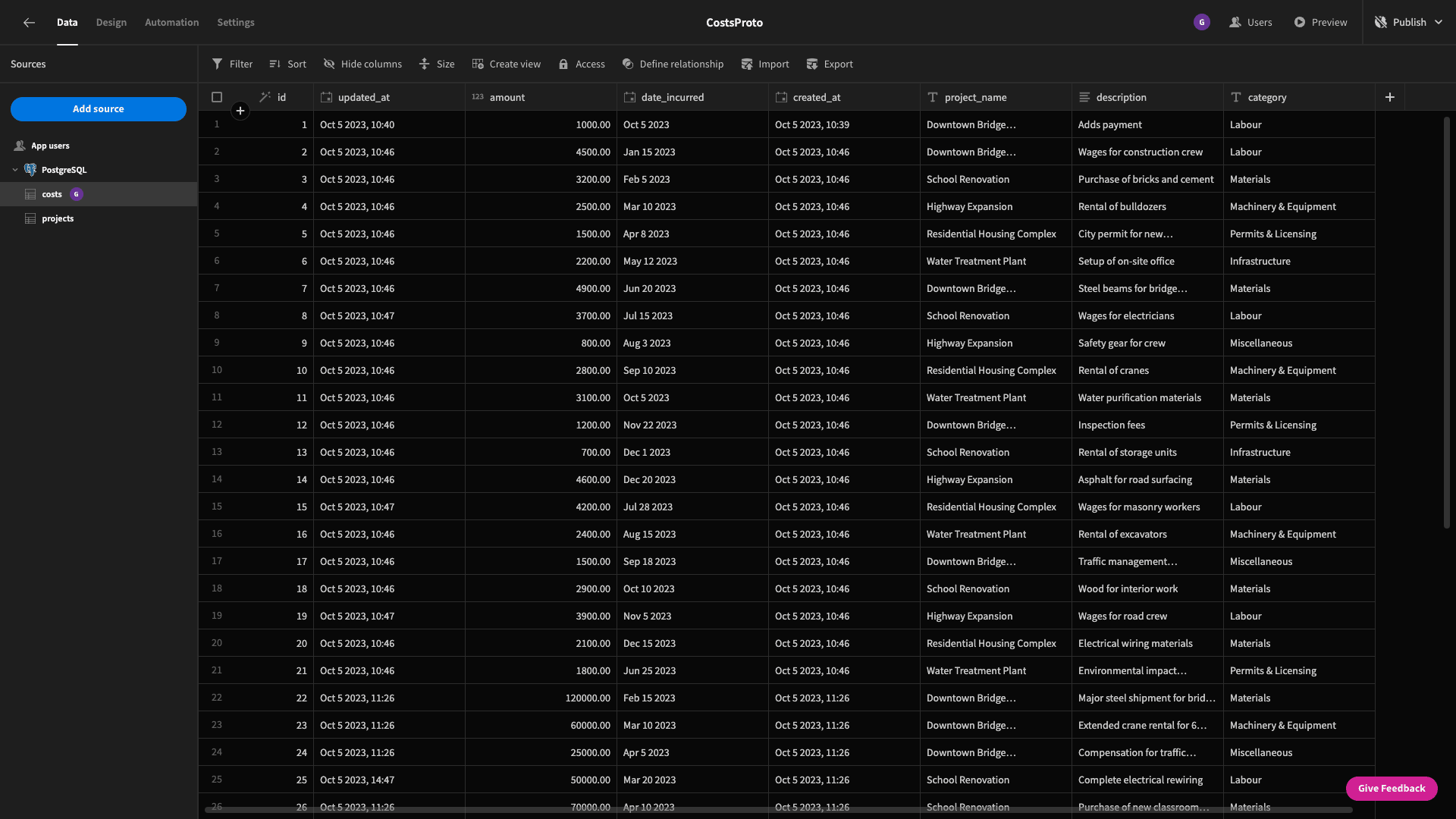
Before we continue, we’re going to make a few quick changes to our data model.
First of all, we want to set the display columns for each of our tables. For projects, this can be the project_name attribute:
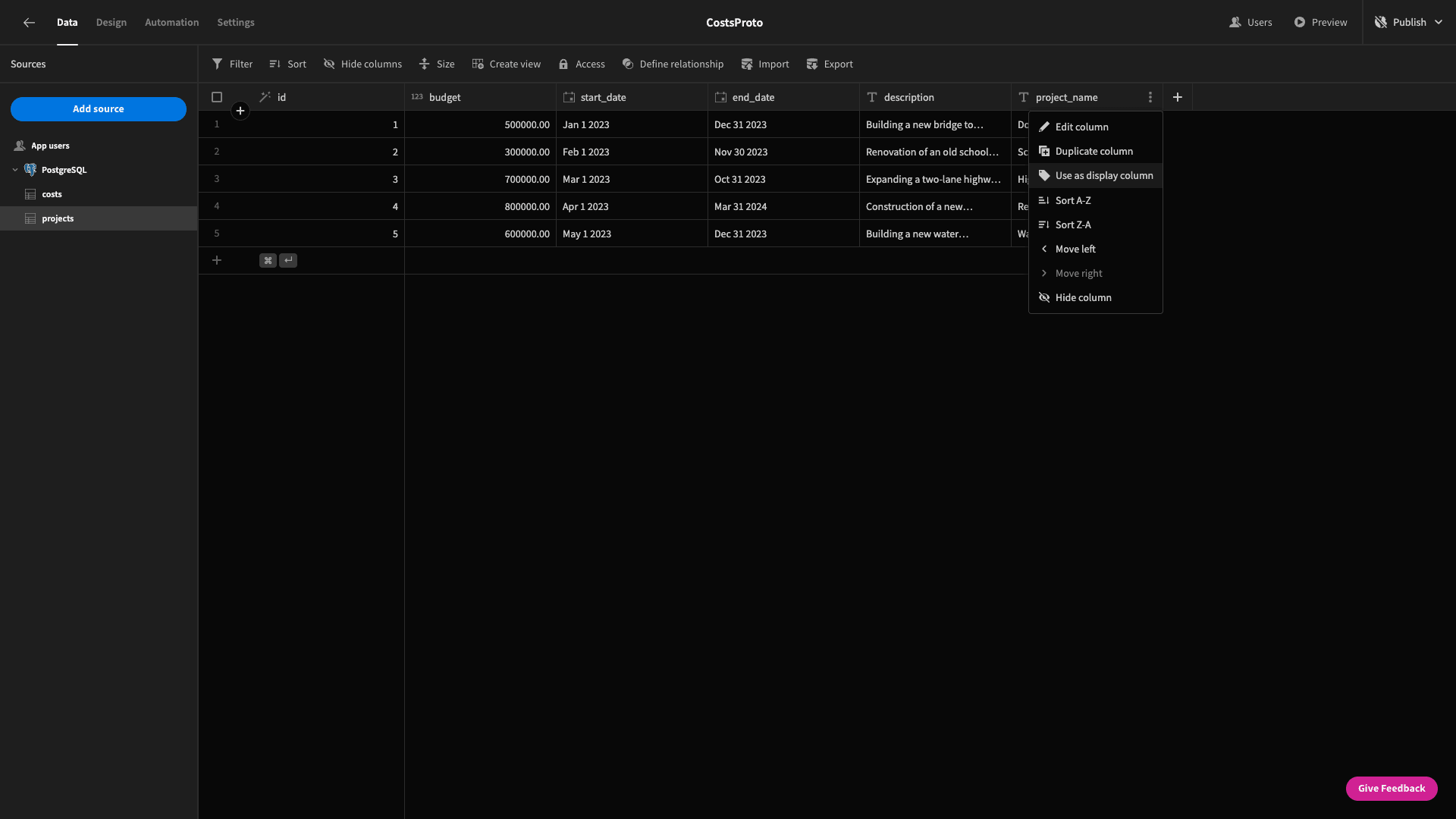
For costs, it’s already the unique id attribute - so we’re okay to stick with that.
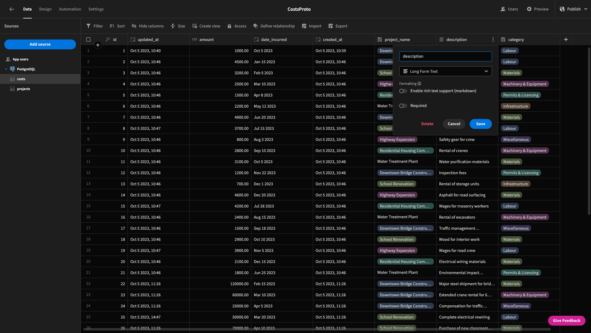
On the costs table, we’re also going to change the data type of a few columns. First, we’ll swap the project_name and category columns from text fields to options:

We’re also ticking the required option for both of these columns. When we configure an options column in Budibase, it will automatically assign a color code - but we could also overwrite this if we wanted.
The last change we’re going to make to our schema is to change the description field to the long-form text type.
This will give us more room in our forms for users to add detail in our form UIs later:
3. Building our new costs form
Now, we can start building some interfaces. The first thing we want is a form where our users can register new costs.
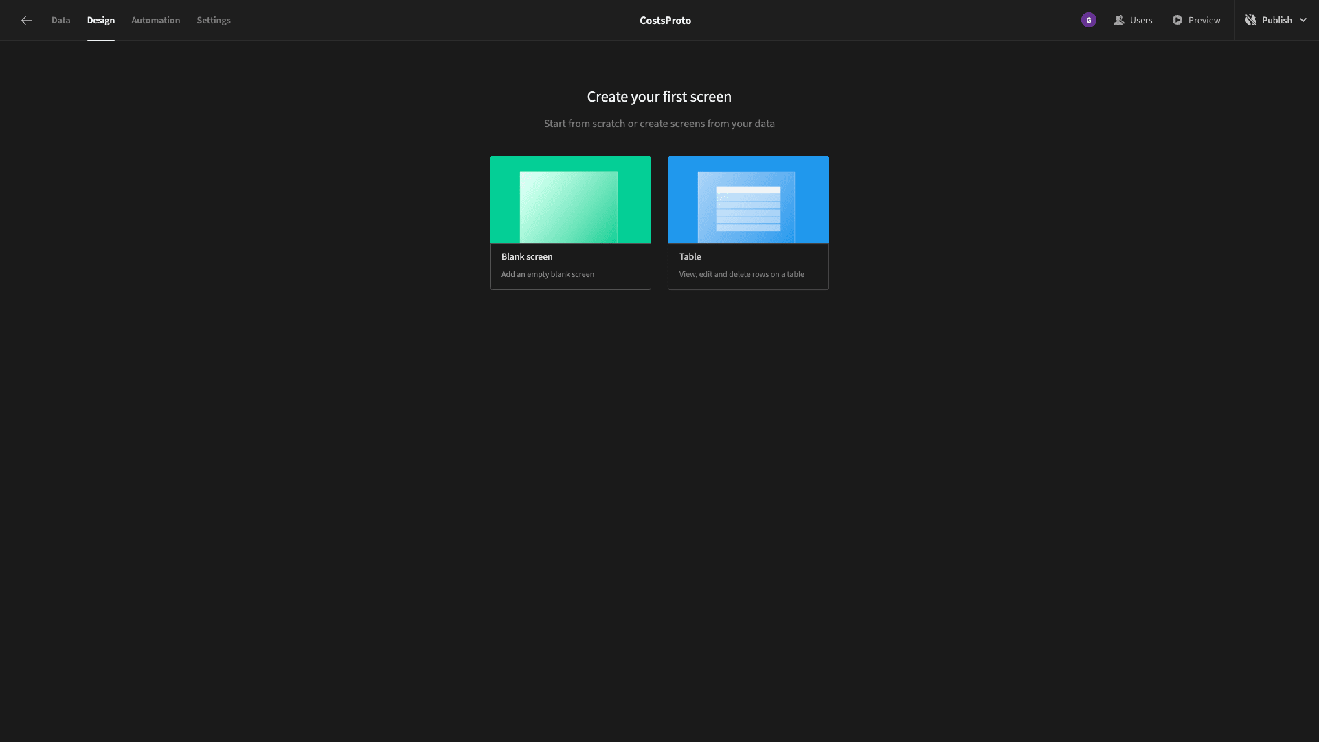
Head to the design tab and add a new blank screen:
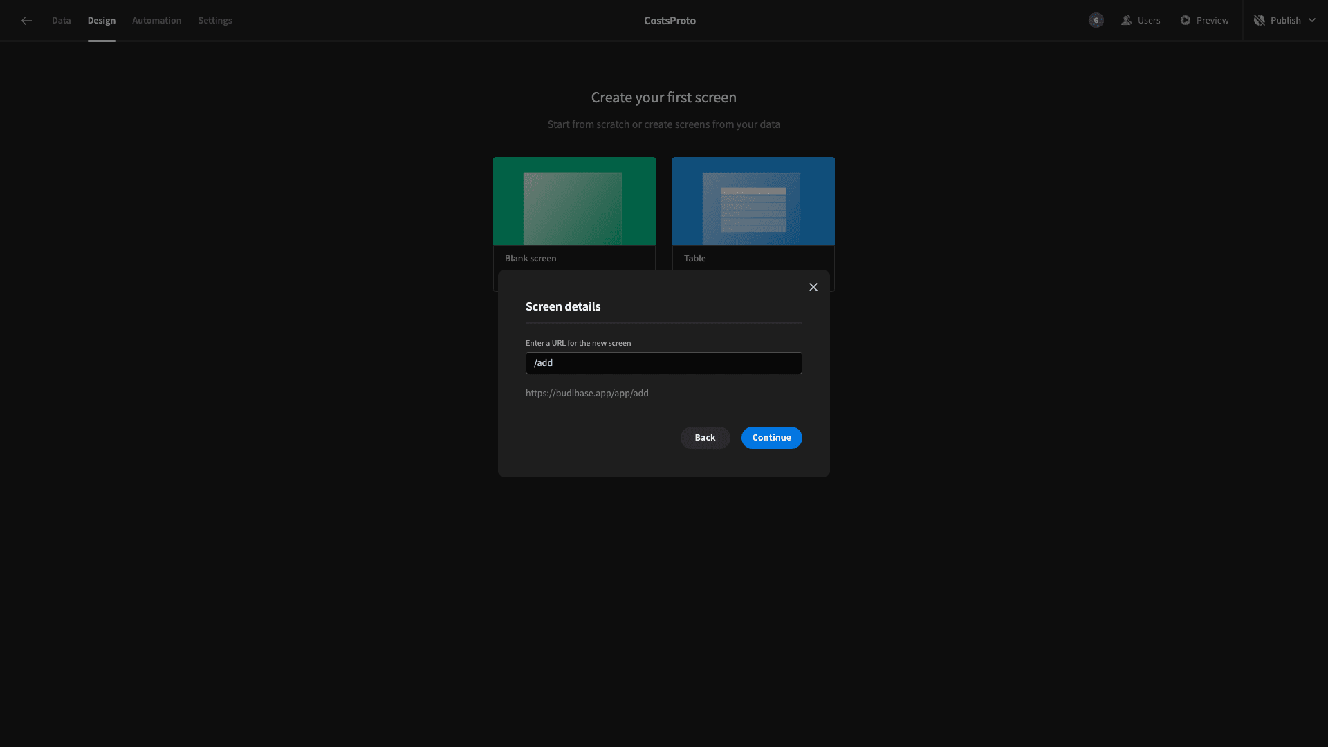
We’ll call this /add.
And now we can start adding components. We’ll start with a form block. This is a prebuilt form that we can assign to any of our connected data tables:
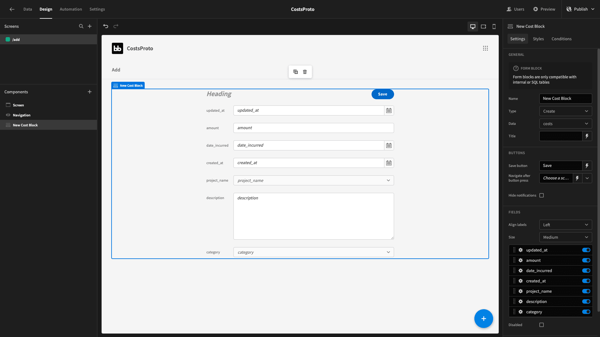
As you can see, it autopopulates with the schema of our costs table when we set this as our data.
All we need to do is play with the design to make it a bit closer to our liking. We’ll set the title to Add new cost and the size to large:
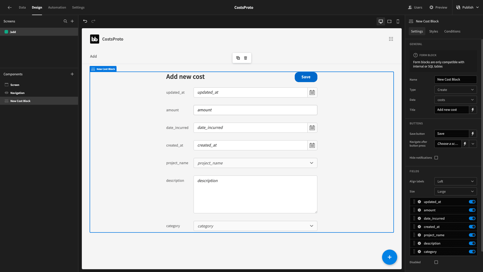
Then, we’ll use the fields section of the sidebar to rearrange our fields and make their labels more readable - rather than just using the column names as they are in our database schema:

And that’s all we need to do for our form.
4. Adding a CRUD screen for our costs
Let’s add another screen - this time for carrying our CRUD operations on our costs table. Create a new screen, but this time select the table option - rather than a blank screen:
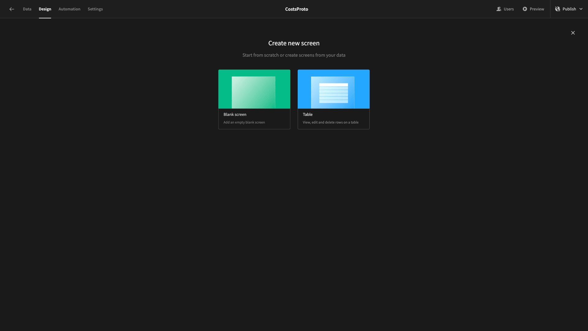
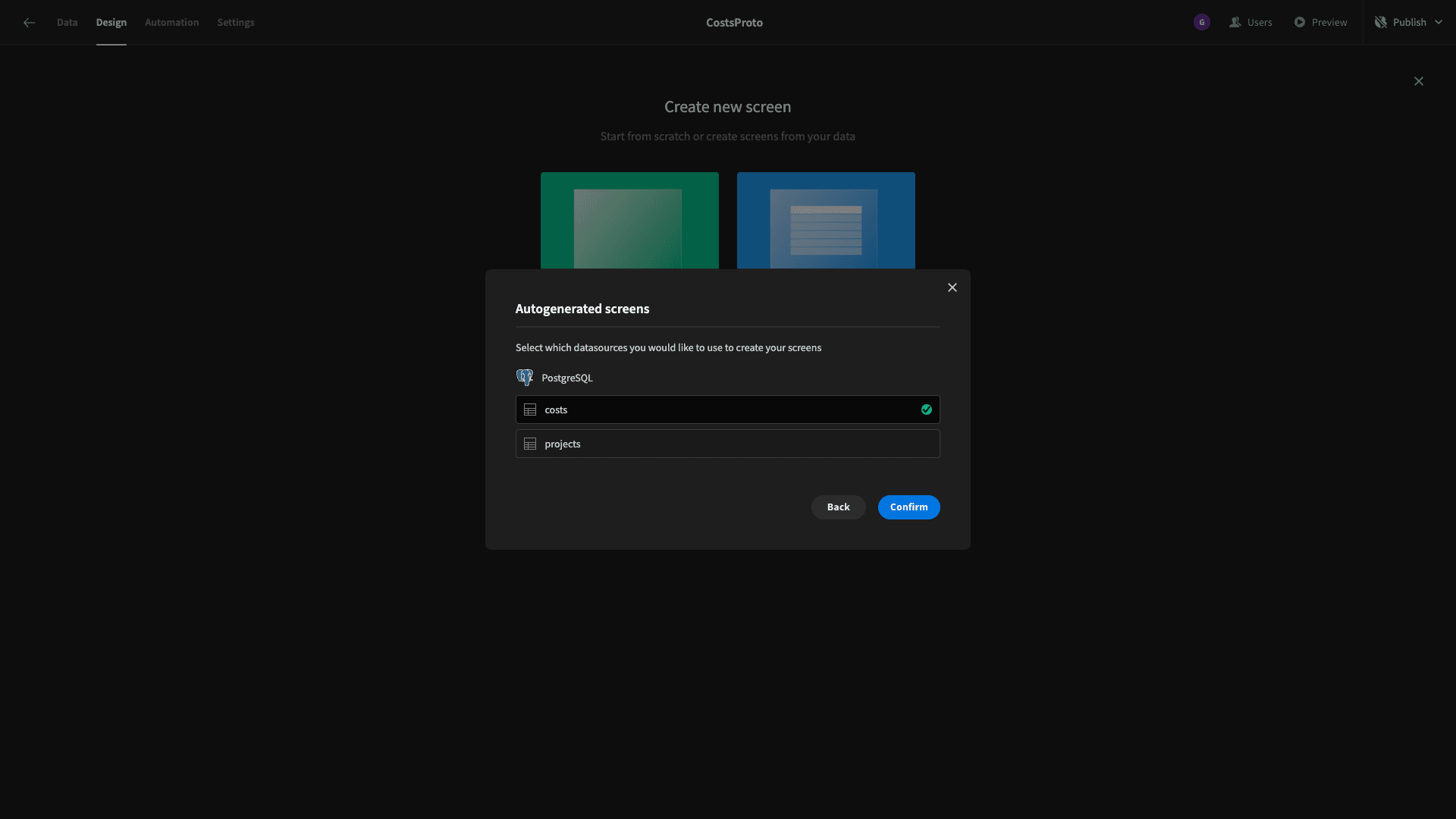
When prompted for which data table we want to point this at, we’ll choose costs:
Now we have a fully-functional CRUD screen - complete with a side-panel for editing existing rows:

Again, all we really want to do is a bit of tidying up. We’ll open the configure columns drawer:
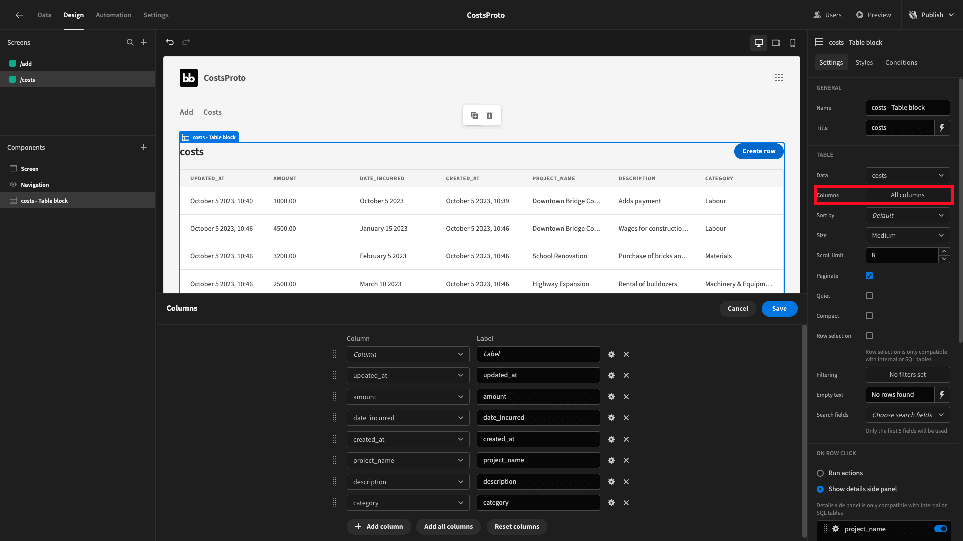
And we’ll simply reduce and rearrange the fields we display in our table:
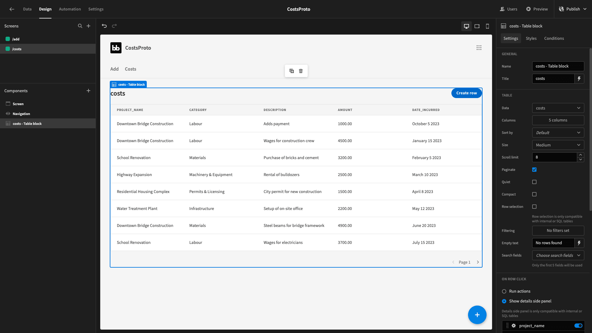
That’s that screen done too.
5. Creating our project cost management dashboard
Let’s create our third and final screen for our project cost management software tool. This one will be a dashboard that displays various metrics and KPIs around our budget utilization.
Start by adding a new blank screen and calling it /home.
Now, before we go any further, let’s remind ourselves what the finished thing should look like:

We’ve essentially got three sections here. Let’s take each one in turn.
Summary cards
At the top of the dashboard, we have two cards. These display our total spending for the month so far - and how far we are under budget.
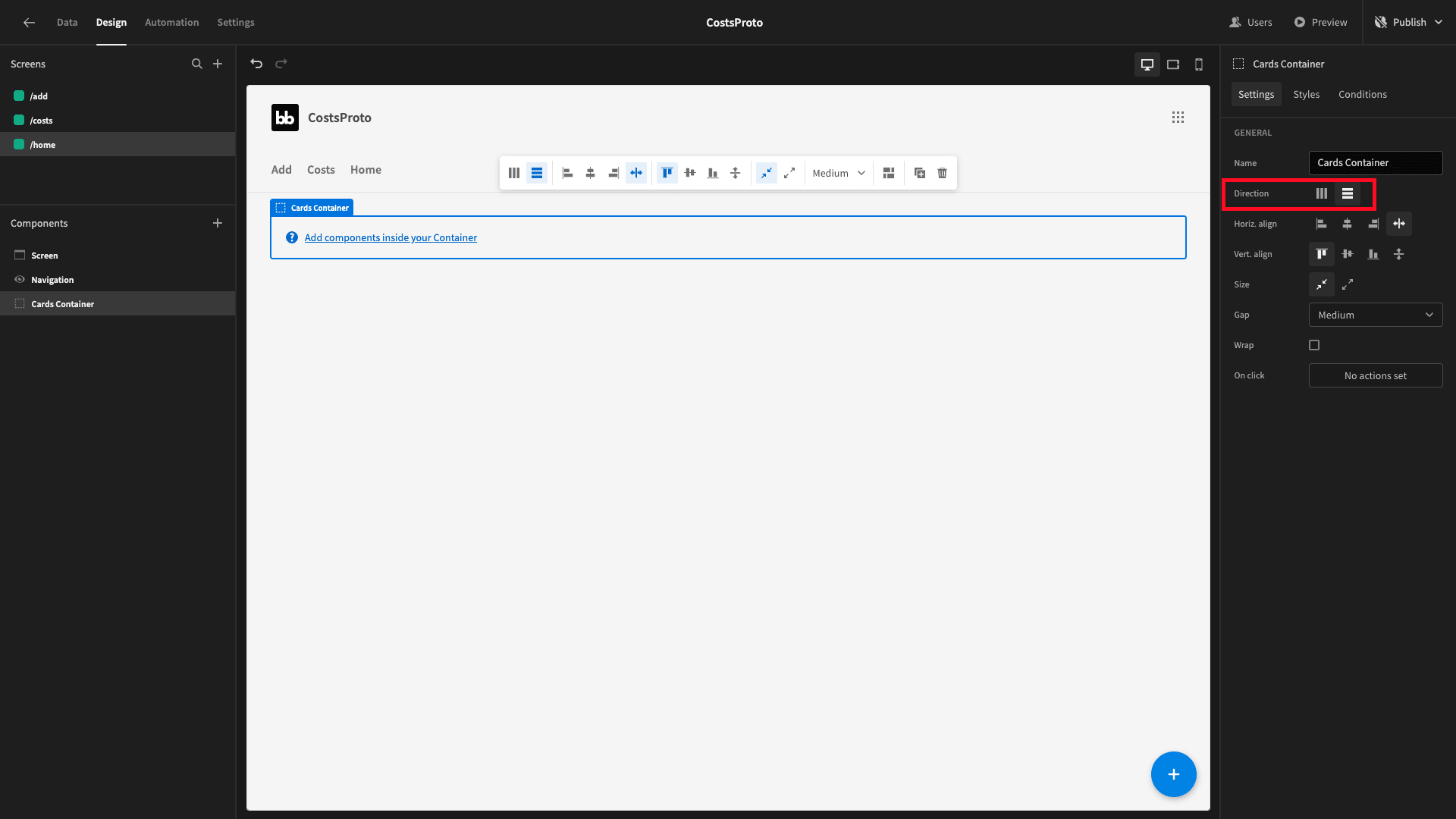
We’ll need a couple of custom queries for this, but first, let’s get our UI structure in place. We’ll start by adding a container and setting its direction to horizontal:
Inside this, we’ll place two cards blocks:
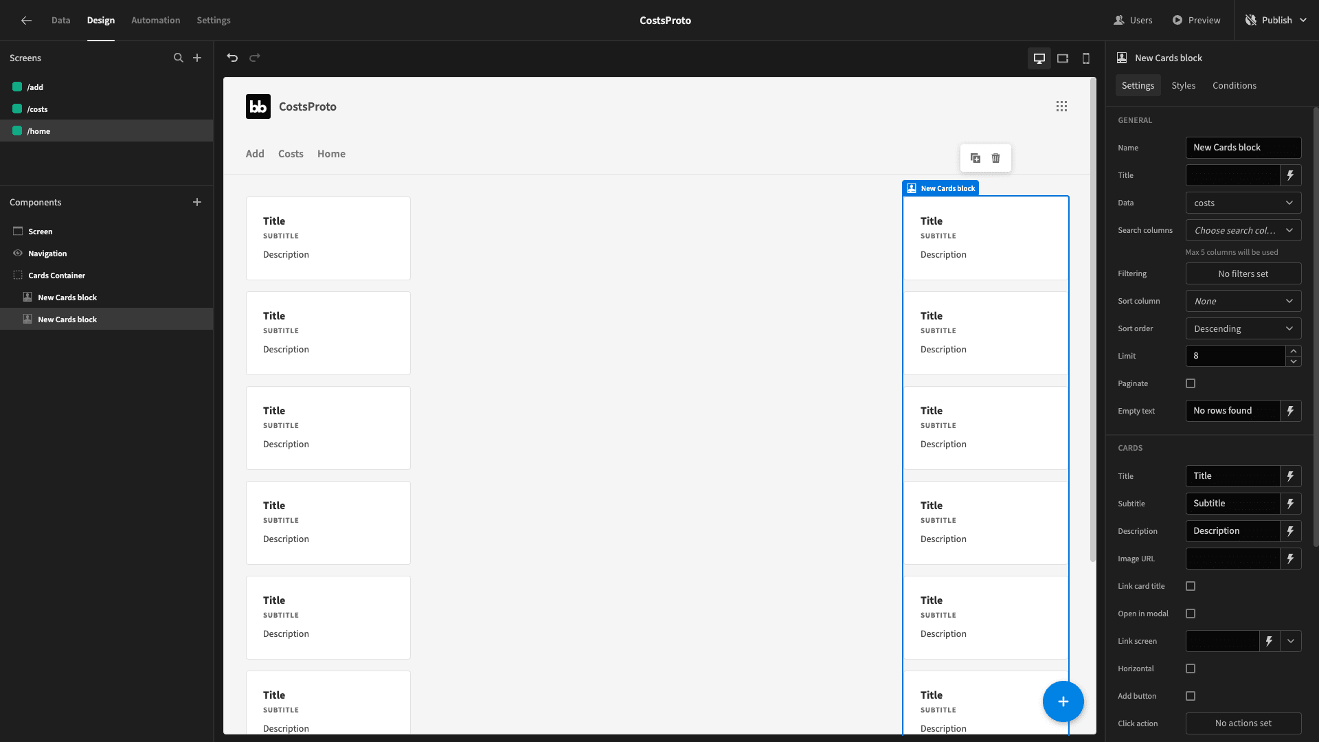
These are prebuilt component blocks that will iterate over whichever data set we point them at and display whatever we want for each item.
When we’re done, we’ll only display one card in each.
So, let’s start building some queries.
Head back to the data section - and create a new query under our Postgres data source:
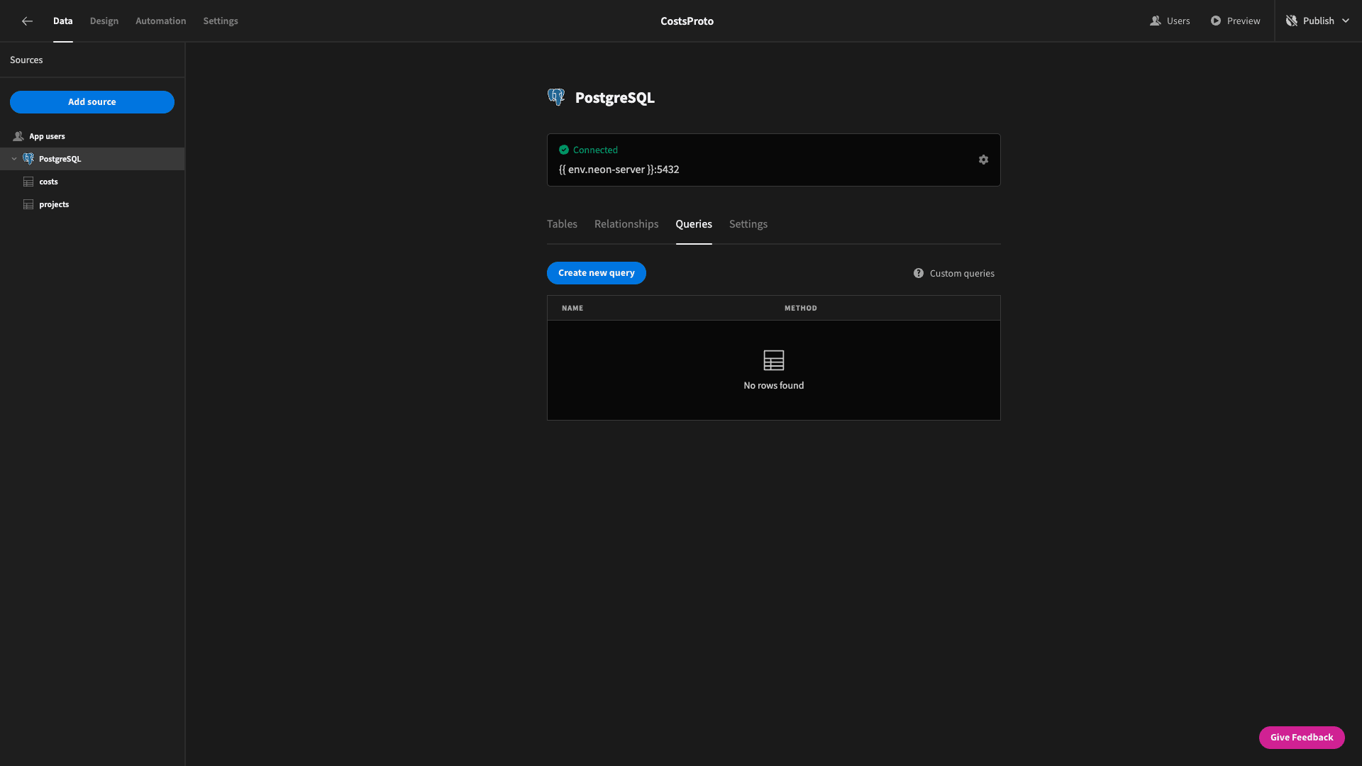
We’ll call our first query TotalSpendThisMonth:

This is a relatively simple one. We want to extract the SUM() of the amount attributes in all of the rows where the month and year match the current date.
So, our query is:
SELECT SUM(amount) AS total_spend_this_month

FROM costs

WHERE EXTRACT(MONTH FROM date_incurred) = EXTRACT(MONTH FROM CURRENT_DATE)

AND EXTRACT(YEAR FROM date_incurred) = EXTRACT(YEAR FROM CURRENT_DATE)
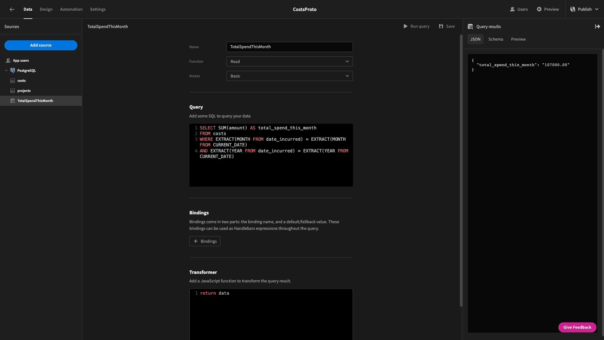
Here’s the data object that this returns:
{

 "total_spend_this_month": "107000.00"

}
While we’re in the data section - we might as well create the query for our other card too. We’ll call this one TotalUnderOver.

But - it’s going to be slightly more complicated - because our budget data and our actual costs are stored in two different tables. We basically need the difference between the SUM() of all the budgets and the SUM() of all the actual costs to figure out where we are.
We can achieve this using a WITH statement, so our query will be:
WITH TotalBudgets AS (
SELECT SUM(budget) AS total_budgets
FROM projects
),
TotalCosts AS (
SELECT SUM(amount) AS total_costs
FROM costs
)
SELECT
tb.total_budgets,
tc.total_costs,
(tb.total_budgets - tc.total_costs) AS difference
FROM TotalBudgets tb, TotalCosts tc;
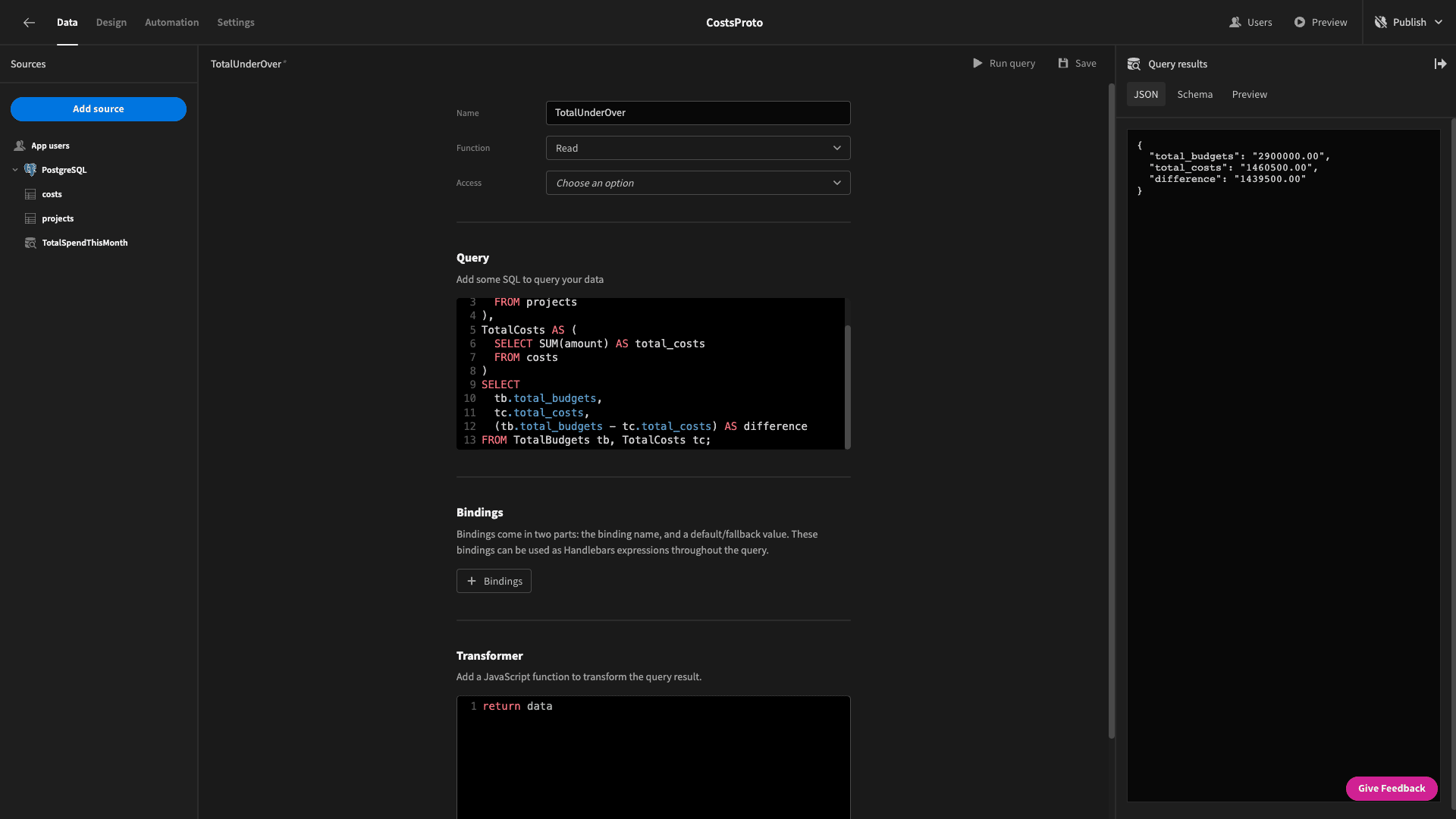
And the returned data object looks like this:
{

 "total_budgets": "2900000.00",

 "total_costs": "1460500.00",

 "difference": "1439500.00"

}
Back to the design tab, we’ll set the data for our cards block to our new queries:

Each one only returns on data object - so each block only contains a single card.
We’re going to use the title fields to display a slightly stylized version of the data we want to show - and the subtitle to show some text to explain what this is.
For the first card, we’ll bind the title to the total_spend_this_month attribute from our first query - with a pound sign at the front:
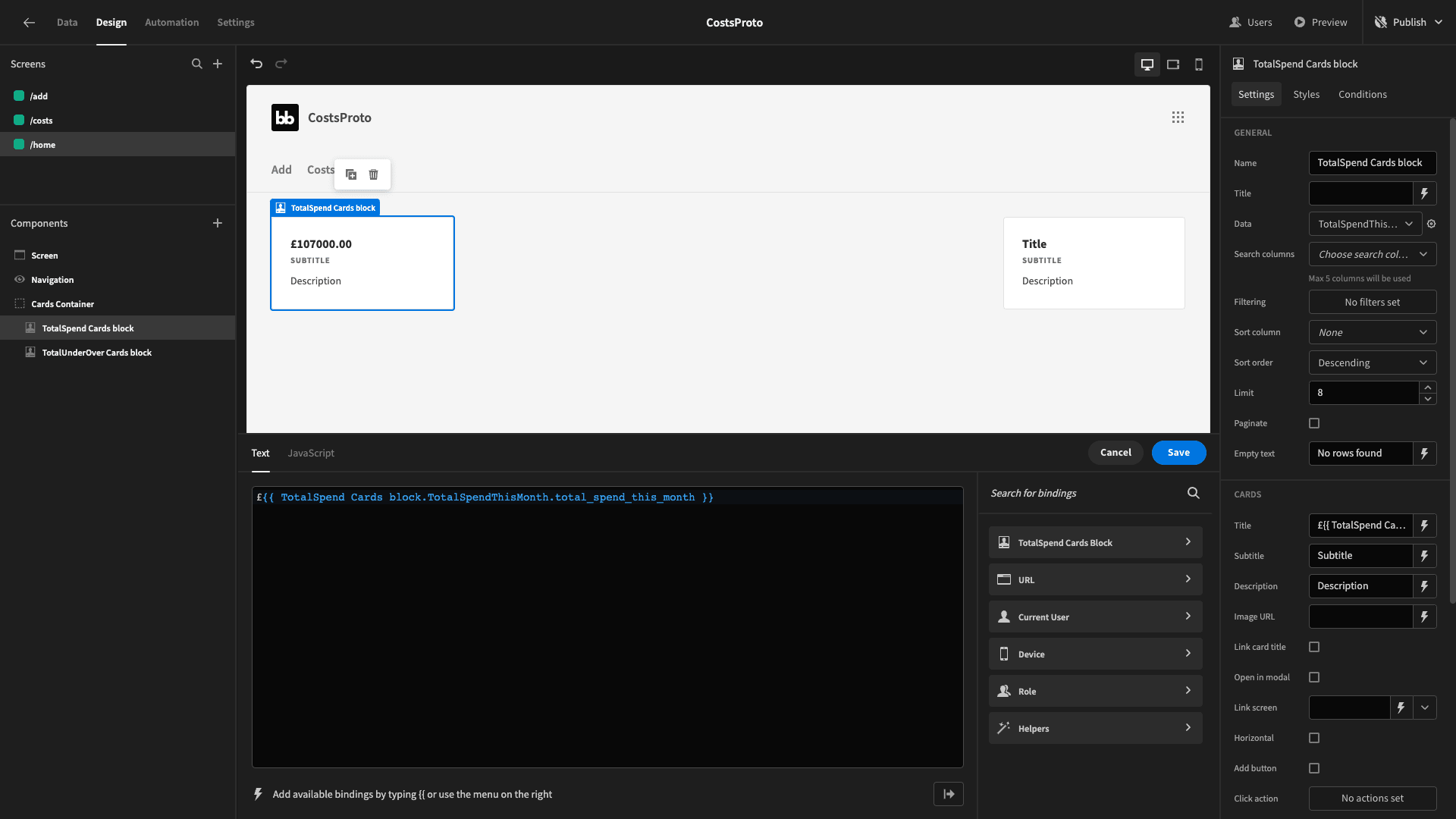
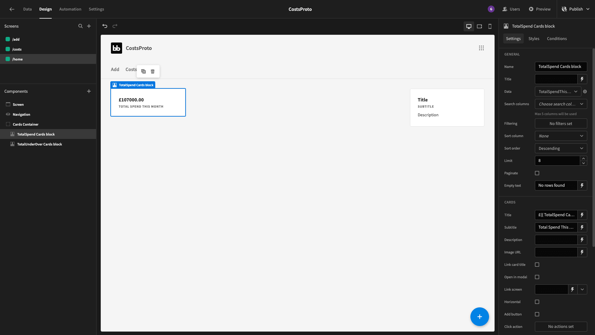
We’ll also delete the description and set the subtitle to Total Spend This Month.
The second one is a bit more complex. First, we’ll use the difference attribute from our second query for the title:
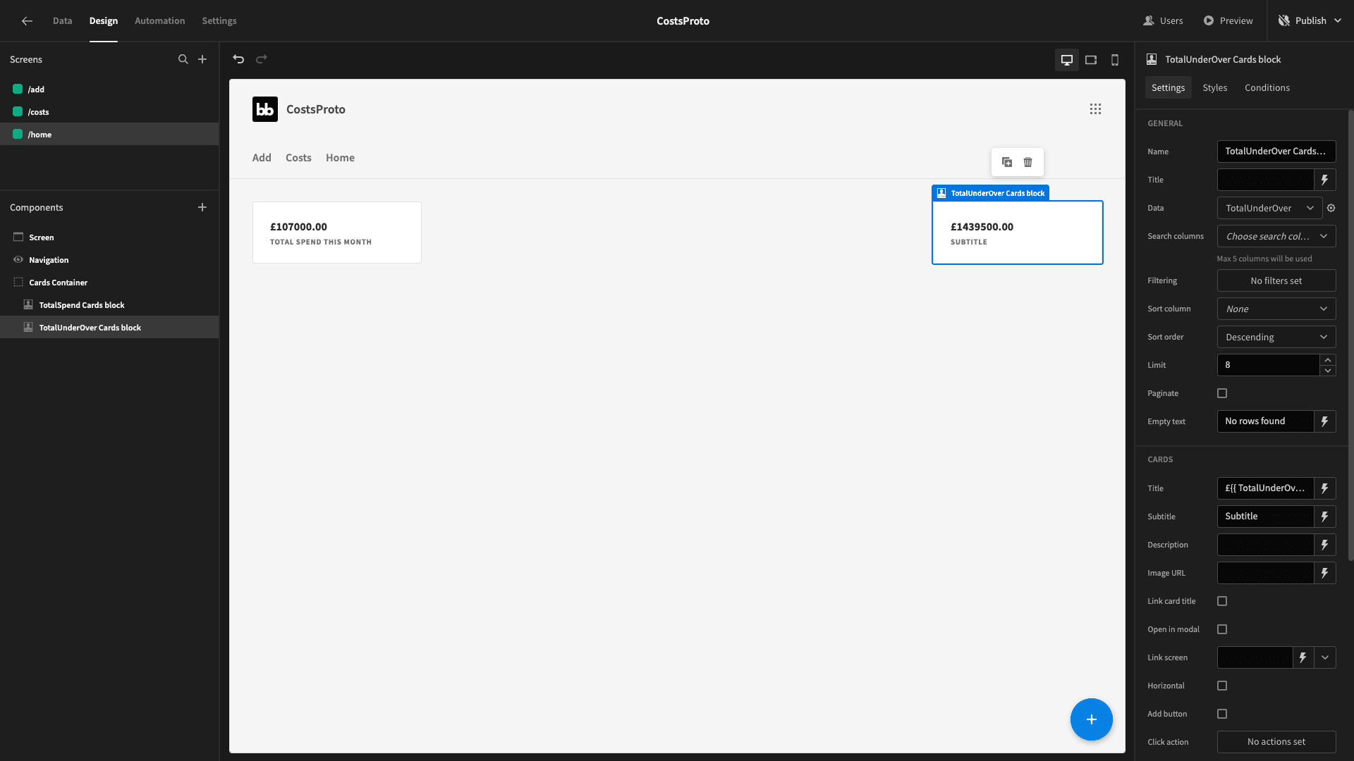
But - we want to display a different subtitle depending on whether we’re currently over or under budget on net.
One way to do this would be to duplicate our card and use Budibase’s built-in conditionality features to hide or display one version based on the value of our difference attribute.
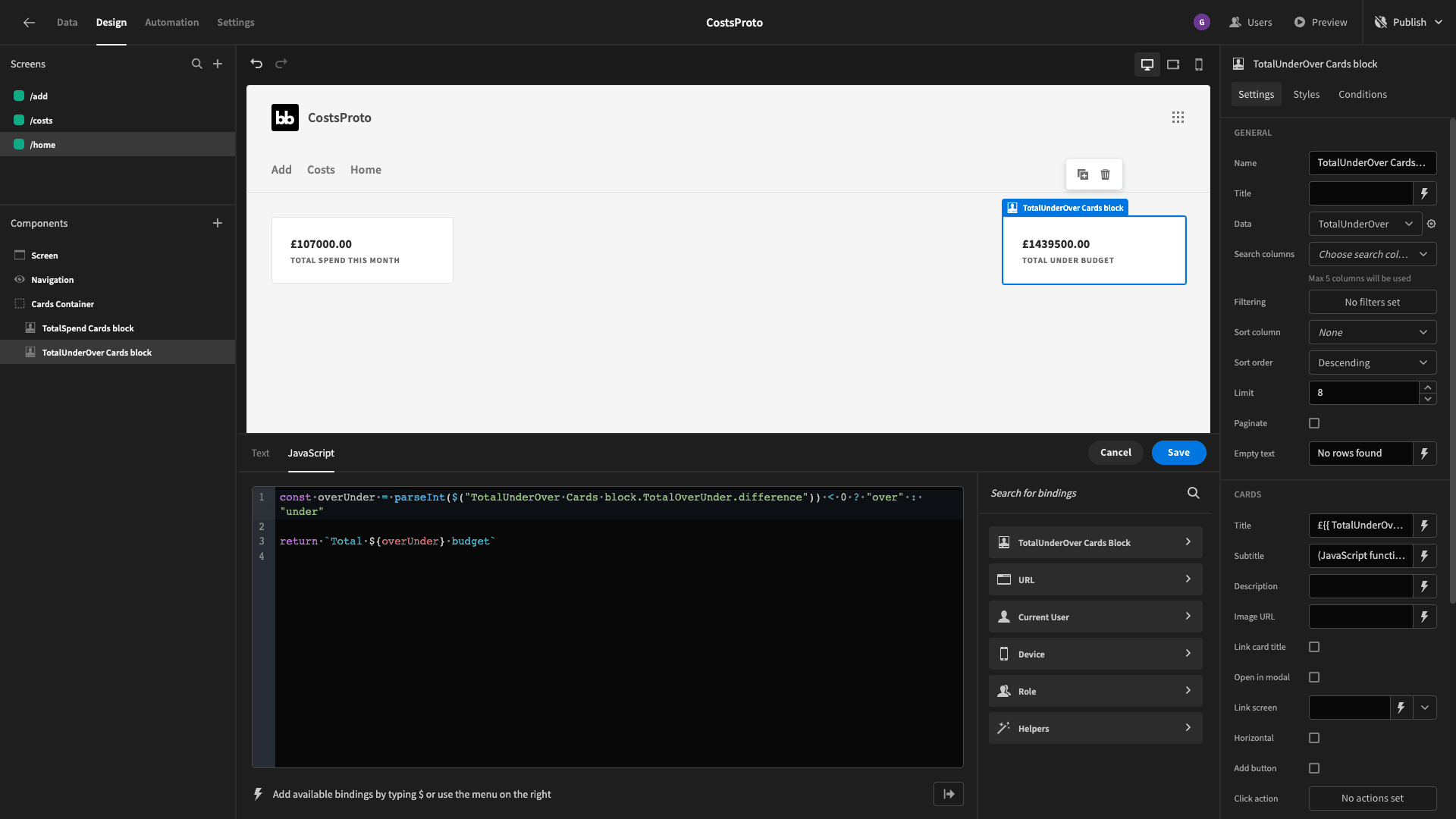
But, we’re going to use a JavaScript binding with a ternary operator instead.
So, we need to bind our subtitle to the following piece of JavaScript:
const overUnder = parseInt($("TotalUnderOver Cards block.TotalOverUnder.difference")) < 0 ? "over" : "under"

return `Total ${overUnder} budget`
If you’re not familiar with the ternary operator - basically what we’ve done is create a variable called overUnder. If difference is less than zero - we set this to over. If not, we set it to under.
We then return Total under budget or Total under budget as a string.
Project budget utilization graph
Next, we want to start building some graphs. The first one will be a bar chart that displays the budget and total actual spend for each project.
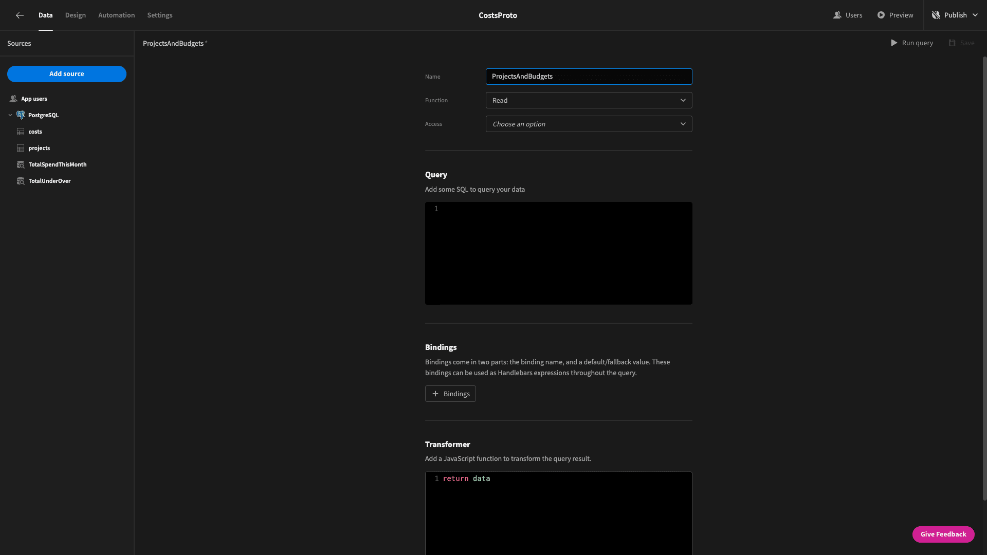
We’ll create another custom query and call it ProjectsAndBudgets:
We’ll start by using another WITH statement to SELECT the project_name and the SUM of the amount fields from our costs table - grouped by project_name.
We’ll SELECT the budget and project_name from the projects table and use a JOIN statement to JOIN the data from both tables on the project_name column.
So, the overall query is:
WITH ProjectCosts AS (
SELECT project_name, SUM(amount) AS total_cost
FROM costs
GROUP BY project_name
)
SELECT p.project_name, p.budget, pc.total_cost
FROM projects p
JOIN ProjectCosts pc ON p.project_name = pc.project_name;
And we get back a data object that looks like this:
{

 "project_name": "Downtown Bridge Construction",

 "budget": "500000.00",

 "total_cost": "218100.00"

}
Save that and head back to the design section.
Underneath our cards container, we’ll add a new chart block. We can choose bar as its chart type and set its data to our new query:
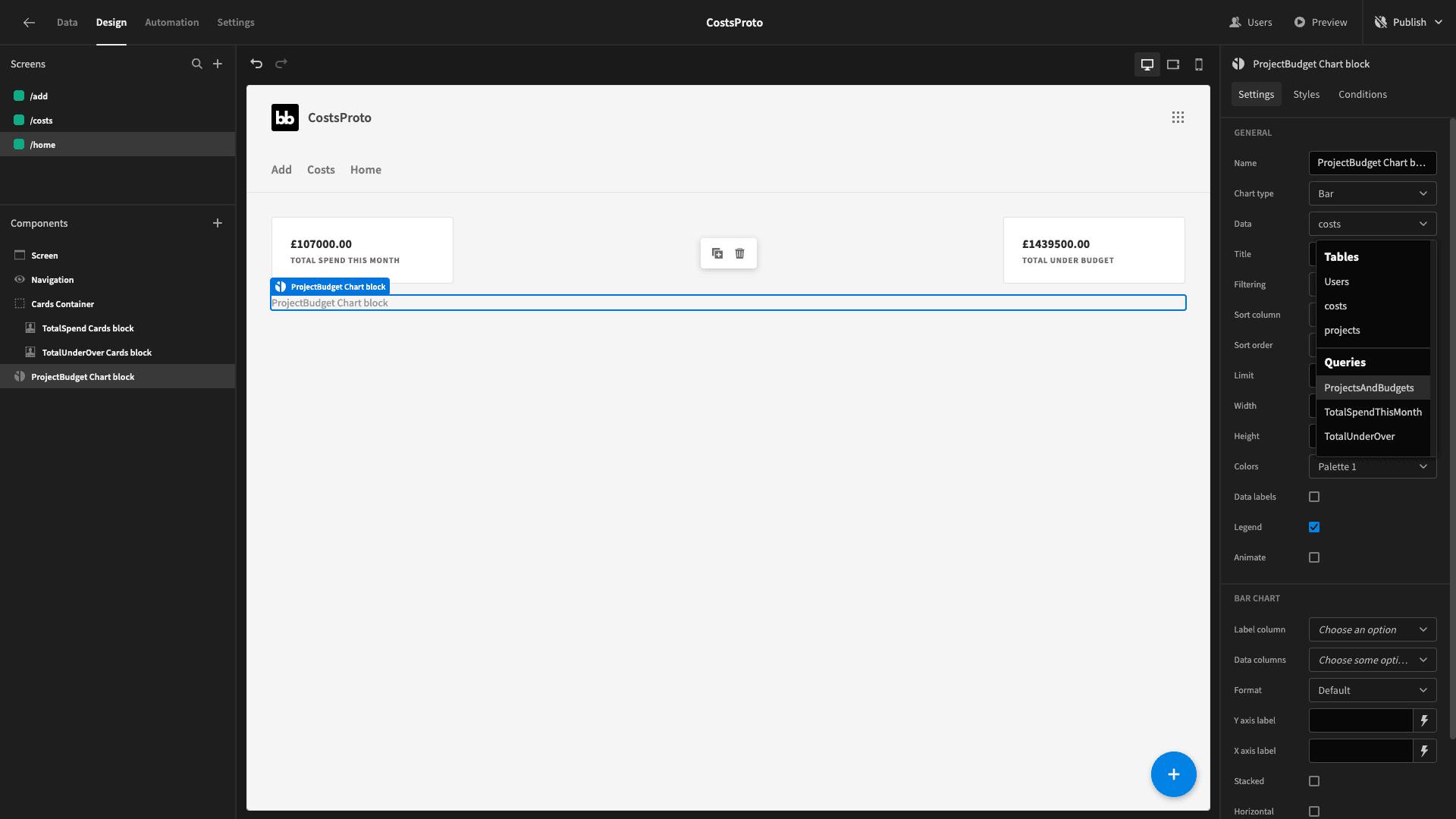
Obviously, this won’t show any data until we tell it what we want it to display.
We’ll set the label column to project_name and our data columns to budget and total_cost:
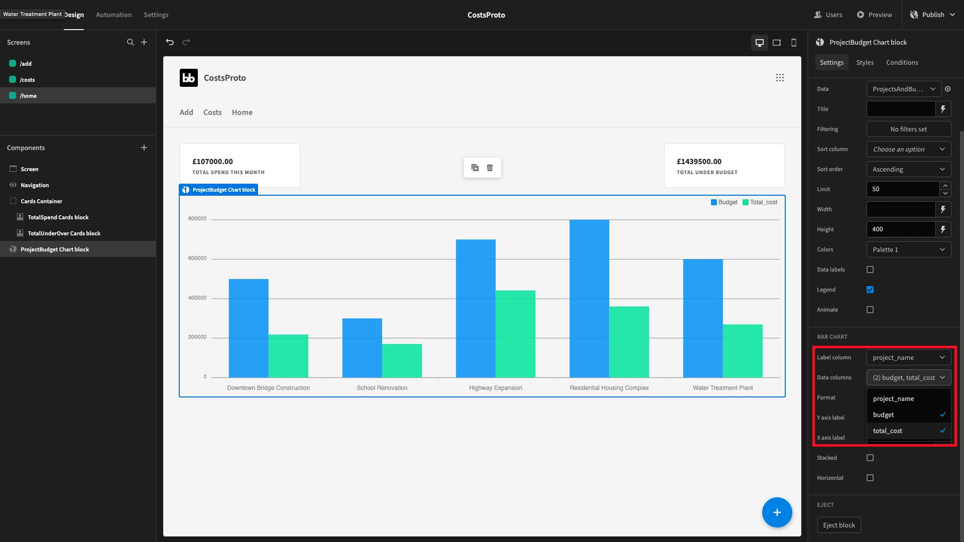
That looks good.
Costs by month & category graphs
We’re going to add two more charts to our dashboard. We want these to show side-by-side - so we’ll start with another horizontal container.
First up, we want a bar chart that displays the number of transactions we have in each category. We need a query that SELECTS the category and the COUNT of the IDs from our COSTs table.
We’ll group this by category and sort by the COUNT of the IDs, descending. We’ll call this TransactionsPerCategory
So, our query is:
SELECT category, COUNT(id) AS transaction_count

FROM costs

GROUP BY category

ORDER BY transaction_count DESC;
And it returns a data object like this:
{

 "category": "Materials",

 "transaction_count": "10"

}
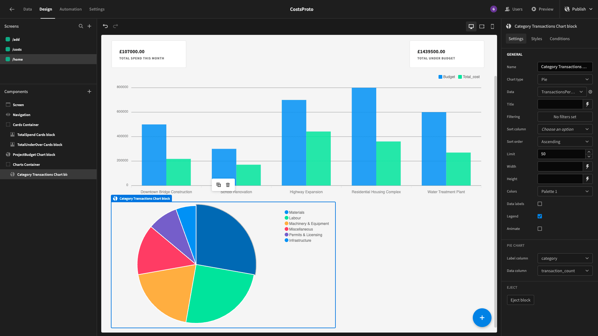
Now, lets add a chart block inside our new container - with its chart type set to pie and its data set to our new query.
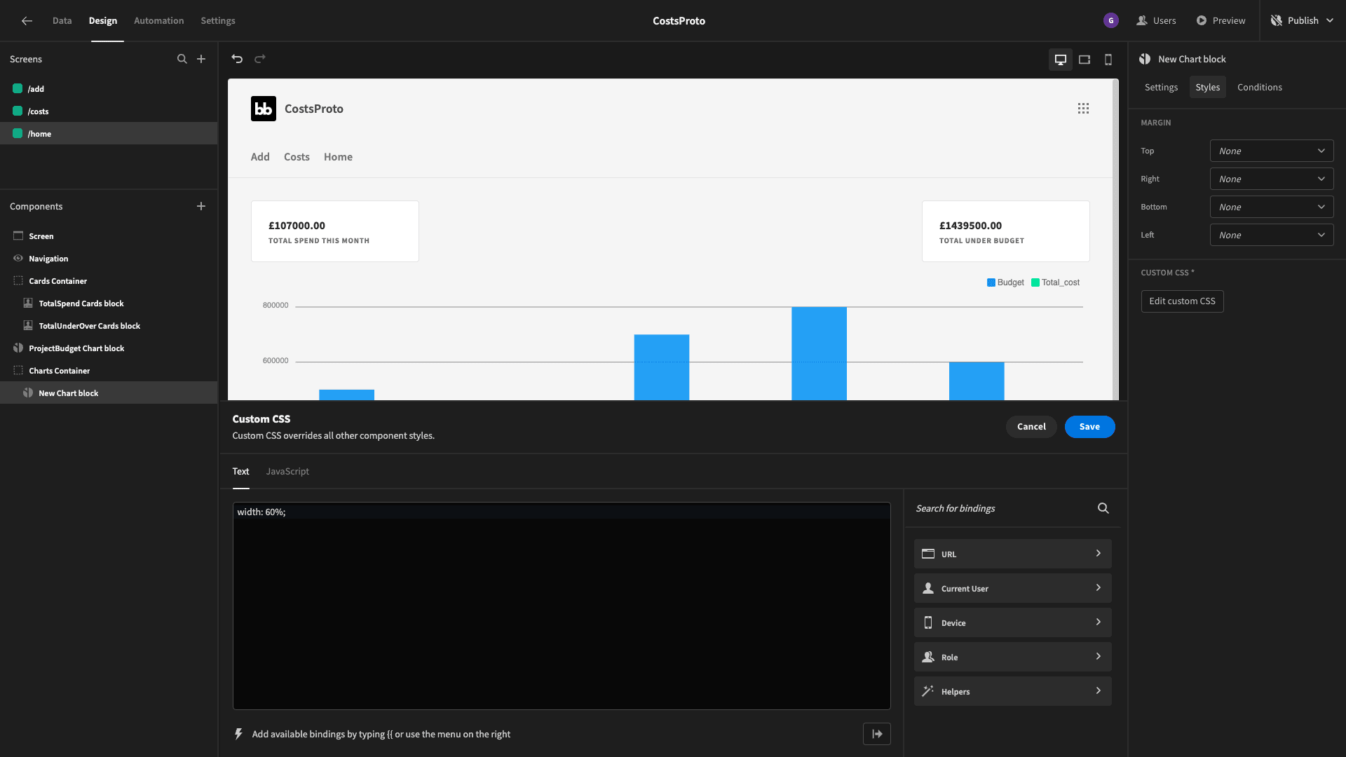
We’ll also use some custom CSS to set it’s width to 60%:
And here’s what we’ve got so far:
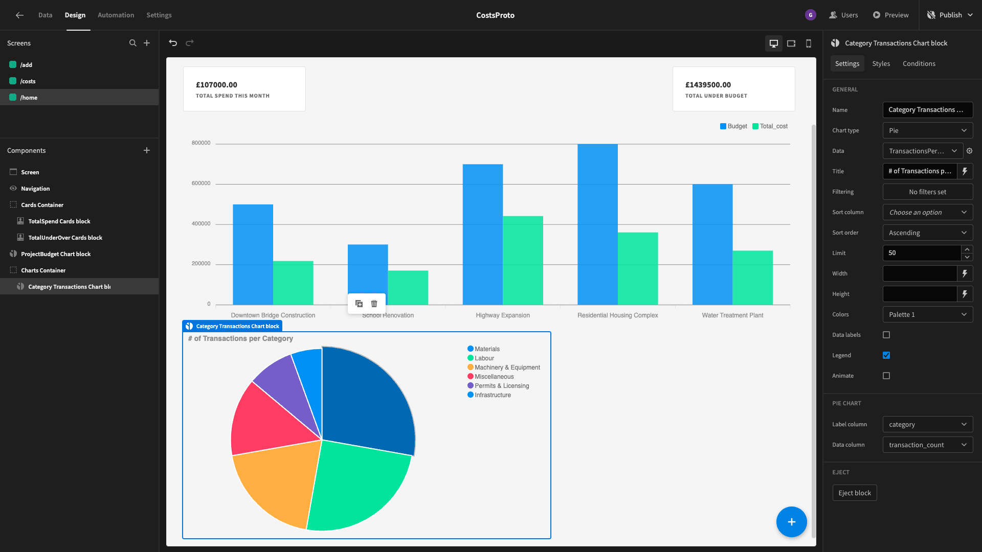
We can also give our new chart a title to make it clear what it represents:
Beside this, we want a line graph that displays our monthly expenditure for the year so far.
Let’s build one last query. We’ll call this one MonthlyExpenditureOverTime.
We want to select the numerical month and the sum of all of the amounts from the costs table for this year - grouped and ordered by month.
We can use this query:
SELECT
EXTRACT(MONTH from date_incurred) AS month,
SUM(amount) AS monthly_expenditure
FROM
costs
WHERE date_incurred BETWEEN (current_date - INTERVAL '1 year') AND current_date
GROUP BY month
ORDER BY month;
Which will return this data object:
{

 "month": "1",

 "monthly_expenditure": "4500.00"

}
We’ll add a line chart and set its data to this new query. We’ll set the label column to month and the data column to monthly_expenditure:

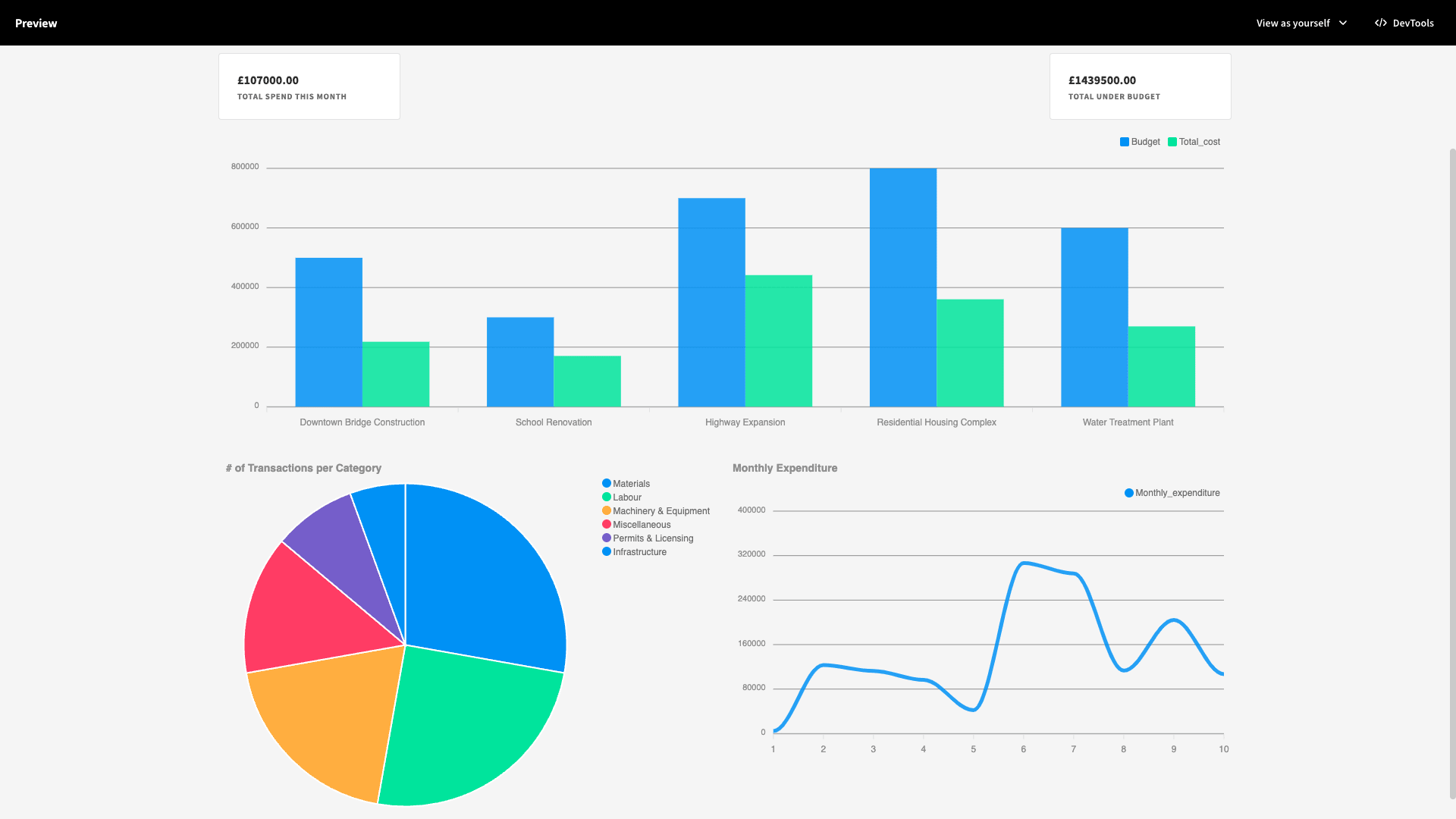
Here’s the full screen on desktop:
Optimizing our dashboard for mobile users
However, having our charts side-by-side isn’t going to look ideal on mobile devices. Budibase offers native responsiveness when we wrap components in containers.
However, we want to remove our custom CSS on the charts for mobile users - as well as display them vertically. So, we’re going to leverage conditionality rules instead. We’ll start by renaming our container full screen charts container to avoid confusion.
Budibase has built-in boolean variables for the current user’s device. We want to hide our component if either {{ Device.Mobile }} or {{ Device.Tablet }} equals true.
We can do this under the conditions tab:
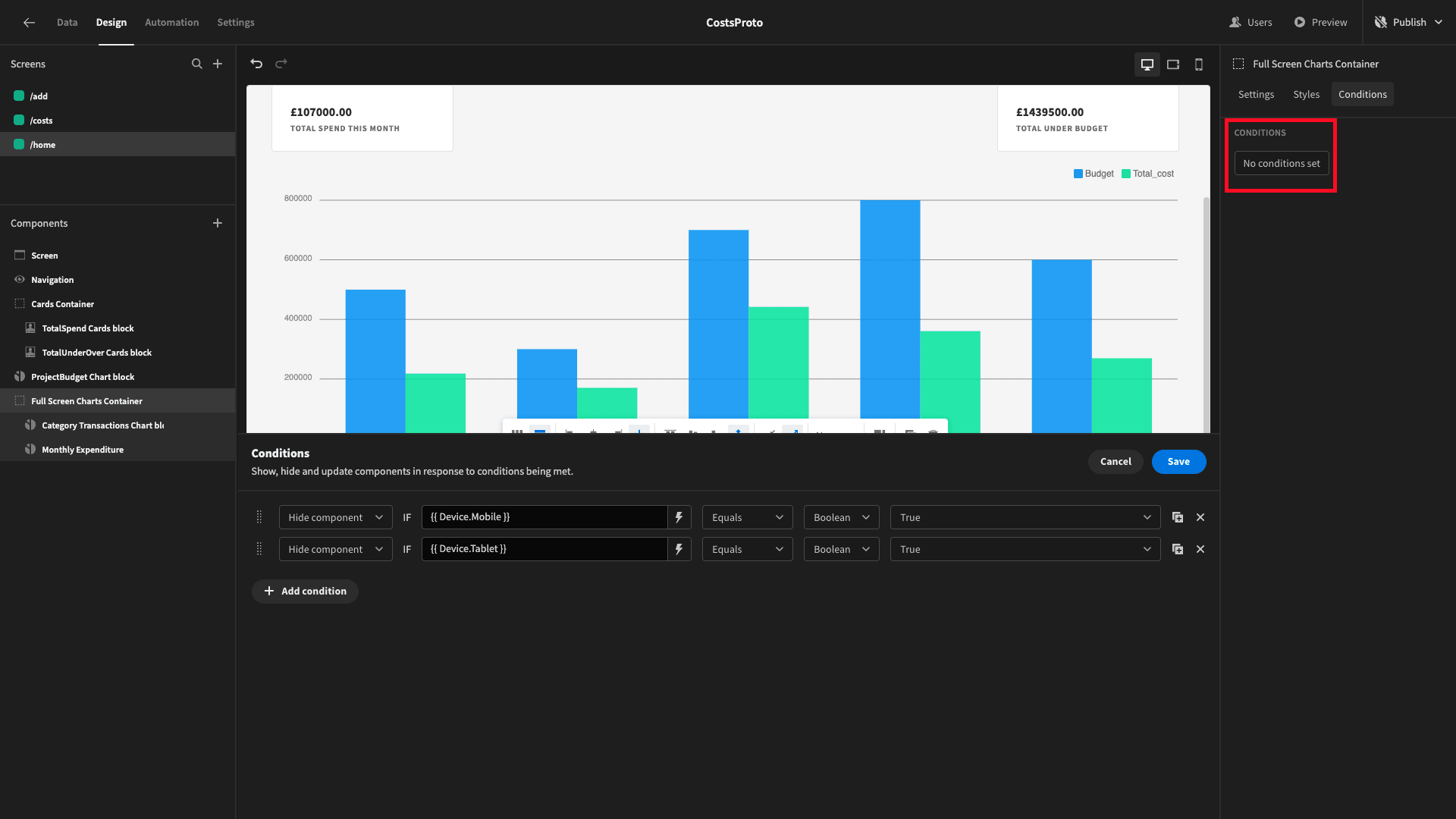
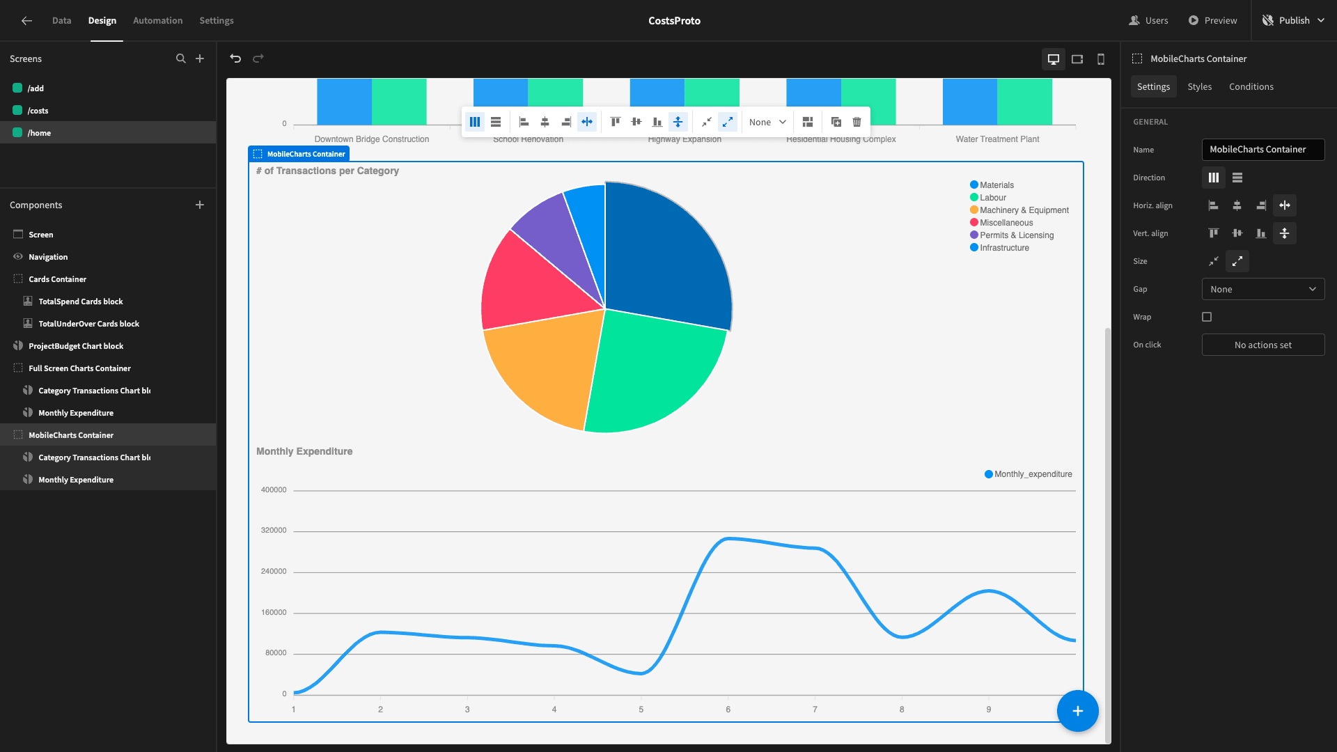
Now, we’re going to duplicate this container and set its conditions so that if it’s displayed if {{ Device.Mobile }} or {{ Device.Tablet }} are true.
We’ll also set the container to vertical and remove the custom CSS on our charts, giving us:
And that’s our project cost management software tool completed! To learn more about how Budibase empowers teams to turn data into action, be sure to check out our features overview.