Knowing how to build a dashboard is one of the core competencies for most knowledge-based jobs. Dashboards are the difference between raw data and clear, actionable insights.
Most of us can pull up a couple of pie charts based on a spreadsheet - or even use a visualization platform like Looker to create basic reports. But what happens when your business data doesn’t fit neatly into one of these tools?
See, businesses hold more data than ever before, but it’s rarely in just one place, in just one format. Instead, we often need to cut through a mess of databases, spreadsheets, SaaS platforms, and APIs to generate the insights we need.
This is where the reporting tools you’re used to can fall down - and, until recently - you might have found yourself running to internal developers to whip up a custom solution.
Today, we’ll see how Budibase empowers professionals to build advanced custom dashboards - with multiple data sources - for themselves. Even better - to do it in a fraction of the time you’d expect.
First, though, let’s think about a little bit of context.
What is a dashboard?
A dashboard is a very simple application that reports on key business data in real time. At least, they’re simple in theory, but in the real world, things can easily get a bit more complex.
The idea is that decision-makers have a UI that they can quickly access to check out a fixed report, that updates automatically - usually with a relatively small number of actual data points.
This means they don’t need to go searching through the data themselves every time they need a summary of whatever we’re reporting on - say, online sales figures for the month.
At a technical level, dashboards are made up of three layers:
- The data layer - Where our data is stored and queried.
- The presentation layer - The interface that users access to check out our report.
- The process layer - Where we carry out any transformations or processing to get our data from the data layer to the presentation layer, in the format we need - as well as cleaning your data.
The process layer becomes one of the more important steps to building a dashboard the more complex our data layer is. For example, if we’re querying one database or Excel table to create our report, we might not need much processing.
If we query two or more separate datasets - say a database plus Google Analytics and an Excel workbook, we’ll need to work a little bit of magic behind the scenes to unify these into a comprehensible report - and so on.
This is where traditional reporting tools, especially spreadsheets, fall down - they just don’t offer us enough capability to process and collate external data.
Therefore, anything but the most basic dashboards often need to be custom-built - typically as web apps or within more complex data visualization tools.
As we’ll see, Budibase offers a powerful alternative.
When are dashboards used?
Dashboards have countless use cases. These comprise any situation where team members need fast, easy access to a real-time, fixed report, business intelligence, or data analysis.
Often, this relates to internal goals and key performance indicators (KPIs), or other progress updates.
So, for example, departmental leaders will often use dashboards to understand how their team is progressing toward top-level strategic goals. For example, monthly revenue figures within sales or marketing departments.
In a product team, this could be used to monitor GitHub metrics in a faster, more intuitive way than we would get from GitHub itself.
Alternatively, dashboards can also be used to report on status updates - either internally or in a customer-facing context.
For instance, your IT team needs to make sure that all of your network infrastructure is running correctly. Uptime dashboards provide a fast, easy way to do this, as well as expediting the process of diagnosing problems if they do occur - which they might not be able to if they rely on a dashboard in Excel or Google Sheets.
Or, in a customer-facing context, we might use a simple web-based dashboard to let users check out the status of your new feature releases, or even check out important data relating to their own accounts.
The possibilities are basically endless.
How to make a dashboard with multiple data sources
As we said earlier, things begin to get a bit trickier when it comes to how to build a dashboard that requires a more complex data model.
This is because the more data sources we draw on, the more collation, aggregation, and other transformation functions we’ll need to get our data into a presentable state.
There are a couple of key things that can cause us problems here.
One is if we store data on the same entities in separate, unrelated data sources. For example, if we have a database with our customer and order information, but we also need to draw on our fulfillment platform for data relating to shipping times - with no formal link between the two.
In an ideal world, we’d have a preconfigured single source of truth to help us here, but the reality for most businesses is that we won’t. So, we’ll need to query both and then use our process layer to collate data from each about individual customers and orders.
The other scenario is if the required data sets differ in terms of their format. We’d still want to view these as a single data tab if they relate to the same entity - rather than multiple app screens.
Say we were building a sales dashboard that comprised data from our ecommerce site for online orders and our invoicing platform for enterprise sales. Even minor variations in how dates are formatted between these tools could skew our figures.
So, we need transformations to achieve consistency before we can present our data.
In terms of implementation, one nice thing about dashboards is that we’ve got a few different options for performing transformations - depending on how we build our dashboards, that is.
Broadly speaking, these are:
- Performing transformations within our data layer - for example, creating aggregated data sets that can be queried.
- Performing transformations with a separate process layer - for example, building them into our queries, or applying them to the output data before it’s called by UI elements.
- Performing transformations within our UI - for example, applying simple manipulations to individual values that are displayed by particular UI elements and chart types.
Each of these options offers distinct pros and cons, so they’re best leveraged in slightly different contexts. For instance, if we’re going to regularly apply the same transformation in different dashboards, it makes sense to create an aggregate data source.
If we’re going to utilize certain transformations throughout a single dashboard, performing these in a dedicated process layer is likely the best option.
For simple transformations that we only need in specific places, like rounding some values or basic mathematical functions, implementation at the UI level is often our best option.
Therefore, to build dashboards effectively, we need to be able to take advantage of a combination of these techniques.
We’ll see how Budibase handles each in the next section.
How to build a dashboard: step-by-step
Enough of the theory. You came here to learn how to build a dashboard - and that’s what we want to focus on.
To show off just what Budibase is capable of as a dashboard designer, we’ve opted for a relatively tricky use case. We’re going to build an online orders dashboard that draws on three different data sets.
These are:
- A Postgres database that stores our online order data.
- A Google Sheets table that stores our display advertising spend.
- A REST API that retrieves customer complaints data from an external tool - in our case, a separate Budibase app.
Here’s what the finished product will look like:
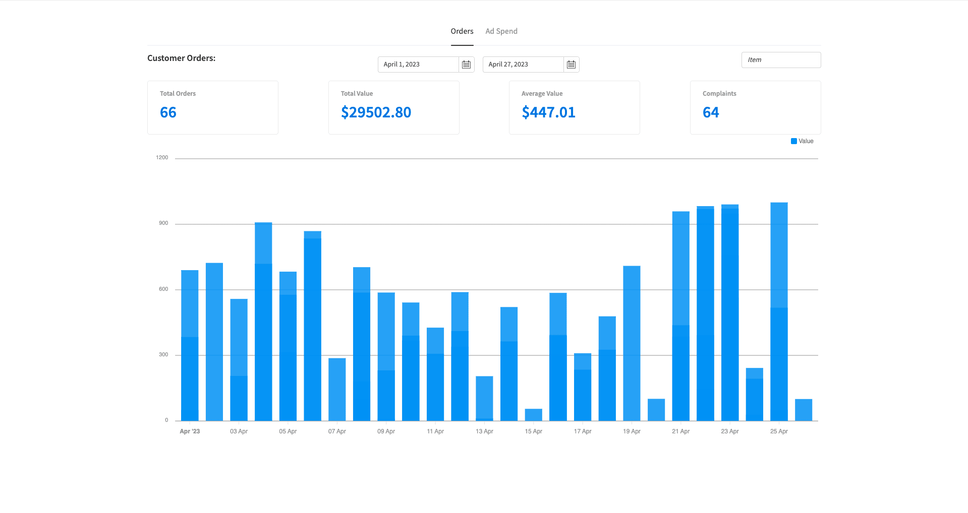
We have two tabs. The first, displayed above displays daily and total order volumes within a user-specified date range using line charts. Users can also filter by specific items.
The second also leverages a user-specified date range, this time showing our daily advertising spend and the return on this over the period selected:
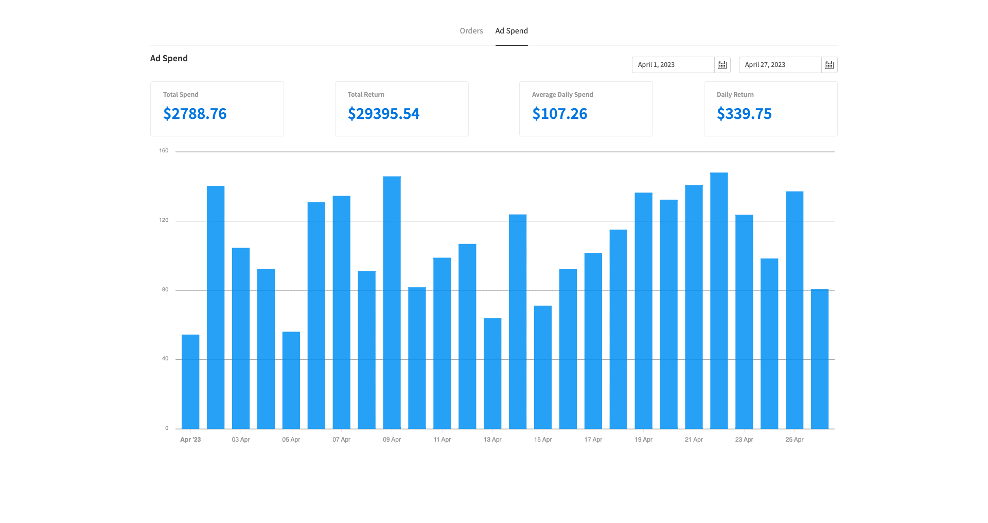
There’s actually quite a bit going on behind the scenes here, so let’s take things one step at a time.
Here’s how to build a dashboard in Budibase in 5 steps.
1. Define your goals
The first step when it comes to building a dashboard is figuring out what we want to achieve. As far as requirements-gathering exercises go, this is relatively straightforward. The big decision is simply what data we need to communicate.
In our case, we want to display the following for specified date ranges:
- Daily online sales figures.
- Sales volumes and total values.
- Average daily order values.
- Total customer complaints.
- Daily advertising spend.
- Total advertising spend.
- Total return on investment.
- Daily return on investment.
Once we know this information, our next step is to figure out where we can get the data that we need - taking into account any additional functionality we need for user interactions. For example, we want users to be able to filter our dashboard by individual items.
Therefore, we’ll need to account for this when choosing data sources.
We’ve already outlined where our data is going to come from, but in the real world, you’d need to do a bit of research on your business’s own data assets to figure this out.
Once we’ve determined exactly what we want to build, it’s time to create a new Budibase application.
2. Create your data layer
When we create a Budibase app, we’ll be prompted to choose a data source:
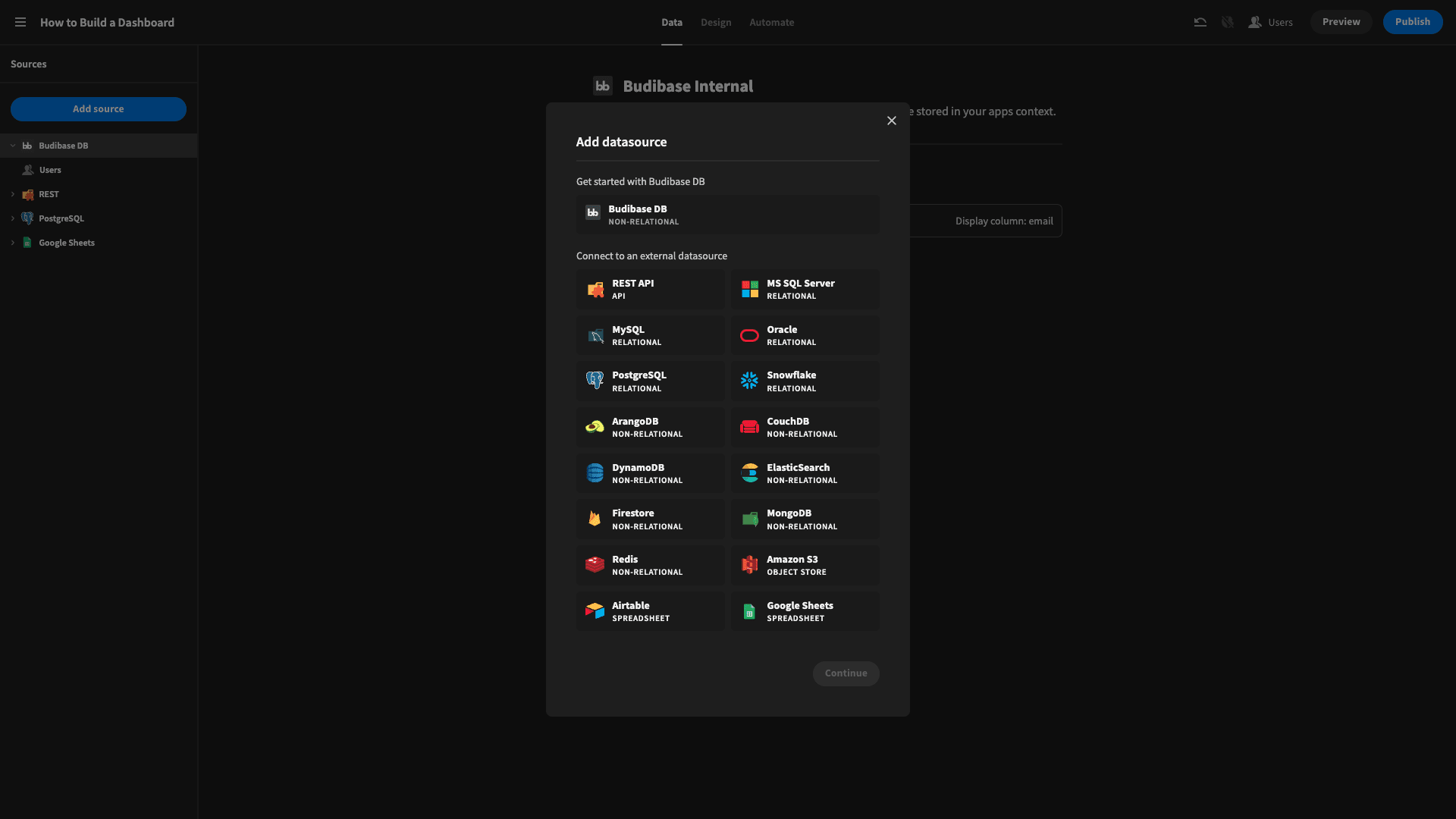
Recall, we’re going to use a Postgres database, a REST API request, and a Google Sheets table - so we’ll actually need to create three separate data sources. This will give us far superior functionality compared to creating an Excel dashboard.
We’ll start with our Postgres table. When we click on Postgres, we’ll see the following form where we can enter our credentials and fetch our tables:
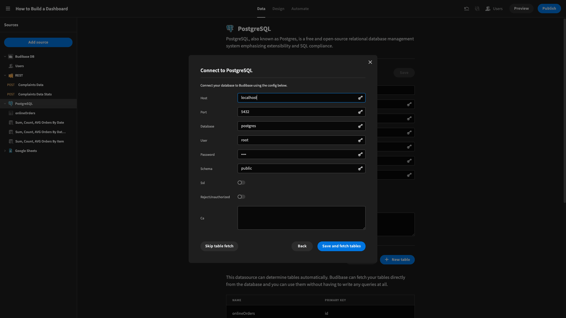
Our demo database only has one table, but if we had multiple, we could select the specific ones we need to access.
Fetching tables imports everything we need into the Budibase builder UI:
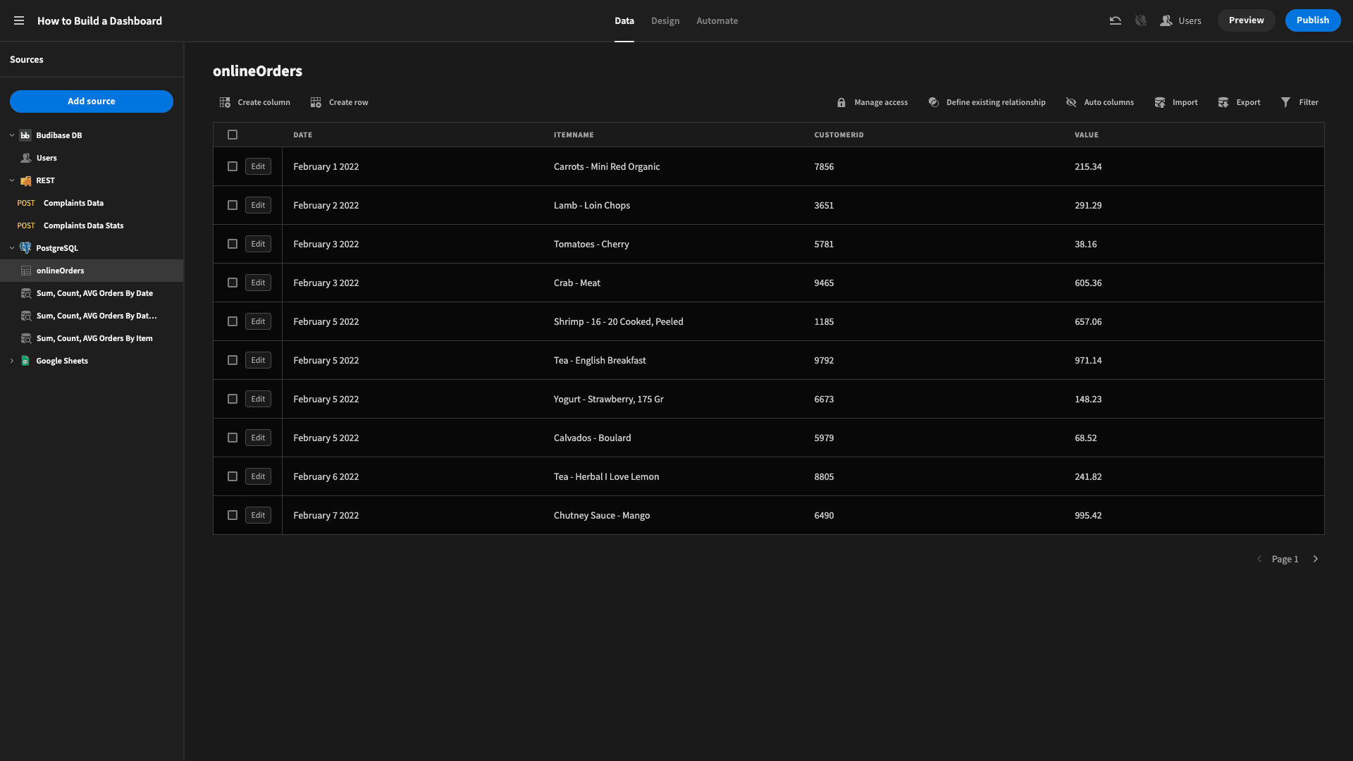
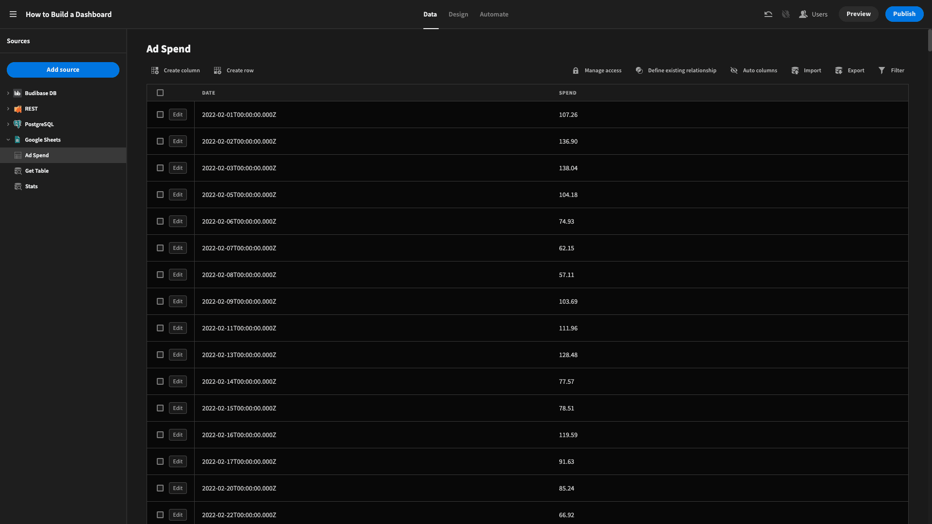
Next, our Google Sheets table. This time, we only need to sign in to Google and paste in the URL of the spreadsheet we want, then we can fetch our tables just like before:

Et voila.
Finally, our REST data source. We’re using this to connect to an external Budibase app, but you could do something similar with any other platform that offers a public API.
We’re using a POST request targeting a URL with the format:
{{baseUrl}}/tables/:tableId/rows/search
Here, {{baseURL}} is the location of our Budibase tenant - so something like your-tenant.budibase.app for a cloud-based account. :tableId is the ID of the table we want to target.
We’ll pop this into the URL box and then add two headers:
- x-budibase-api-key - for our unique API key.
- x-budibase-app-id - for the ID of the specific Budibase app we want to target.

We can get our API key from the menu in the top right corner of the screen and the app ID from the manage section of any published app.
Once we’ve filled in those details, we can send the request to make sure it works. This is the JSON object that our’s returns:
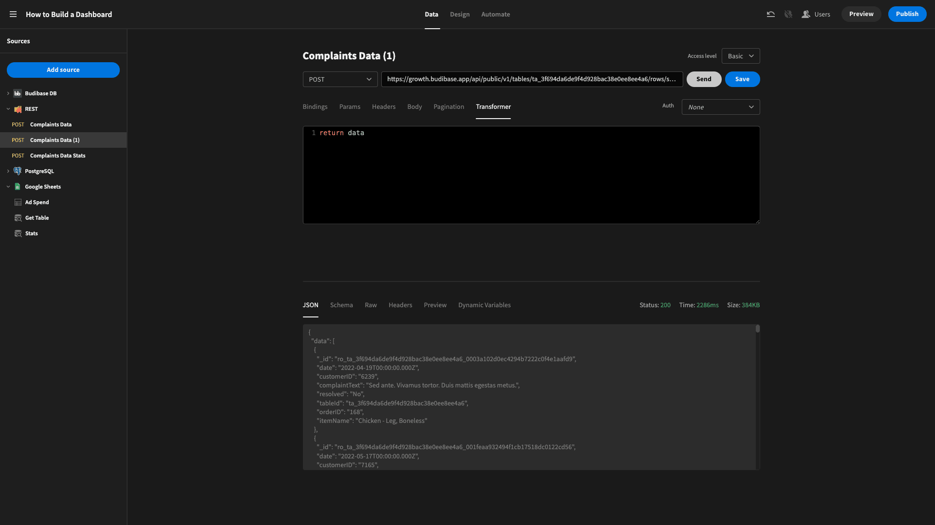
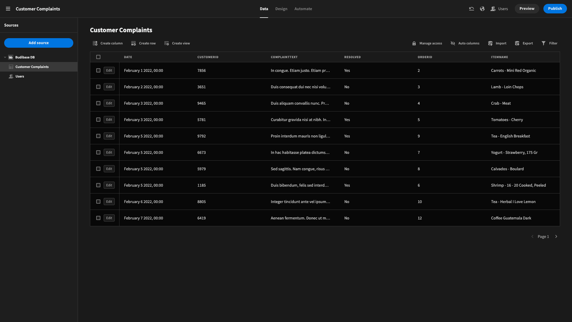
For context, here’s what the table looks like in the app we’re requesting the data from:
So, now all of our data sources are connected, we can start performing any transformations we need to get the information into a usable format.
3. Perform transformations
We’re going to apply the bulk of our transformations within the Data section of Budibase. In terms of traditional app architecture, this will form the equivalent of our process layer. We could also supplement this with our built-in Automation editor.
But, for our purposes today, we can do everything we need without going down that road, so there’s no sense in over-complicating our app.
Here are the transformations that we applied to each data source.
Postgres
The daily sales figures for our dashboard can be accessed from our Postgres table as is. However, we need a couple of custom queries to get the summary figures for our order count, total value, and average value.
We’ll use one query to do this, filtered by date, and a second to do the same, filtered by date and item name.
So, we start with a SELECT statement for:
- SUM(“value”) - the total of all of the values.
- COUNT(“id”) - the number of unique IDs.
- AVG(“value”) - the average of all of the IDs.
- COUNT(“date”) AS “days” - the total number of unique dates, presented as a variable called “days”.
To filter this by date, we need to create two bindable values that we can include in a WHERE clause - for user-defined start and end dates:
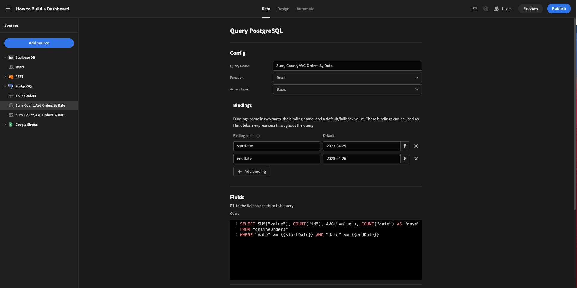
We’ve called these startDate and endDate, and given them default values that we know match some of our rows. We can call these in our customer query as {{startDate}} and {{endDate}} respectively.
Our completed query looks like this:

The transformer box is set to return data by default, which we’ll keep. So, when we run the query, we get the following object:
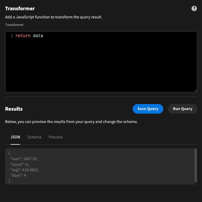
This looks good.
We can then duplicate this query, and add a third binding called itemName to the new version - and add this to our WHERE clause, so our query this time is:

And that’s everything we need for our Postgres table.
Google Sheets
Next, we’ll check out Google Sheets. This time, we just need one custom query - again, to get the same statistics as before for our specific date range. We’ll start by creating bindings again for startDate and endDate - this time with arbitrary default values:
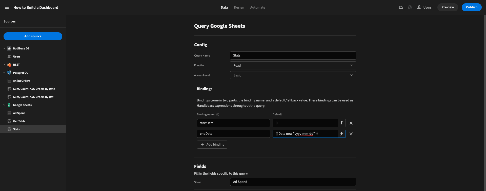
We can’t query Google Sheets with SQL, so we need to use JavaScript to perform our desired transformations on the data that’s returned when we read the table.
We need to do the following:
-
Create a new variable called responseData and set this to the data that Google Sheets provides.
-
Create an empty array called outputData.
-
Create three variables called totalValue, count, and avgValue - and set each to 0.
-
Use a for loop to iterate over responseData.
-
Use an if statement to assess if each row’s date falls between our specific range. If so:
-
- Add each of these rows’ Spend attribute to our totalValue.
- Increment our count variable.
- Set avgValue to (totalValue / count)
- Wrap these values in an object called rowData, with the keys “sum”, “count”, and “avg”.
-
After our for loop the final value for rowData is pushed to the outputData array.
-
Return outputData.
The Budibase JS editor is a little small for pulling clear screengrabs, so here’s what this would look like in VS code:
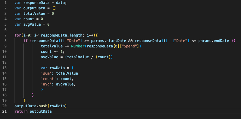
And here’s the JSON response when we run our query:
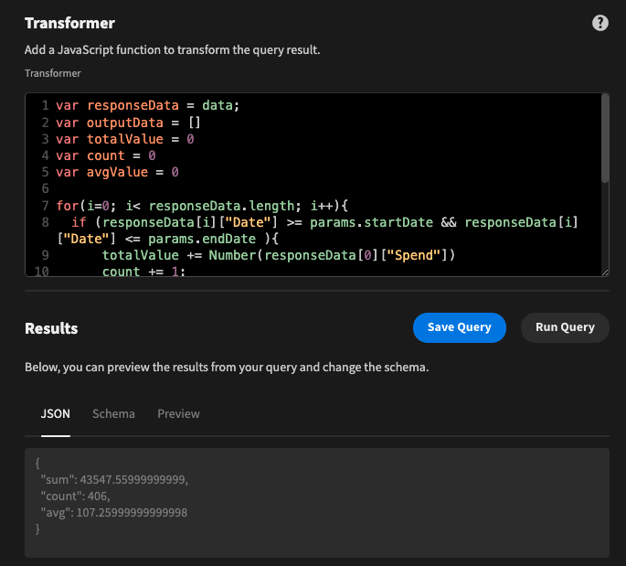
Note that in JavaScript, we access our bindings with the expression params.bindingName.
Hit Save Query and we’re done.
REST API
Lastly, we need to apply some similar transformations to our REST response.
First, if you were eagle-eyed, you’ll have noticed that the response earlier was wrapped in an object called “data”:
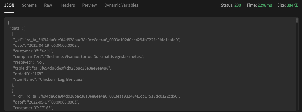
Each entity also includes some attributes we don’t strictly need, like the table’s autogenerated row _id and even the tableID.
So, we’ll do a little bit of cleaning up before we start using this in our UI.
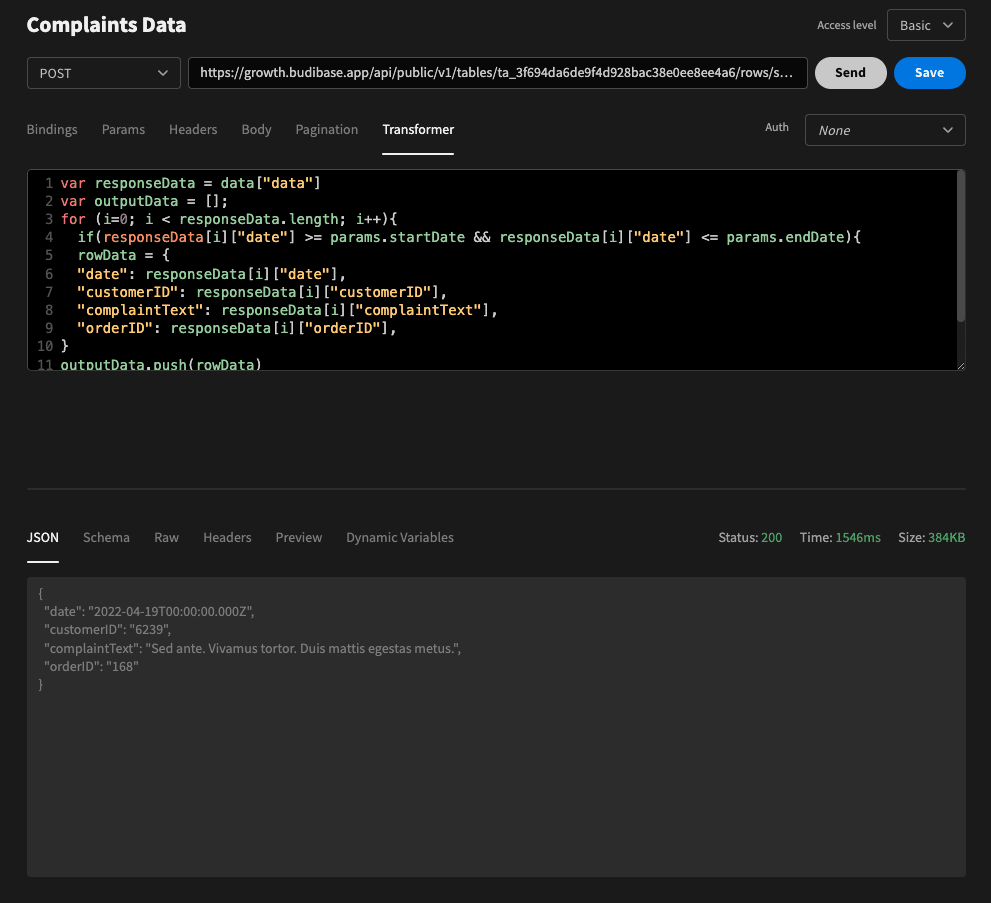
We’ll start by creating the exact same startDate and endDate bindings as before. We’ll then use basically the same script as before, but with a couple of key changes:
- We set responseData to data[“data”] - to access the contents of the “data” object - and then create an empty array called outputData
- We iterate over responseData and add the same if statement as before.
- Inside the if statement we create a rowData object with the keys “date”, customerID”, “complaintText”, and “orderID”, with values for the respective attributes from the current row in the iteration.
- We then push rowData to outputData inside the for loop, adding each row to our array.
- We return rowData.
Again, we’re how this would look in VS Code:

And here’s the output:
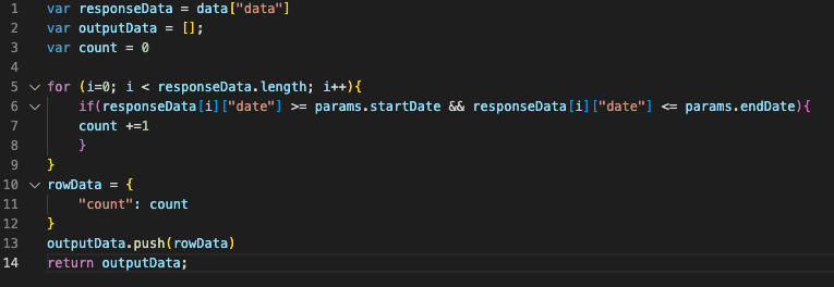
Then, we’ll duplicate our request, and write a new transformer to grab count of our complaints for a given date range.
This works just like the stats in our Google Sheets query, so we won’t go through it all again. Here’s the code:
And the response:
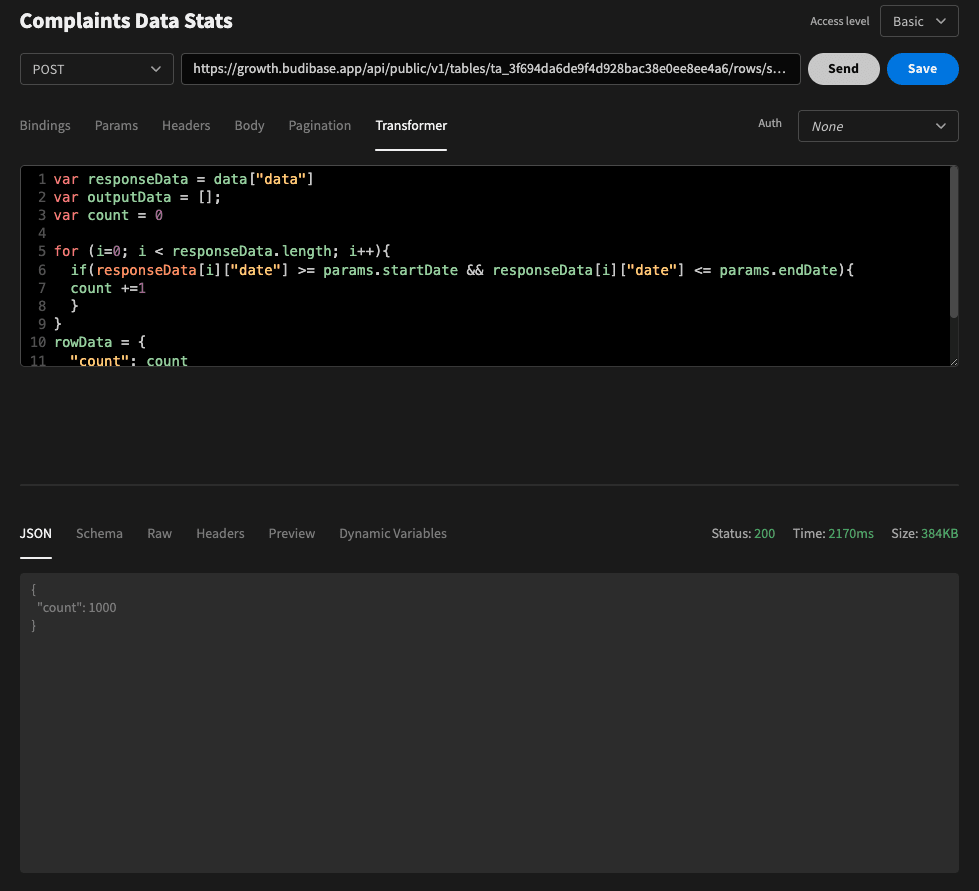
We’ll do a little bit more aggregation and reformatting as we build out our UI, but that’s the bulk of our transformation complete.
4. Build your UI
Next, we can start building our UI. Our dashboard is actually just one screen, but we’ve created tabs to flick between two slightly different reports.
Here’s the component tree for the overall layout and the Online Orders tab:

As you can see, we’ve just got one bar chart, a few stat cards, and three data providers with repeaters.
Here’s what that looks like in situ:
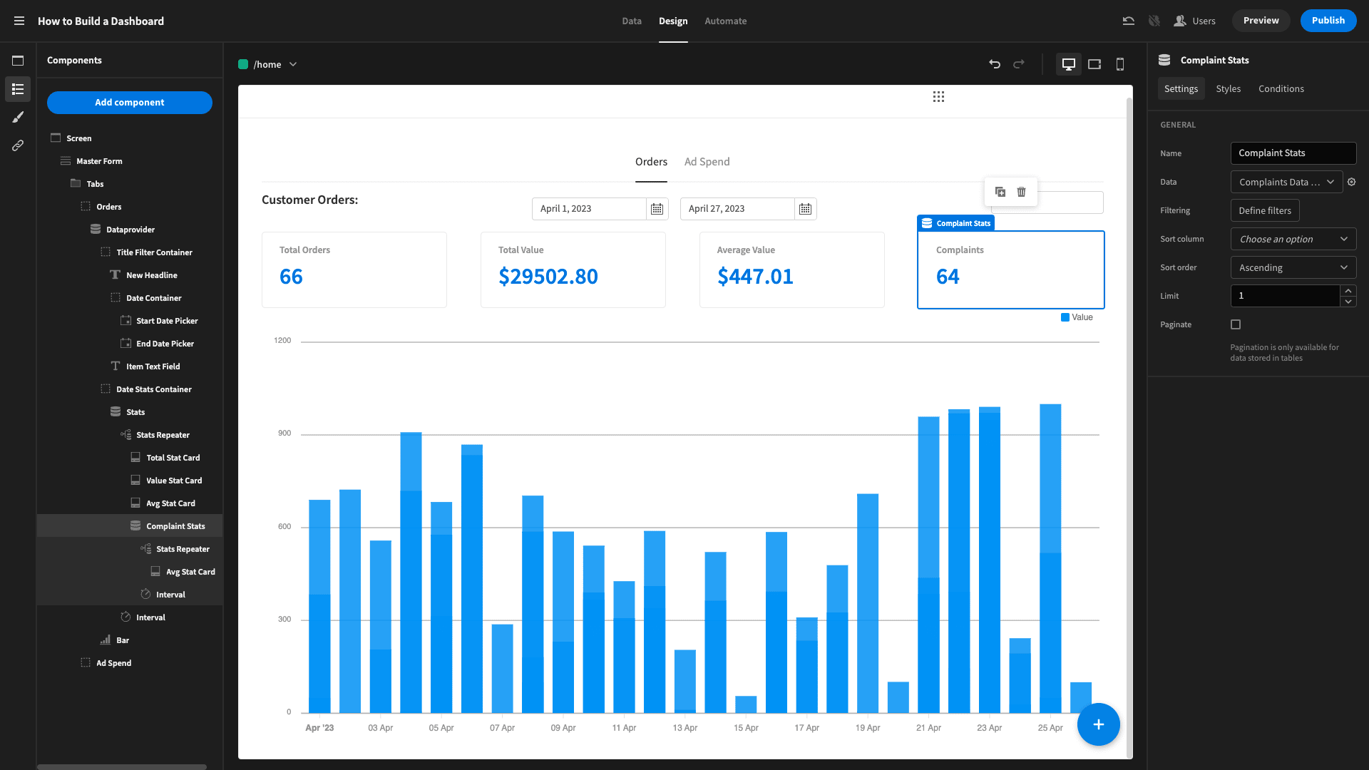
Let’s see how we’d build this, one step at a time.
Tabs and layout
We’ll start by creating a form to wrap everything, as this will allow us to filter data a little bit later using form field components.
We’ve called this Master Form.
Inside, we’ve added a Super Tabs component - which is actually a custom plug-in. It’s publicly available though, so you can grab the URL from our plug-ins repo and paste it into your accounts plug-ins section.
Basically, this creates tabs based on any components nested directly inside. It’s pretty nifty.
We’ve put two containers inside our Super Tabs, called Online Orders and Ad Spend. Here’s how this looks so far:
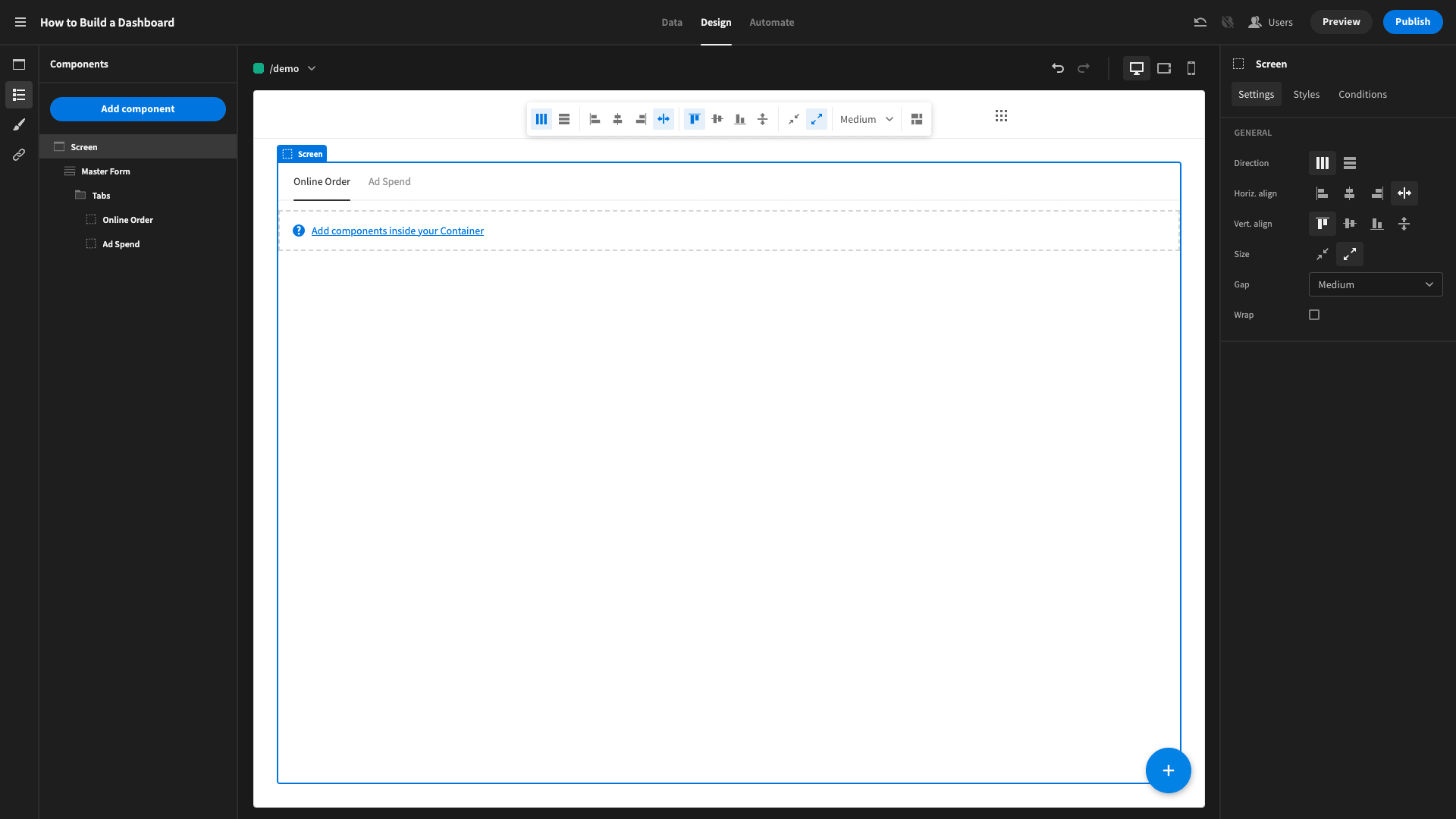
We’ll build our two reports inside these tabs.
Cards
Next we’ll add our stat cards. First, we add a Data Provider set to our SUM, COUNT, AVG by Date query to our orders table. Inside this, we’ll add a horizontal repeater and three stat cards with titles Total Orders, Total Value, and Average Value.
We’ll use handlebars expressions to bind the values for these to the sum, count, and avg attributes in the query response respectively, and add in dollar signs where we need to.
For example: {{ Stats Repeater.Sum, Count, AVG Orders By Date.count }}
Our fourth card will be the count of customer complaints, so we need an extra data provider and repeater pair inside our existing repeater to access this. We’ll set our new provider to the Complaints Data Stats query, and add a fourth stat card inside its repeater.
The title for this is Complaints and the value is bound to the count attribute.
This is what our cards look like for the Online Orders tab:
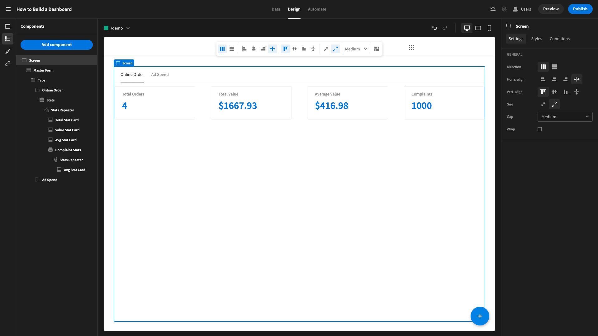
We’ll copy this and paste it into the Ad Spend Tab, then change the first data provider to the Ad Spend Stats query. This time, our cards are going to show:
- Total Spend.
- Total Return.
- Average Daily Spend.
- Daily Return.
The first and third cards can be bound to the sum and avg attributes from our updated existing data provider, plus dollar signs.
Cards two and four will need to be wrapped in data providers for our online order stats. So we’ll wrap these in data provider and repeater pairs, with the data source set to our SUM, COUNT, AVG by DATE query.
We’re going to use a bit of JavaScript to get aggregate values for these.
So, our total return is the revenue we generated - which is stored in Postgres - minus what we spend on advertising, as stored in the Google Sheets Table.
We use the following JavaScript as the card’s value, returning it to two decimal places:
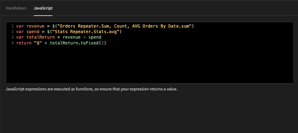
Then for the daily average return card, we use a JavaScript binding to take the average advertising spend away from our daily average revenue:
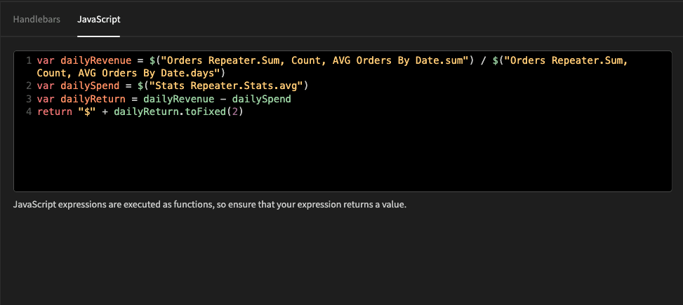
And that’s our cards most of the way there. We’ll update these to account for our user-defined filtering shortly to finish them off.
Charts
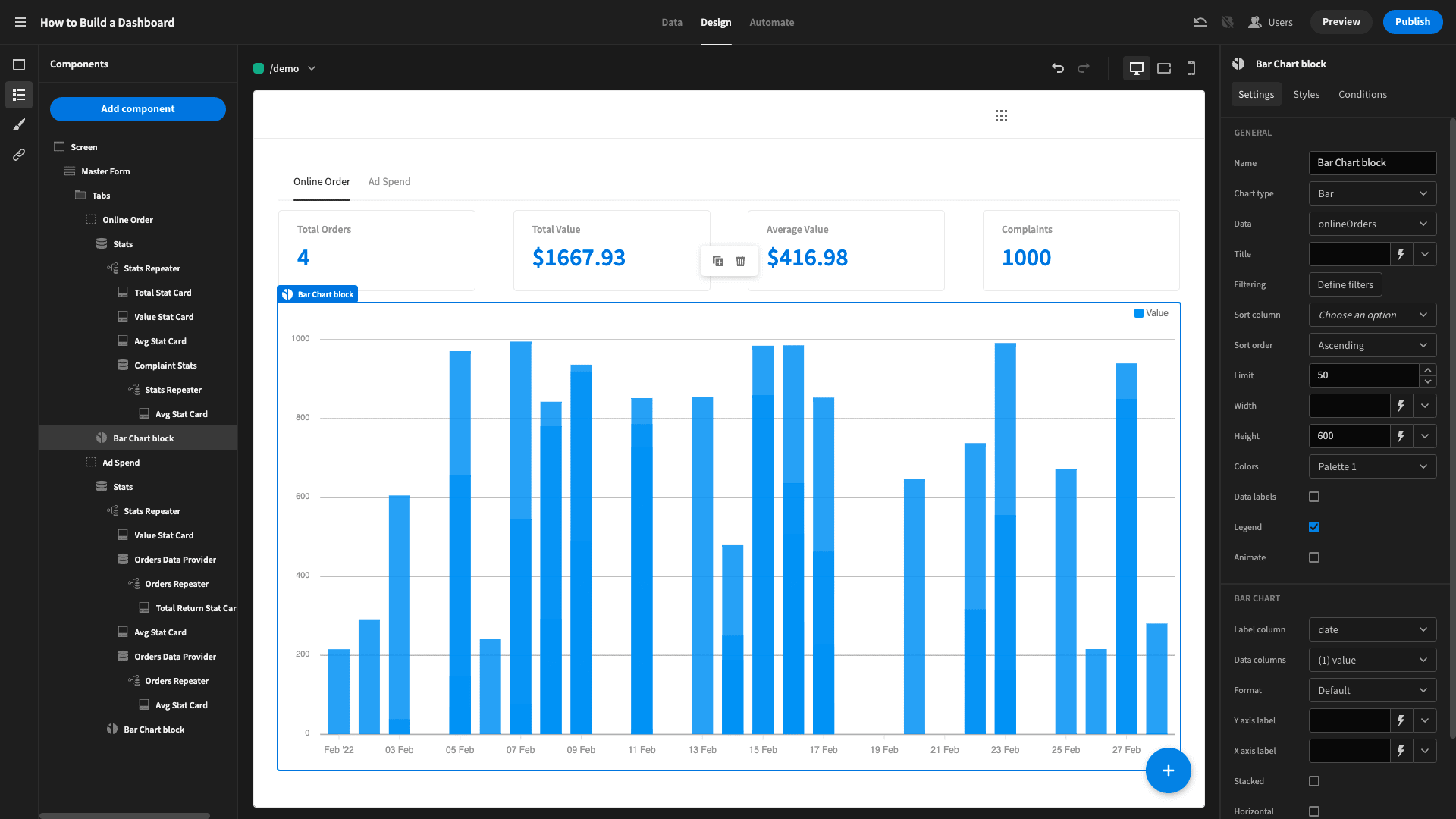
Next, we’ll add a Chart Block to the bottom of each report. For the first, we’ll set the data to onlineOrders, the label column to date, and the data column to value. We’ll also change the height setting from 400 to 600, to make it a little taller.
We can also use custom CSS to perfect our chart’s area.
Then, we’ll do the same with our Ad Spend tab, this time using Ad Spend as the data, Date as the label, and Spend as the data column.
You might also like our guide on how to build a Google Sheets GUI.
And that’s it:
User filtering
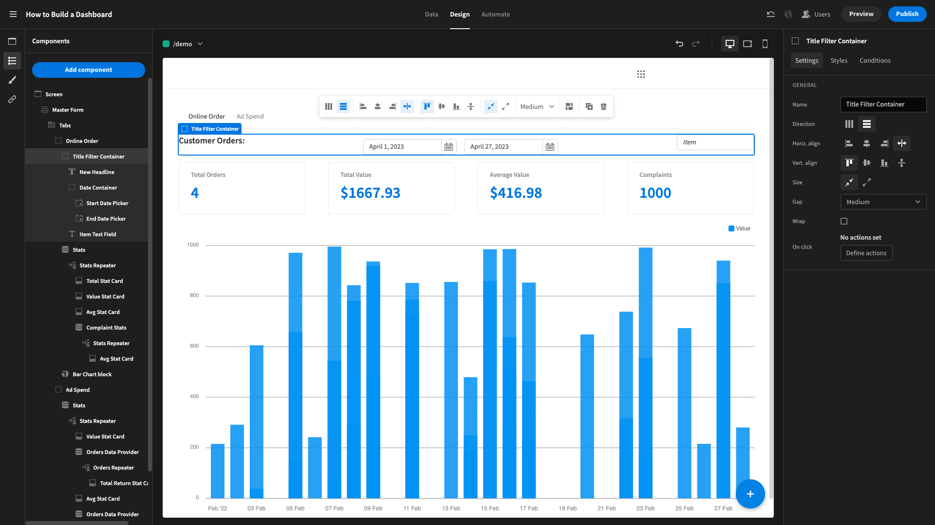
Next, we’ll add our filtering UI. On the Online Orders tab, users can set a date range and filter by item name. On the Ad Spend tab, they can just set a date range.
We’ll create a horizontal container at the top of our orders tab. Inside this we’ll place a:
- Title component.
- Two date pickers inside another horizontal container, with their fields set to startDate and endDate.
- A text box, with the field set to itemName.
This looks like this:
Now, we need to set these to alter each of the data providers. For the custom queries, we’ll click on the cog beside the data dropdown and set the bindings to our form fields value:
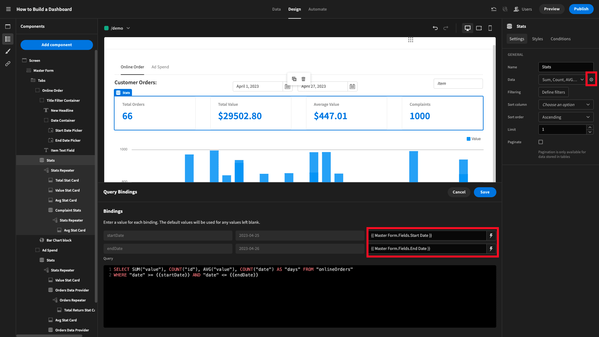
Repeat this step for all of our data providers.
Then for our charts, we’ll need to use the Define Filters menu to create equivalent filtering statements:
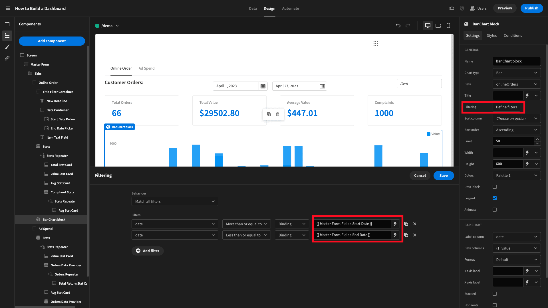
You can repeat this exact process for the Ad Spend tab, but simply leave out the Item Name text field.
Finally, we also need to make our data providers filterable by item, but only if the text field isn’t empty.
For each data provider, we add a condition to update the data to our other custom query that includes the itemName binding, whenever the form field is not null:
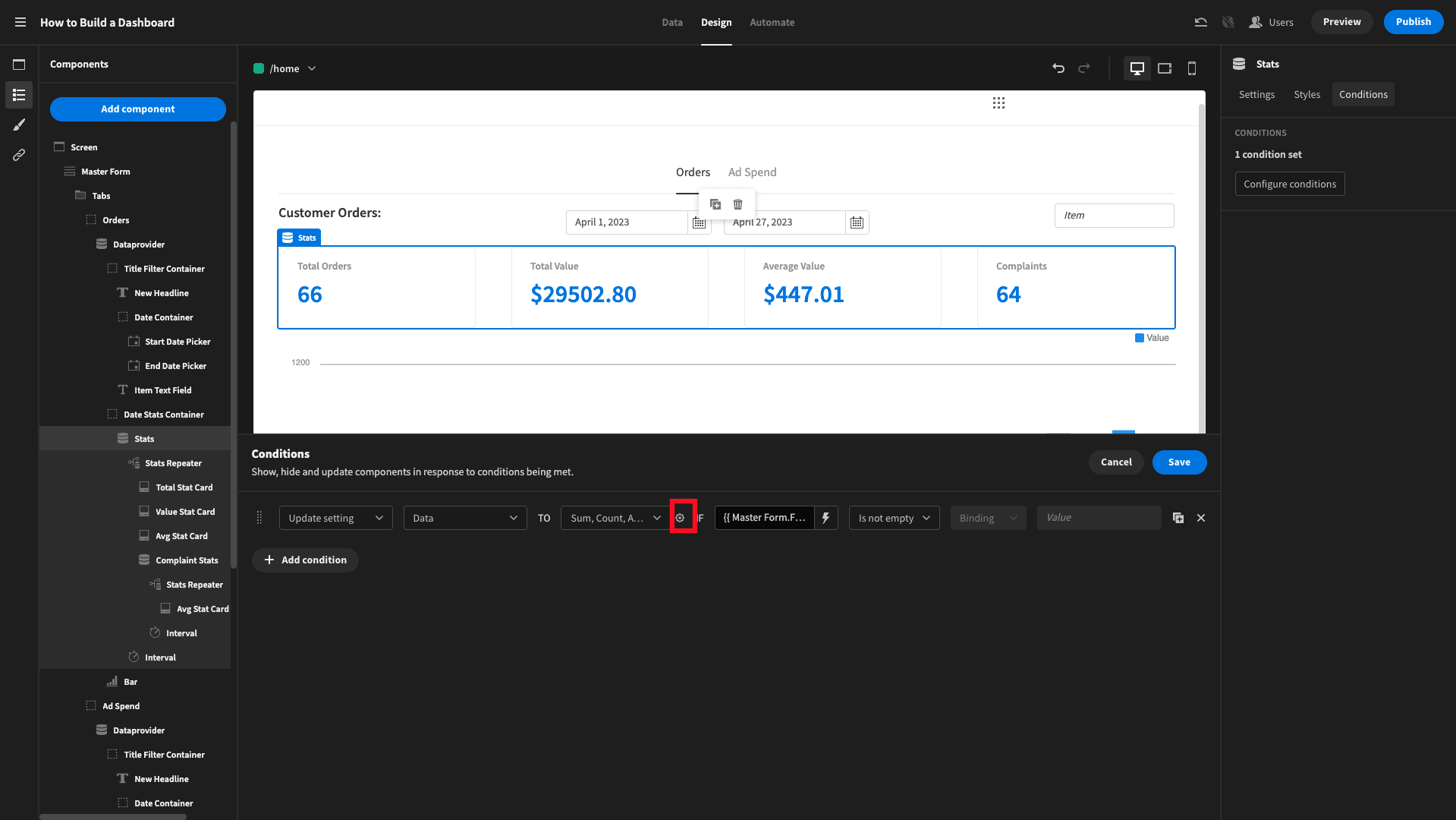
Use the cog icon highlighted above to access the bindings menu and set the itemName value to the form field input:

And you can create a condition similar to this for the chart block’s data and filtering to finish it off.
Now, we have all of our data displayed and filterable by user inputs.
For more inspiration, check out our round-up of examples of web applcation design.
Adding realtime refreshes
We’re just going to add one more little trick to our dashboard, using another custom component plug-in. This one is called the interval component.
This lets us define an interval in seconds, and an action to perform each time this is met.
We’re setting ours to 120 seconds, so it goes off every two minutes, with an action to refresh any data providers it’s nested inside. We’ll eject our chart block to expose the data provider inside it.
Then we’ll place an interval component inside every data provider:
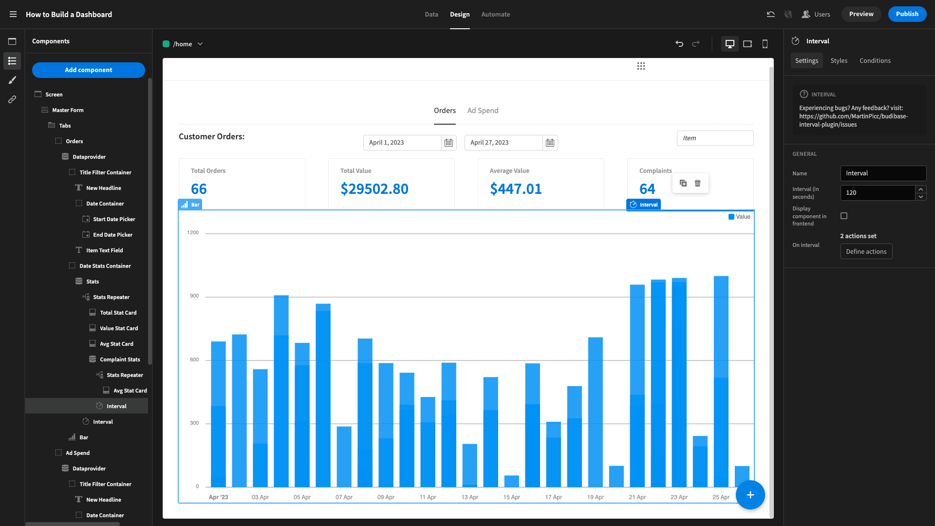
Where we have data providers nested inside other data providers, we can nest an interval within the innermost one, and set multiple actions to refresh them all.
Now our dashboard will display our desired data in real-time, with a two-minute refresh rate. So, we’ll never be dealing with out-of-date figures. All of the data providers will also refresh whenever the screen is reloaded or refreshed.
You might also like our guide to building an employee management app.
5. Design tweaks and UX
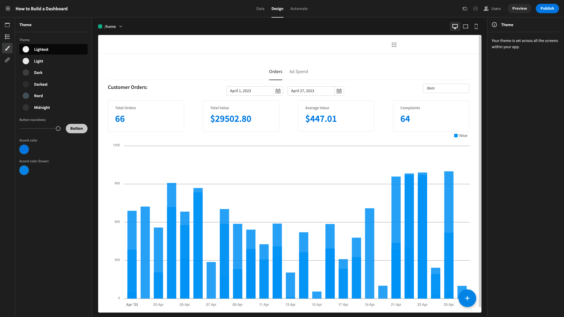
Finally, we’ll tweak our design a little bit, just to make it a bit more appealing for users. First, we’ll set our theme to Lightest:
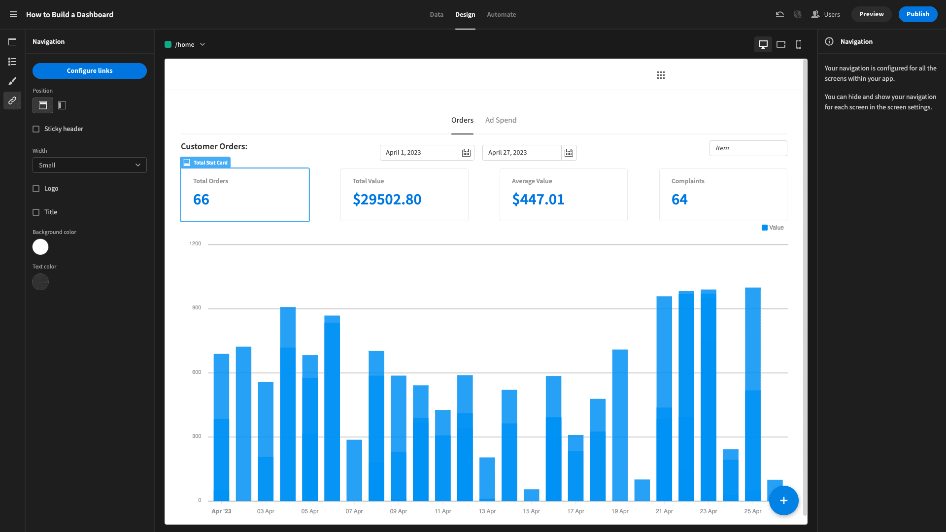
Then we’ll remove any navigational elements, the app logo, and the title, to give it a cleaner look:
And we’re done!
Here’s our finished app again:

To learn more, why not check out our ultimate guide to data management software solutions?
Turn data into action with Budibase
At Budibase, our mission is to help teams turn data into action. IT teams are under more pressure and businesses are more reliant on data-driven decision-making than ever before.
Let’s check out how Budibase empowers busy IT professionals to do more with less.
Our open-source, low-code platform
With intuitive design tools, autogenerated screens, extensive data support, and immense extensibility, our platform is the fast, easy way to build all kinds of custom web apps.
Our platform is the perfect way to build easy-to-understand, interactive dashboards that work seamlessly on desktop and mobile devices.
Check out our features overview to learn more.
Connect to external data
We lead the pack for external data support. Budibase offers dedicated connector UIs for SQL, Postgres, Google Sheets, Airtable, REST, Oracle, S3, Mongo, Couch, and more. Wherever your data lives, Budibase is the easy way to build professional UIs around it.
We also have our own built-in database with full support for CSV uploads, as well as an internal API.
Build automations
Build custom automation rules with minimal manual coding. Our built-in automation editor features an array of nestable, configurable actions and triggers, with support for looping and conditional logic.
You can even leverage external data and events within automation rules, using Zapier, webhooks, and REST.
Optional self-hosting
Budibase offers optional-self hosting. Deploy to your own infrastructure, using Kubernetes, Docker, Docker Compose, Digital Ocean, and more.
Or, choose Budibase Cloud, and let us handle everything. Check out our pricing page to learn more about both options.
Custom plug-ins
At Budibase, our design philosophy is simplicity by default; extensibility when you need it. So, we launched custom plug-ins. Build your own data sources and components, and ship them across all of your Budibase builds.
Check out our plug-ins documentation to learn more.
Configurable RBAC
Budibase makes it a breeze to perfectly balance security with user experience. Assign users to preconfigured roles and grant or restrict access at the level of data sources, queries, automation rules, screens, or individual components.
We also offer free SSO and user groups, so you can manage access however you need.
50+ free app templates
Budibase is the ideal solution for building all kinds of internal tools. To prove it, we’ve created more than fifty free, deployment-ready, and fully customizable app templates - including a whole raft of dashboard templates.
To start building web apps the fast, easy way, sign up to Budibase today for free.