The humble table is the core of almost any data-centric app interface. Table UI design is central to how your users find, view, and interact with all kinds of information.
With such a fundamental role in your tools, the design of your tables and the screens that contain them can have an outsized impact on your overall user experiences.
Today, we’re going to look at some of the top ways you can design your tables for maximum efficiency, usability, and effectiveness.
But first, let’s take a step back.
Why does your table UI design matter?
Data tables play a deceptively important role in your app UIs. Specifically, they enable users to interact with the data they need, at any moment. This can be as simple as quickly viewing a specific database entry or searching a table to find specific information to drill into.
In other words, tables are the first component users will encounter while carrying out a vast range of tasks.
For example, if a user wants to do anything that involves updating an existing database entry, they first need to find the right one and access its edit screen.
The faster they can do this, the more efficient any subsequent workflow will be.
Therefore, optimizing table UIs is one of the first things you should look to do within any wider UX optimization project.
With Budibase, we can autogenerate fully functioning, customizable table UIs based on connected database tables in under a minute.
Join 300,000 teams running operations on Budibase
Get started for freeWhat makes an effective table UI?
So what does success look like here?
Tables essentially play three roles within a data-focused application:
- Allowing users to read and search multiple database entries at a time.
- Displaying attributes that allow users to identify the correct entry for their needs.
- Empower users to take action on their desired rows.
Of course, there are variations within this formula. These relate to the complexity of your app, including its actual functionality, along with its data model.
Say you ran a franchise business, and you wanted to build a sales leaderboard to track how each of your locations is performing. If you only had a handful of stores, you could simply display each one’s unique identifiers, as well as its current revenue for the month.
Here, the table would be the extent of the UI you’d need.
However, for a larger franchise business, you’d probably need to flick between aggregate data points for different regions or countries, as well as drilling into the figures for individual stores.
In this case, the table component itself would likely only be one part of a wider dashboard interface.
You might also like our ultimate guide to workflow management.
Our 14 tips for table UI design
So much about the theory. Our goal today is to give you actionable tips for how you can build better, more streamlined table UIs for your users.
Let’s jump right into our 14 tips.
1. Keep it simple
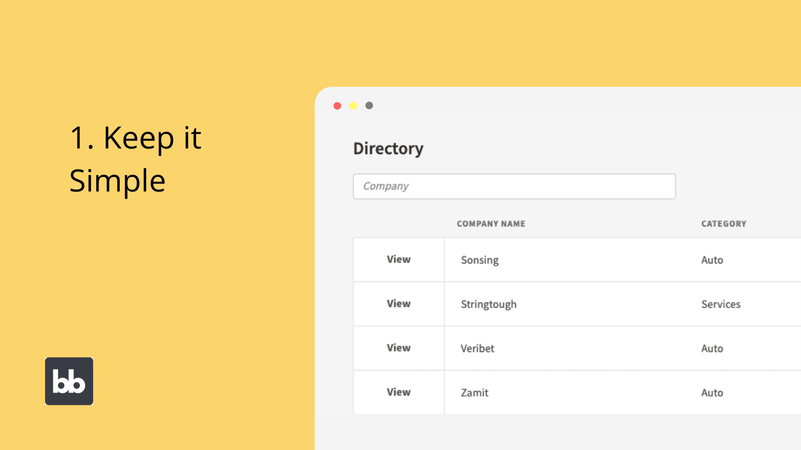
One of the core principles of UX design is to avoid overloading users with excessive information and reduce the visual noise in interfaces. When designing tables, this is especially important, as you have a limited amount of horizontal space to play with.
As such, you’ll need to carefully consider the attributes your tables will display, especially if you don’t want these to exceed the width of users’ screens.
Typically, you’ll want to include your unique display columns, along with any other attributes users are most likely to need access to at a glance. For example, if your data set was a simple client contact list, you’d probably include:
- The organization name.
- Your contact person.
- The phone number or email.
- The category.
Any more in-depth information could then be accessible through a separate details screen.
In other cases, you might opt to include more fields and allow users to scroll horizontally across your table, as well as vertically. For example, in information-heavy enterprise app UIs we might want to prioritize fast data access over aesthetics.
2. Understand your users
In any design project, it’s vitally important that you understand your users. This includes their technical skills, UX preferences, their core problems, and the workflows that your apps sit within.
That is, many of the design decisions you make will be informed by the context of how your tools are used.
With data table design specifically, there are a few different ways that this can play out.
For example, if we had a userbase that we knew had low levels of technical literacy, we’d need to reflect this in the design of our tables. This could mean reducing the number of actions available from our table interfaces, to provide clearer user flows.
Similarly, if we knew our users had additional accessibility needs, we could opt for larger text, more prominent CTAs, or more spacing between different on-screen elements.
We’ll look at accessibility in more detail a little bit later.
3. Create mobile-friendly tables
You’ll need to consider whether and how to offer support across different kinds of devices. Table UIs are some of the trickiest interfaces to build for mobile users. Naturally, it’s difficult to build an effective table interface for a long, narrow screen layout.
Most often, only one or two columns will fit on the screen at a time.
This creates a few different challenges. For one thing, horizontal scrolling is fairly counterintuitive on mobile devices. This will also create usability issues if you have clickable rows.
As such, if you have a table that you want to use to display a lot of information on mobile devices, it’s best to use embedded buttons for any click-through actions, rather than clickable rows.
There’s also a greater impetus to limit the number of columns you display to mobile users.
We might also decide that we want to offer more limited filtering options on mobile devices so that we don’t clutter smaller screens.
Of course, this means that we’ll need to display different table UIs to different users.
This leads us neatly onto tip number four.
4. Leverage conditionality
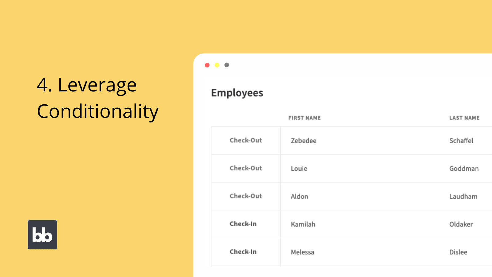
Conditional design means creating rules that govern how different components appear in your UIs. These can be based on user data, behavior, back-end attributes, contextual factors, or any other values your app handles.
When these conditions are met, individual UI elements can be hidden, displayed, or have their settings changed.
For example, we might set a condition to display fewer columns if a user accesses our table from a mobile device. Alternatively, we could build two entirely separate table UIs, and only display one or the other based on the current user’s device.
Of course, there are other situations where we’d leverage conditionality for our table UI designs.
We might display additional elements for users with higher access roles, or even hide different data at certain times of the day.
5. To paginate or not to paginate
For large data sets, pagination is a major decision point when designing tables. That is, do we want to divide our displayed data into pages, or allow users to scroll through all entries at once?
Again, there isn’t necessarily a right or wrong answer here.
Pagination can make it easier for users to scan through displayed data, as they can only see a small subset of all entries at any given time. However, some users prefer being able to scroll through all entries.
This largely comes down to user preferences.
Pagination can also bring performance benefits. Obviously, when your UI only needs to display a handful of entries at a time, rather than thousands, this is easier to handle from a technical point of view.
A good rule of thumb is therefore to use pagination for larger data sets unless you have a particularly good reason not to.
6. Adding interactivity
How your users interact with table UIs greatly influences their efficiency and usability. As we know, there are a few different actions users can take from a table, including:
- Simply viewing the displayed data.
- Clicking through to more detailed information screens.
- Accessing screens for updating data.
- Accessing functionality for some other kind of data manipulation.
We have a couple of different options for how we can implement these. For example, do we want to use embedded links and buttons, or simply make the entire row clickable. Do we want screens to open in a new tab, a modal pop-up, or the current tab?
Each of these decisions can subtly alter the usability of your apps.
For example, modal screens are a good way to display more detailed information or update forms UIs, without removing the user from the main table UI. This offers excellent backward navigation, which is helpful when users need to take repetitive actions on multiple entries.
Deciding between embedded links and clickable rows is another important decision point. Clickable rows allow you to dedicate more space in your table UIs to displaying information.
However, this can also provide a somewhat less clear UX, if users can’t immediately tell that rows are clickable.
You might also choose to alter styling when users hover over rows.
7. Searchability, sorting, and filtering
How you allow users to sort, search and filter data also determines how effective your table UIs are. This is especially important for large or complex data sets.
There are really two things you need to decide here:
- The attributes you’ll allow users to search, sort, or filter data by.
- The interface elements you’ll use to do this.
There’s a balance here to be struck between functionality and simplicity. The more search bars, check boxes, and dropdowns you add to your UIs, the more confusing some users will find them.
So, we might only include search fields for essential attributes. For instance, employees’ names or roles within a company directory. If we use more than a handful of search fields, we risk overwhelming less technical users, as well as cluttering our wider interface.
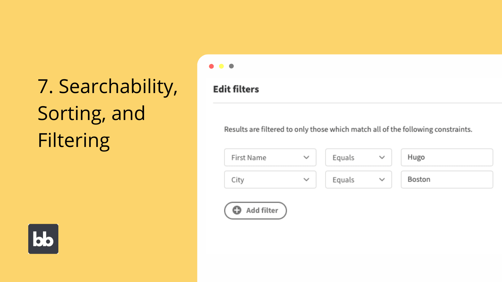
An alternative to traditional search boxes is Budibase’s dynamic filtering component. On clicking this, users are presented with a modal screen where they can set filtering conditions for any attribute that you want them to.
Quickly add complex searchability and filtering functionality, without creating overly busy and distracting interfaces.
Join 300,000 teams running operations on Budibase
Get started for free8. Using modal screens
Modal screens are a simple but effective way to streamline user experiences around table interfaces. This means that, rather than opening linked screens in a full-size window, they’ll be displayed in a smaller pop-up.
The idea here is to allow users to quickly navigate to deeper screens, without losing the context of where they accessed them from.
As we hinted at earlier, this helps greatly with backward navigation. It also means that when users return to your main table UI, they’ll retain any search results or filtering options that they used previously.
However, modal screens can also introduce a few additional challenges. A big one is mobile usability. Another is designing interfaces that are equally effective on modal screens and in dedicated windows, assuming that users can access them both ways.
Luckily, both of these challenges can be overcome by smart use of conditionality rules, as discussed earlier.
9. Sizing and scale
The size and scale of different UI elements are hugely important too. Of course, on one level this relates to aesthetics. It also plays a more concrete role in the usability of your table UIs.
One of the most obvious places that this comes into effect is the actual text within your tables.
There’s a tradeoff here between the number of attributes you can include and how readable they’ll be. That is, the more attributes you want to include, the less space you can dedicate to each one.
You’ll need to consider padding, margins, and space between attributes in the same way. For example, condensing your tables down helps you to include more information, but you’ll still sacrifice readability if you have insufficient space between rows and columns.
Therefore, there’s a compromise to be struck here.
Budibase offers several built-in table styles, for size and scale, as well as color options, so you can experiment and decide what works for your project, in just a few clicks.
10. Horizontal and vertical alignment
We also need to consider alignment, both of the table component itself and any text or embedded elements within it. This impacts a number of important UX factors.
Generally speaking, left-alignment is preferred for elements within tables. This is the clearest and most effective way to present most information. You might then center or right-align important, shorter attributes to help them to stand out.
How you align the table itself depends on a couple of different factors.
Firstly, there’s the table’s role within the wider interface. In many cases, the table will be the primary focal point of the screen. For example, the home screen of a CRUD app is typically built around a table for your entire data set.
In this case, you’ll almost always center-align it.
In other cases, you might include a table for a subset of data, within a more extensive information screen. For example, in an approval app, you might have detail screens for individual employees and include a table for all of their previous requests.
Since this wouldn’t necessarily be the priority element on the screen, you have more flexibility for how you would align it, as there’s less need for it to be prominently displayed to users.
11. Branding, color, and visual design
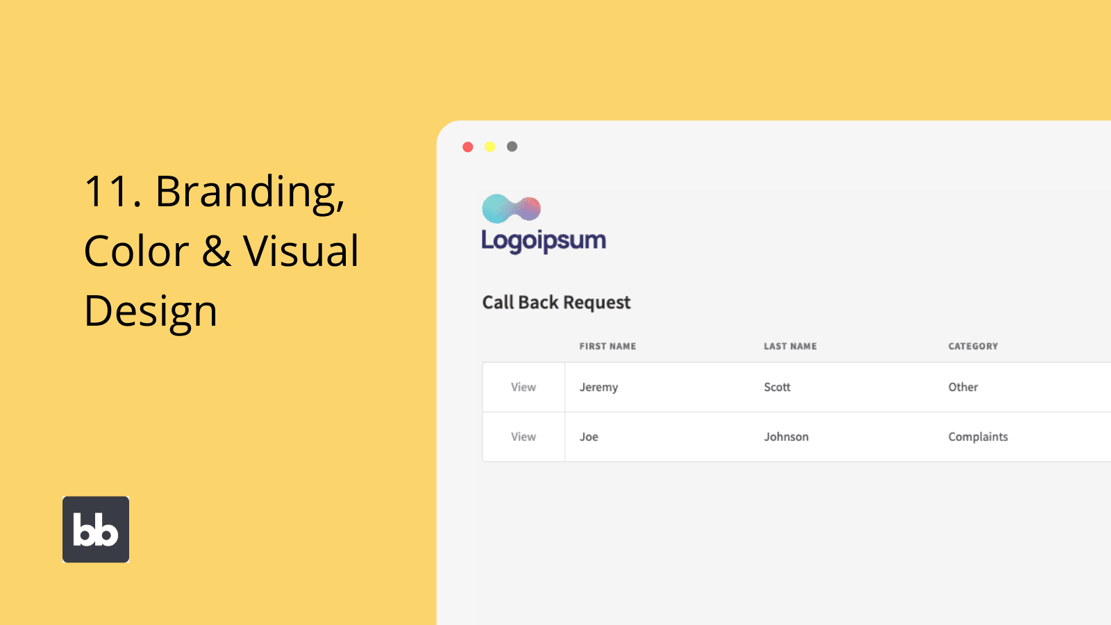
You’ll also need to put extensive thought into the color scheme and visual design of your table UIs. It’s easy to think this is purely an aesthetic decision, but it actually plays out on a couple of other levels, including:
- The consistency of the branding across tools.
- Prioritizing recognition over recall for different user actions.
- Usability and accessibility.
- Providing additional prominence to priority UI elements.
The first two points are particularly important if you have several different custom solutions, that are aimed at the same user groups. Say you had a number of single-function internal tools, to manage different data sources.
Providing consistent coloring across CTAs and interactive elements helps users intuitively know how to carry out actions, without the need for retraining on each specific platform.
At a more basic level, consistent coloring in customer-facing tools helps you to project a stronger brand image.
Your choice of colors also has an impact on your table UI’s wider usability, including with regard to accessibility. High contrast colors help users, including those with visual impairments, to quickly locate priority information and interactive elements.
We can also use coloring to reflect the current values of different attributes. For example, if you had a net profit/loss column in a table of all your financial trades, you could use a green/red color code to see which entries currently have negative or positive returns.
12. Consider accessibility needs
Accessibility refers to how easy users with additional needs find it to navigate and use your apps. Specifically, this usually means users with visual impairments, as well as those who are limited by the devices they’re using.
Luckily, we can rely on many of the same strategies for both of these kinds of users.
The key is creating interfaces that are sufficiently clear and readable on all kinds of devices and aspect ratios. This is influenced by factors including the size, spacing, and color schemes of different design elements.
Focusing on building clear, decluttered interfaces helps to ensure that your apps offer the smoothest possible experiences to users with additional accessibility requirements.
Similarly, you’ll need to think about how your tools will appear for users with poor internet connections or older mobile devices. The priority here is to minimize the load speeds of each individual app screen.
That way, you can be confident that your tools offer optimal performance, even on legacy devices.
13. Be sparing with embedded components
You can also embed components within table rows, for several use cases. The most obvious example of this is buttons or links, which are used to navigate to more in-depth screens for each individual table row.
However, there are situations where you might want to embed other kinds of components too.
For example, you might want to embed images or other kinds of file attachments in tables, for easy access. That way, users can view and save these resources, without the need to click through to a details screen.
We could even embed other visual elements, like progress bars or simple traffic light icons to denote the status of different projects and workflows.
However, it’s worth stating that we don’t want to go overboard here.
Using excessive embedded elements can quickly undermine your table UI designs by adding unnecessary clutter and confusion. They’ll also make it more difficult to create effective mobile user experiences.
As such, you should treat embedded components as you would any other column, and try to stick to the principle of including the minimum viable number of elements.
14. Designing screens around table components
Finally, let’s think about how we can build our wider app UI design to get the best effect out of our tables. That is, how we can make tables fit most effectively into our overall app designs.
For a start, there’s the issue of how prominent tables should be within a given screen. As we hinted at earlier, we can distinguish between screens where tables are the primary focus and those where they’re a secondary concern.
So, we have certain screens which primarily aim to allow users to read data through a table, and others where this is an additional feature within a larger interface.
For example, consider the difference between the home screen of a CRUD app, and a summary table within an analytics screen.
We can also think about whether the goal of the table is simply to display data or if it’s to allow users to access deeper functionality for individual entries. For example, update screens, further drill-downs, or other functionalities.
Each of these concerns influences the interfaces you’ll build around your data tables.
This includes several design decisions. We can dedicate more space to tables where they’re the main focal point of the interface. Therefore, we can include more columns, more rows per page, more spacing, and larger internal elements.
By contrast, when tables are a lower priority within the wider interface, we can dedicate less space to them. We’d therefore need to limit the number of elements we include, at far as we can while still allowing users to carry out their core tasks.
Join 300,000 teams running operations on Budibase
Get started for free3 real-world examples of great table UI designs
To put some of what we've learned into practice, we can think about some real-world examples of table UIs with great designs. We've chosen three tools from the field that provide sleak, attractive, and functional UXs.
First, here's a table view from GitHub Issues.
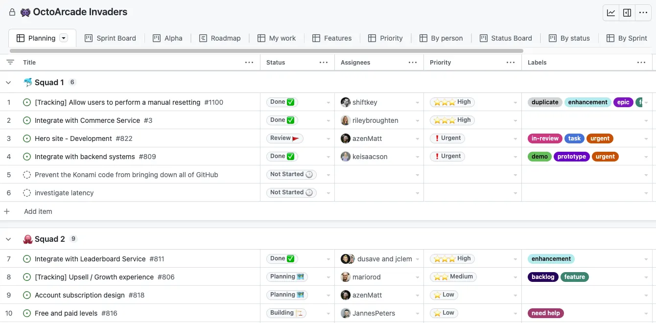
There are a couple of key things to notice here. The first is that there are multiple pre-configured views that users can switch between, giving them quick access to task-specific data.
The other is that the table uses several types of visual cues to offer instant recognition, including emojis, star ratings, and other users' avatars.
Here's another example from NeonDB, a serverless Postgres instance.
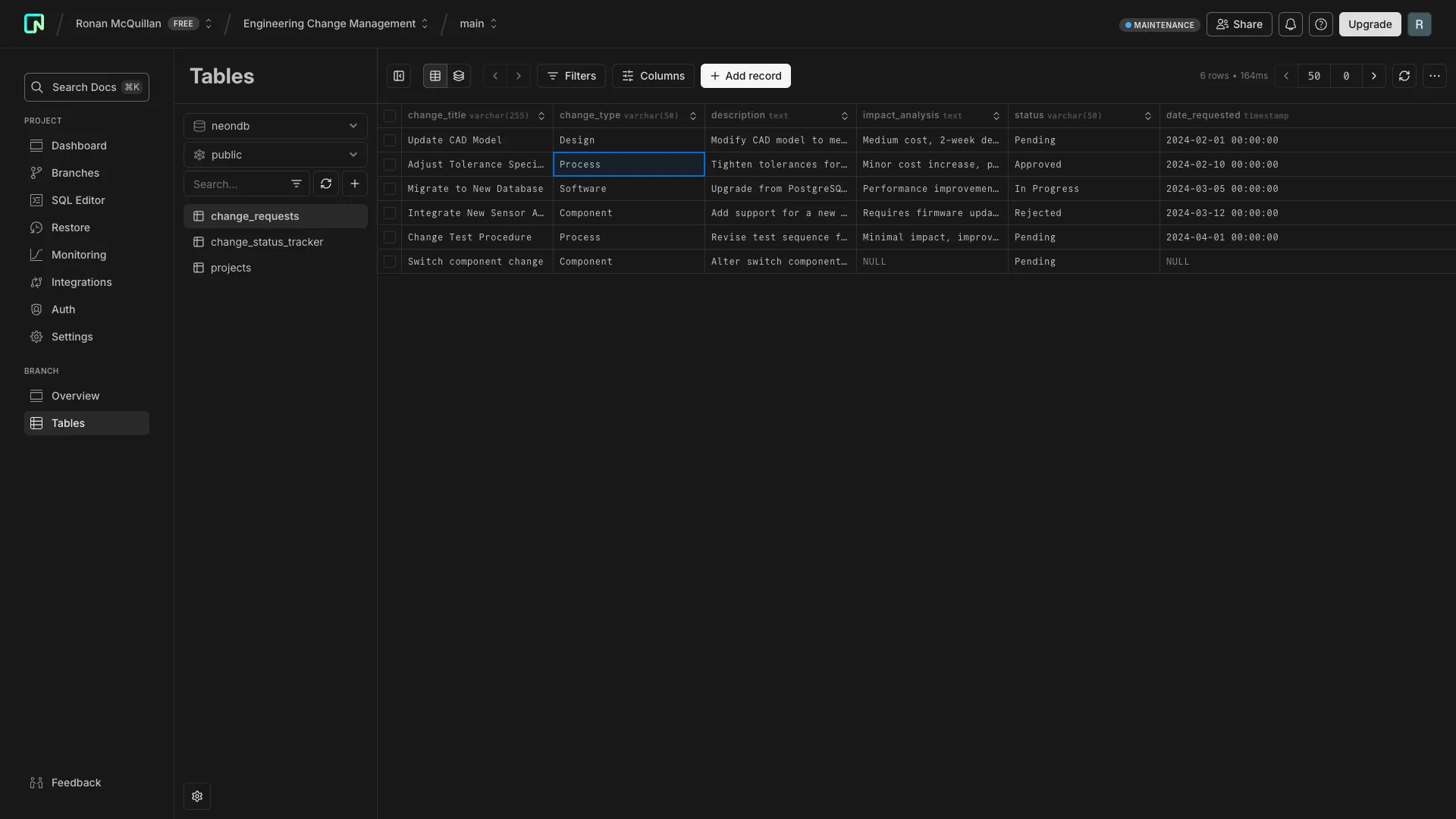
This is a deciptively simple table UI design. At first glance, it might not look like much, but compared to your typical database's admin panel, there are some really nice UX touches.
Firstly, it offers in-line editing. This means we can make simple changes to our stored data, without having to manually query Postgres.
Similarly, it offers flexible filtering with expressions that are structured like actual SQL WHERE clauses SELECT statements, offering us huge power to return specific values in a familiar experience.
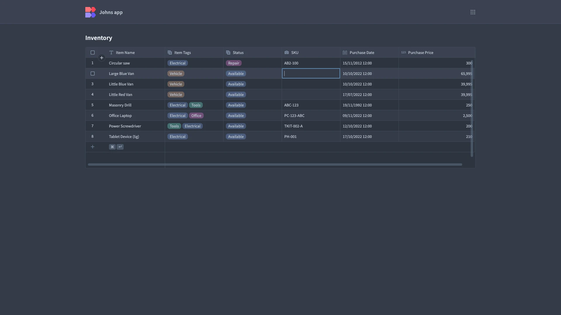
Lastly, if we wanted to combine in-line editing with visual cues, Budibase's Table component is the ideal solution - we could even easily connect to GitHub Issues or NeonDB and build custom admin panels.
Here's how this might look in the field.
Non-tabular UI options for presenting data
Of course, tables aren't the only way to present database records.
In fact, there are plenty of use cases where they're unlikely to be suitable, either from a UX point of view or because we're dealing with non-tabular data.
So, let's think about some of the key alternatives to table UIs.
Cards
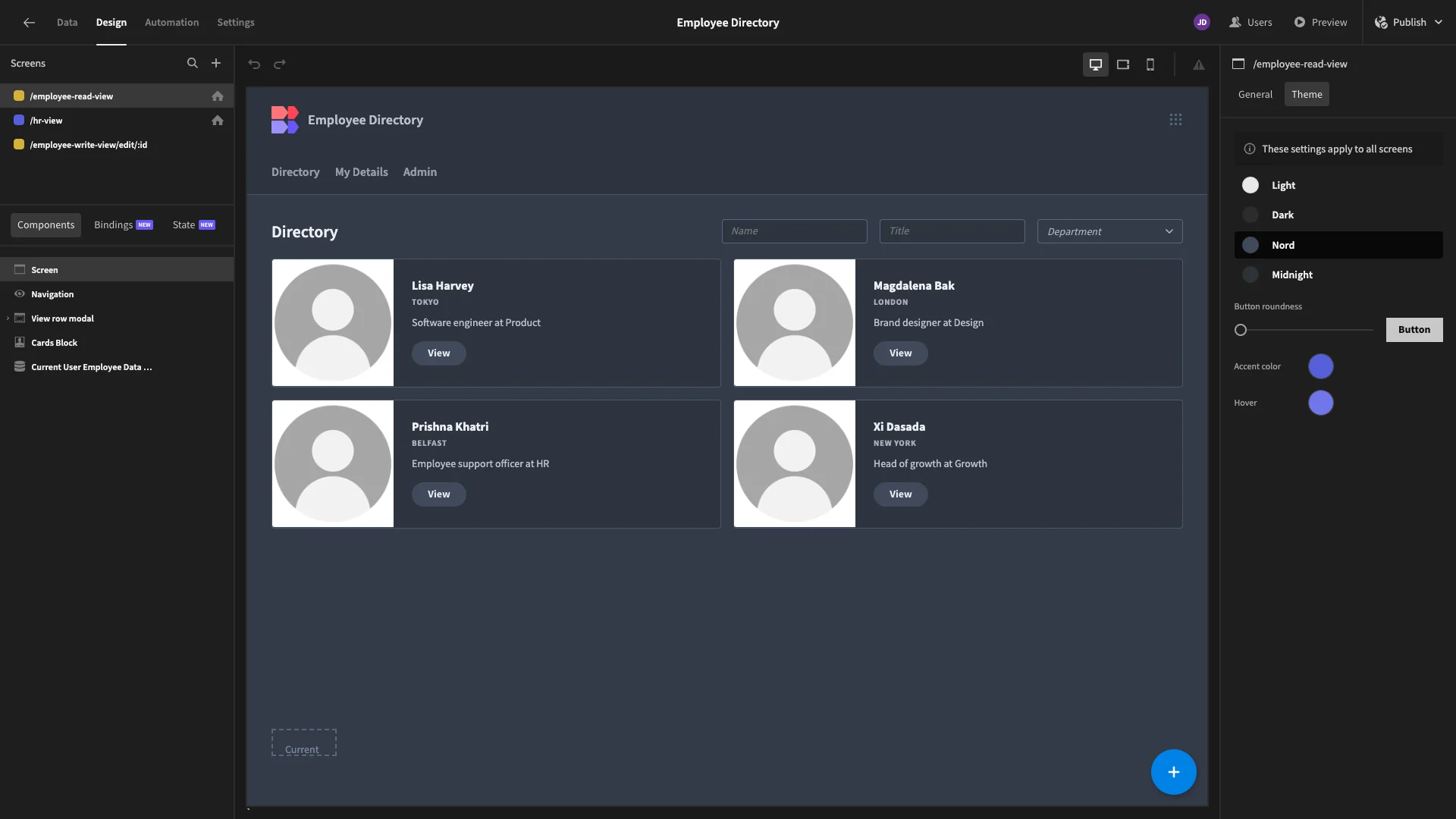
A card is a design pattern where related information is placed in a flexible container, often resembling a card. This can be repeated over for each entry in a database, creating an array of cards.
The benfit is that cards can be made to look much more attractive than a table UI. For instance, only including title and tagline attributes from a database, along with a featured image. This makes it a more suitable approach for many B2B use cases.
We can still add searchability and front-end filtering too, although this is a little less common. Here's how an array of cards might look for an employee directory, built in Budibase.
Carousels
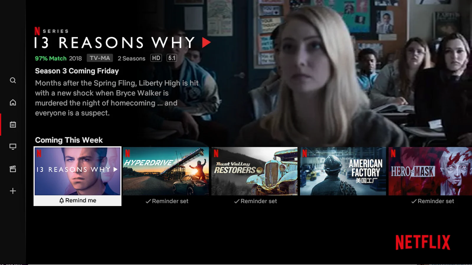
Carousels are similar to arrays of cards, but they're generally used to focus users's attention on a small number of data objects, often just one.
They then use interactive elements to allow users to scroll through items in the carrousel. As such, they're generally more focused on visuals than textual information.
They're often used in ecommerce sites, where designers want to prioritize click through rates for certain items. Here's an example that will be familiar to most readers, from the Netflix home screen.
Data trees
Lastly, with the rise of NoSQL, we also need tools to present non-tabular data. That is, collections of objects that don't necesarily share the same schema.
Often, this will still rely on table UIs to present high level information about our objects. For example, making them searchable by a unique ID or display attribute. However, if they don't share a schema, we can't present the full details in a table.
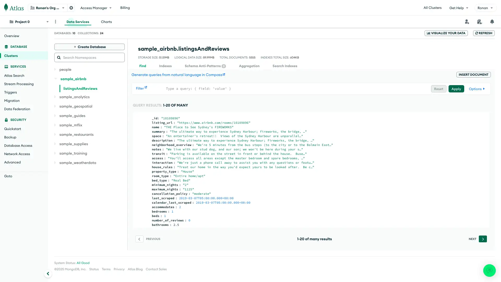
An alternative approach to this are data trees. Basically, when we select a specific object, data trees expand their stored attributes in a stylized, more readable fashion than raw JSON. For instance, using indentation or other design elements to display the relationship between attributes.
Here's how this looks if we expand a data object in MongoDB's back-end.
Build better table UIs with Budibase
Building data tables is one of the most repetitive, time-wasting tasks that designers contend with. Budibase offers a faster, more cost-effective way to build professional table UIs for a huge range of web app projects.
Let’s look at some of the ways our low-code platform can help you achieve better results, in a fraction of the time.
Flexible, pre-built table components
With Budibase, building data tables from scratch only takes a few seconds. We offer pre-built table blocks, as well as separate table components that can be embedded within existing data providers.
Simply choose your data source and which columns you’d like to display.
Budibase also makes it easy to set labels, format columns, and alter the design of your tables. We offer a variety of presets for size and color. Use our compact, quiet, and standard configurations to quickly perfect your UIs.
Set the pagination limit for rows, add custom CSS, configure filtering, use fixed headers or resizable columns, and choose your sorted column, to create your perfect table in just a few clicks.
Budibase even offers full in-line editing with our grid component.
Choose from our light, lightest, dark, and darkest themes to quickly create professional, attractive app designs. Configure zebra stripes, vertical and horizontal lines between cells, and row styles, to build your perfect data table UI.
You might also like our guide to building a SQL GUI.
Autogenerated CRUD screens
Budibase is the fast way to build simple, functional web apps. Autogenerate customizable CRUD screens for a range of data sources, at the press of a button. Say goodbye to laborious, repetitive builds.

Without lifting a finger, you’ll have a fully functioning table UI, complete with in-line editing for each individual entry.Of course, our autogenerated screens still offer extensive configuration and customization.
Add filtering components, alter our default designs, or configure your own display settings to tweak and perfect our pre-made defaults.
Configurable data sources
Budibase supports a leading range of internal and external data sources. We’ve created dedicated data connectors for a huge number of common data sources, including MSSQL, MySQL, Postgres, REST API, Airtable, Mongo, CouchDB, Oracle, S3, and more.
We’ve built intuitive UIs for configuring each data source, with minimal technical skills required.
Use Budibase to build usable, low-code interfaces for all kinds of external data management tasks.
We also offer our dedicated built-in database.
Quickly create a data model from scratch, using a wide range of different data types and simple relationships between tables. We even offer direct CSV uploads to build apps around spreadsheet data.
Budibase is the flexible, easy way to build data-centric apps for a huge range of existing and new data sets.
Intuitive component nesting
Build incredible UIs with Budibase’s intuitive component nesting. Use a clear visual hierarchy to place additional components within tables, and vice versa. For data-focused elements, all nested components inherit the configured sources from their parents.
This means that any components nested within a table have access to bindable data for their respective rows. We can then use these bindings for conditionality rules, filtering, or displaying and transforming data.
For example, we could conditionally display relevant button components to allow users to access different functions, depending on the current status of a given database entry.
We can also nest table blocks within data providers to create complex filtering views, in order to reflect and display relationships between different data entities.
Custom conditionality rules
Budibase also offers an intuitive, simple interface for building custom conditionality rules for any component. Hide, display, or update any built-in setting, based on any combination of variables the component can access.
Conditionality rules are complemented greatly by a range of other Budibase features.
For example, we also offer fully configurable role-based access control. Create dedicated table UIs for each internal role, to provide the right user experience for each distinct group of users.
Alternatively, you can use system metrics, user data, environmental factors, or in-app actions to set conditions for how components are configured and displayed.
For example, you might store a user attribute for the departments different employees belong to. You could then use this to display entirely different table UIs to each department, based on the information that’s relevant to their workflows.
Data transformations
Budibase tables support advanced transformations for displayed data. After all, stored data can often offer poor readability, or lack insightfulness at first glance. Transformations allow you to use JavaScript of Handlebars to set rules for the information each column displays.
This could mean reformatting data or creating entirely new display values based on what you have stored.
Reformatting is the more common use case. Say you have dates stored in hexadecimal. That is milliseconds since the first of January 1970.
This is a common format since it’s easy for computers to process. However, it’s not much use for human users. So, rather than creating a whole new attribute in our data source with a readable date, we’d use transformers to turn this into something more user-friendly.
We could write this out as a string or use MM/DD/YYYY format. We could even use conditionality rules to use different formats, based on the conventions of the country the user is accessing our app from.
Alternatively, we could use transformations to display entirely new values.
Say we had a data source storing information on all of our sales leads. One attribute is each company’s employee count. This is valuable information, but it might be more detail than our sales reps need for their day to day work.
Instead, we could use a series of JavaScript if/else statements to return enumerated values instead of numerical data. In other words, we’d set threshold employee counts, to simply display small, medium, or enterprise.
For example, something like:
if (employeeCount < 100) {
 return ‘Small’;
}
if (employeeCount >= 100 && employeeCount < 5000){
 return ‘Medium’;
}
else return ‘Enterprise’;
Start using Budibase today
Building professional table UIs doesn’t need to be time-consuming. With Budibase, it’s never been faster or easier to build incredible app interfaces, with minimal custom code. Businesses around the world choose Budibase for smooth, cost-effective developer experiences.
Connect a vast range of data sources and build CRUD apps in seconds.
We offer optional self-hosting, configurable RBAC, free SSO, custom automations, cloud deployments, an intuitive design system, and more.
Build everything from simple data entry tools, free forms, and approval platforms to complex portal apps, in a matter of minutes.
We’ve also created more than 50 free app templates to help you get started. Sign up to Budibase for free to start building stunning, professional applications.