
Building applications is all about making users’ lives easier, smoother, and more efficient. Your app UI design is a critical part of this. As we’ll see, UIs impact everything from the basic usability of your tools to the concrete business value they’ll ultimately provide.
Still, we’ve all struggled with using poorly-designed applications.
Today we’re going in-depth on what you need to know about building effective UI/UXs. We’ll cover everything from the core principles of design, to specific tools, techniques, and strategies you can use to build incredible UIs.
We’ll also look at a few examples along the way, of course, as well as how Budibase is changing the way businesses build slick, user-friendly applications, forever.
First, though, let’s start with the basics.
What role do interfaces play in your apps?
Your app’s user interface (UI) is the front-end layer that users actually interact with. This comprises everything from app screens and navigational structure, to individual components and other elements used to build your user experience.
It’s the part of the app that users see, experience, and take action with.
The goal is to give users an intuitive way to carry out defined actions. In other words, different design elements are used to trigger actions in the app’s business process and data layers.
A successful UI allows users to do this in the shortest time possible, with minimal difficulty or thought.
As we’ll see a little bit later, countless factors can influence this.
For now, though, the key thing to understand is that your UI design shapes how users interact with your applications. Depending on the nature of your app, this can mean more efficient internal tasks or improved CRO within external-facing applications.
How does UI design impact your app’s success?
It’s worth drilling into the concrete impact that application UI design can have on the success of your project. That is, how design factors can influence the return on investment you’ll see from whatever kind of app you build.
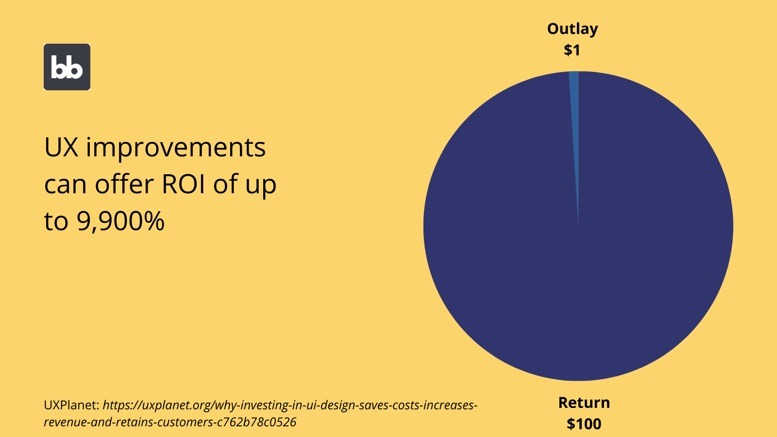
Specifically, we want to know how your UIs will affect your app’s profitability, either by reducing costs or boosting revenues.
Here are a few of the specific levels that this happens at.
Efficiency
Efficiency is probably the most obvious way that effective UIs can impact your business’ bottom line. Essentially, this means empowering users to achieve the same results, in less time, for any given action.
However, this works a little bit differently in different scenarios.
In an internal tool, efficiency is all about minimizing the labor costs incurred to complete a particular task. For example, through automation or by simplifying and reducing the actions that users need to take.
In a consumer-facing context, things are a little bit more complex.
The key efficiency dividend comes from making it faster and easier for customers to take whatever action you want them to perform. Typically, this means making a purchase, contacting your team, or signing up to a platform.
This is also known as conversion rate optimization (CRO).
Improved CRO has a direct link to increased revenues, as a greater proportion of users who land on your platform will complete your desired action.
You might also like our guide on how to make a web app.
Usability
Similar to efficiency, usability is how easy users find it to take different actions. You can also think of this as how intuitive your app’s UI is. Several factors influence this, as we’ll see a little later.
The net effect is feeding into the application’s overall efficiency.
This works by eliminating any points of ambiguity or confusion around how users interact with your interfaces, as well as ensuring that your apps are completely suitable for different kinds of users and devices.
More on this second point later.
In any case, the idea is that usability helps to minimize costs associated with poor user experiences, including delays, mistakes, or low adoption rates. This applies equally to desktop and mobile designs.
Retention/buy-in
These are related metrics, which help measure the ultimate success of your application as it’s rolled out to users. However, they’re helpful in slightly different use-cases.
That is:
- Retention is a measure of how long your users carry on using your app. This is most often used in consumer-facing applications.
- Buy-in/adoption is a metric for how widely your app has been adopted by users and integrated into their daily tasks. As such, this is typically measured for internal tools or B2B applications.
Each of these has a huge impact on the ROI of your app project. Retention has a strong correlation with high lifetime values in B2C apps, while adoption of internal tools is critical for ensuring that they provide the business value you expected.
Training costs
The effectiveness of your UIs directly impacts the extent of training and onboarding your users need. Of course, the less training users require, the lower the costs of providing this.
This should be fairly intuitive. The key thing is understanding that providing usable interfaces helps to minimize the need for training costs, by ensuring that users can quickly and easily understand how your app works.
Again, we’ll cover the specific details of how you can achieve this in a later section.
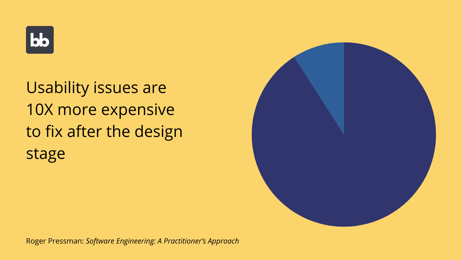
Accuracy
It’s also worth noting the hidden costs of poor app UIs, and how solid design principles can minimize these. In large part, this comes down to human error.
Specifically, inaccuracy means:
- Users inputting the wrong values within a given action.
- Users taking the wrong action entirely.
This can lead to a range of different indirect costs, including error correction, impaired decision-making, or even data loss and other breaches.
As such, building UIs that ensure maximum accuracy is crucial.
Security & compliance
Similarly, effective UI design can contribute to your security and compliance strategies. As we’ll see later, a large part of this is limiting the actions that different users can take in different scenarios.
On one level, this contributes to some of the other points we touched on above, especially concerning efficiency, usability, and accuracy.
Besides this, limiting the actions different users can take helps to prevent a number of security and compliance issues, including unauthorized access, data loss, breaches, corruption, and more, as well as the costs associated with each of these.
Check out our in-depth guide to enterprise app UI design.
6 essential UI design principles
So far, we’ve covered why app UI design is important, along with how it can have a material impact on your business. Next, we’ll turn our attention to the core principles of effective design, so you can begin to build incredible in-app experiences.
With that in mind, here are our six essential principles of app UI design.
1. Consistency and predictability
Consistency helps to minimize confusion and scope for error, by ensuring that users can take similar actions across your applications, using similar interactions. Once your user knows how to do something in one part of your app, they should know how to do it everywhere.
This is beneficial within a single tool, but it’s ideal if you can achieve this kind of consistency across different platforms in your software stack.
We can think about consistency at two levels:
- Visual consistency - where different elements of the same class have a similar appearance, making them easier to locate.
- Functional consistency - where different features can be accessed in the same way throughout your app.
It’s also important that your UIs are consistent with your users’ expectations. That is, users have certain expectations about how different applications will work. If your interfaces don’t comply with these, people will find them confusing and your usage metrics will suffer.
2. Reducing cognitive load
Humans can only process so much at one time. When we’re presented with too much information or too many options, we’ll get overwhelmed. The idea behind reducing cognitive load is to prevent this.
In other words, we want to build interfaces that keep users focused on whatever task we want them to complete at a given time.
This is sometimes referred to as decluttering UIs. The idea is that we want to display the minimum number of components, information, and options that will allow users to perform the tasks they need to.
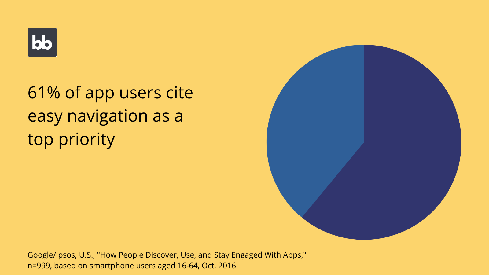
3. Minimizing navigational depth
Navigational depth is the number of clicks required to reach any given screen within your app. As a general rule, this should be as low as possible. This is all the more important for priority screens.
In other words, the more important a screen is, the easier it should be to reach from anywhere else in your application.
There are several ways to achieve this, including using clear menus, and effective, navigable home screens.
4. Creating paths of least resistance
Similarly, we want to minimize the number of actions and user inputs required to complete any given task. However, this is a little bit more complex in practice than minimizing the navigational depth of different screens.
Obviously, many user actions are a lot more complex than simple in-app navigation.
Luckily, you have a range of different options available to you for different tasks. For example, in a data entry tool, you can use multi-step form UIs to help guide users through different categories of information, and default values to reduce the amount of manual work needed.
5. Prioritize recognition over recall
This is the idea that users should intuitively understand how to perform different actions, rather than needing to explicitly learn and remember how to do so.
For example, in an internal request tool, users should know at a glance how to view their previous submissions, without the need for excessive training and recall.
Again, there are countless different strategies you can use to achieve this. For instance, using clear in-app labeling and conventional icons for common actions.
For example, there’s no need to reinvent the wheel for save buttons or to access your settings menu, as conventional icons for these kinds of functions are well established and understood.
6. Build-in error prevention
Finally, it’s vital to build error prevention measures into your app UI design. That is, leveraging different techniques to ensure that your users perform the right actions, accurately and at the right time.
An obvious example of this is autocompleting information, wherever possible. For example, if you already store information on the current user, this can be used to autocomplete forms with their contact details or other relevant data.
We can also use additional protections to prevent certain actions from being taken accidentally. For instance, using modal pop-ups to ask users to confirm that they actually meant to delete data.
Essential components of a web app
Next, let’s think about the specific components that typically make up any given app UI. Nowadays, most apps are built around reusable components. This either involves using code frameworks and libraries, or no/low-code tools.
In any case, here are the most common kinds of components you’ll find in just about any web app.
Forms
Forms are probably the most basic and ubiquitous types of app components. However, there’s more to this than meets the eye. In terms of structure, forms can range from single-field inputs to complex, branching multi-step interfaces.
These are integral to all kinds of database queries, in-app actions, and other basic tasks.
Besides simply giving users a way to input information, form components can be used to perform more advanced functions, including filtering on-screen data, configuring in-app options, and search functionality.
Tables
At a basic level, table UIs are fairly self-explanatory. That is, tables are a familiar way of detailing information on different database entries and entities. However, the more specific design of your tables can have a huge impact on your overall app’s UI.
For example, there’s a balance to be struck between providing sufficient information for your users at a glance and preventing cognitive overload.
The specific formatting of tables and the labels you use for different columns can also have an impact on users’ ability to find and consume information.
Cards
Cards are used to provide a snapshot of key information or statistics, often within a dashboard or details screen for an individual database entry.
Essentially, these are pre-built blocks that normally display values for one or two attributes. For example, on a request detail screen, you might use a card to highlight the date of the original request and its current status.
In dashboards and admin panels, statistics cards are normally used to display aggregate values. This could be the total number of requests that have been made to a particular platform or the average rating given by users to a specific product.
Data providers and repeaters
Your UI is also made up of components that your users are unlikely to be aware of. These are used to provide other components with data from your app’s back end.
Data providers are configurable components that determine which specific data sets different UI elements can draw on to populate different queries.
Specifically, they allow you to:
- Provide a connection to different data sources.
- Create filtering rules.
- Limit the number of entries that will be displayed.
- Set the attributes that are used to sort entries.
Based on these configuration options, any components nested within the data provider will have access to its output.
Repeaters can be nested within data providers to iterate over their output. As the name suggests, each component nested inside the repeater is repeated for each entity within the data provider, including their respective values.
Interactive elements
We can also use a range of interactive elements in our user interface designs. These are the components that allow users to take different actions. The most basic examples include clickable elements, like buttons or embedded links.
These can be used to initiate countless different processes and actions.
For example, triggering queries and automation, navigating to different screens, setting in-app states, refreshing data providers, and more.
Of course, there are more sophisticated interactive elements too.
For instance, Budibase offers pre-built map components, that offer extensive interactivity. Drown pins, click through to detailed location information, or scroll and zoom with intuitive actions.
Charts, graphs, and visualization tools
Data visualization is crucial for all sorts of internal tools, dashboards, admin panels, and more. Data-driven apps require advanced charts, graphs, and other visualization tools that can draw on a range of stored attributes and aggregate values.
The idea is to provide interfaces that update with new data in real-time, without the need for manual action.
Of course, different kinds of data require different kinds of charts. Budibase offers a range of pie charts, bar graphs, area charts, candlesticks, and more, along with custom JavaScript-based transformers to prepare your data for visualization.
Navigational elements
There are also countless different tools we can use to make our app UIs more navigable. Remember, the core principle here is that all screens should be accessible in the fewest number of clicks possible.
Breadcrumbs are a helpful way to aid users to return to their previous screens, especially within complex nests of parents and child pages.
Additionally, Budibase offers clickability for a range of components, including cards and individual rows, to make it easy for users to access detailed summaries, edit screens, and more.
Structural and stylistic elements
Of course, some components play a pure design role. That is, they’re aimed at making your app UIs more scannable, intuitive, and aesthetically pleasing. Basic examples include embedded images or simple dividers.
Containers and sections are used to perfect the layout of components in your UIs.
These also play an important role in shaping how your application scales to fit on different screens and devices. We’ll discuss the importance of this in more detail in the following section.
Accessibility and mobile-friendliness
There’s a lot more to an effective app UI than simply creating attractive designs. In fact, several technical standards need to be implemented, both to provide maximum functionality and to meet users’ expectations.
The two most important elements of this are accessibility and mobile-friendliness. While each of these is a distinct concept, there’s a fair amount of overlap in terms of how they work in practice.
Let’s take a look at both.
What is accessibility?
Accessibility is the idea that your apps should be usable by all kinds of people, regardless of their digital literacy, the kind of device they’re using, or if they have any disabilities which mean they interact with devices differently.
Often, this relates to creating UIs that are accessible to people with visual impairments. Luckily, there are established best practices that we can rely on here. Many of these overlap with the principles of effective UI design that we discussed earlier.
For example, decluttering UIs to reduce cognitive load also helps users with visual impairment to interact more easily with your apps. Similarly, using consistent, prominent CTAs greatly improves users with additional accessibility needs’ ability to intuitively use your tools.
We’ll also see some more sophisticated methods we can use to assist visually impaired users in a second when we discuss mobile-friendliness.
Accessibility also covers the steps you take to provide effective experiences for users who have additional needs as a result of the device they’re using. Therefore, the technical performance of your app greatly improves its UX.
For example, we still want to provide top-quality experiences to users with poor internet connections or older devices. Performant, fast-loading UIs are critical here.
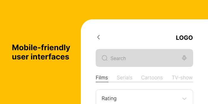
What is a mobile-friendly UI?
It’s also important to consider how users on different kinds of devices interact with your UIs. Most of the time, we want users to be able to enjoy the same experiences and functionality, regardless of their device.
Of course, there are certain exceptions to this.
Naturally, if you were building a native mobile tool that was only available through the app store, you wouldn’t need to worry about how it looks on a desktop.
However, in the context of web apps, cross-device support is vital.
There are a few different techniques you can use to achieve this. One is creating mobile-responsive interfaces. This means that all components and screens automatically scale and resize, to suit different devices.
This means that your application will work seamlessly across different devices. It also means that they’ll be compatible with certain tools that are used by visually impaired users to resize their own screens.
Alternatively, you can create dedicated mobile app designs.
For example, you might truncate certain screens or break forms into multiple steps for a more functional mobile UI. You’d then implement conditionality rules to display the correct version to individual users, based on their current device.
Conditional design rules
Conditionality is all about creating rules to govern components, based on a range of system, user, and environmental variables. When a condition is met, relevant components are displayed, hidden, or have their settings changed.
This is a useful way to achieve all kinds of complex requirements.
As we saw a second ago, we can set conditionality rules to alter UIs based on the device your app is accessed from, but there are countless other user attributes we can leverage here too.
For example, you could hide or display certain design elements relating to a restricted function, based on a user’s access role. Or, you could use user attributes to apply filters to data providers.
Alternatively, conditionality rules can draw on system factors. For example, you might hide a stat card for a given attribute if it’s null. Or you could use environmental factors like time of day to update your interfaces.
For example, to display different messaging outside of core business hours.
Budibase offers a simple conditionality editor for each individual component. Set conditions based on any bindable value that the component has access to, to hide or display components, or update any of their settings.
7 app UI design patterns you need to know
Now, it’s time to start putting what we’ve learned so far into practice. Luckily, there are well-established design patterns to draw on for different kinds of applications.
Remember, we’ve said throughout this guide that a large part of creating effective UIs comes down to meeting users’ expectations. That is, your apps should work the way people would expect them to.
This means sticking to the conventions of whatever kind of app you’re building.
This helps to ensure that users intuitively understand how your tools work and that they can recognize how to carry out different tasks, rather than needing to rely on recall.
Let’s take a look at some of the most important app UI design patterns you can draw on.
1. CRUD apps
CRUD apps are some of the most basic tools around, allowing users to create, read, update, or delete database entries. However, their ubiquity means that even small variations in your user experience can have outsize impacts on your bottom line.
For example, if you had 1000s of employees working on a simple data entry tool, even a small improvement in efficiency or accuracy could lead to huge boosts in productivity.
So how are CRUD UIs normally structured?
We already know that CRUD tools essentially have four different actions that users can perform. The question is how do we most effectively present these to users?
A basic CRUD app only needs three separate screens:
- A table UI, displaying key details for each entry.
- A new entry form, for creating new records.
- An edit entry form, where you can update or delete existing entries.
Of course, there are plenty of variations on this formula. For example, say you wanted a CRUD tool for a database table with a large number of different attributes. Things could get messy if you could only read entries via a table UI.
So, you might decide you need an additional details screen for each entry. That way, you can declutter your table by only displaying high-level attributes.
You could also tailor your CRUD UIs to your more specific needs using techniques like multi-step forms, modal screens, or implementing RBAC to restrict different functions.
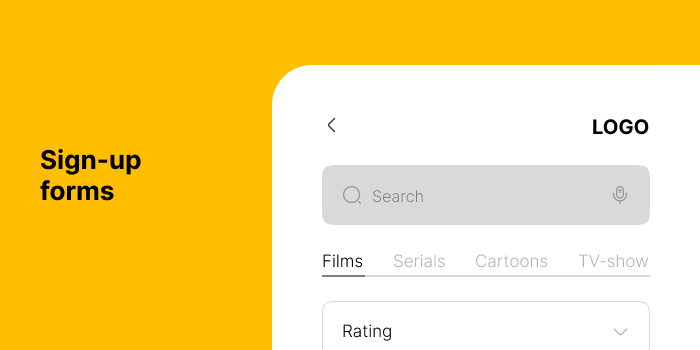
2. Sign-up forms
Sign-up forms are another basic UI that can have a big impact. For example, onboarding screens, lead-generation forms, or call-back request tools. However, the important metric here isn’t so much efficiency as completion rates.
That is, the goal of your UIs is to encourage as many people as possible to provide their information.
There are a few key variables that play a role here:
- The number of fields included in the form.
- The clarity of the information being requested.
- The presentation and layout of the UI.
- Design elements that encourage users to progress.
- The users’ actual incentive for completing the form.
Depending on the nature of the information you’re gathering, the importance of each of these can vary.
For example, in a lead generation form, you’ll often want to minimize the amount of information you request, but individual attributes will be pretty self-explanatory, so clarity is less of a concern.
In any case, there are several techniques we can leverage to optimize our form UIs. For example, providing progress bars, or breaking information into sections and smaller form steps, so we don’t overwhelm users.
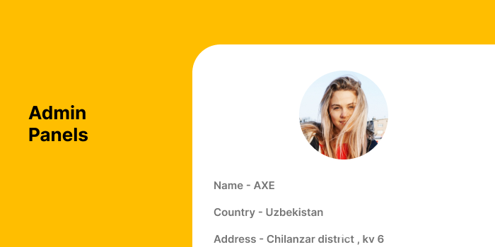
3. Dashboards and admin panels
For dashboards and admin panels, the priority is efficient access to information. That is, these kinds of tools are designed to allow users to instantly check key metrics. For example, you might use a simple admin panel to track online orders.
Naturally, these types of tools rely heavily on a combination of charts, graphs, cards, and other visualization components.
As such, one of the challenges here is the need to present information in a scannable format, without undermining its insightfulness or value.
Of course, how you achieve this in practice depends greatly on the nature of your dashboard.
For example, for a relatively simple dataset, you could easily balance these issues with a single-screen UI.
For more complex data sets, you might need to think about how you can categorize different metrics across multiple screens or tabs.
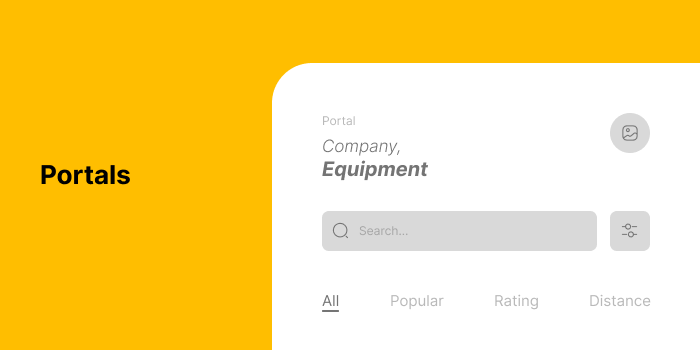
4. Portals
Portals are trickier. This is because internal apps normally offer multiple distinct functions in a single application. As such, it’s more difficult to make sweeping statements about how to build an effective UI.
Instead, we can return to the principles we discussed earlier.
Navigability is perhaps the biggest challenge when you have a single tool to manage different tasks. Remember, our goal is that users should be able to access any screen they need, in the fewest number of clicks possible.
A range of strategies can be employed here.
One of the most important is creating effective top-level navigation menus, with clear, descriptive labels. For more complex portals, you can also think about using sub-menus within specific screens.
Besides this, other navigational elements, like breadcrumbs, can provide additional ways to quickly return to important screens within your portal UI.
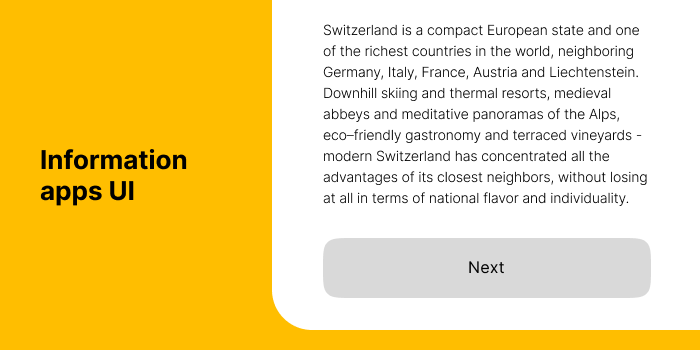
5. Information apps
Some apps are primarily built to provide in-depth information on a specific topic or a set of related topics. Normally, this involves some kind of searchability, to help users find the specific information they need, as quickly as possible.
For example, content platforms, knowledge bases, wikis, and other digital information systems.
Here, the key challenge is ensuring that users can locate any given piece of information with a range of different searchable values. On top of this, there’s the need to present information in a comprehensible format.
Budibase offers searchability in a couple of different ways. As we saw earlier, we can create simple search functionality by using forms to filter data providers. This is useful if you want to offer simple, static search boxes, based on a small number of attributes.
Alternatively, we have a pre-build dynamic filter component. This can be configured so that users can use complex combinations of filtering conditions, based on any stored attributes you want to make available.
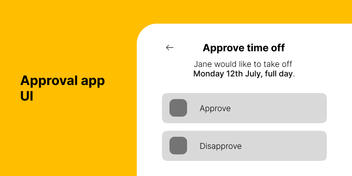
6. Approval apps
Approval apps are used in many contexts to ensure accountability and enforce various business rules within workflows. Usually, this means allowing employees to submit requests, either for a particular resource or to proceed with a given action.
Their supervisor, manager, or a team member from another team can then approve or reject this request. This might include invoice approval tools, vacation booking apps, or any other sign-off workflow.
The challenge is that approval apps often require separate UIs for users with different competencies. Users who make requests and users who approve these interact with the app differently.
Requests normally only require a form UI. You might also include extra screens so that users can view their own submissions or edit existing ones.
Approvals can work in a few different ways.
For basic requests, you might opt for a simple details screen, with buttons to mark an entry as approved or declined. In more complex workflows, you might choose an edit form UI, so users can approve specific elements of the request or provide the rationale for their decision
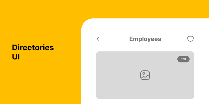
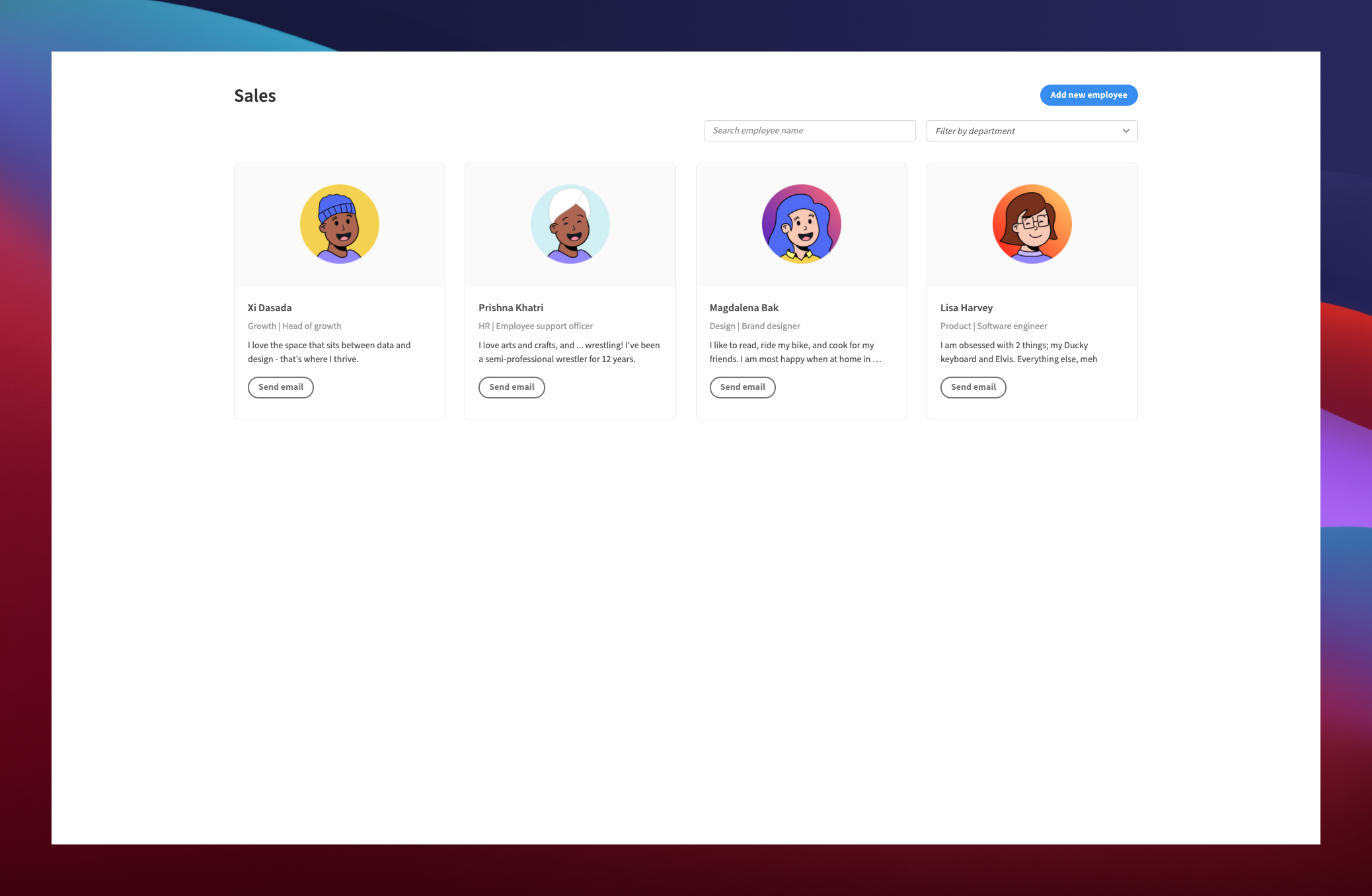
7. Directories
Like information-based tools, directories are primarily concerned with making it easy for users to find specific information. Specifically, this relates to people, companies, departments, or other contacts.
Thankfully, directory UIs are relatively straightforward. Again, searchability is key here.
Besides looking up contact information, directories provide a few additional functions that need to be accounted for too. For example, if your users need to be able to update their own information, you’ll need to provide a form for this.
Or, you might provide dedicated admin screens if entries can only be updated by internal users.
You’ll also need to consider any contact options you want to build into your directory. Depending on the use case, you have a few different options here. If you have external users, you might simply use mailto links for entries’ email addresses.
In an internal directory, you can rely more heavily on integrations with existing communications tools. For example, you might use buttons to trigger automations in your existing email client or instant messaging apps.
How to design an app UI in 7 steps
Now that we have a better grasp of how the most common types of applications should look and feel, we can look at the concrete process you should follow to build an effective UI.
Of course, this straddles a range of technical, operational, and aesthetic considerations.
With that in mind, here’s our 7-step framework for successful app UI design projects.
1. Planning and specifications
The first step is creating a plan for your app build and gathering requirements. Obviously, you need to know what your app is going to do before you can start building it. In fact, the more detail you can establish at this stage, the easier the remaining steps will be.
The first thing you need to do is define the specific actions that users will need to perform.
This is the basis of any thorough requirements gathering process. In most apps, users have a set number of discrete actions available to them. For example, in a simple employee directory tool, this might look like the following:
- The directory should store and present information including employees’ personal, professional, contact, and biographical details.
- Employees can search for their colleagues based on their name, phone number, job description, or department.
- Users should be able to manage and edit their own information.
- The app should offer one-click functionality to contact colleagues.
Once we have this in place, we can think about how users will be able to perform each action. We’ll flesh this out in more detail in the next section. For now, we can take a higher-level view of the kinds of interfaces we’ll leverage.
Let’s take our directory example’s home screen. One option would be to base this around a simple table with clickable rows. This would be a highly-functional way to present information, especially if we had a large number of entries.
That is, with the caveat that it won’t be the most exciting UI in the world.
Alternatively, we could use a repeater, nested with cards to display key information or even imagery for each entry. This would be a more sophisticated UI, but you’d need to take additional steps to avoid clutter, especially with large datasets.
Check out our directory templates to see a few examples of different ways to approach this issue.
2. Wireframing and prototyping
Once we have a firmer idea of the kinds of UI we need to build, we can think more specifically about different components and layouts. Then, we can put these into practice in a mock-up, wireframe, or prototype.
The idea here is to create a visual representation of how your finished app will look, without necessarily needing to connect to your actual data sources or develop your final functions.
To do this, you might rely on dummy data or placeholder functions.
This achieves a few key aims, including:
- Providing proof of concept for your application.
- Allowing you to experiment with different screen layouts and components.
- Creating a demo platform that users can provide feedback on.
- Establishing the back-end tools and system processes you’ll need to create to put your app into production.
At this stage, we’re primarily thinking about these issues at the level of individual application screens. Of course, it’s also useful to have an idea of how you’ll structure your navigation, but we’ll tweak and finalize this in later steps.
We also need to reflect our desired functionality in our mock-ups. However, there are varying degrees to which you can do this.
In large part, this depends on the level of interactivity you want to add to your mock-ups.
For a purely visual wireframe, adding the kinds of UI components that will allow users to take action will be sufficient, although you might want to provide explanatory comments for developers or decision-makers.
On the other hand, if you want to build more of an interactive demo UI, you’ll want to create placeholder events to provide users with a more realistic reflection of the experience your finished app will provide.
As we’ll see in the next step, this approach helps gather more insightful user feedback.
3. Gathering user feedback
It’s always a good idea to engage with your users as early in the design process as possible. Obviously, though, this is easier in certain situations than in others. Clearly, it’s easier to get users to demo your app UIs for an internal tool project than for a brand new B2C platform.
In any case, the idea is to get as many representative users as you can to try out your app and provide feedback. Specifically, you need to measure how well your app UI design adheres to the principles we outlined earlier.
For example, how intuitive do they find the platform? Can they easily recognize how to access functions without explicitly being shown how? Do think your UIs are unnecessarily cluttered?
It’s also important to gather open-ended feedback. If you only ask closed questions, you’ll limit users’ ability to bring up issues that you hadn’t considered. You also run the risk of people just telling you what they think you want to hear.
How you go about gathering feedback will depend on the size of your sample group. If you’re simply sharing your designs with a few colleagues, an informal chat will normally be fine.
If you had a larger sample size, surveys or focus groups would be more efficient and easier to analyze.
4. Implementing feedback
In an ideal world, your demo users would tell you that your app is perfect and you’re ready to put your UIs into action. Unfortunately, though, this is unlikely to happen.
More likely, you’ll come away with a list of suggestions, problems, and potential improvements. Your next challenge is figuring out which of these you’re going to implement and thinking about solutions to any problems that have been highlighted.
This is all the more tricky if you’ve received conflicting feedback from different users.
That is, if some users reacted positively to elements of your app that others found issues with.
This highlights the importance of having a sufficiently large sample size of representative users. That way, you have a quantifiable basis for deciding which feedback to prioritize.
Of course, the actual implementation steps you need to take depend on the nature of the feedback itself. Sometimes users will provide detailed explanations for what doesn’t work, or even suggestions for how it can be improved.
Other times, you’ll get more nebulous feedback. For example, that your UI is ‘confusing’.
In these cases, you’ll need to return to first principles to think about how you can improve your designs. For example, is there excessive clutter or cognitive load? Are your CTAs and labels clear enough?
A good solution to this is to present demo users with multiple options for specific screens and UIs. That way, you’ll have an easier time determining their specific preferences across different permutations of your app.
5. Optimization, navigation, and user-flows
Once you’ve perfected your individual app screens, you can begin to think about how they’ll fit together within the broader UI. This is a crucial step for perfecting the UX you’ll provide in your finished app.
This mainly concerns how users will move through your app as they carry out various tasks.
Of course, this requires a firm grasp of how different tasks fit together. Check out our in-depth guide to workflow analysis to find out more information.
Remember, the idea here is to ensure that users can access any given screen in the fewest clicks possible. Obviously, this is easy for simple apps. If you only have a handful of screens, you can make them all accessible in a single click using top-level navigation.
For more complex tools, we need to be a bit smarter.
One way to do this is to establish which screens users are most likely to want to navigate to from any given point in your app. That way, you can provide the most navigable user flows, at least in the majority of cases.
Let’s take an example to see how this works in practice.
Say you wanted to design a customer account portal. The goal is to allow users to take control over a range of different functions, including editing their personal information, managing orders, updating payment information, and accessing personalized offers.
Each of these groups of functions will comprise several screens, so it wouldn’t be viable to include all of them in your top-level menu. Instead, we’d only include the parent pages for each group of functions in this.
Then, we’d make each child page as easily accessible as possible from its parent, using embedded clickable elements, sub-navigation menus, and breadcrumbs.
6. Connecting your UIs to data and process layers
Next, it’s time to turn our UIs into an actual viable application. In traditional builds, this would be when designers hand the project over to the development team. With more modern tools, including low-code development, the same people might carry on to this next stage.
Of course, there are countless different approaches, development tools, and frameworks that can be leveraged here, and it would be impossible to cover them in-depth.
Instead, we’ll take a deeper dive into how this works in Budibase, to uncover the core tasks involved here.
First up, connecting your UI to your desired data source. Generally, during the design and mock-up stage, you’ll only work with dummy data, if even that. To translate this into a production app, we’ll either need to connect to an existing data source or create a new one.
We can then configure our data provider components so that any UI elements nested within them have access to the appropriate data. Check out our ultimate guide to data sources for more information.
With this in place, we can begin to create automations and other system processes we need for users to carry out our required functions. Budibase offers an intuitive low-code interface for creating automation rules that are triggerable by any user action.
Take a look at our guide to workflow automation to find out more.
7. Testing your app UI design
Finally, it’s time to test your finished app. Again, there are several facets to this that are outside of the scope of this article. As such, we’ll focus on the specific elements of testing that you need to worry about for the purposes of app UI design.
Of course, the first step is testing that each of your interactive UI elements actually triggers the events that you mean it to. This is basic functional testing.
Additionally, it’s important to consider fringe cases and different permutations of actions that users could provide or data they could provide. This is important for preempting bugs or errors that could emerge, especially from poor inputs or incorrect actions.
Beyond this, usability testing plays a vital role too.
Earlier, we discussed gathering feedback from a sample of demo users. This time, the idea is to verify that your app meets the same standards in production.
Low-code app UI design from Budibase
Building app UIs can be a massive time sink. UX and UI designers’ time is incredibly valuable, so the design stage of any app build can be a costly process. Most designers work on similar apps, over and over again, especially in internal development teams.
That’s where Budibase comes in.
We’re on a mission to change the way businesses build applications, forever. With low-code design tools, autogenerated CRUD screens, custom conditionality rules, and a massive range of accessible pre-built components, you can build your perfect web app in minutes.
Budibase tools also boast customizable RBAC, optional self-hosting, free SSO, an internal database, and a wide range of external data connectors. We even have our own cloud hosting platform, for rapid deployment.
Take a look at our product page to find out more about building custom tools with Budibase.