Designing admin UIs is a part of the app development process that’s quite easy to overlook. In fact, in many cases, it’s a bit of an afterthought.
This is a big mistake.
Providing sleek, efficient user experiences for your app’s admin functions is just as important as it is with any other functionality.
Today, we’re drilling into some concrete strategies that you can use to craft effective, professional app screens for your admin users. Our goal is to provide repeatable techniques to improve efficiency, usability, and accuracy across admin UIs for just about any use case.
Along the way, we’ll see how Budibase empowers developers and business users alike to build deployment-ready UIs in a fraction of the time.
By the end, you’ll be fully equipped to design performant tools to help your team manage internal processes - on top of just about any data source.
But first, let’s check out a bit of background.
What is an admin UI?
Basically, an admin UI is an interface that’s used by application administrators - or other responsible colleagues - to perform tasks and access insights that are reserved for their role within a given process.
This might be provided as part of a wider application or as a standalone internal tool.
An example of the former might be in an asset management application - where ordinary users can search and request inventory items - but only certain users can access and admin panel to review and manage these requests or access data relating to current allocations.
The latter could mean building a dedicated admin UI for performing management functions relating to a process that is otherwise handled in existing tools. For instance, if we generated reports based on invoicing and CRM data within a customer service process.
But, that’s pre-empting our next question a little bit.
What is an admin UI used for?
Before we think about how we can design UIs that can be most efficiently used to perform particular tasks - we need to know what we need to do.
Now, if we wanted to get very granular, it would be worth noting that this can be highly contextual. What we mean by this is that the specific admin tasks that we need to carry out will inevitably vary greatly between individual processes and apps.
But - what we can do is point to two broad categories of functions that will more or less cover everything we need to know.
Management functions
First up, we have management functions. Essentially, this includes any reserved action that only admins can carry out within a process. So - in theory, it could be just about anything, depending on your business rules.
There are a few examples that crop up most often though.
One is approvals. Many business processes can be expressed as request/approval flows - where one kind of user can make a request for something - and an admin or manager can review, assess, and action this request.
Since this is a reserved action, it’s typically contained on a screen that’s also reserved for admins.
Other common examples of management functions include triggering communications, updating and deleting protected records, manual overwrites, handling escalations, or assigning actions to other users.
Alternatively, management functions might be essentially the same actions that ordinary users can take - but with a different level of data exposure.
For example, if basic app users can only access and manage data in an application that relates to them in some way - but admins can do the same for data relating to any user.
Reporting and dashboards
The other key type of functionality that’s typically included in admin UIs relates to accessing, aggregating, and displaying data.
To put this another way, many admin UIs are often centered around reporting functionality for key metrics relating to the goals of the process at hand.
This means leveraging what are known as admin dashboards. Basically, these are interactive reports that update in real time with high-level data relating to the performance of our process or application.
For example, app usage, ticket resolution times, sales figures, resource allocation, customer acquisition data, or any other insights that admins need quick, efficient access to.
To learn more, check out our guide on how to build a dashboard.
8 admin UI design tips
So, that’s enough theory. Let’s start diving into some of the strategies that we can leverage to build effective admin UIs.
1. Keep it simple
This one applies to just about any kind of UI in the context of internal tools, but it’s particularly important when we’re dealing with admin functions.
See, we’re normally dealing with a very limited set of possible user actions. There’s also very little need to engage or retain users, as we might encounter with other kinds of UIs.
Instead, the most important things are accuracy, clarity, and efficiency. There are a few key ways we can achieve this.
First, we have blocking. This is a design principle that clusters together related UI components in order to maximize scannability within our app. In other words, to make it as easy as possible to locate specific information or interactive components.
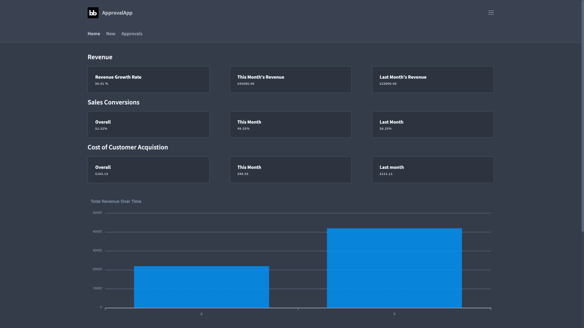
On top of this, we must make a concerted effort to reduce visual noise. That is, elements that don’t actually contribute.
For example, carefully choosing the attributes and data points within tables or dashboard UIs in order to closely match the data models relating to the task at hand.
2. In-line editing actions
This one is a bit more novel - but it’s a very powerful tool. Basically, in-line editing means displaying data in a table where users can interact with it directly.
So, carrying out create, update, or delete operations - as well as reading data. This enables our team to take basic data management actions in a highly streamlined fashion – especially if we need to carry out multiple instances of the same action at scale.
This can be easily achieved using Budibase’s grid component.
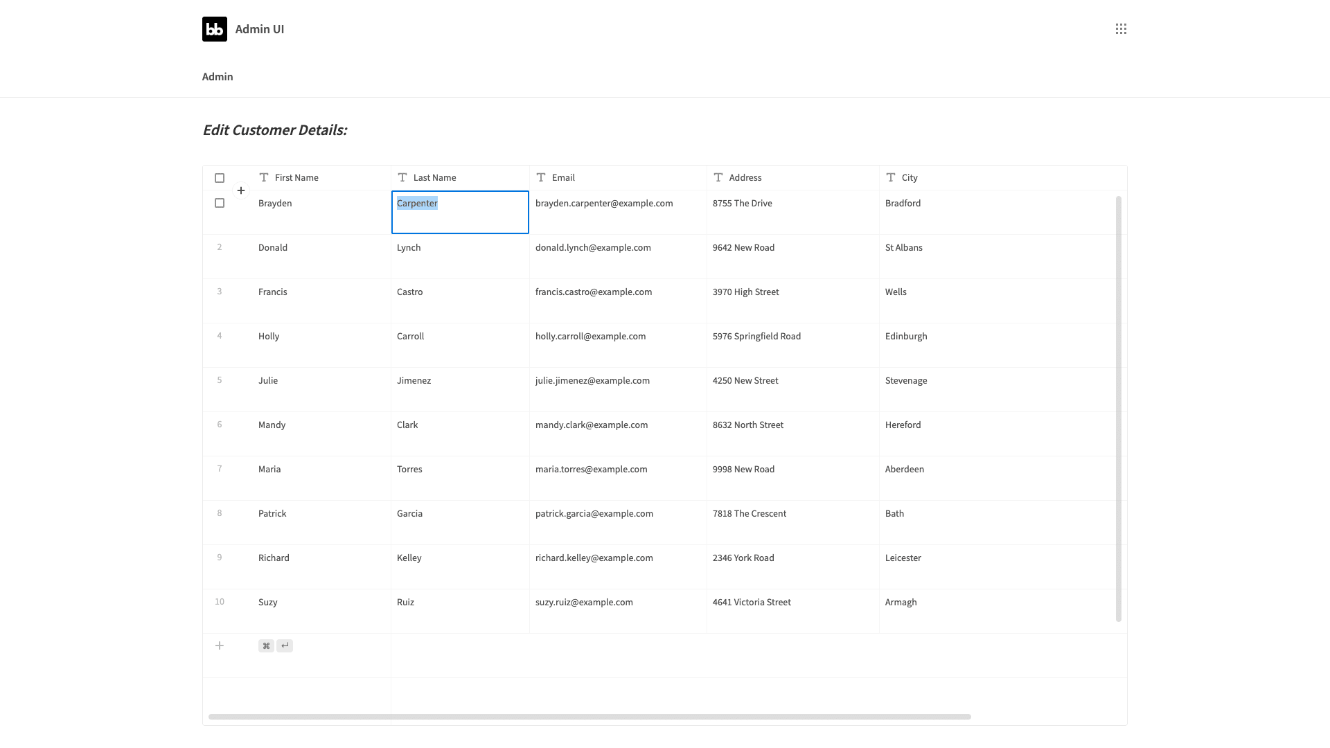
We can apply the same principle to other kinds of actions by utilizing clickable rows. So, we might use on-click actions as automation triggers for the likes of sending notifications, processing orders, or any other defined sequence of actions.
However, this is usually only suitable for situations where users could only potentially want to take one action on the data in question. Otherwise, we might be introducing unnecessary scope for error.
Join 300,000 teams running operations on Budibase
Get started for free3. Combining RBAC and conditionality
Next, we have another slightly more advanced design strategy. Say we had different levels of admin functionality within our application. Maybe - one group of colleagues can manage other users’ data - but only a few users above these can delete entries.
In a situation like this, it wouldn’t make a whole lot of sense to create and serve an additional admin UI. Instead, we can use conditional design elements to hide, display, or otherwise modify parts of our admin UI based on the current user’s role.
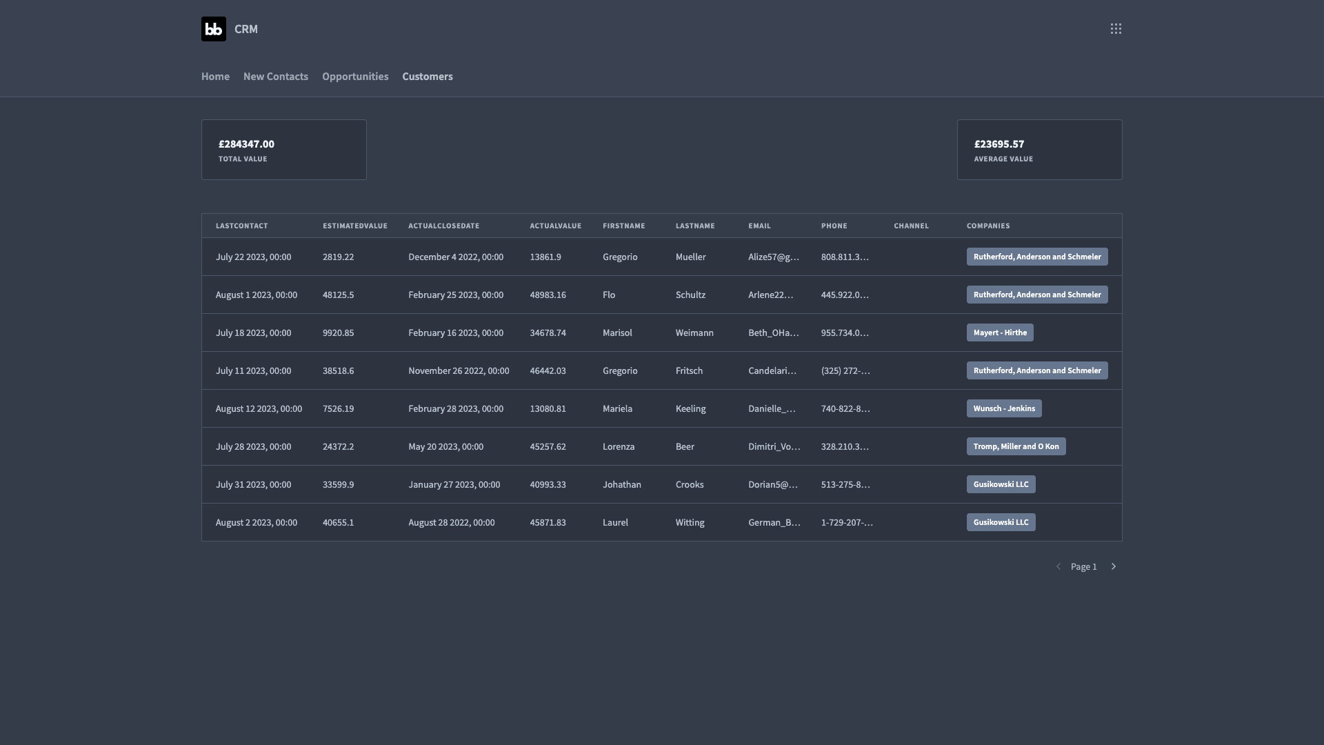
So, we might only display certain charts, data, or interactive elements to users with the highest role, while still giving less permissioned users access to other aspects of our admin screen.
That way, we have a single, much more manageable app screen, which can contain all admin actions and data.
4. Tabbing UIs
But what about situations where we have more complex admin functionality within our app - such that everything we need to include won’t fit onto a single screen? One option would be to have a separate navigation sub-menu for an admin section.
But this could get a bit messy.
Another option is building a tabbing UI. In other words, retaining a single-screen UI, but containing related functions in tabs. This makes it easier to find specific elements, declutters our UI, and improves efficiency.
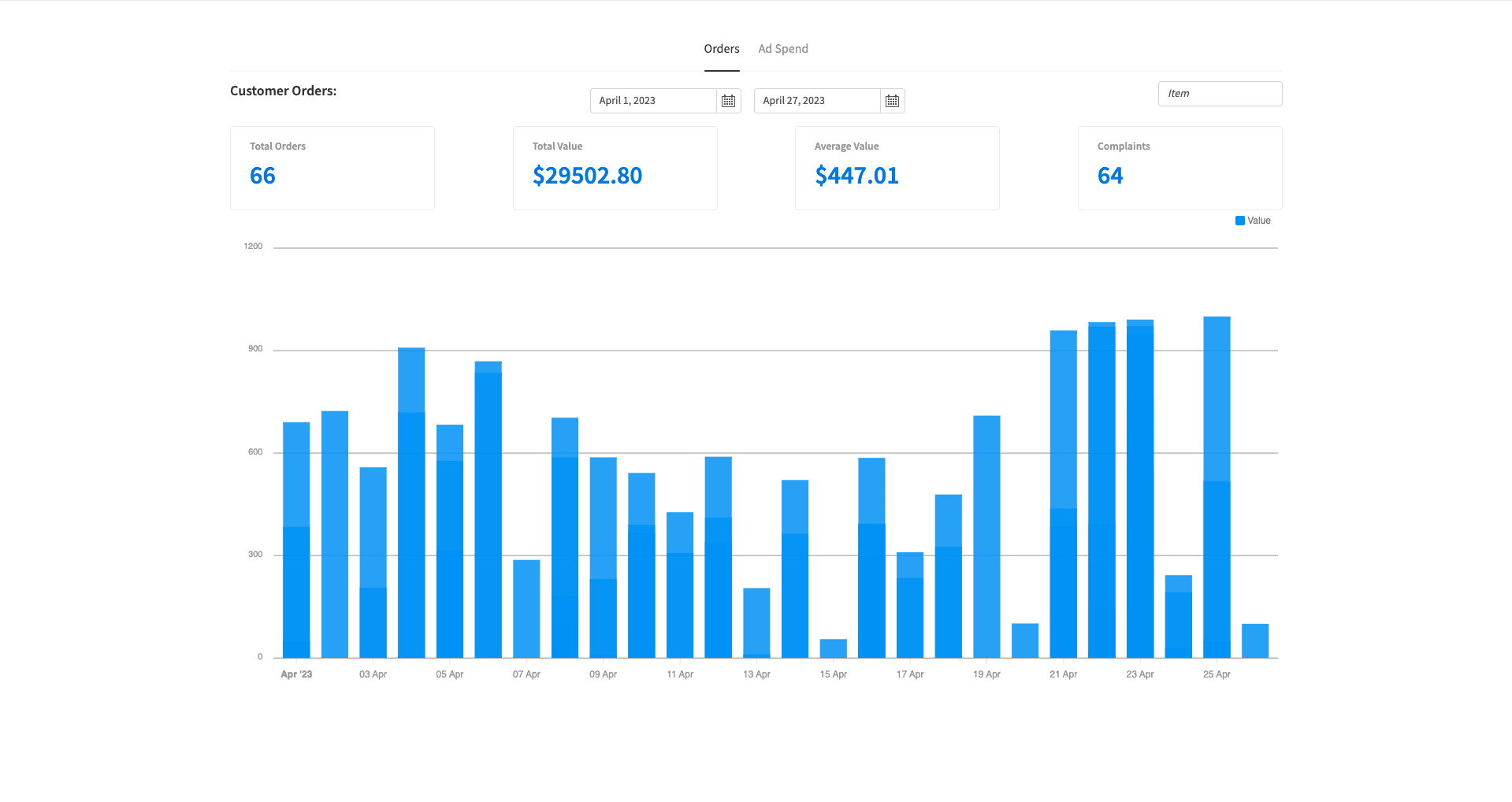
So, for example, we might have one tab with all of our reporting functionality, and then another with various management functions - like approvals or work assignments.
Alternatively, if we wanted more complex reporting, we could have several tabs for displaying distinct groups of metrics.
5. Visual categorization
Many admin tasks relate in some way to how different kinds of data objects are categorized. A large proportion of the time this relies on some kind of status attribute. A very basic example of this would be within an approval/request workflow.
So, at any given time, a particular request entry could have its status attribute set to submitted, approved, or declined - based on defined business logic. This determines the next steps that should be taken in our admin UI.
Reading that status in a table is one thing, but we can make this a little bit easier for our admins using visual categorization - improving accuracy and efficiency in one swoop.
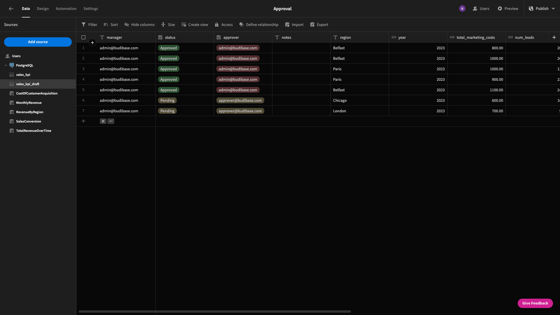
This basically means visually presenting enum attributes as color-coded tags. So, in our request status example, we could use a traffic light system where submitted is amber, approved is green, and declined is red.
6. Responsive designs
Responsive designs are really the norm at this point, but a huge number of businesses fail to properly reflect this fact in their internal tools. This is a big oversight that can hinder the usability, accessibility, and ultimate effectiveness of our solutions.
The key principle behind responsive designs is that UI elements scale and resize depending on the device a user accesses our app from. This is really the easiest way to empower our users to access resources from any device, wherever they are.
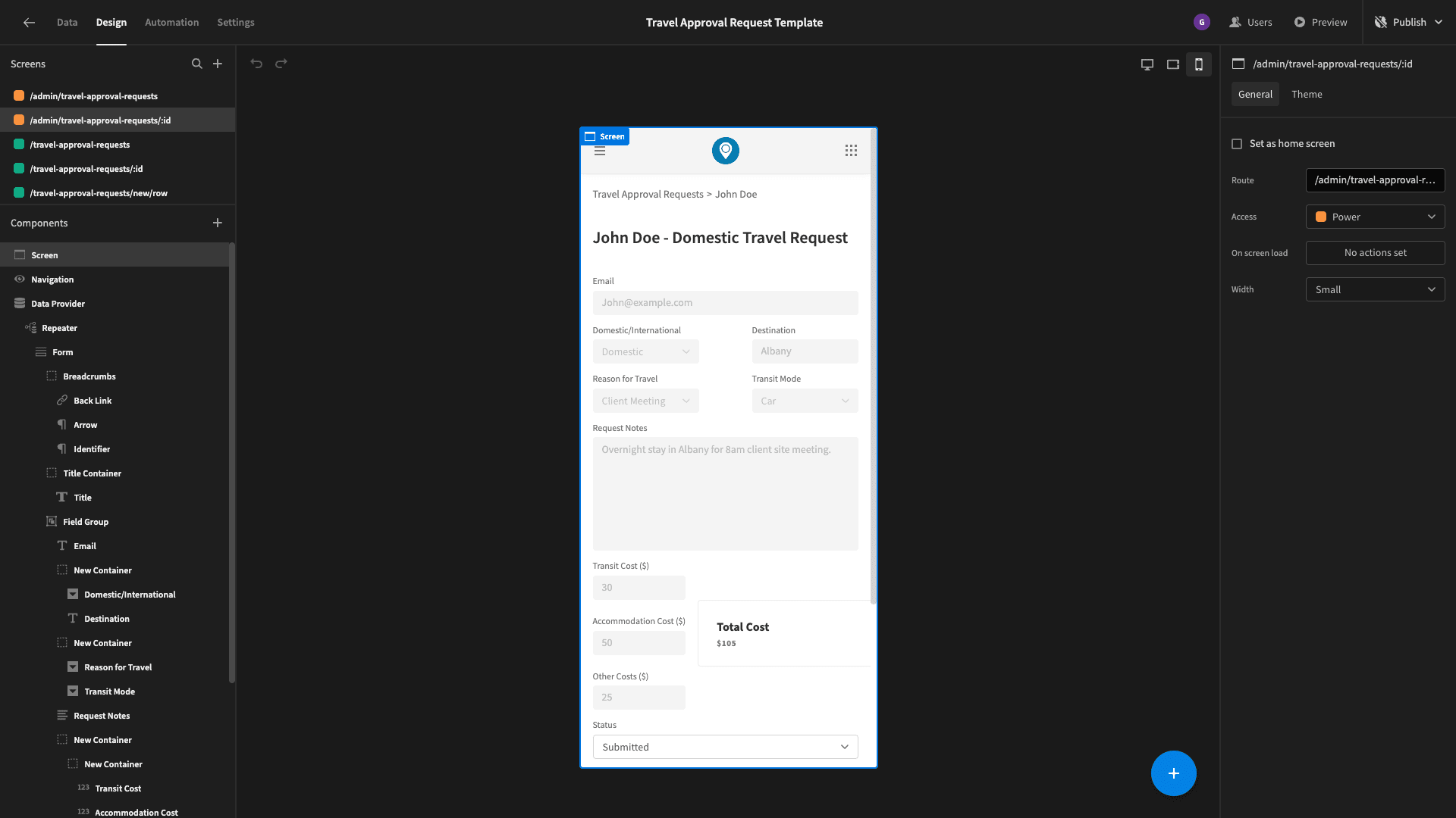
This is critical since our admins might need to take action urgently when they aren’t necessarily at their desks.
But, it’s not the only show in town. An alternative option is using conditionality rules based on the current user’s device to hide, truncate, or relocate certain design elements. This can give a better optimized mobile experience - particularly for more complex admin UIs.
7. Leverage sidebar UIs
A sidebar UI is an on-screen container that can be opened or closed using specific user actions - in order to access specific functionality.
The goal is to enable us to include specific capabilities on our admin UI that don’t need to be displayed all of the time, without the need to build and navigate to additional screens.
The best example of this would be an update form for existing database entries. We might build this in a sidebar UI which can be opened by clicking on the relevant row in a table on our existing admin screen.
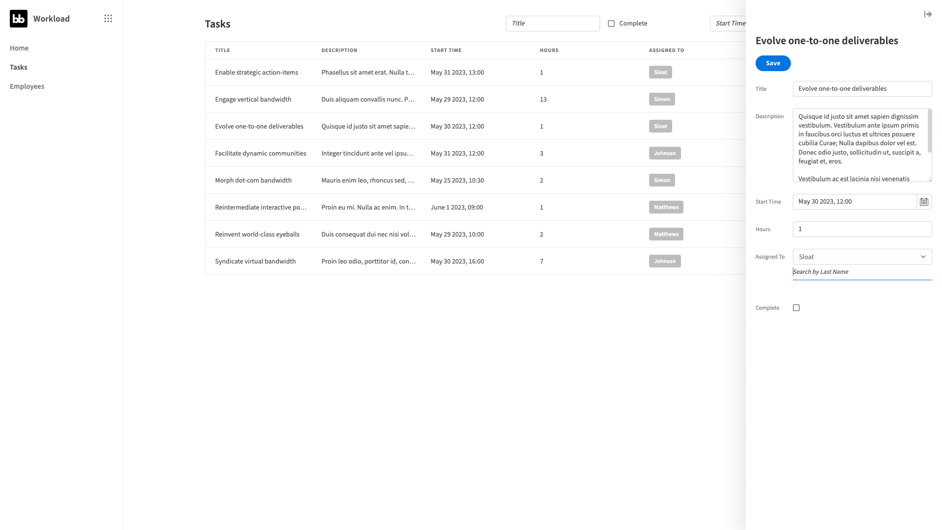
That way, users can update entries without having to navigate away from our primary screen - but we still avoid overly cluttering our design.
8. Preventing cognitive overload
Our final admin UI design tip is more of a guiding principle than a specific strategy per se. Cognitive overload is a key idea in UX design. The basic idea is that users can only process so much information at once.
When we overload users, they’ll find it difficult to take the appropriate action in any given situation. This can lead to delays - but it can also cause human error and avoidable mistakes when users select the wrong action.
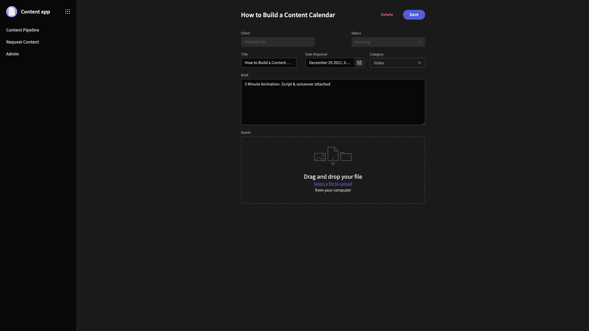
In some ways, all of our admin UI design tips so far have touched on this issue - in seeking to facilitate sleek, efficient user experiences.
To learn more about how this fits into the wider context of building high-quality, performant tools, check out our ultimate guide to digital transformation platforms.