Every once in a while, I'll come across examples of web application design that really draw me in. I've listed these web applications below and ranked them from 10 - 1.
These web applications contain a beautiful mix of design, usability and creativity. They are masterpieces, and wonderful tokens of inspiration.
Huge amounts of time and thought have went into the design of these web applications and credit must go to the designs.
What Is Web Application Design
Web application design is an important stage when building a web application. It focuses on the look and feel of the web application in the wider context of software development.
The web app design process encompasses several different aspects, including user interface design (UI), usability (UX), content production, and graphic design. Within this post, we focused mainly on UI and UX design.
What is UI in Web Application?
UI stands for User Interface. UI is the part of the web application which a user interacts with. It simple terms, it's everything you see and touch, such as buttons, colours, fonts, navigation, etc.
What is UX in Web Application?
UX stands for User Experience. UX focuses on how the users feels towards the application, and their experience using it. Was the web application hard to use, was it slow, was the user disappointed when using it? These are the types of questions a UX designer will focus on when reviewing web applications.
How do you design a web app?
If you want to be a web app designer, but you never created an app, it’s easier than it seems.
You can easily get into application design and create an app using low-code tools and templates.
These tools can help you with the technical side of app building, even if you aren't an experienced UI designer. They can give you the framework to design an app and make it functional in no time.
But you as the web app designer need to know what your application does - alongside user research for your web app UI.
That’s the most important part.
Of course, the visuals, color palettes, and other design work are important. But your users will remember more about how it helped them achieve their goals, and how easy it was to do it.
Here is a quick checklist to make sure you design web apps that work well:
- Define clear objectives - for example, if you have a price comparison app, define clearly what the scope is, and lay down the different steps your users need to take to run their comparisons
- Check the current solutions - competition is an asset, it is a sign of a thriving market. Embrace the competition and try to improve yourself as a web app designer by incorporating good ideas and fixing bad ones
- Pick a tool and implement it - don’t just plan, launch a tool such as Budibase and get started with your application design. Test what seems to make sense and try to poke holes in your ideas
- Gather user feedback - run tests with real users as soon as possible, if you are solving a big problem they’ll be happy to give you feedback to make it even better
Check out our guide on how to build a web app for more information.
Our Top 10 Web Application Designs
The following web applications were chosen by the Budibase team. Scoring was based on:
- Design
- Usability
- Creativity
The goal is to choose the best web application design examples from across all sorts of use-cases. Ok, let’s do this!
10. Carbon
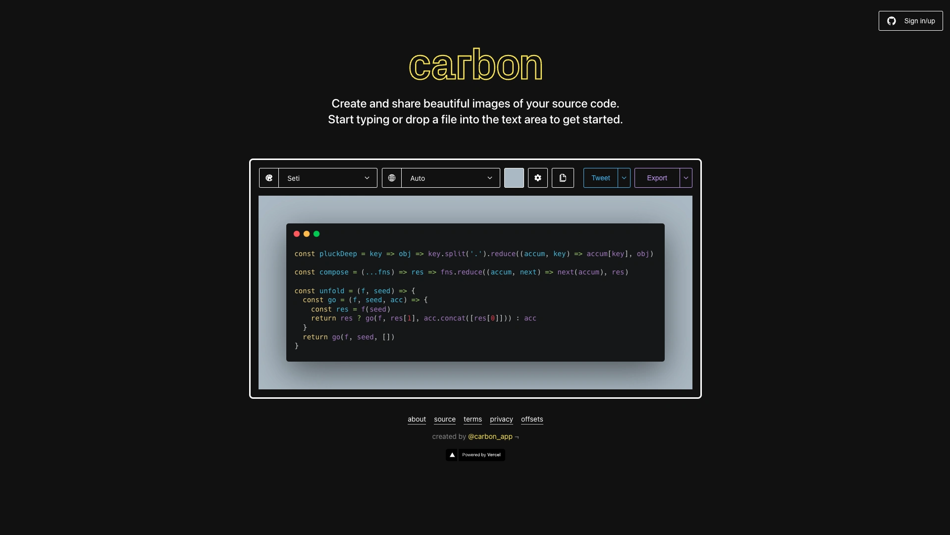
First up, we've got Carbon.
This is a free, super minimal tool that enables developers to output shareable, stylized images with their code snippets. From a design perspective, it's the perfect example of lightweight web app that does one thing well.
Developers don't have time to spend on graphic design. Carbon offers professional visual assets for your code with just three settings - a theme, the language for your syntax highlighting, and a color for your border.
It's used by developers in huge organization including Google and Microsoft, which just goes to show that we don't need to reinvent the wheel when it comes to designing web apps.
Design - ❤️❤️
Usability - 😻😻😻😻
Creativity - 🌟🌟
9. Miro
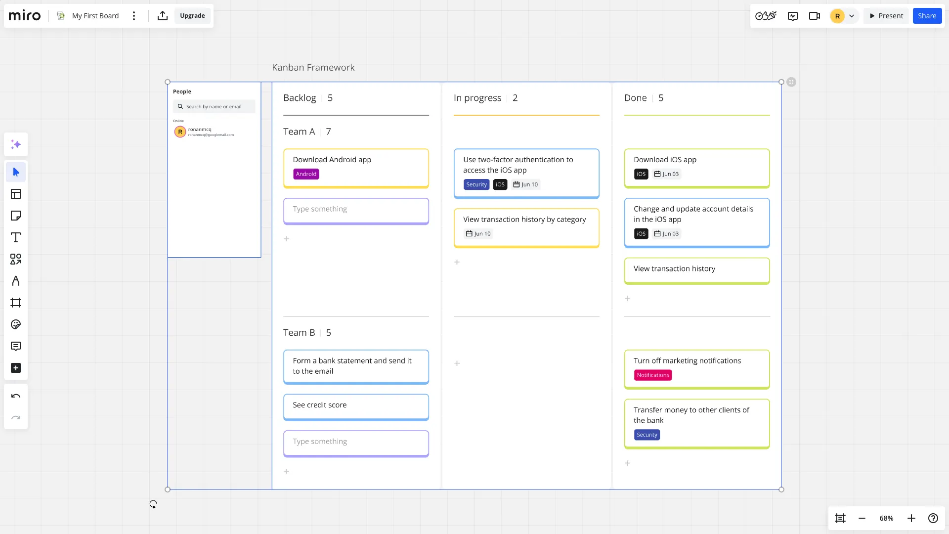
Miro is a great example of web application design that combines practical functionality with aesthetic appeal.
At its core, it's a visual collaboration platform, allowing multiple users to edit documents, idea boards, project timelines, and more, in real time.
Its clean, modern interface offers an intuitive experience for manipulating visual elements, with minimal learning curve. We're particular fans of Miro's startegic use of colors, helping to highlight important functionality without creating excessive mental load.
Collaboration features are integrated seamlessly, with color-coded cursors helping to signpost which team members are currently taking different actions. Miro is excellent proof that feature-heavy tools can still have great design
Design - ❤️❤️❤️❤️
Usability - 😻😻😻
Creativity - 🌟🌟
8. PostHog
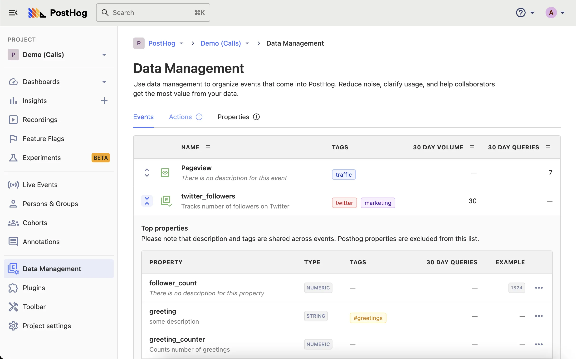
PostHog is a hugely flexible, configurable analytics platform for software products. It's probably also the best example of a web application design that uses clever information architecture to ensure that key features are easily located.
It utilizes logical, consistent side-bar navigation to seamlessly guide users from one task to the next.
Like Miro, PostHog also offers a range of collaboration features, including allowing users to tag their experiences. That way, your team can share insights in seconds, without ever leaving the platform.
Of course, we can't mention talking about its customizable dashboards and reporting, which allow even non-data professionals to ship stunning visualizations.
Design - ❤️❤️❤️❤️❤️
Usability - 😻😻😻
Creativity - 🌟
7. Zapier
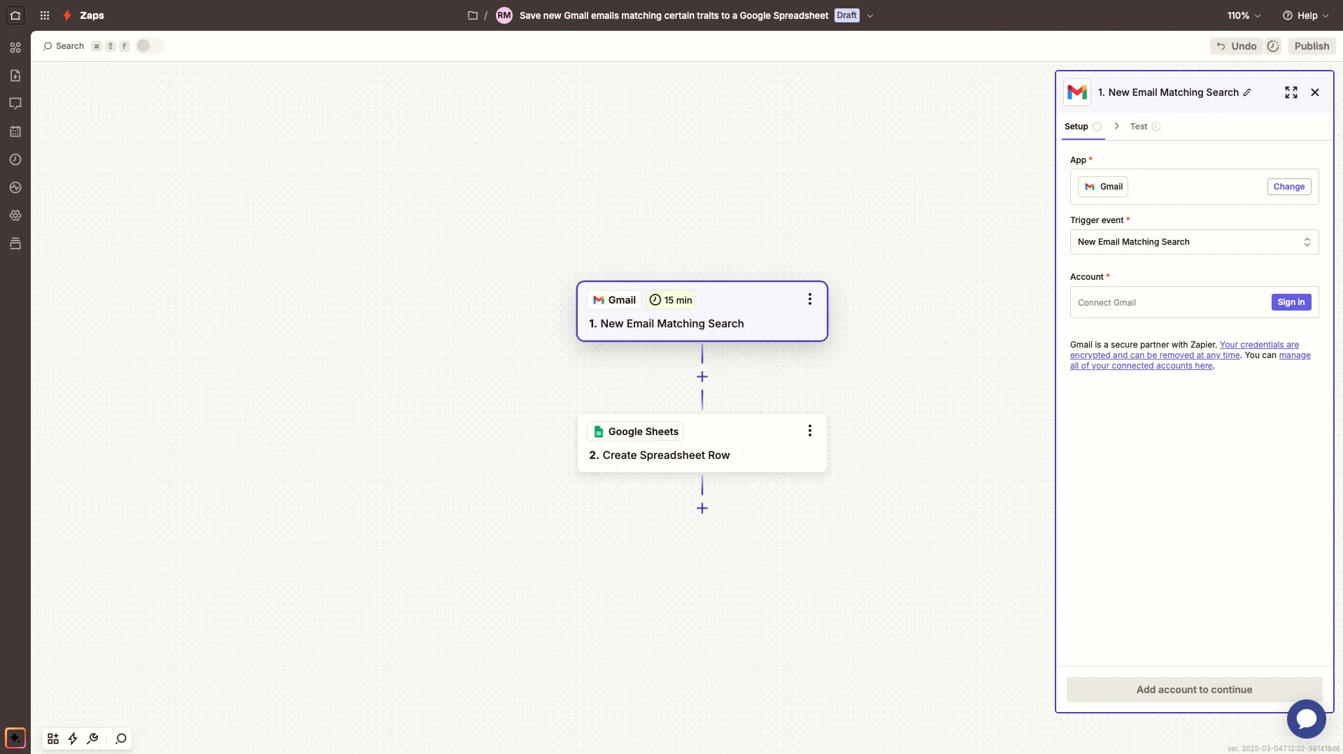
Zapier is a visual automation and integration platform, that empowers non-techincal users to set up sophisticated workflows and processes, leveraging their existing tech stack - tasks that might otherwise require a professional developer.
This simply wouldn't be possible without exceptional design. More specifically, where Zapier succeeds is carefully guiding users through the process of setting up Zaps. This starts with onboarding, including clear labellign and genuinely helpfull tooltips that educate users on the basics of integration.
Zapier's core experience centers around a flow-chart interface, which offers a clean, intuitive experience for setting up even complex rules.
It's also a great example of one of the core principles of great web app design - recognition over recall. In particular, it carefully leverages visual elements like icons for specific action types or logos for connected applications, to allow users to quickly scan their automation flows to understand how they work.
Design - ❤️❤️❤️❤️
Usability - 😻😻😻
Creativity - 🌟🌟
6. Canva
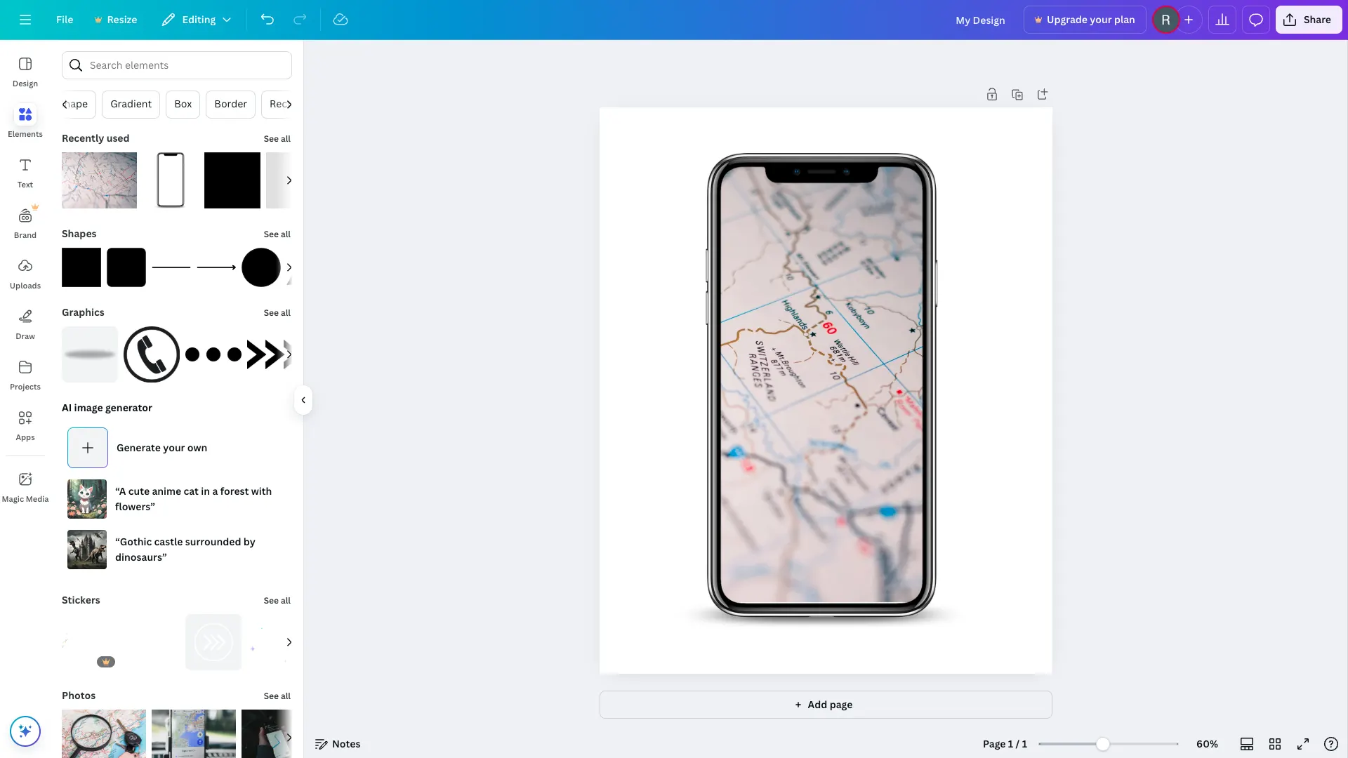
Canva is another tool that empowers users to perform tasks that might otherwise require more niche skills. This time, though, it's focused on graphic design. Part of the reason that this works so well is its unique visual identity. Canva's curved lines and soft color scheme are the antithesis of more specialized design tools, making it a much more appealing, less intimidating platform.
Similarly, it leverages large CTAs and easy-to-read typography to keep things accessible for less technical colleagues.
Another real strong suit how Canva balances more advanced capabilities with intuitive user experiences. This is achieved with a clear hierarchy of information, with core tasks like recoloring or repositioning elements always being prominent.
It's little wonder that Canva has established itself as one of the go-to platforms for desining assets, in a relatively short span of time.
Design - ❤️❤️❤️
Usability - 😻😻😻😻
Creativity - 🌟🌟
5. Intercom
Next on our list is Intercom.
Intercom describes their company as a suite of messaging-first products, designed to accelerate business growth. Founded in 2011, the Intercom suite of products have went through multiple design iterations.
The most recent design attracted a lot of praise, and also some negativity from the darker corners of the internet - but we're going to ignore the trolls as we're huge fans.
The UI is clean, and boasts an efficient layout and simplified navigation. The Old UI was busy and when working within Intercom for long hours, it would often feel cluttered. At Budibase, we feel the new design solves this issue and presents users with a calming interface which we love to use.
Design - ❤️❤️❤️
Usability - 😻😻😻😻
Creativity - 🌟🌟
4. Buffer
Buffer is one of the original social media management platforms. In 2014, Buffer solved one of my biggest problems as a young digital marketer - scheduling social media posts. Since then, Buffer has grown and just recently divided their offering into 3 products. Along with the new offering, was a new UI.
Buffer takes advantage of a primary top nav, and secondary left navigation panel. This makes it easy to navigate between products and functionality. The UI is very clean and utilises whitespace well. It also mixes it's brand colours wonderfully throughout the UI giving it character and creativity.
The platform is simple to use and a pleasure to work with. It makes scheduling social media posts easy, and presents users with a wonderful reporting platform for simple analyse. Well done Buffer - you aced the redesign!
Bonus - Buffer have 'open-sourced' their UI. Check out their UI components repo on Github. They've also 'open sourced' the UI for their Analyse tool.
Design - ❤️❤️❤️
Usability - 😻😻😻😻
Creativity - 🌟🌟🌟
3. Notion
I am a huge fan of Notion, and I’ve been an avid user since 2016. It’s minimalist and uncluttered feel provides the user with a blank canvas, free from distraction - making it a great example of modern web app design.
When I first used the web app, it was slow and unresponsive in some cases. I wasn't the only person to feel this, and it ultimately led to a complete rebuild of the product.
Thankfully, the rebuild paid off. Notion is now used by over 1,000,000 users and performs flawlessly.
For me, Notion was my number 1 pick for the best example of modern web application design. It's use of emojis against a clean interface is incredibly smart and gives the user options to creative.
You might also like our round-up of the top open-source low-code platforms.
Design - ❤️❤️❤️❤️
Usability - 😻😻😻
Creativity - 🌟🌟🌟🌟🌟
2. Netlify
Netlify takes the complicated and makes it simple.
Netlify offers hosting and severless backend solutions to static websites.
My first experience with Netlify was in 2017. Before Netlify, I used AWS to host my static websites.
Within the first 2 minutes of using Netlify, I was in shock. How could this painstaking process, which I frequently fretted upon, be so easy?
The answer, DESIGN.
Every screen/feature is clearly explained and beautifully structured. Their tables, fonts, and navigation are beautiful to look at and simple to use. Information is only presented when it needs to be. Unlike AWS, you feel comfortable and in control.
In 2017, I'm pretty confident I was Netlify's best sales person. I referred it to all my social circles, singing its praises when possible. Netlify, is by a long way the best UX I've experienced within a web application - it's incredible.
Design - ❤️❤️❤️❤️❤️
Usability - 😻😻😻😻😻
Creativity - 🌟🌟🌟
1. Mailchimp
Mailchimp started as a side project over ten years ago. In 2009 they added a freemium version and their customers jumped from 85,000 - 450,000. Today they provide millions of startups / small companies around the world with a simple, beautiful marketing platform (it's now more than the email platform it use to be).
I've been a user of Mailchimp since the beginning and I've watched how they've changed the UI/UX over the years. It continually gets better! At Mailchimp, they take design serious. They have a consistent design structure across the platform, and their design language is evident. Structural elements like the logo, colour palette and typography keep the design grounded and consistent. This leaves their designers room to express themselves.
Recently, the Mailchimp UI has become more playful, introducing a cleaner interface with expressive fonts (we love the Cooper font!) and playful illustrations.
Mailchimp rely heavily on UX testing and supplying users with an interface which is incredibly simple to use. Mailchimp's support is terrible - which is possibly the reason they invest so heavily in UX - and it works.
Mailchimp's web application design is the best on our list and scored maximum points across the board. The web app is a joy to use and the web application design is an inspiration for the team at Budibase.
Well done to Mailchimp on continually delivering a beautiful product which is easy to look at, and even easier to use.
Design - ❤️❤️❤️❤️❤️
Usability - 😻😻😻😻😻
Creativity - 🌟🌟🌟🌟🌟
I hope you enjoyed and take inspiration from our top 10 web application designs - we certainly did! We will continue to update this post as new web application designs are released. If you have any web application designs you feel should be on the list, send us a DM on Twitter and let us know.
Considering Building A Web Application?
If you are considering building a web app, I would start by reading the following:
If you are considering building a web app, and but you don't know what to build, we've got you covered. Check out the following inspirational post:
And if you are looking considering tools to build your next web application, reduce your development time by choosing Budibase. Simply sign up using the form below.